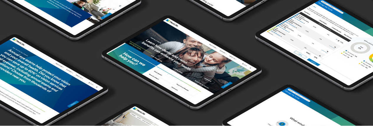
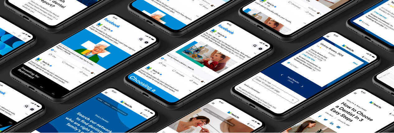
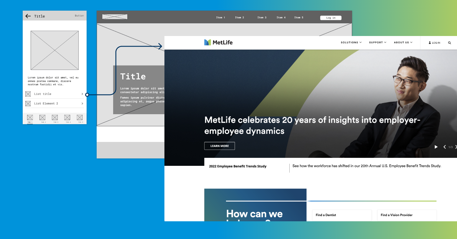
This design system is your guide to creating digital experiences that look, talk, and act like MetLife. Our standards, core guidance, and resources are building blocks that will help you work efficiently, iterate quickly, and deliver seamless experiences that meet our customers’ needs, and exceed their expectations.
Jumpstart your digital design
What's new in the design system?
Foundations
Standards
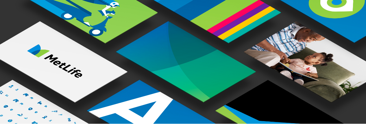
Our logo, typography, color palette, and more—these are the standards that must be followed, without exception, in all digital communications and experiences.
Core Guidance
From illustration and icons to photography and graphics, here you’ll find guidance on how our foundations can flex to help you push your digital designs.
Resources
Showcase
Case Studies
Check out some of the best examples of experience design work from MetLife teams around the world.
Digital Brand Expression
Find creative inspiration to help you design digital experiences for our different local markets.
XD in Practice
Deliver Exceptional Experiences
Find guidance and best practices for common MetLife digital design use cases.
XD in Practice (VPN Access Only)


