MARKETING & ADVERTISING GUIDANCE
Overview
Guidance
Here are a few things to keep in mind and consider trying as you compose and design your emails.
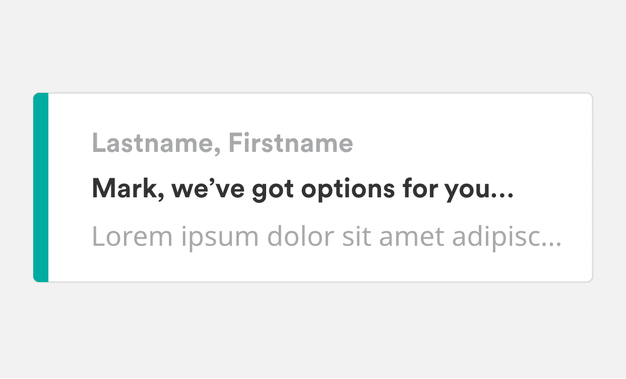
Subject Line
Do
- Consider personalizing the email by using customers’ names in the subject line. Try to keep subject lines short and clear as a rule of thumb, and attention-grabbing whenever possible.
Header & Footer
Do
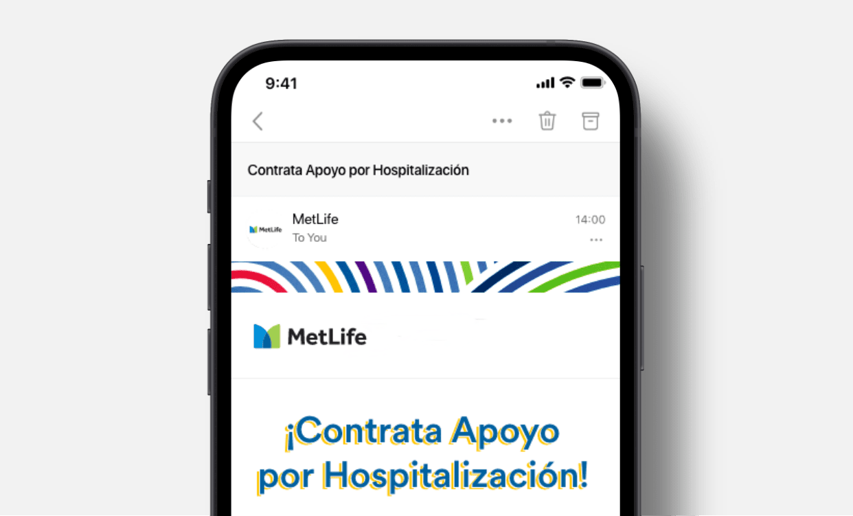
- Consider a small branded accent at the top of the email, like a gradient bar or some graphic style.
Do
- Use a transparent background logo image and with @media query swap logos when dark mode is enabled so that a dark-mode-friendly version appears.
- Alternatively place the logo in a header graphic that’s the width of your email template, this allows you to have exact control over the logo and background behind it.

Do
Keep headlines above the fold.
- Try to keep headlines clear and concise so they do not get cut off, especially on mobile.
Do
Consider following the standard footer content.
- Required legal text.
- Opt-out link, if you're designing a newsletter.
- Copyright info.
Body
Do
Design emails to be mobile first with responsive layouts.
- Keep content to a single column when possible.
- Content created in two columns should resize to a single column in mobile views.
- Keep images to a minimum. Email file size should be optimized for quick viewing on any device.
Do
Use Circular and Noto Sans as web fonts when possible with Arial as a backup.
- Web fonts can bring the brand to life for customers on modern email clients.
- Email can be unpredictable, most customers will view content in Arial when web fonts are disabled.
Do
Use text based content over graphics.
- Pair back the use of branding and allow the focus to be on the content.
Avoid
- Using background images.
- Placing typography or icons over focal points or multi-colored graphics.

In Use
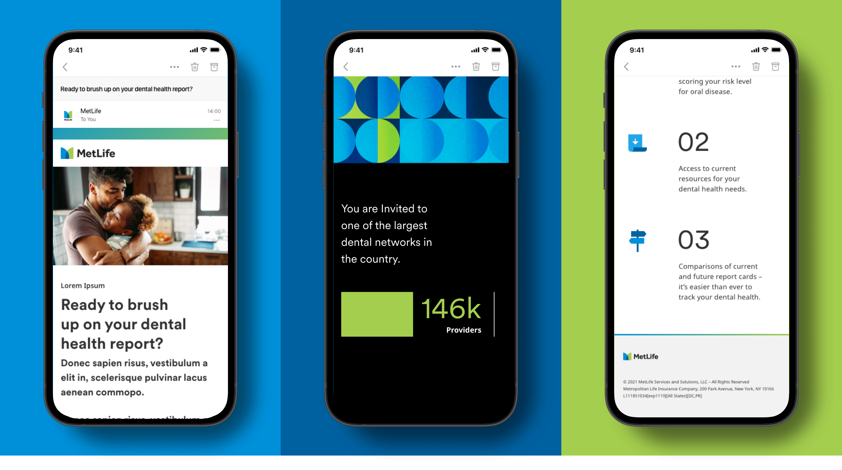
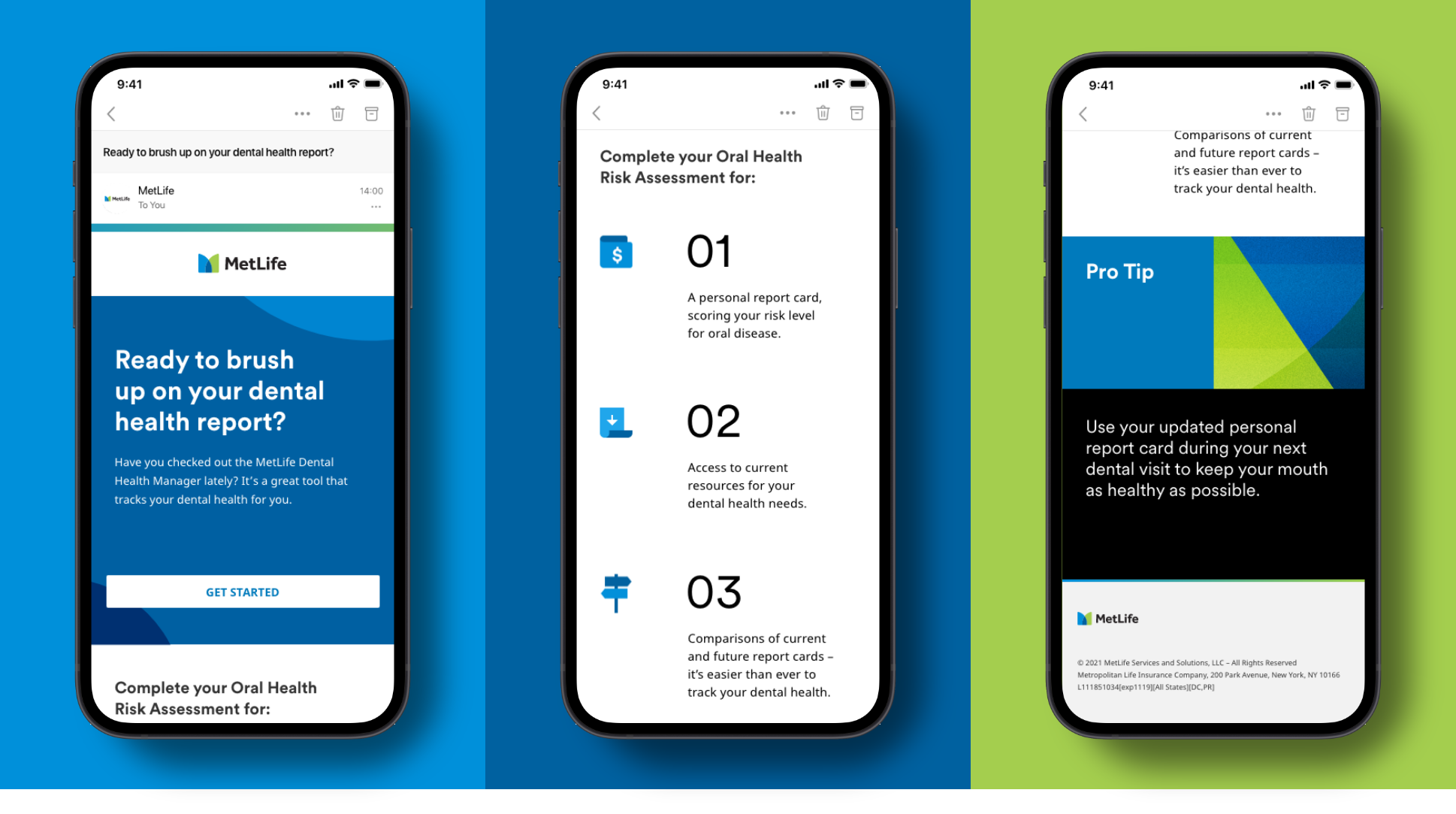
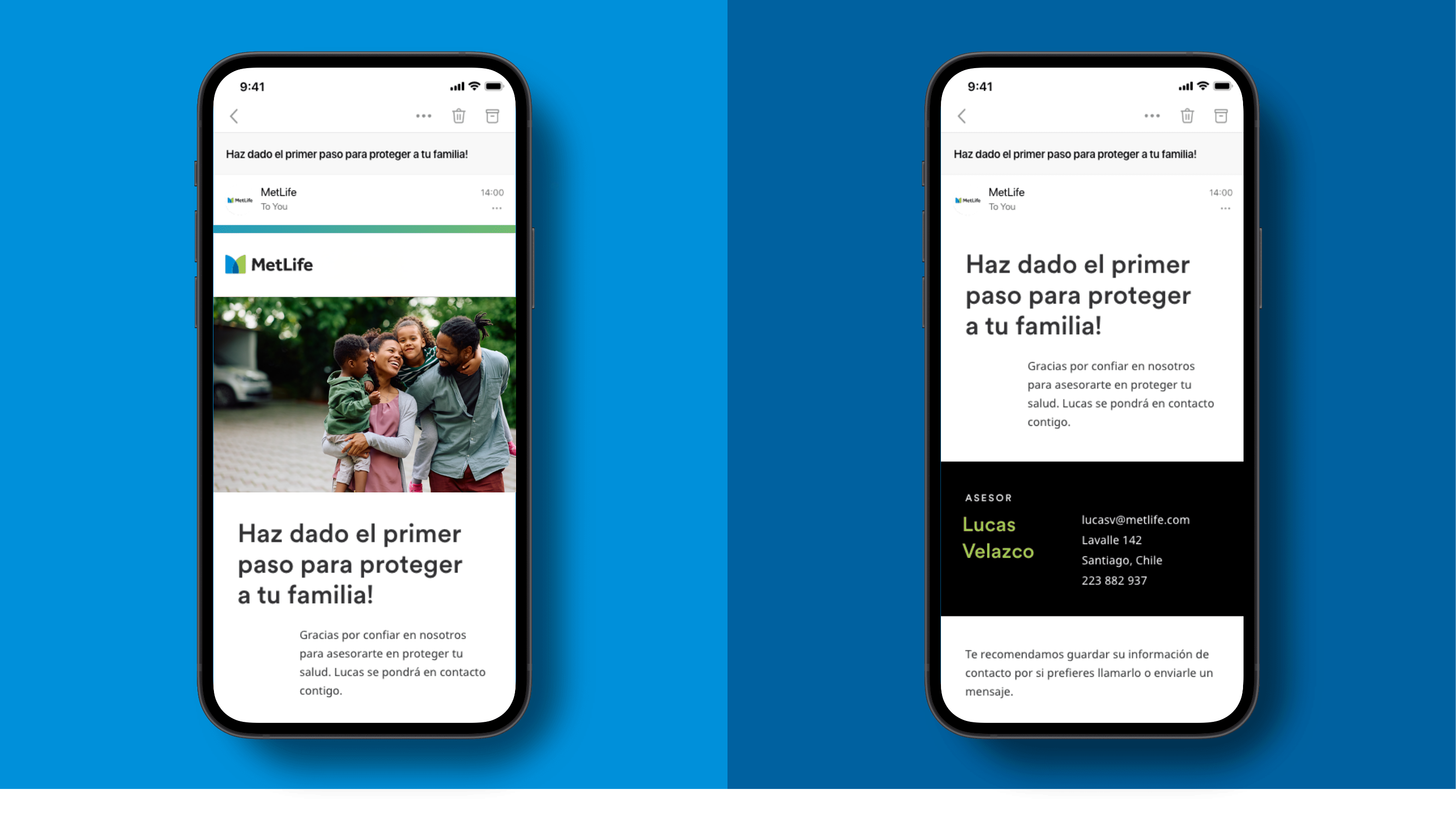
Servicing email (U.S.)
Servicing email (U.S.)
Thank you email (Chile)
Error Message
Servicing email (U.S.)
Servicing email (U.S.)
Thank you email (Chile)
Email Components & Templates
