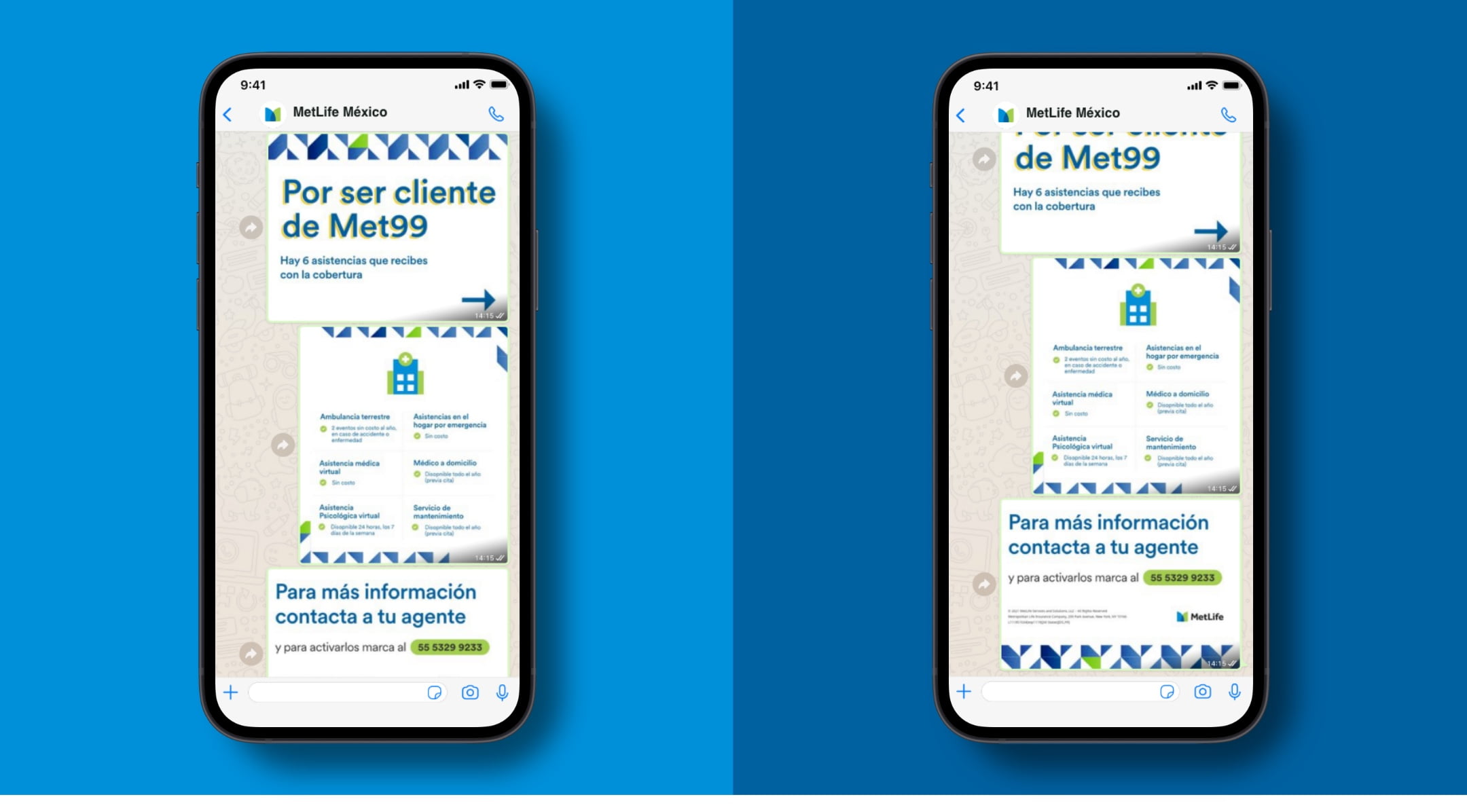
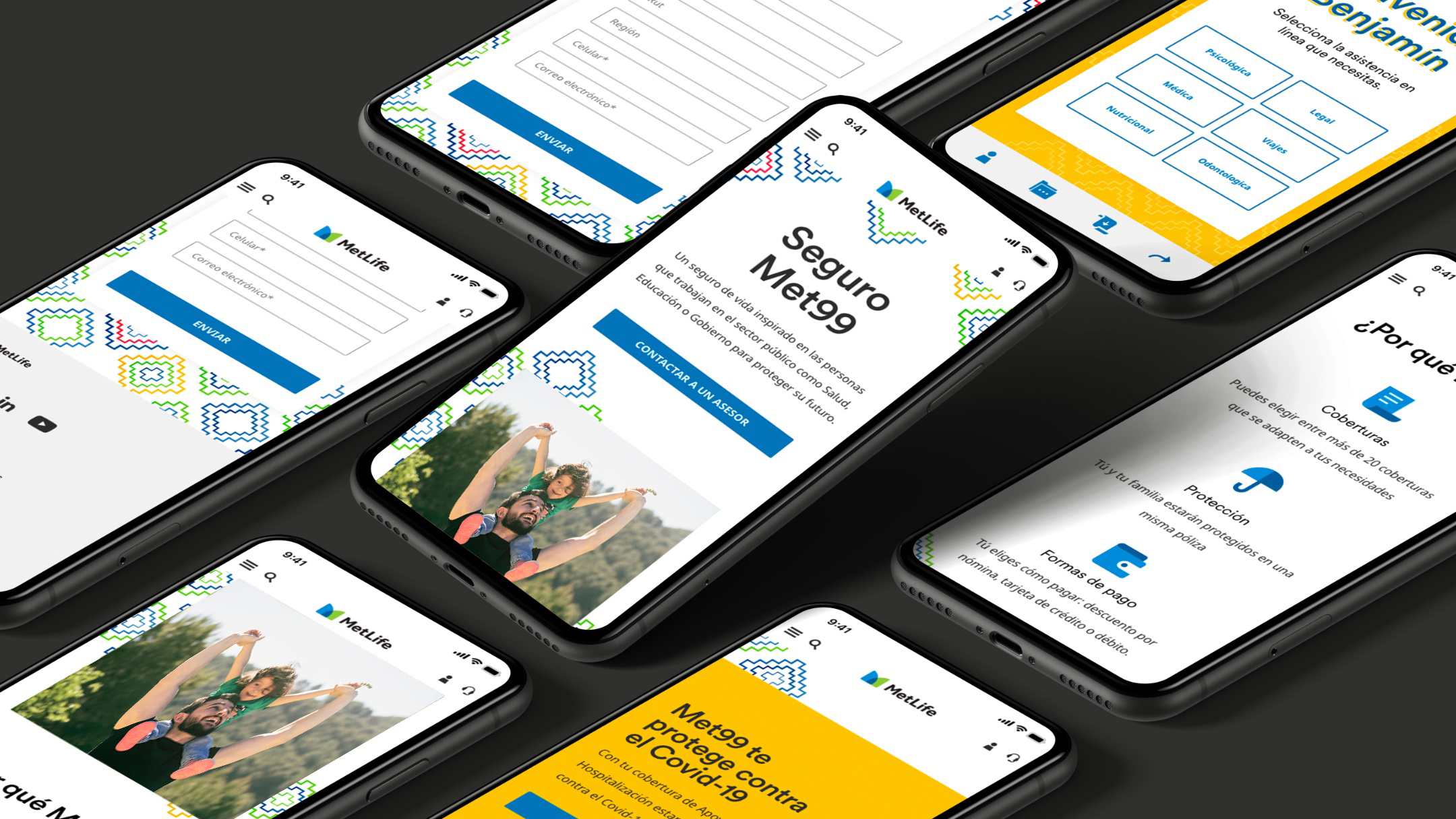
To better connect with customers in Mexico, we stretch the global MetLife digital brand in a few different ways. Here you’ll find digital examples and guidance to help you bring communications to life in the Mexican market.
Overview
In Mexico, the extended MetLife brand is expressive, vibrant, and rooted in heritage.
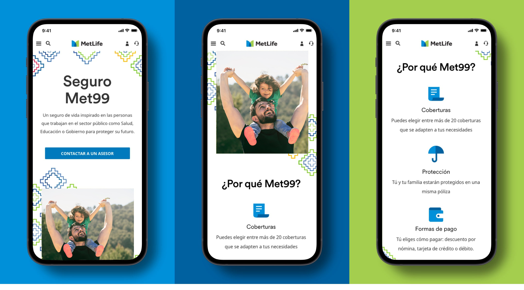
Family and heritage are an integral part of Mexican culture, so we look to use our brand elements in ways that speak to those values. Our photography depicts genuine family interactions, typography is expressive and bold, our graphics are rooted in Mexican heritage, and the colors we use are vibrant and distinct to the country.
Digital Guidance
Explore these pages for specific guidance on how to use our brand elements in the Mexican market.
Social
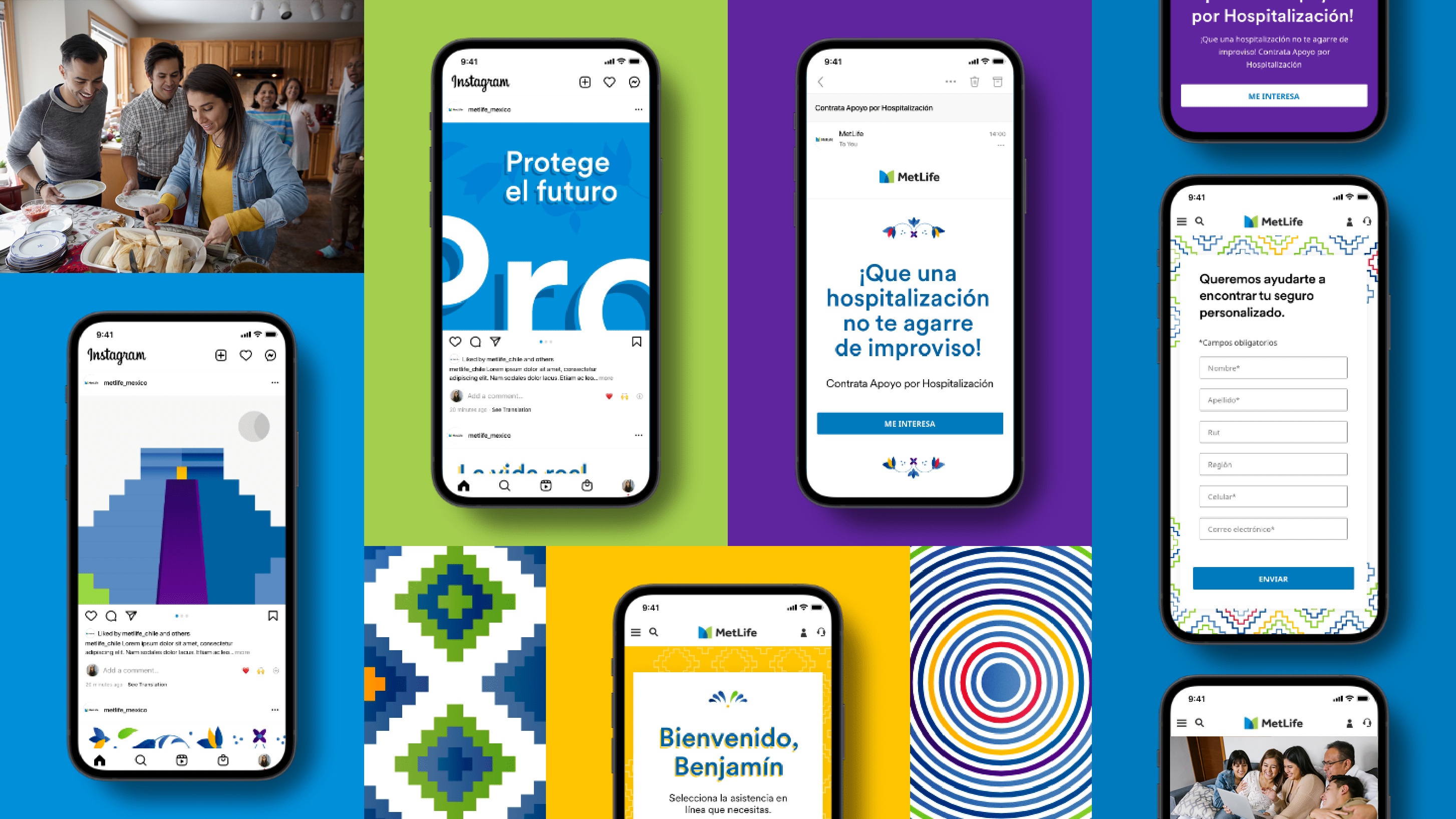
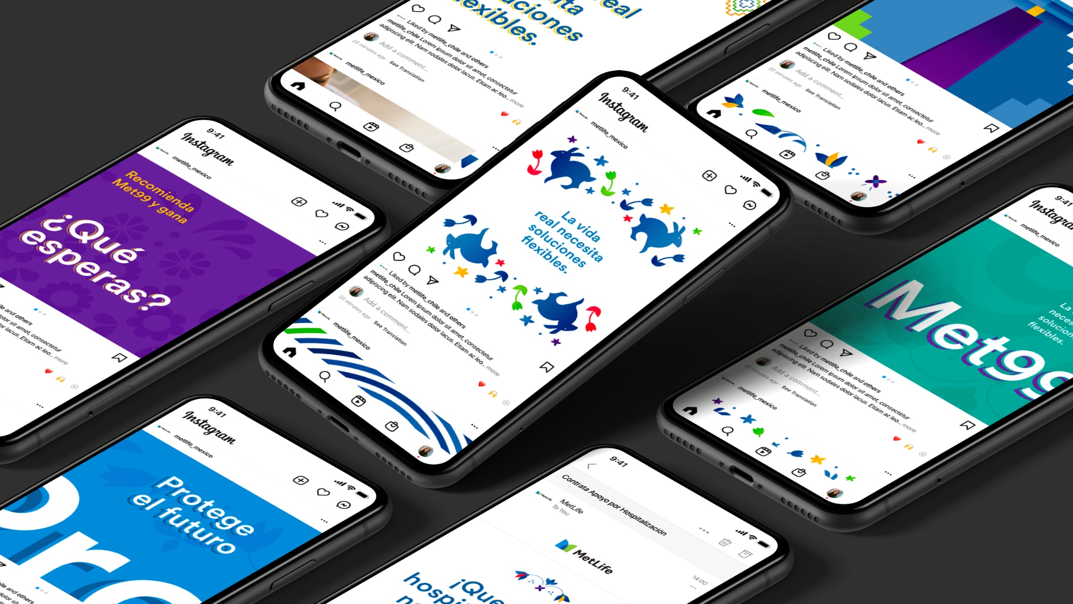
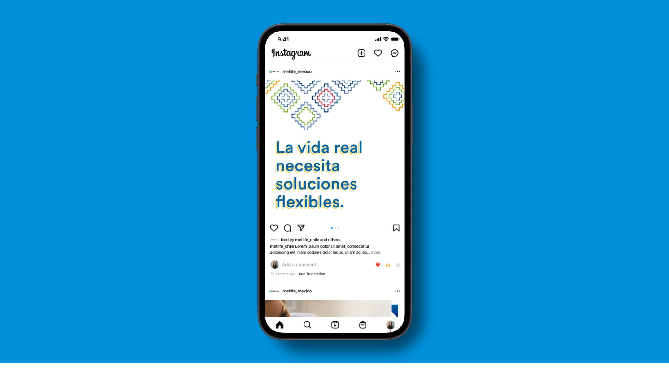
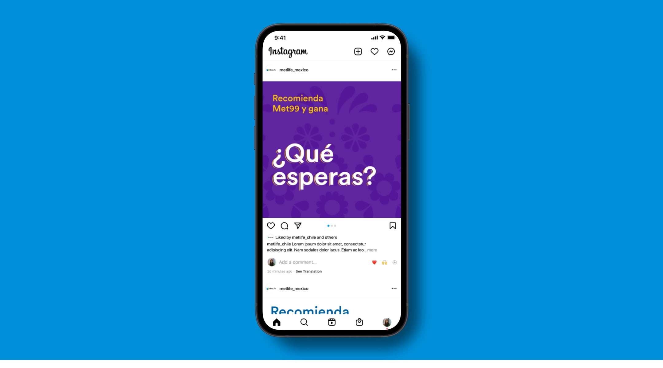
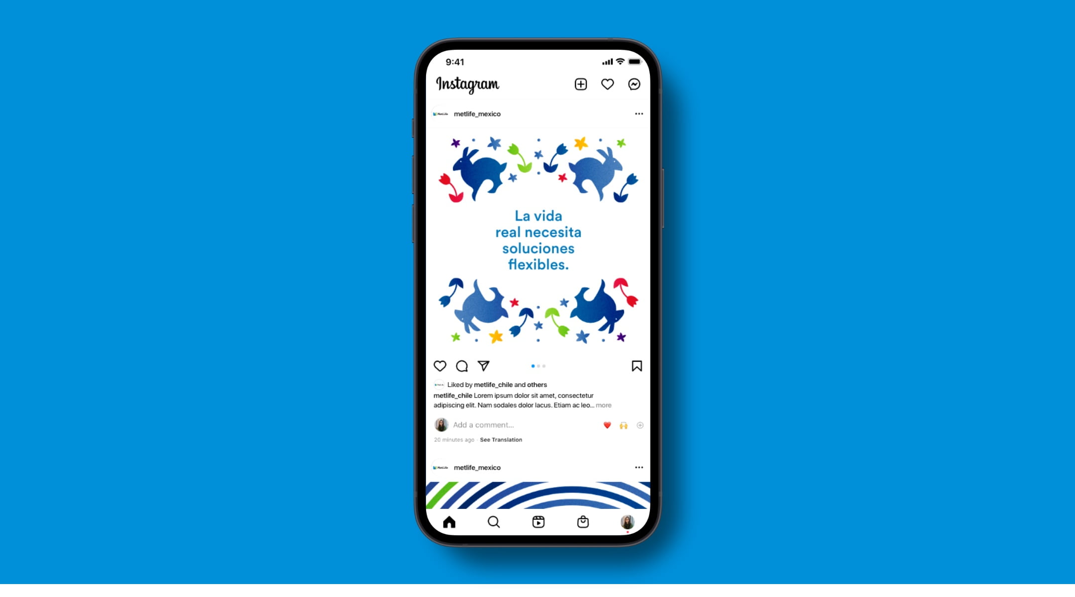
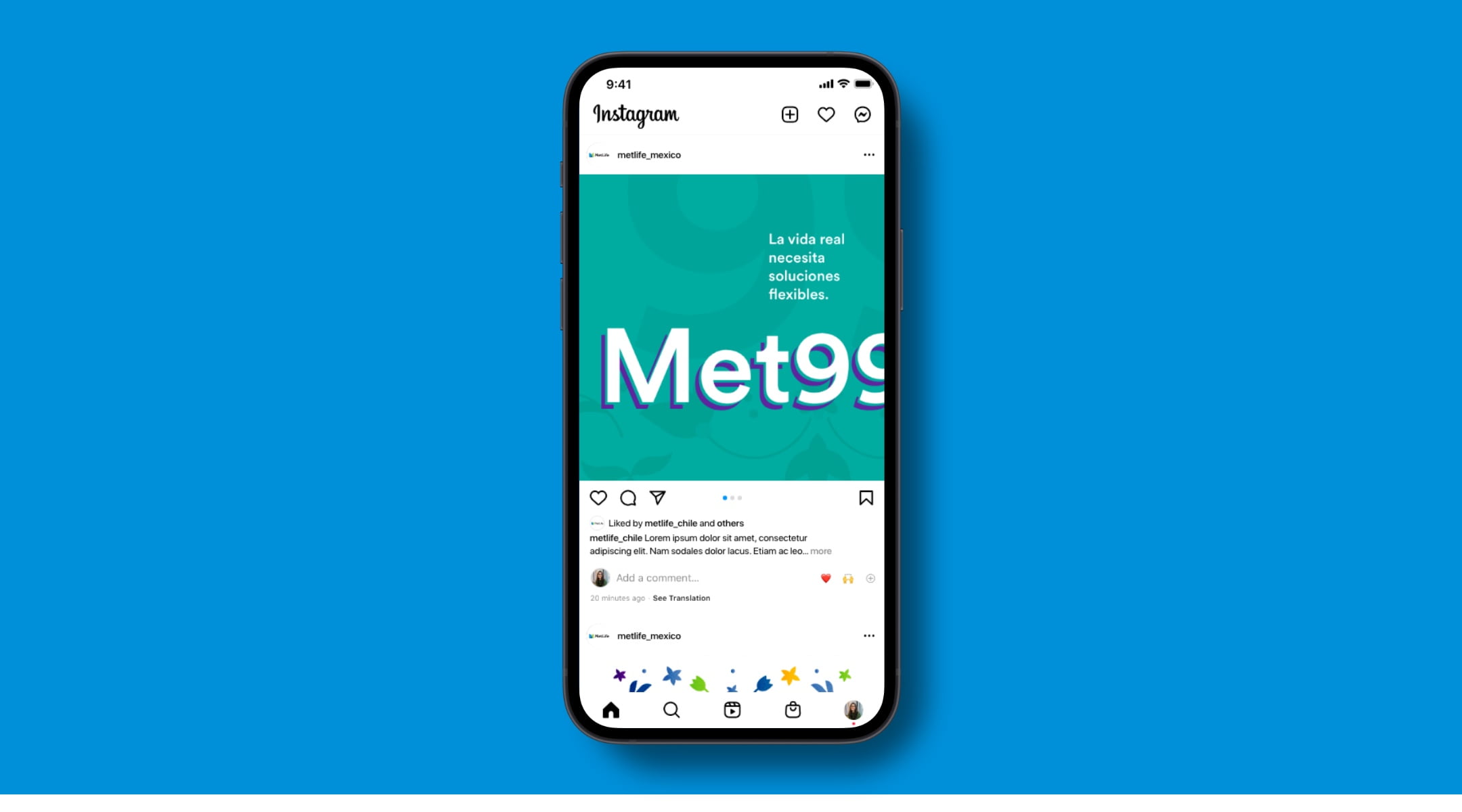
In designs for social, we amplify the secondary color palette and use contrasting colors to add vibrancy that is distinct to Mexico. We also incorporate traditional patterns that help make our messages locally relevant. Variety is key to bringing in the vibrancy of the Mexican market, so we always make sure to mix our use of patterns, bold color, and photography in our posts.
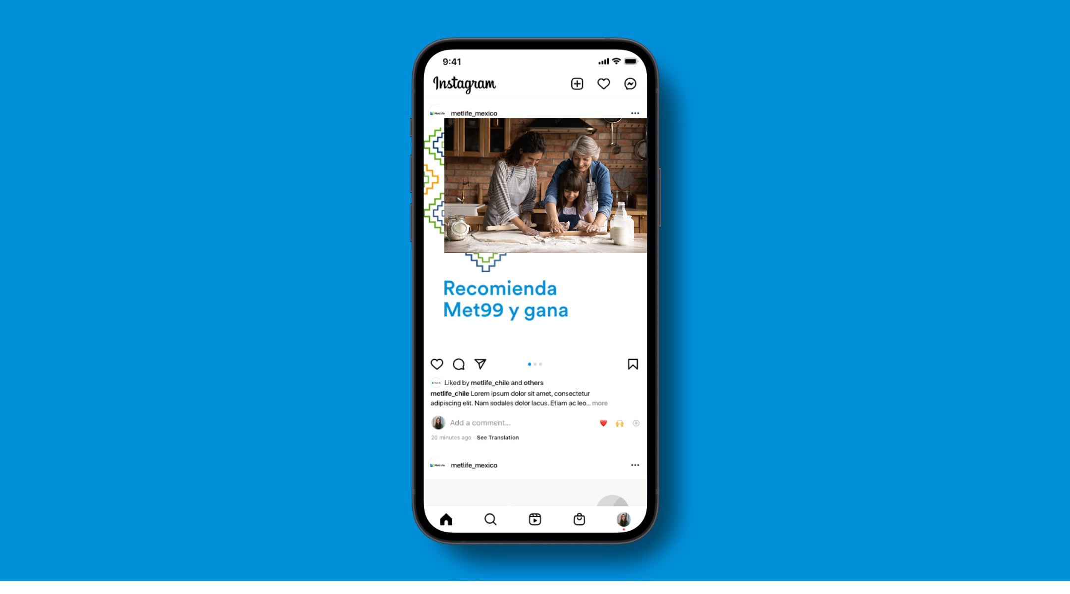
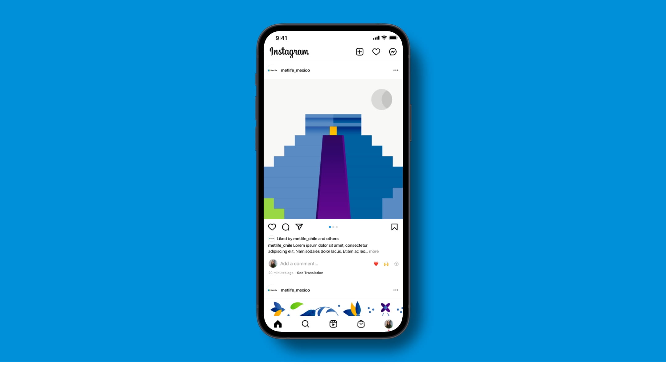
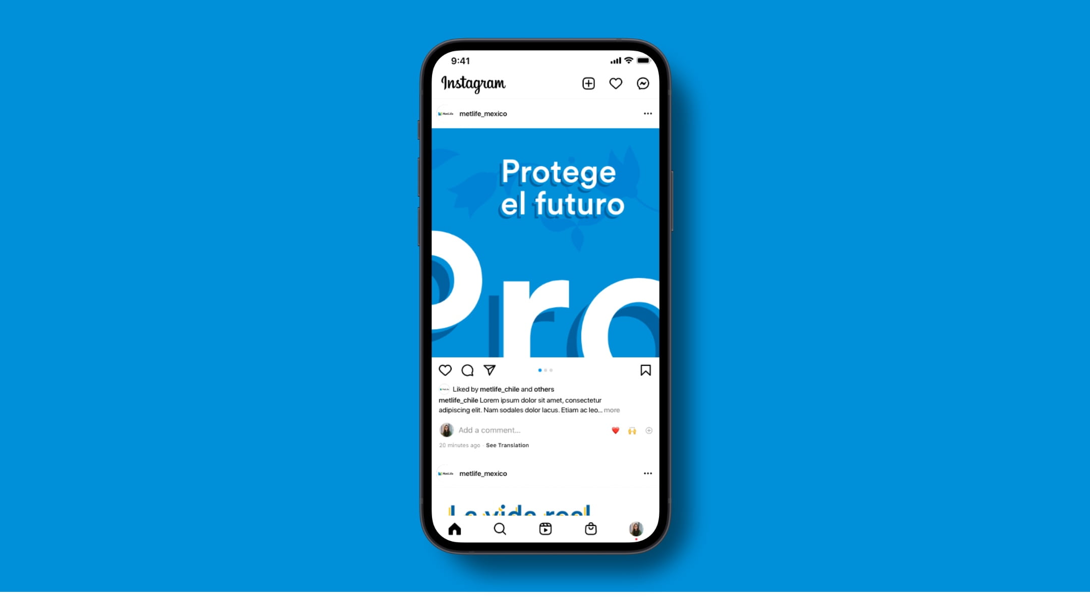
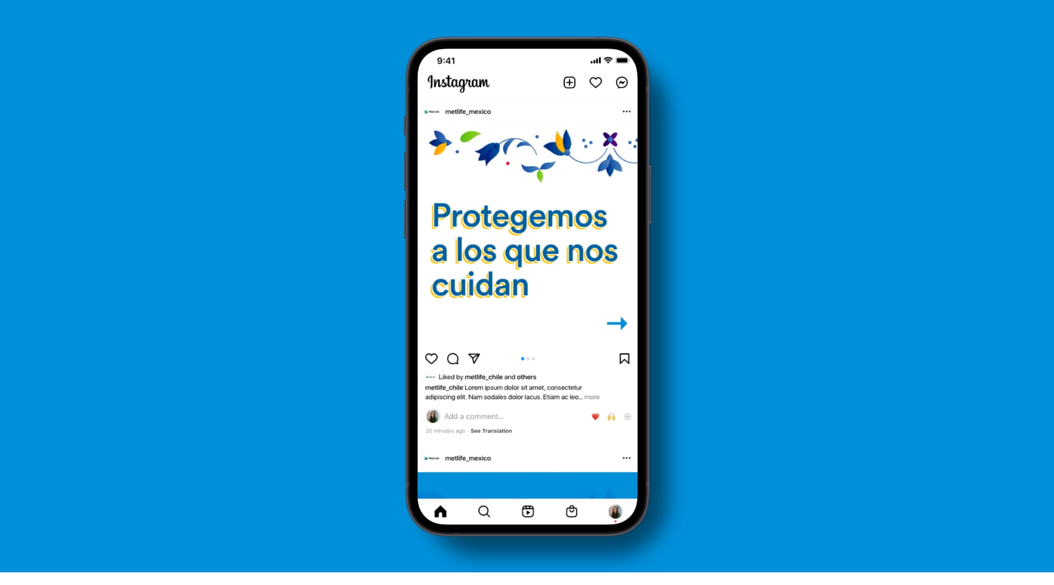
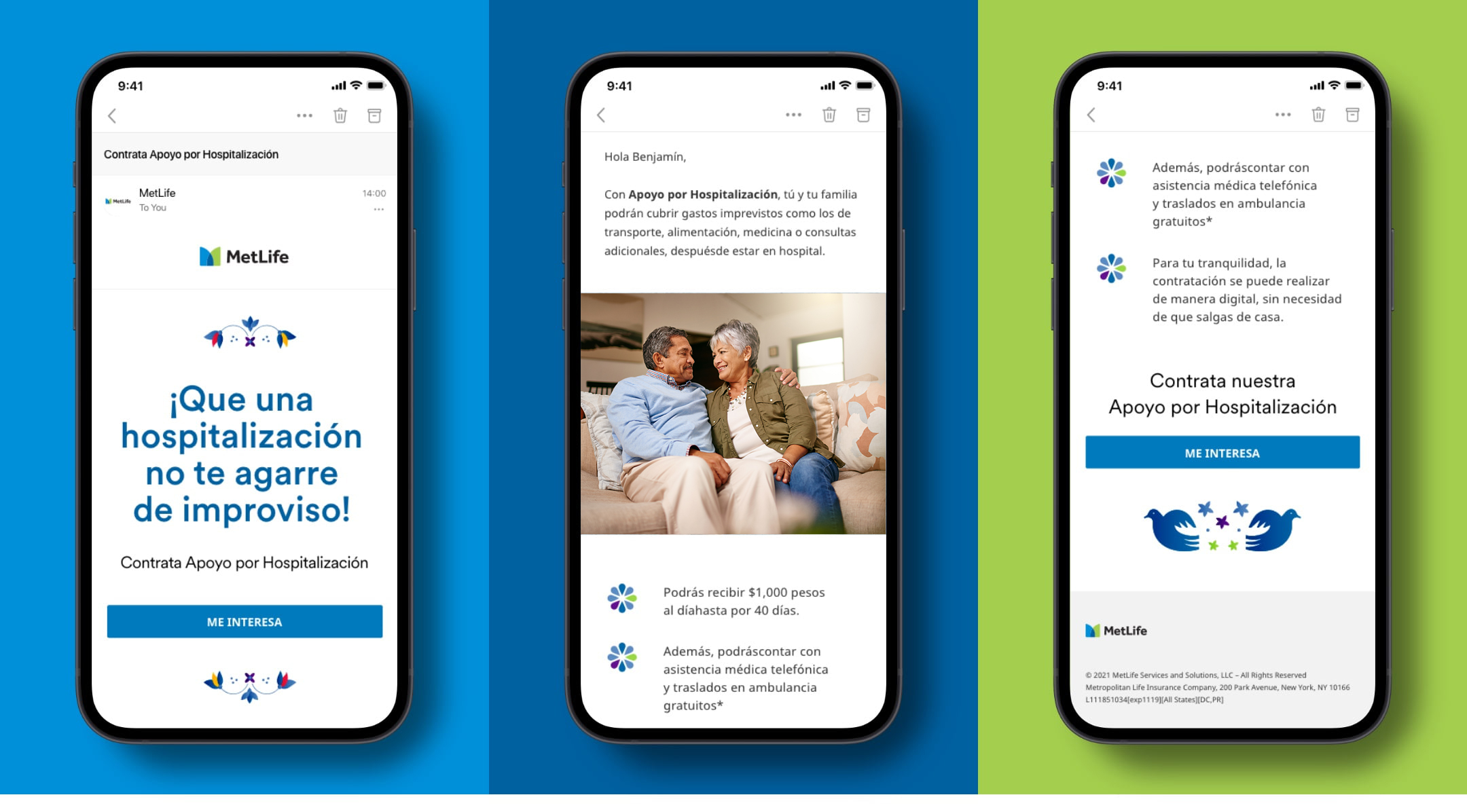
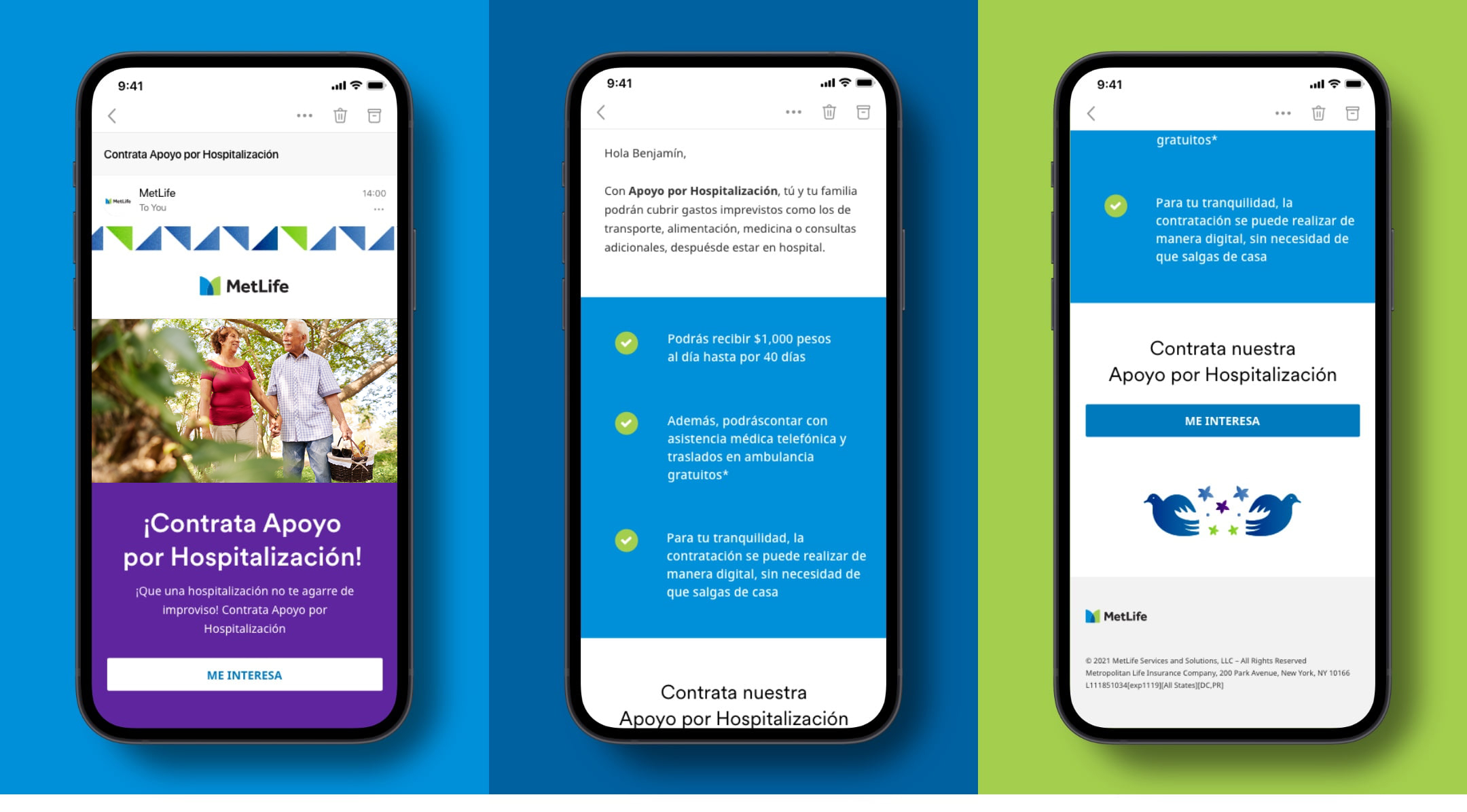
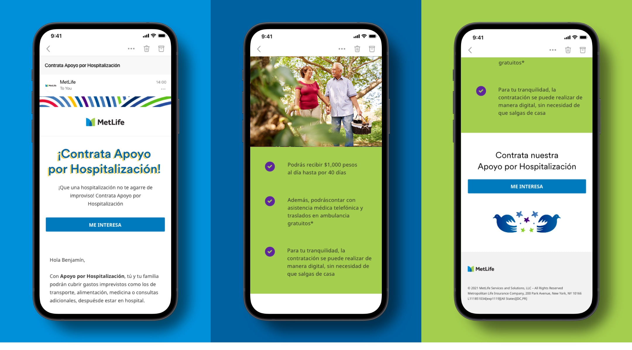
In our emails, we balance bold expressions of the brand with more functional, straightforward moments. We brand the top and bottom of emails with local graphics to always ground the user in the communication. In the body of the email, we use a simple mix of photography, color, and graphics that lends vibrancy, but does not distract from the messages we’re trying to communicate.
Additionally, we always adhere to email best practices—keeping image sizes small, avoiding the use of background images, and making sure that our headlines fall above the fold.
Web
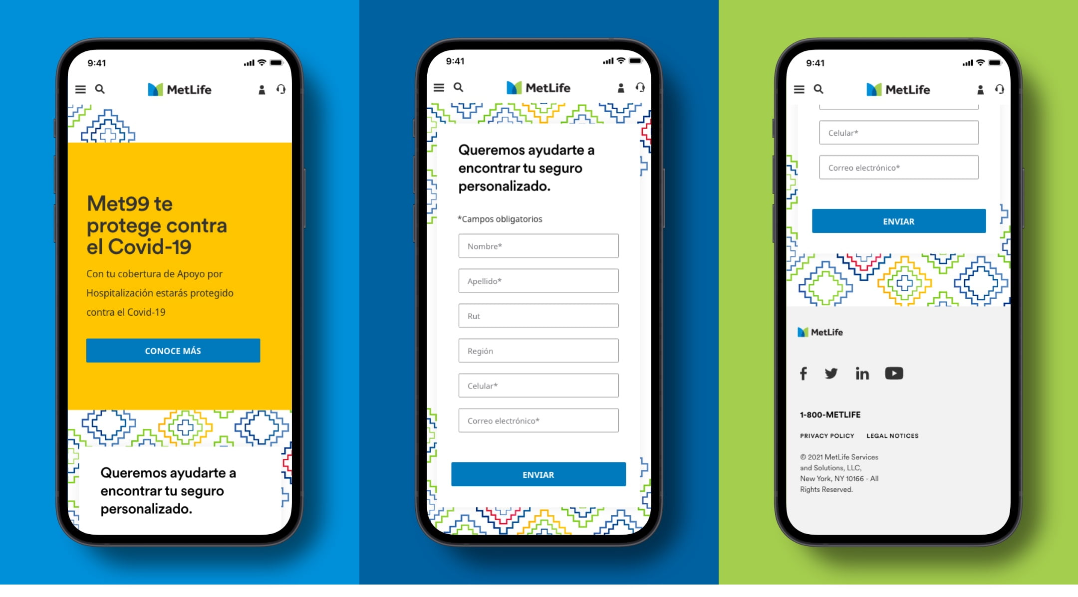
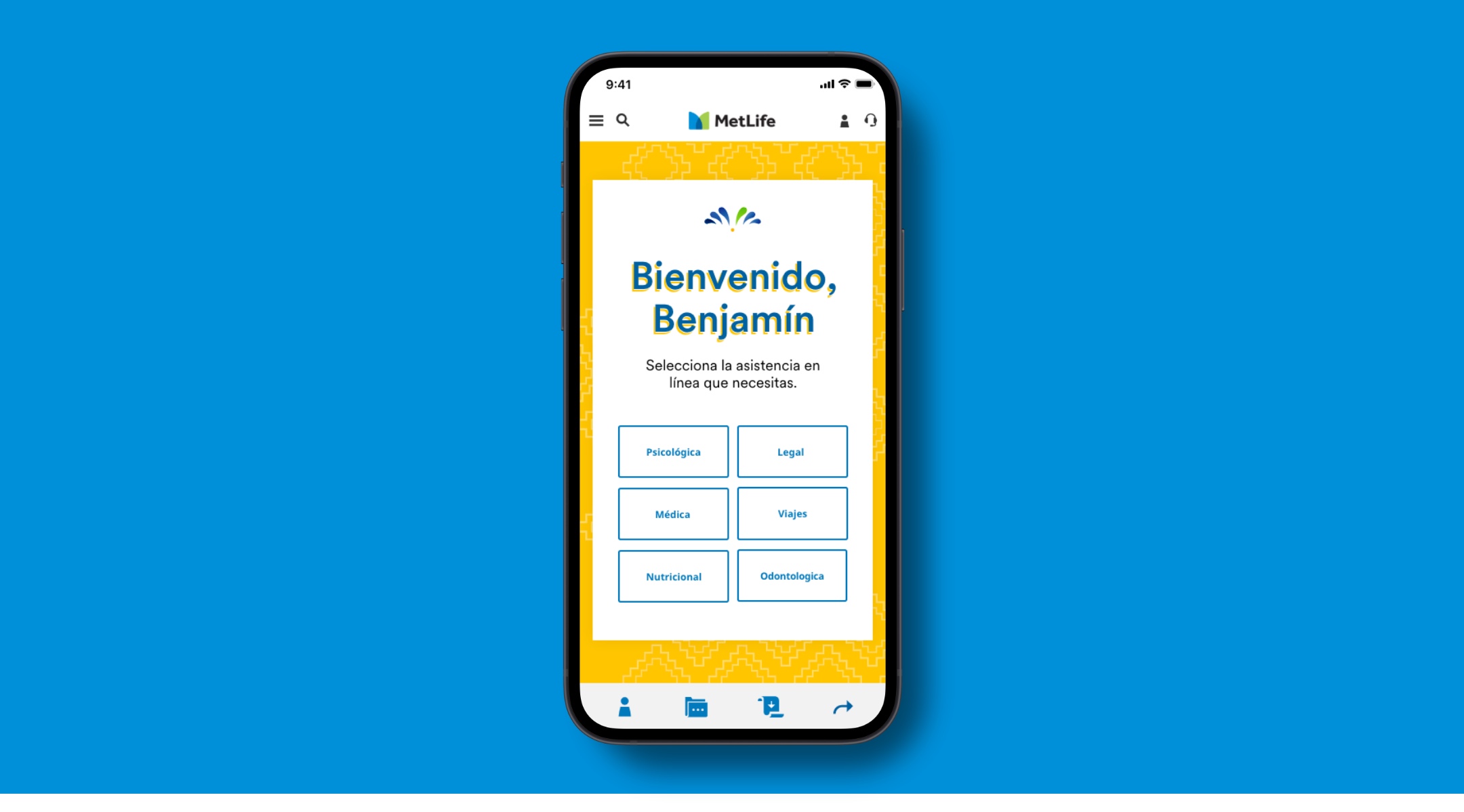
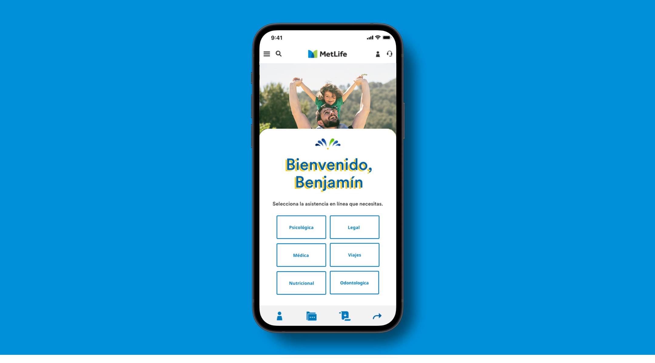
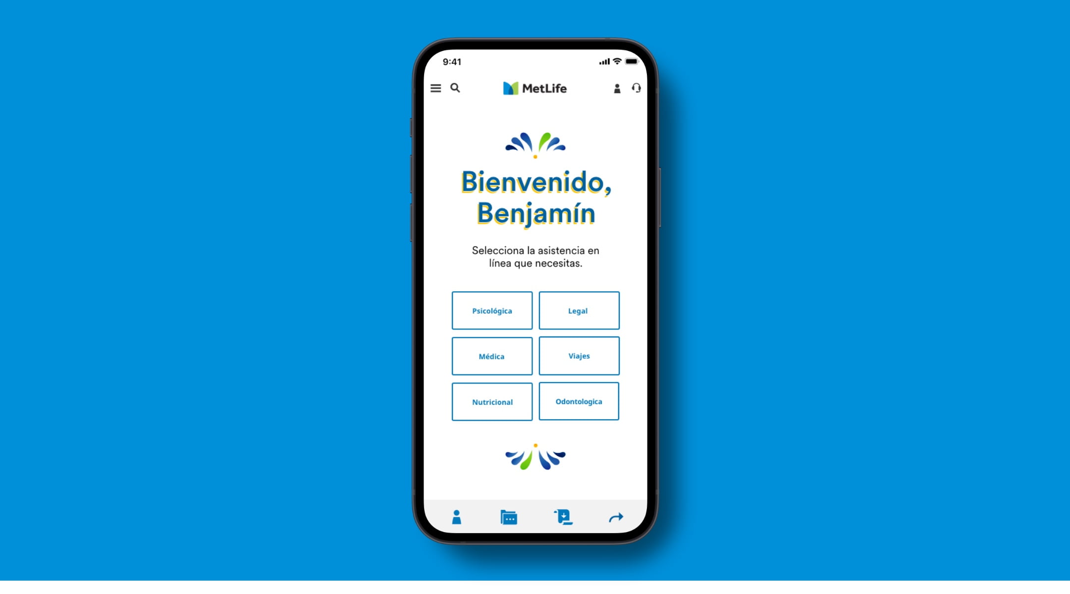
In more functional moments on the web, we use our secondary color palette to draw the user’s eye down the page and complement the key information with modern graphics and authentic photography. Because the Mexico brand is so vibrant, it is important to be intentional with where and how much of the brand is brought in. For example, header moments introduce the brand, so they can be more expressive, whereas input fields are about utility, so the brand should not get in the way of the task a user is looking to accomplish.
WSG
Product Page
