MARKETING & ADVERTISING GUIDANCE
Social
Overview
Social media allows us to maintain a digital presence, engage with our audience, increase brand awareness, and drive consideration. It’s where we share content that is helpful to our customers and drives business results. Here is some guidance to help you jumpstart your next social campaign.
Developing Content that Delivers Results
We cultivate a vibrant social community by providing relevant content that drives business results and helps our customers thrive in their new work-life world.
Breakthrough Creative
We create social-first assets that elevate our brand, videos and animations that stop people in feed, and graphics that are share worthy.
Authentic Voice
We always speak in our simple, empathetic, insightful and forward-thinking terms. Where appropriate, we bring in executive and employee voices on our social channels.
Utility
Our social content provides quick hits of useful information that drive engagement and clicks. (Tips, advice, general support).
Guidance
Writing for Social
Here are some copy considerations for social. For in-depth language standards and guidance please refer to our Tone of Voice page.
Be straightforward, concise, and simply human.
- Keep social posts short.
- Twitter has a max of 280 characters, and with a web link that decreases to 257 characters.
- The preview people see when scrolling on Facebook or LinkedIn will only show the first 1-2 sentences.
Use hashtags.
- These can be general (#FinancialWellness) or campaign specific (#SBIndex, #BenefitTrends2021).
- You can integrate hashtags into the sentence structure or at the end of the post after the URL.
Get legal approval.
- Any post mentioning a product or service needs to go through legal approval.
- If you have content for a larger campaign with multiple posts (like EBTS), it is best to submit through SMRS so legal can review all at once.
Check spelling and grammar.
- Also check spacing. Any additional blank lines or extra spaces between text will be published with the post.
Scheduling & Publishing
Schedule your posts on a calendar.
- No more than two posts to be scheduled each day.
- Exceptions can be made if there is a last-minute press release or a campaign/event happening that would require multiple posts on the same day.
Consider ideal times to post.
- Ideal times to post Monday through Thursday: 7-8AM, 11:30-12:30PM, 4-5PM
- On Fridays, posts should go out by 2PM.
- Scheduling on the weekend is okay. Business content should be shared on weekdays, but brand/timely/fun content can be posted on the weekend.
Be sure to use the correct usernames when tagging an account.
- If you are tagging another brand, page, or account double check that you are tagging the right one.
- If you are tagging an executive, they should be notified beforehand to give their approval.
- If you want to tag someone on LinkedIn, you need to go directly to the post on LinkedIn after it has been published and edit it.
Animation
Use simple motion.
- Motion should not be disorienting or overly complicated.
Keep the text short.
- Viewers prefer short, concise and easy-to-digest text.
Consider the frame count.
- Keyframes should be 12 frames apart as a rule of thumb.
- Show no more than a few objects or graphic elements.
- The fewer the better as more objects and graphic elements on-screen can create a sense of clutter.
Video
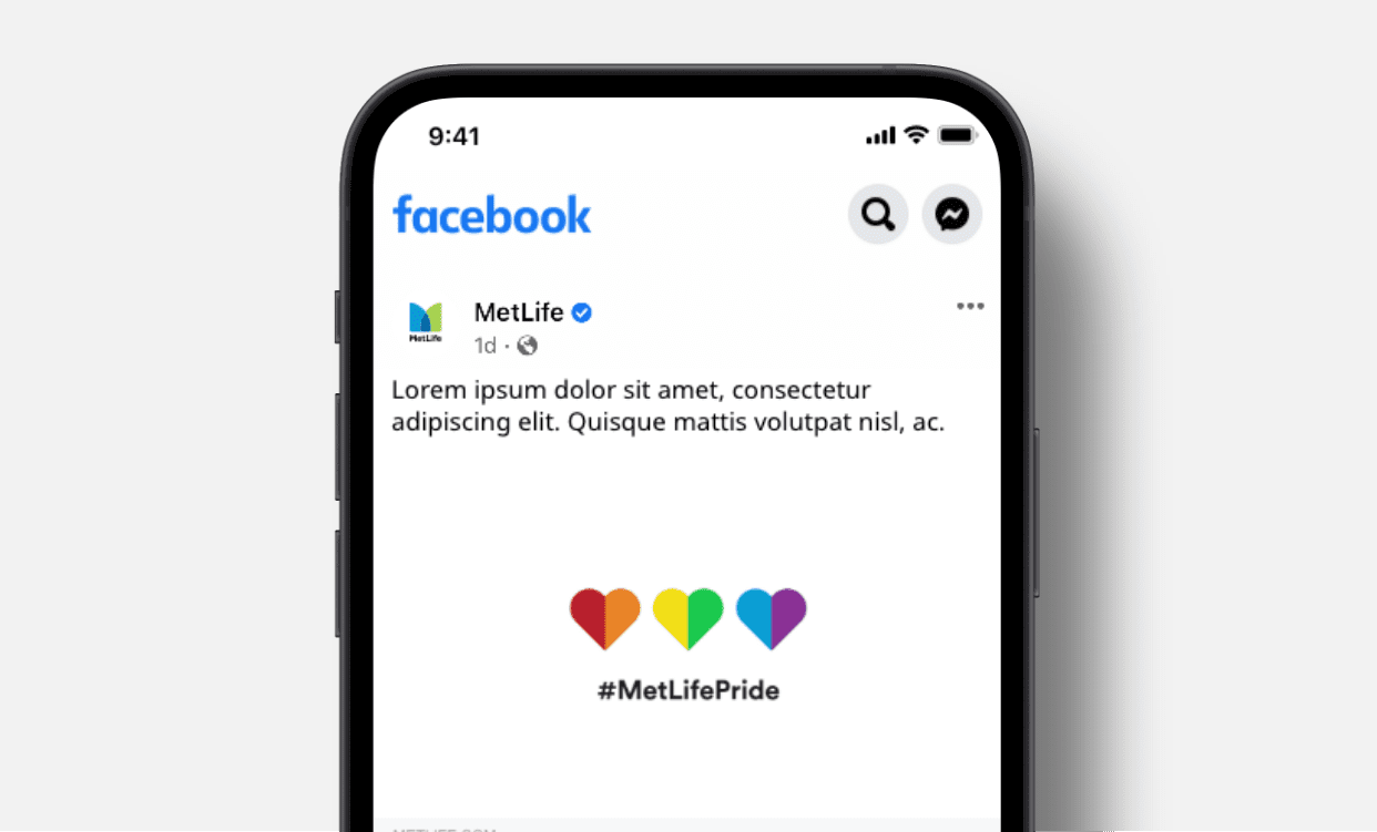
Keep videos under :30.
- If you have a long video, create a shorter version for social. The shorter the better.
Keep the narrative impactful and clearly human.
- The script and design need to feel relatable and create purpose.
Communicate optimism.
- Use language that is positive and optimistic in tone.
- Any videos with voiceovers or speakers must include closed captioning.
- Use 16x9 format on all channels.
In Use
Color
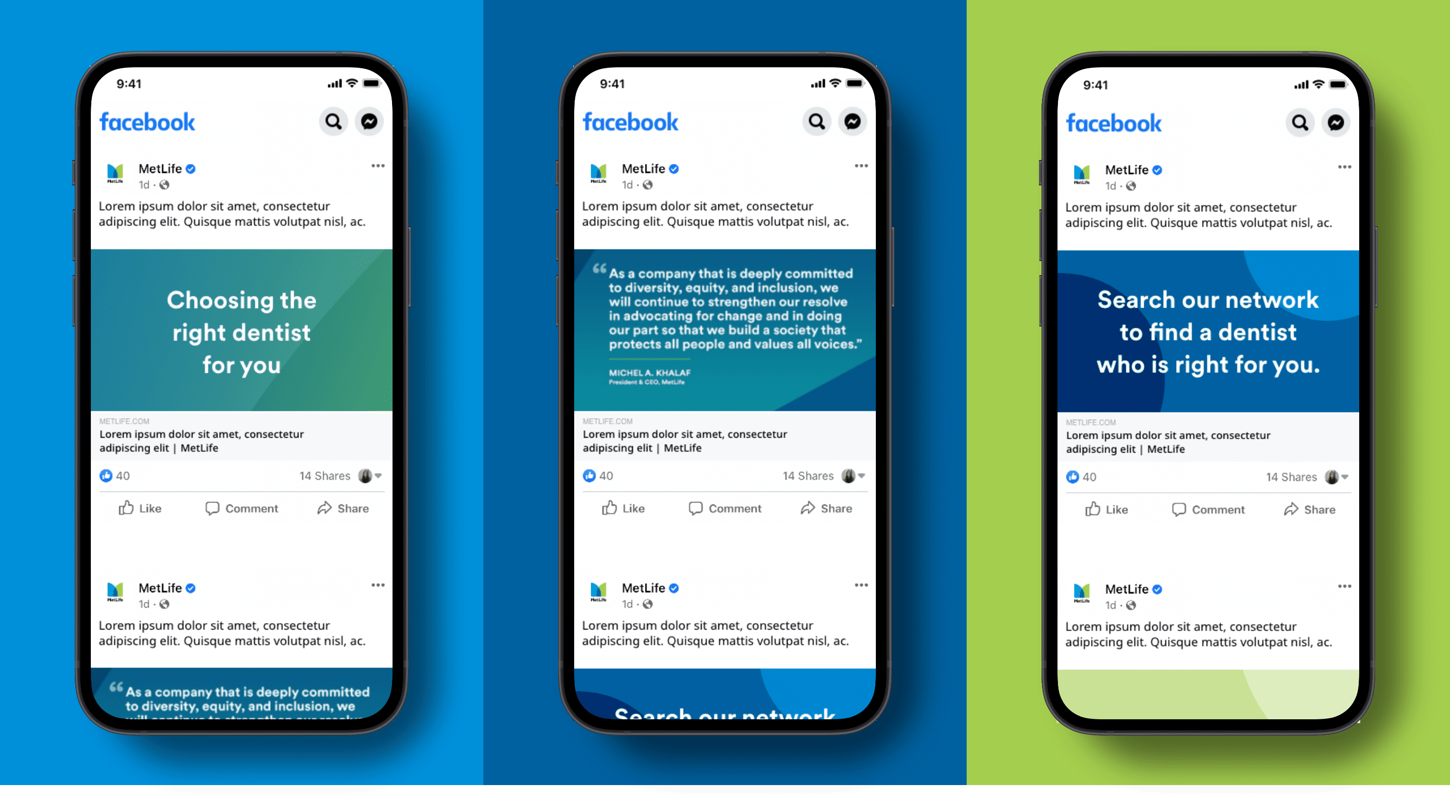
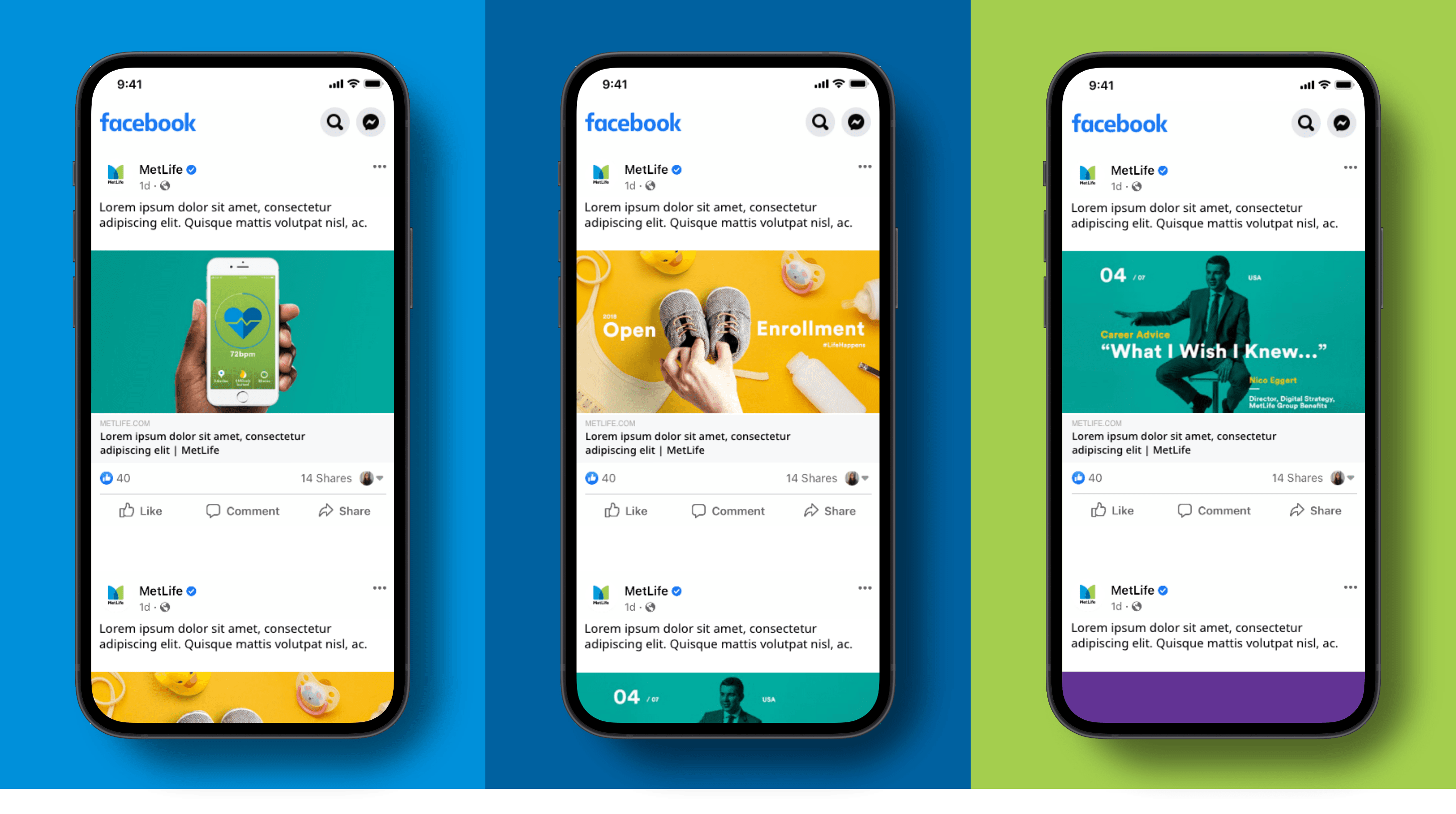
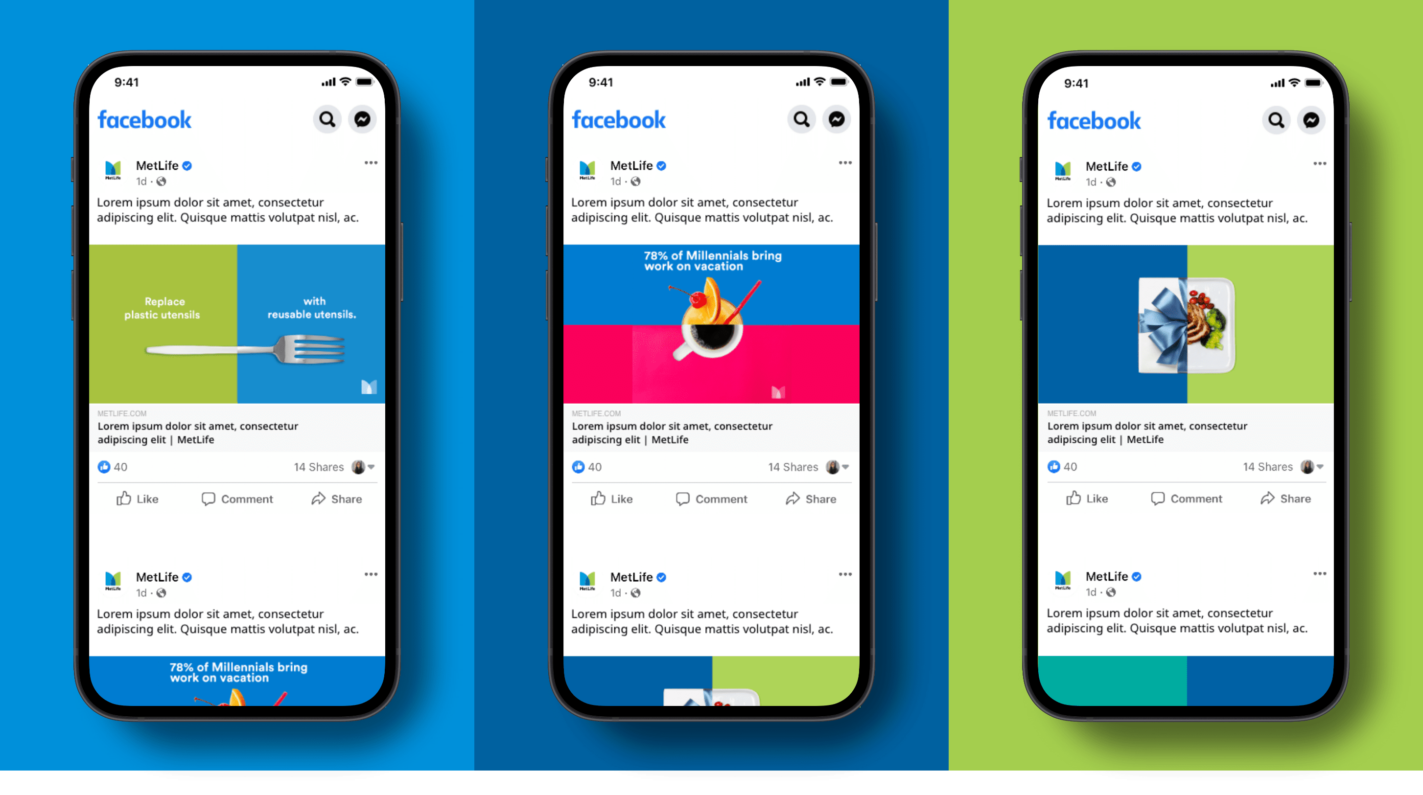
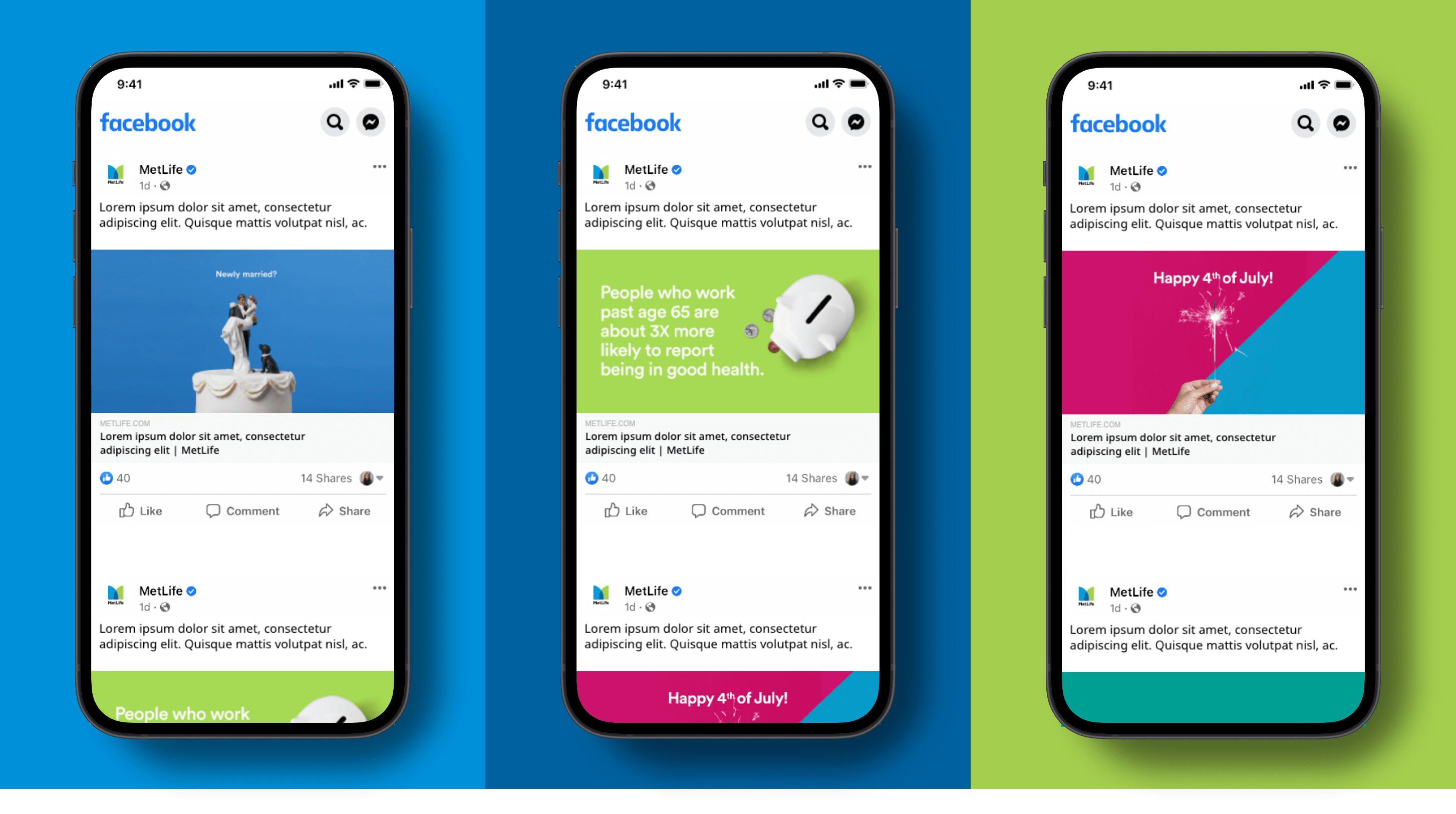
Color breathes life into the social experiences we design and helps create an association with the brand. Explore the examples below to see how our color palette can be used to help evoke emotion and build a deeper relationship with our customers.
Typography
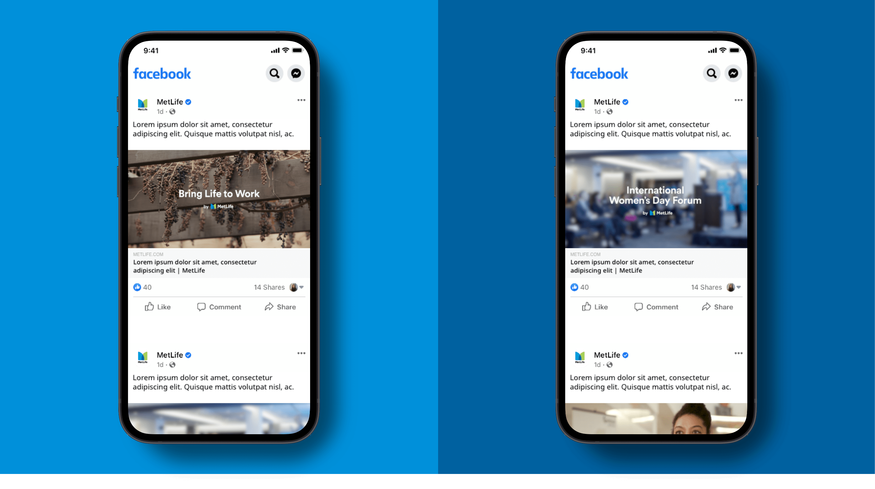
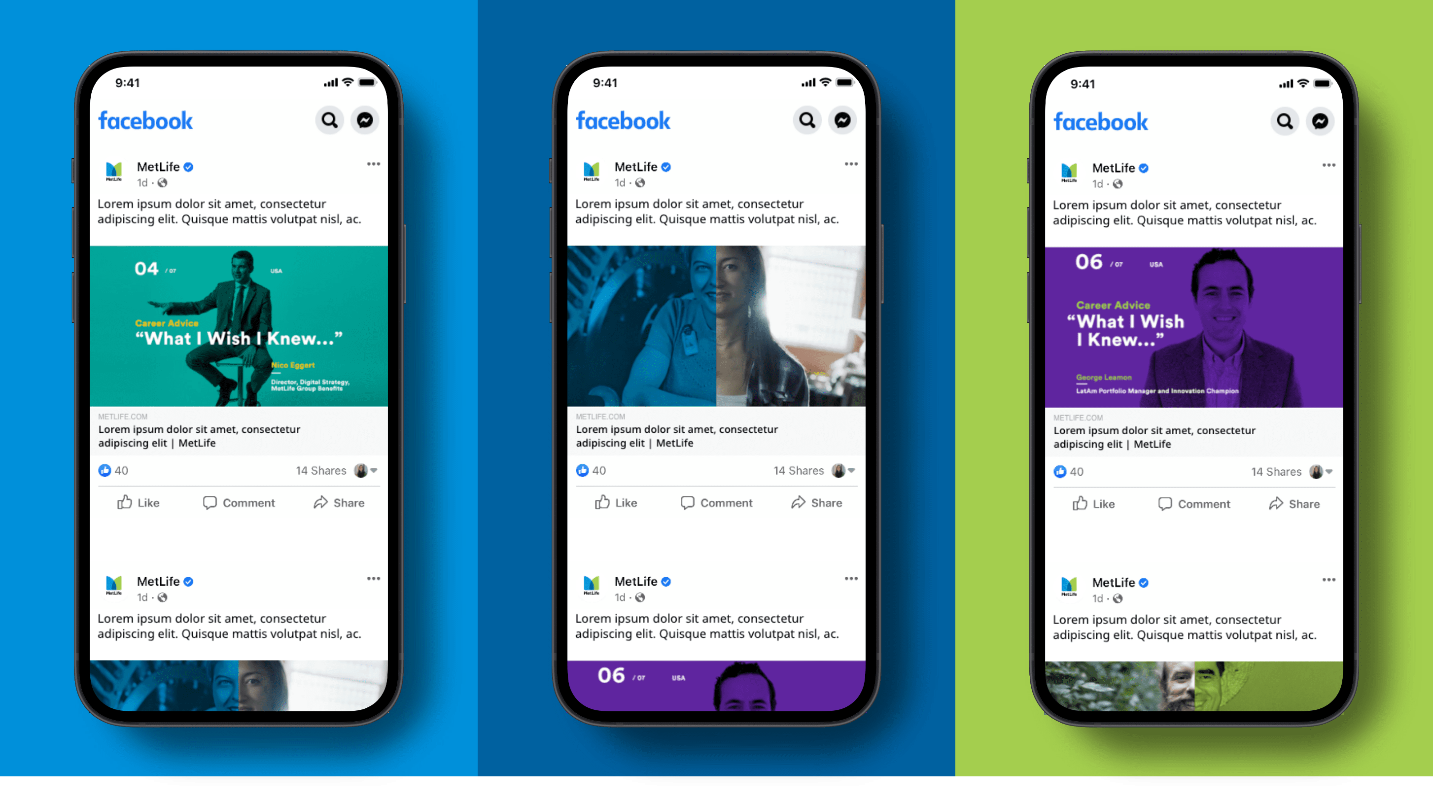
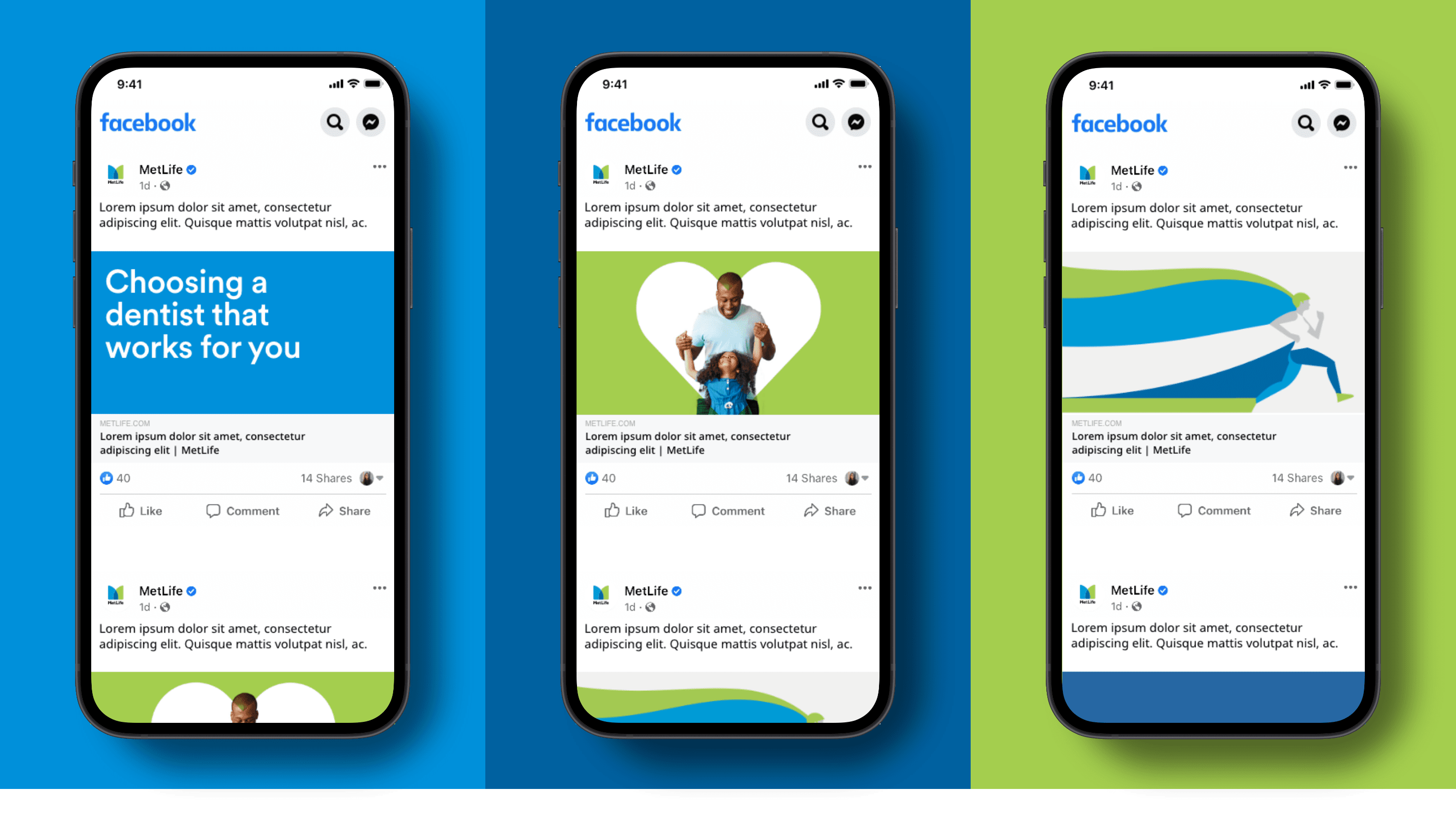
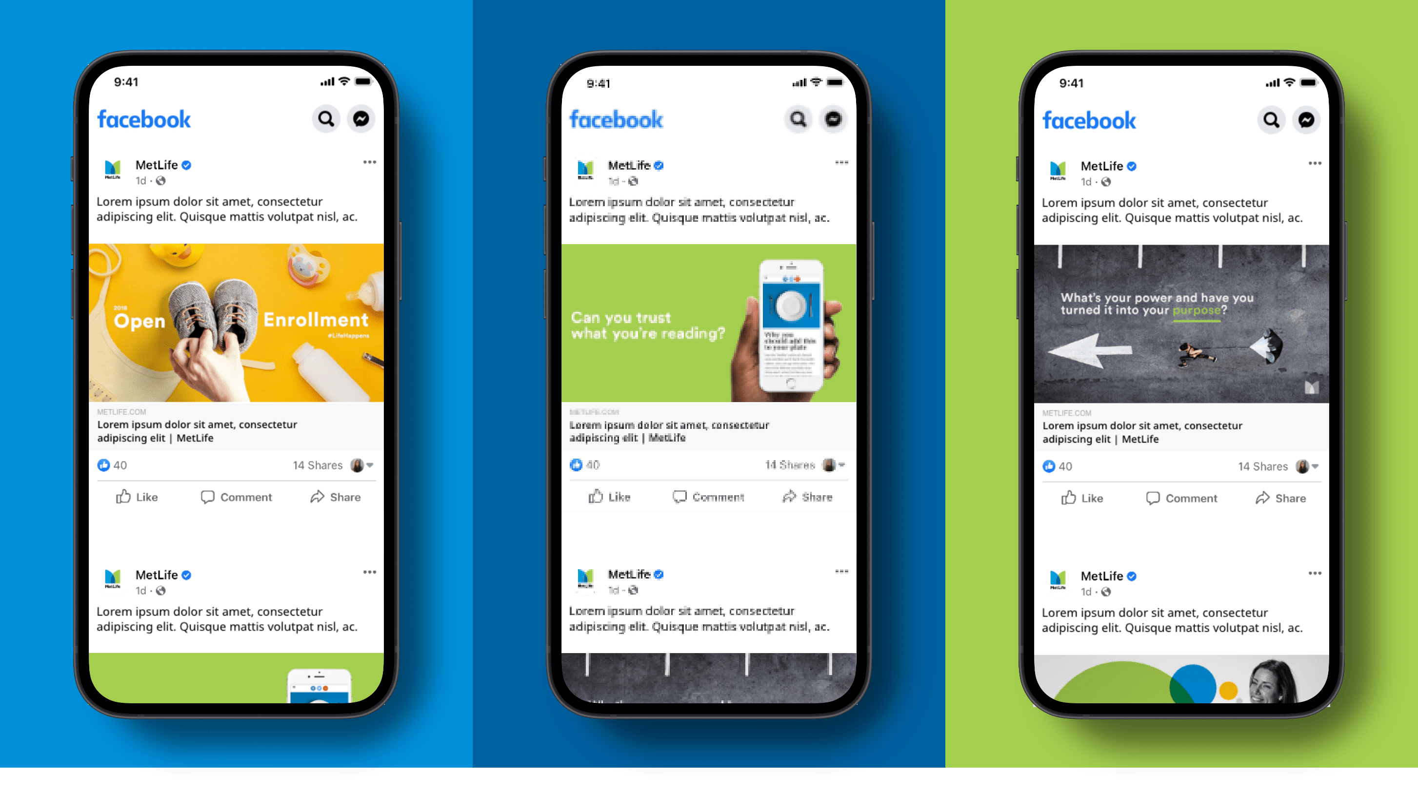
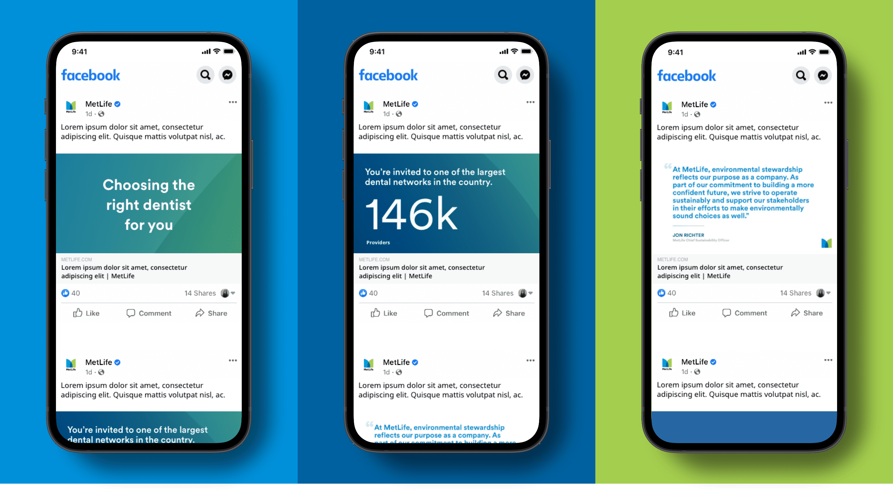
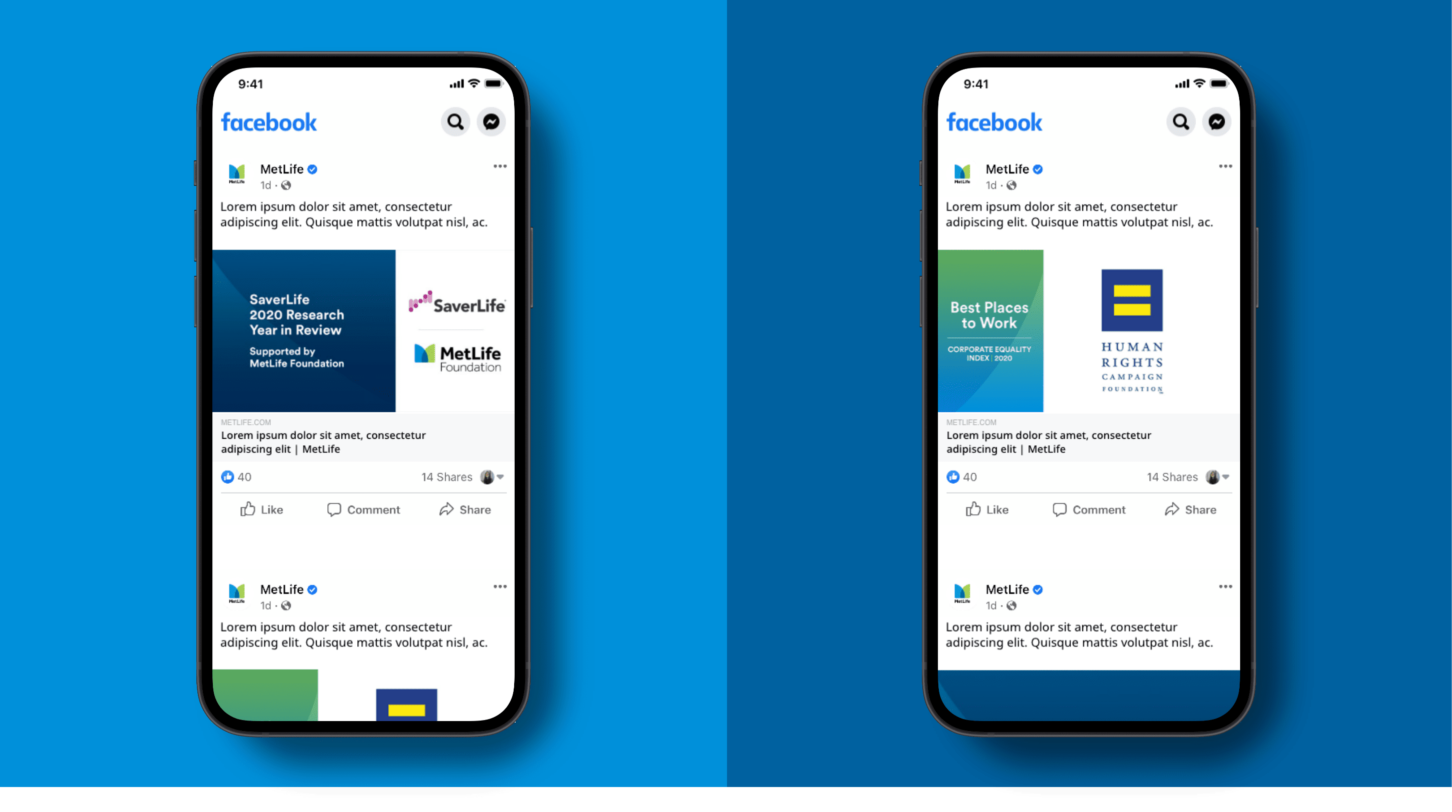
Typography helps us create consistency in our digital experiences and gives people a sense of familiarity with our brand. We use crisp, modern typography across all digital touchpoints. Here are some social examples.
Photography
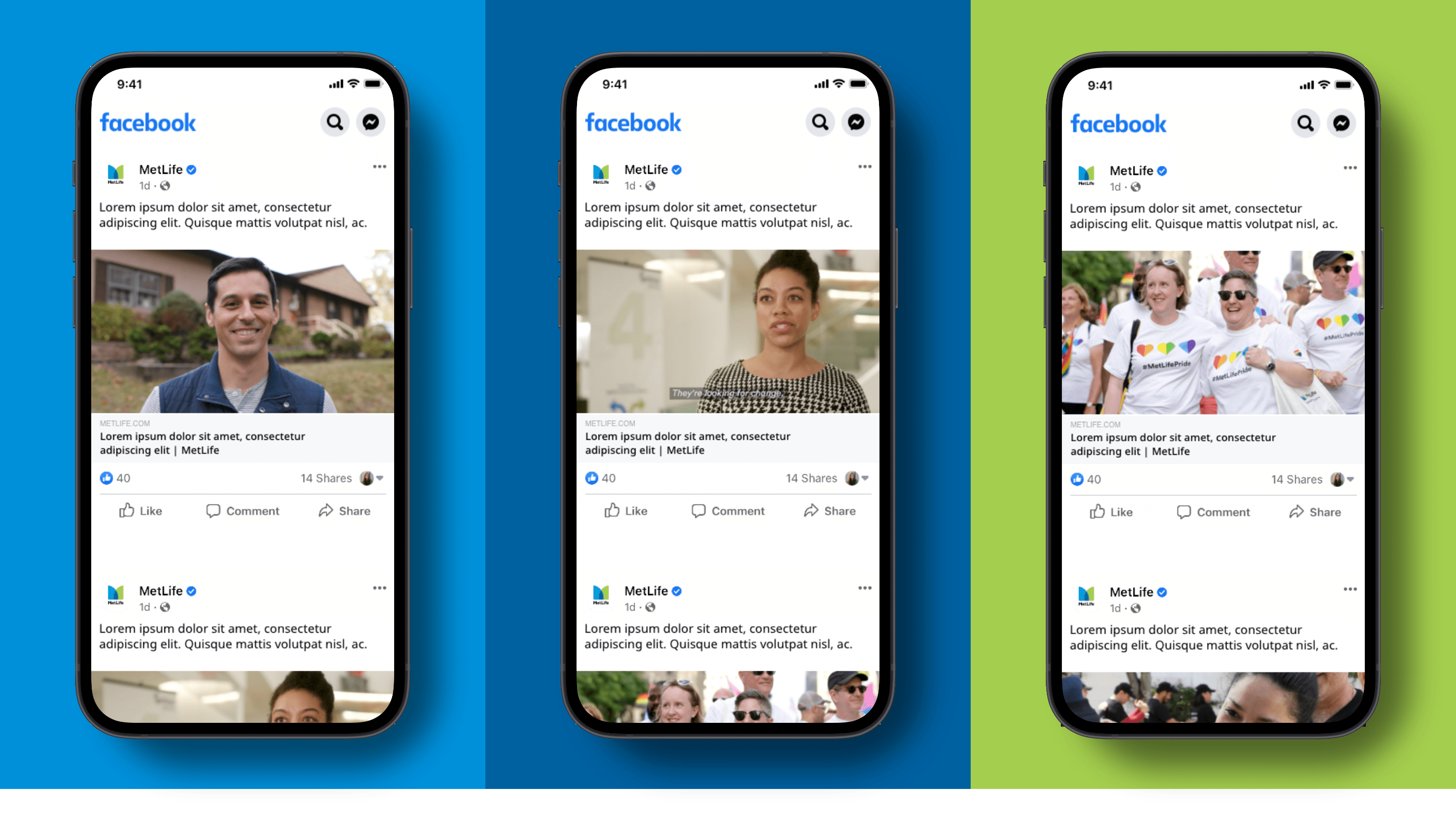
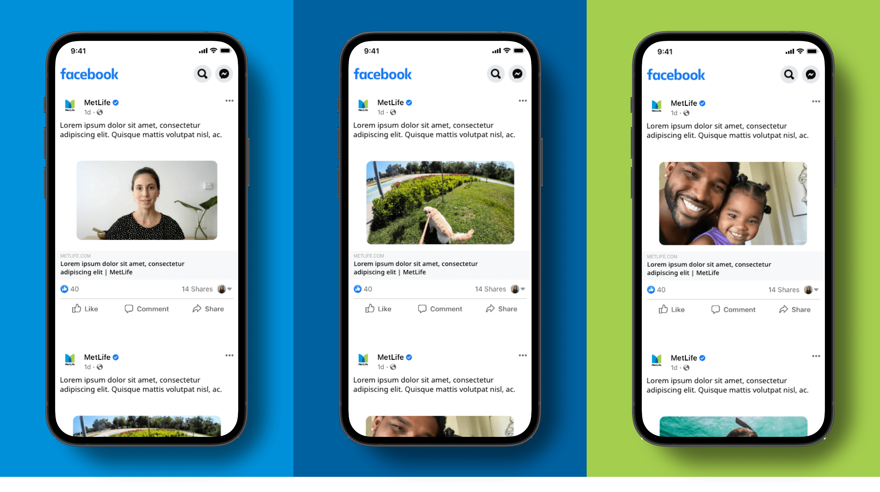
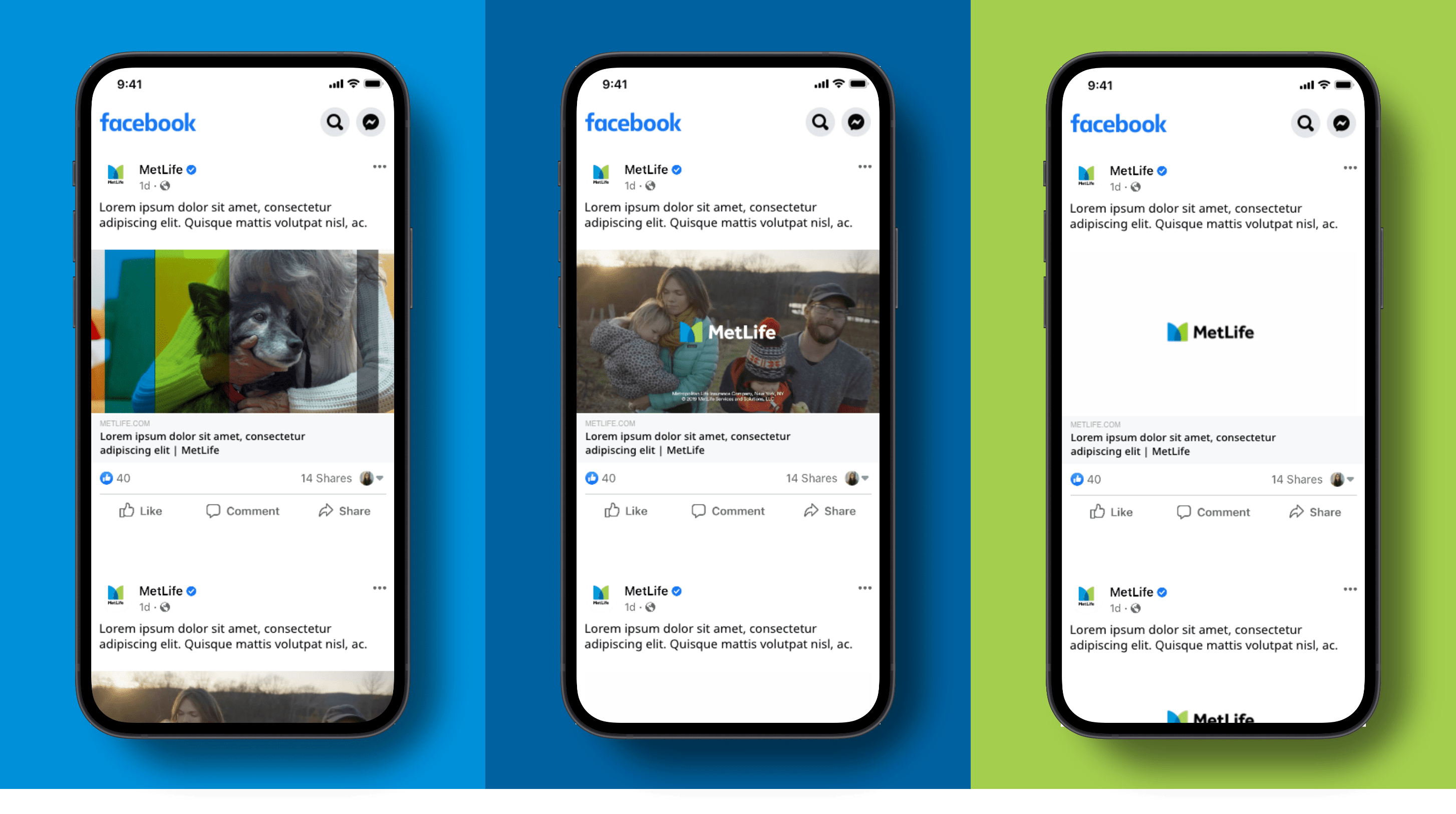
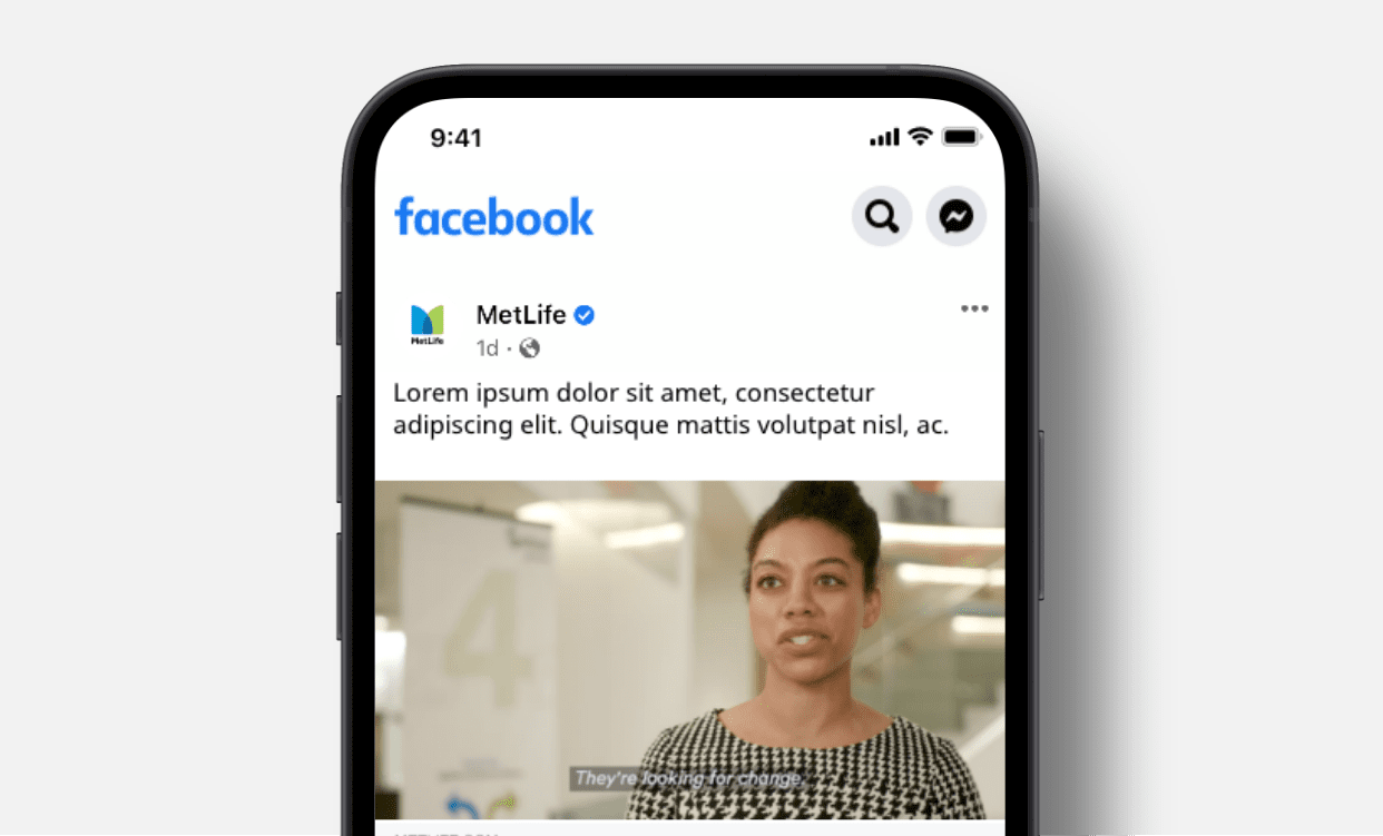
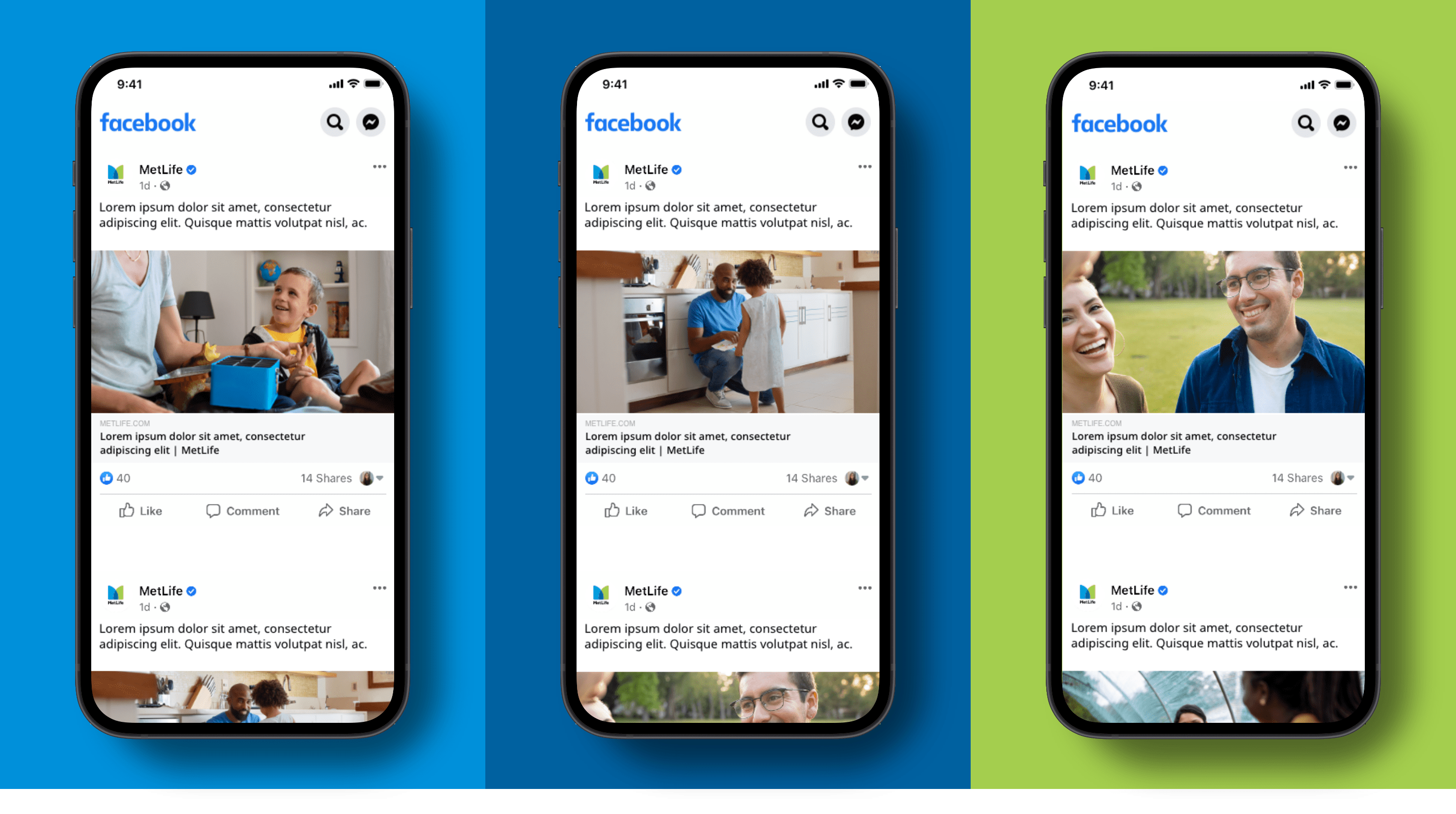
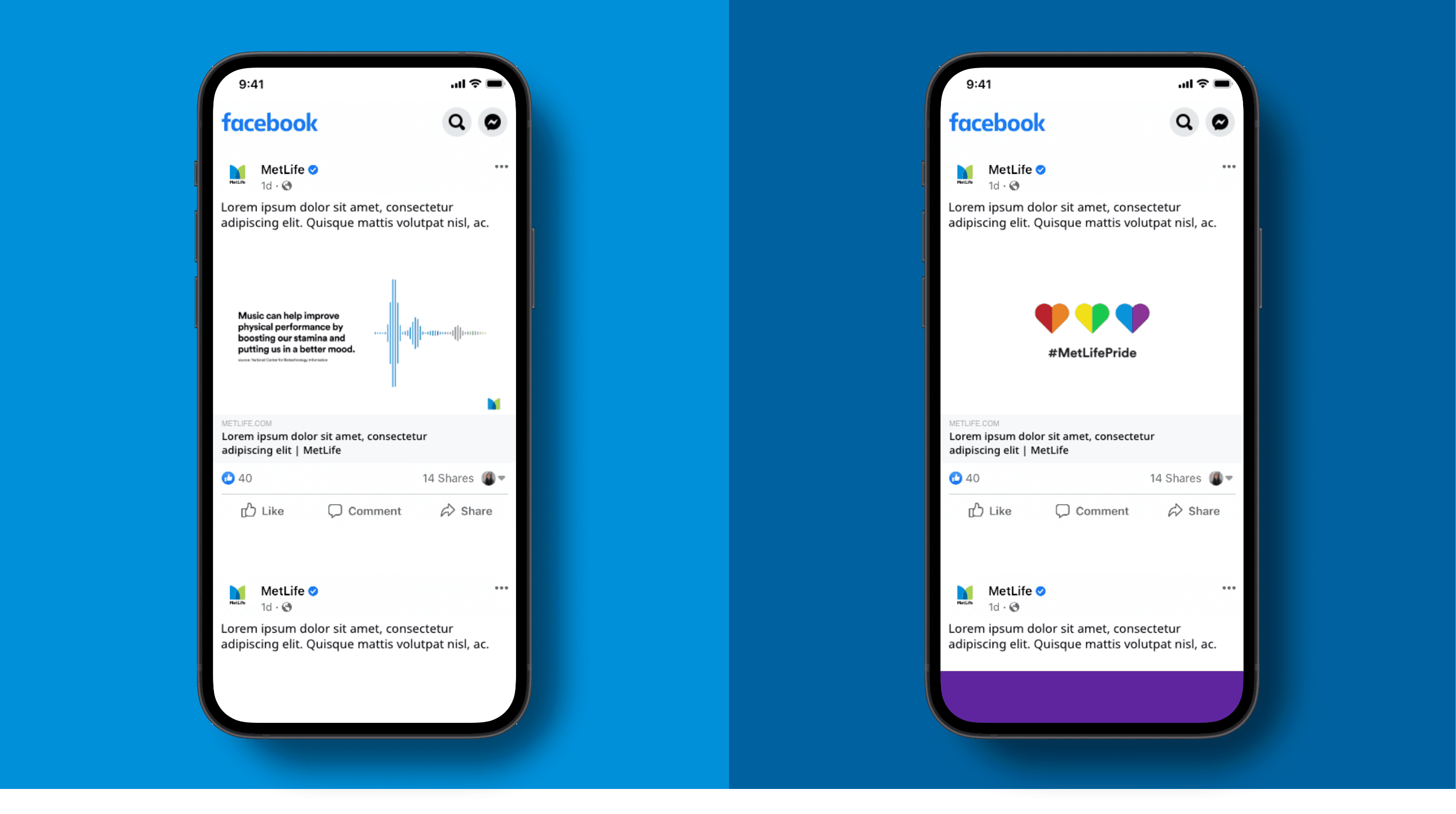
The photography we use should be personable, relatable, and optimistic. You can use photography from the DAM, stock photography, or user-generated images. Check out these tips for using imagery on social.
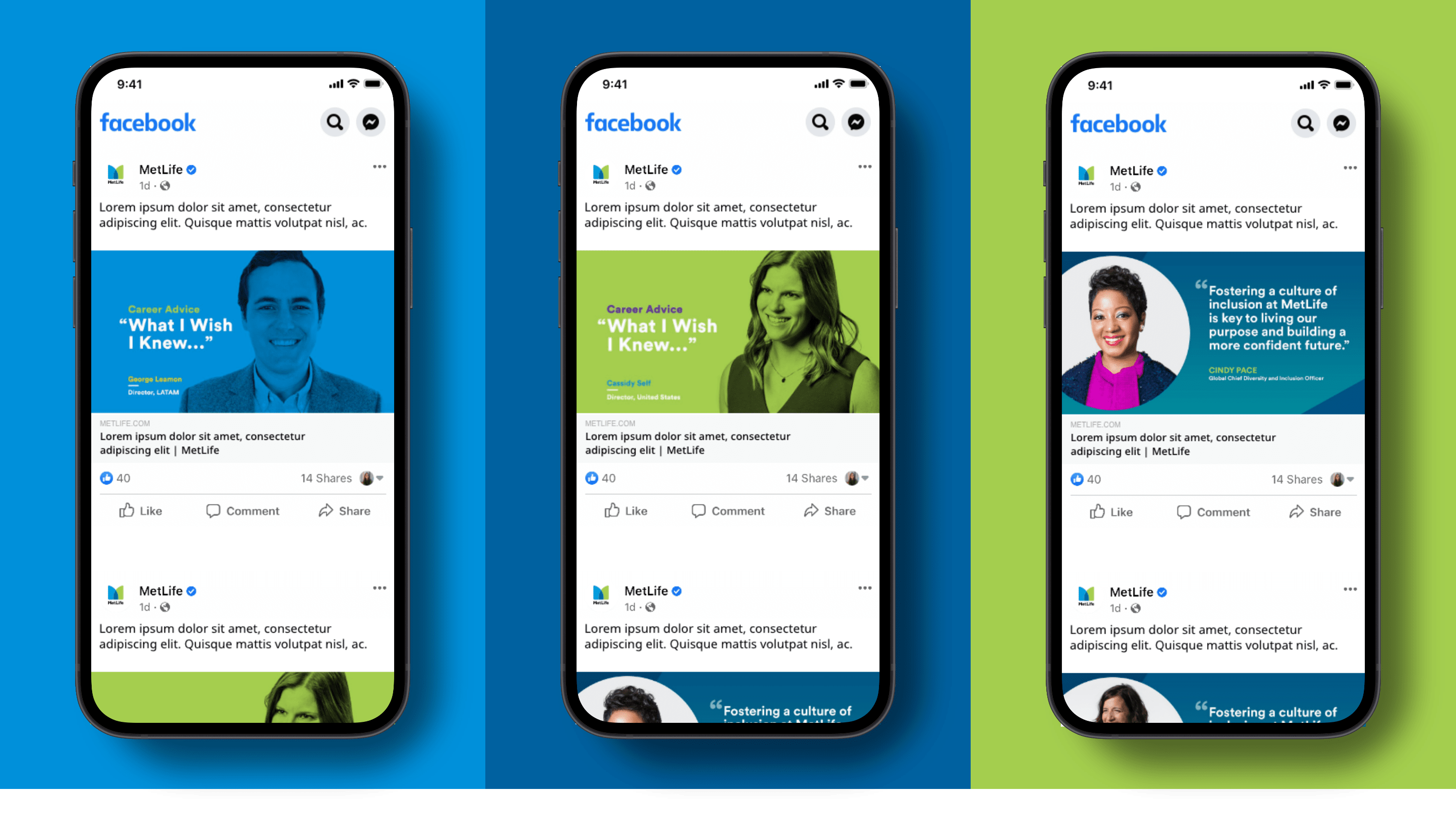
Iconography
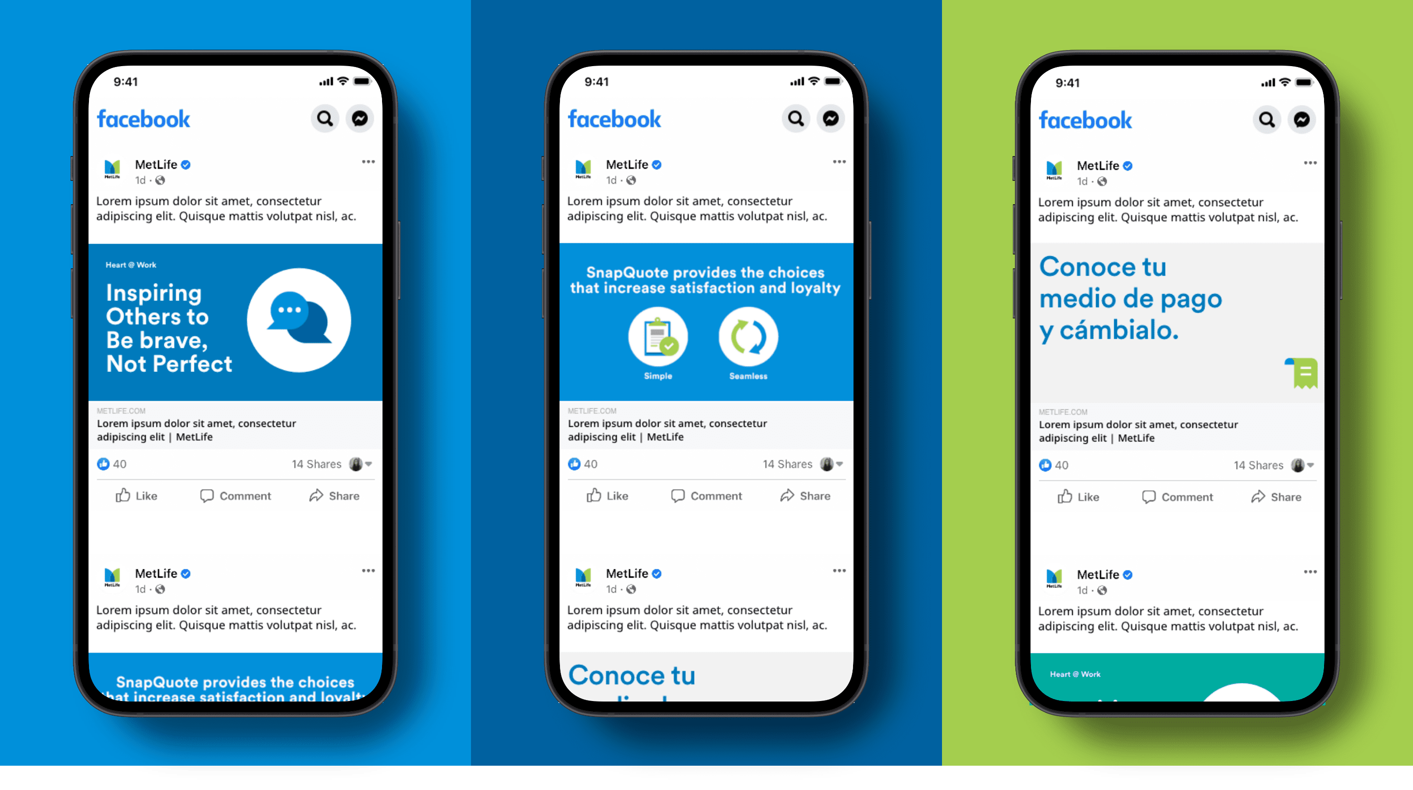
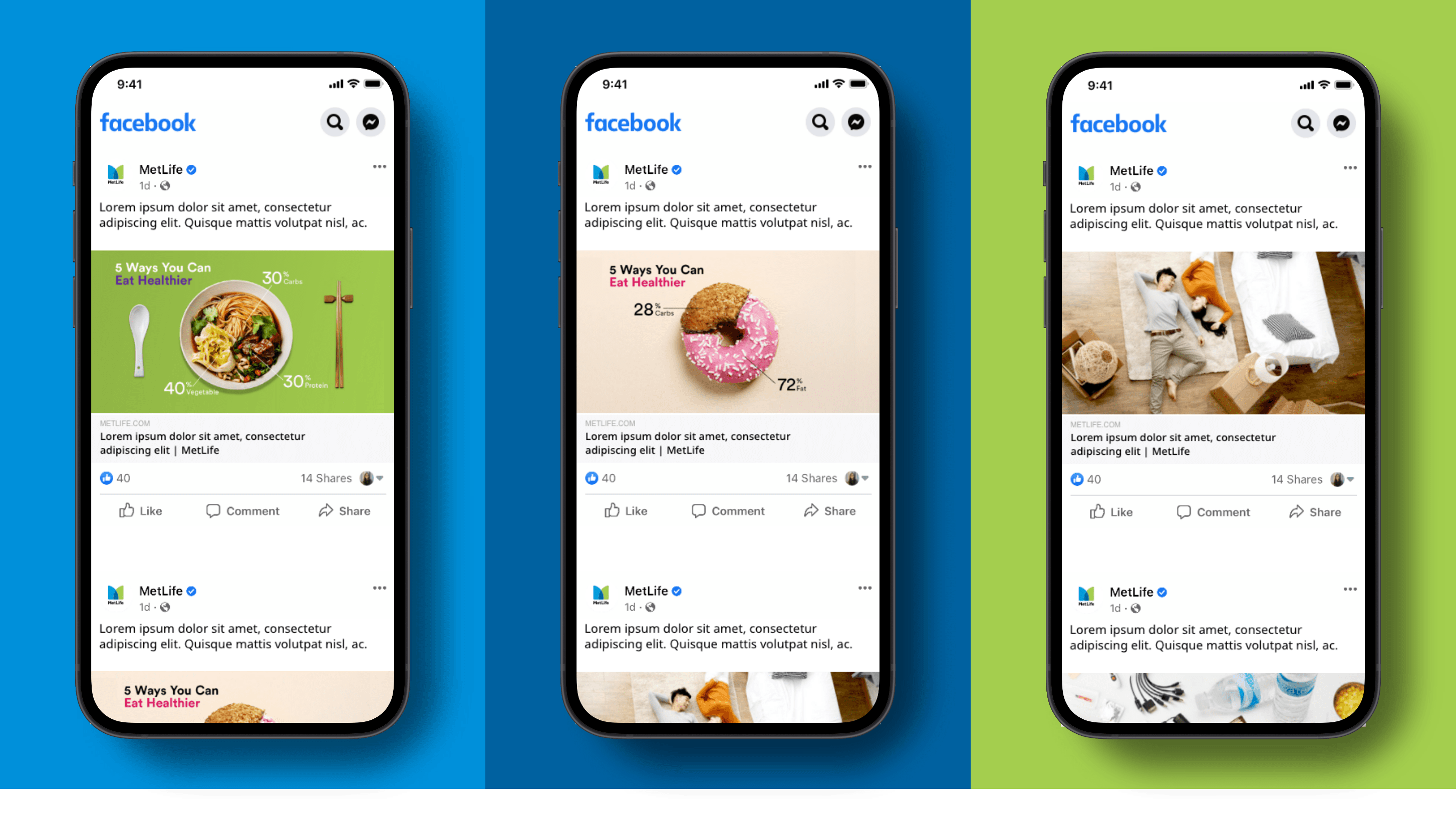
Our icons are used to enhance storytelling. These icons add clarity and branding to more functional screen moments. Here’s how that can come to life on social.
Graphics
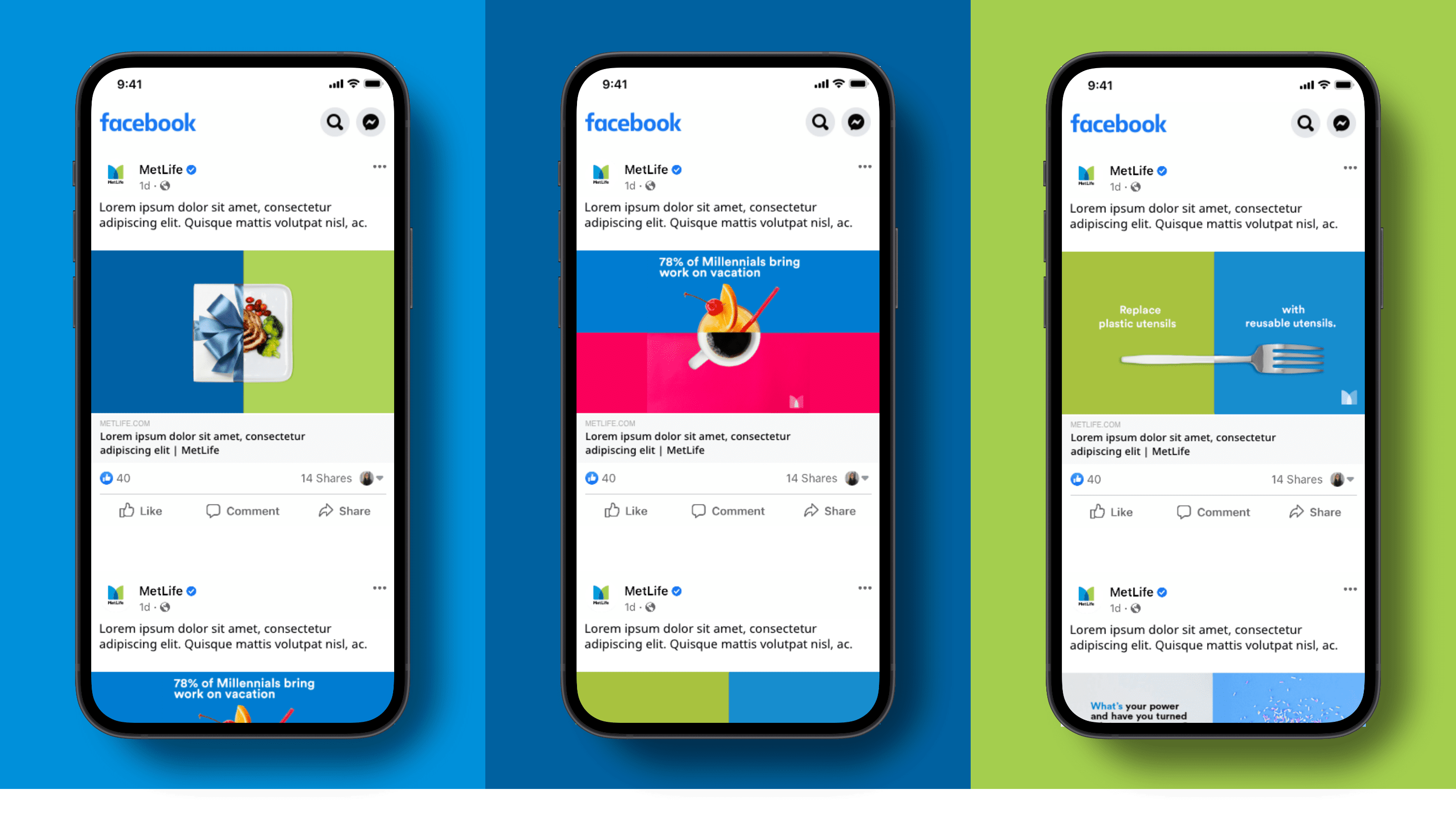
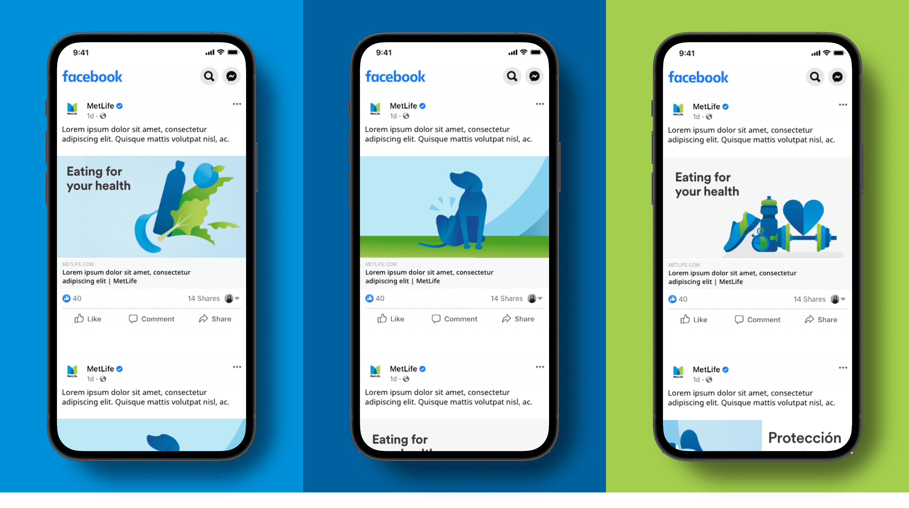
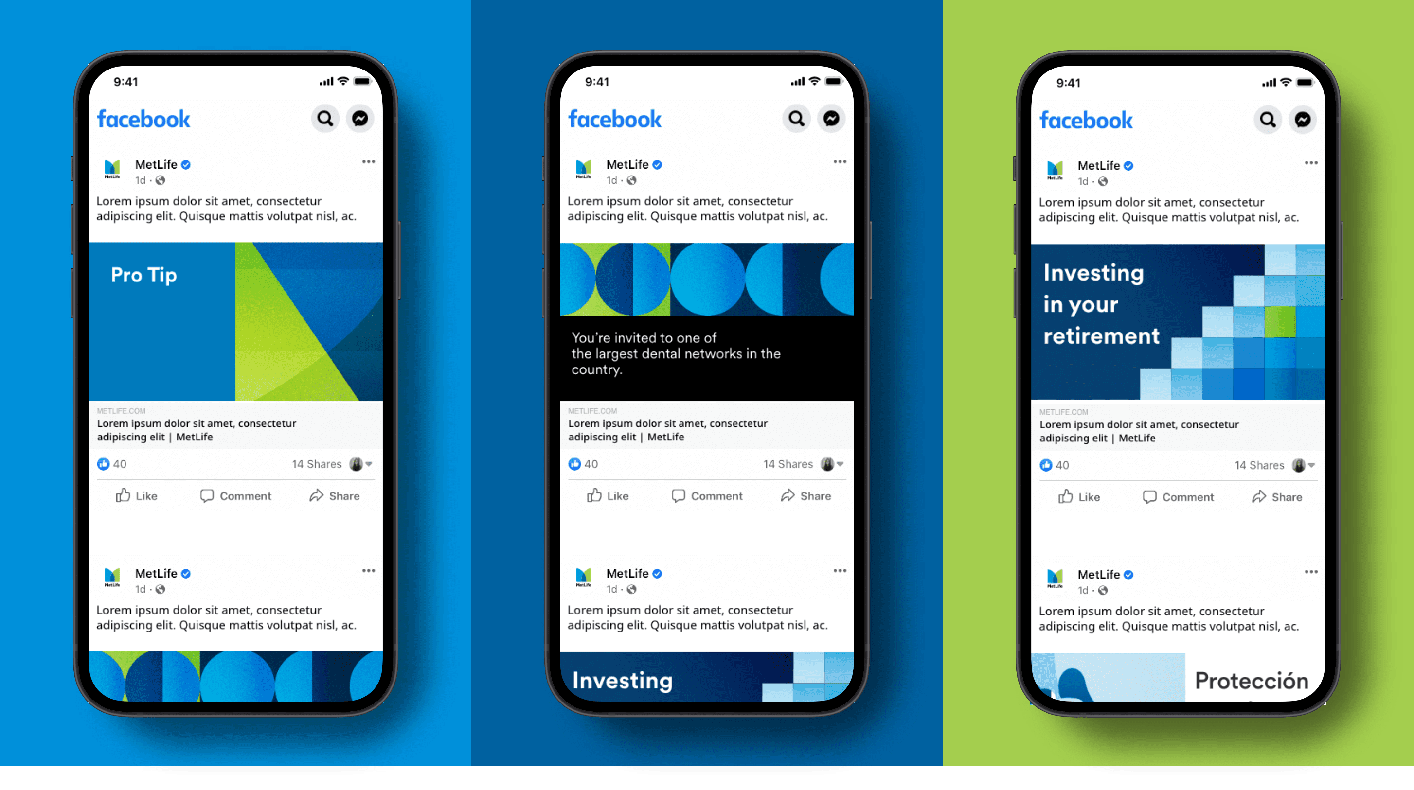
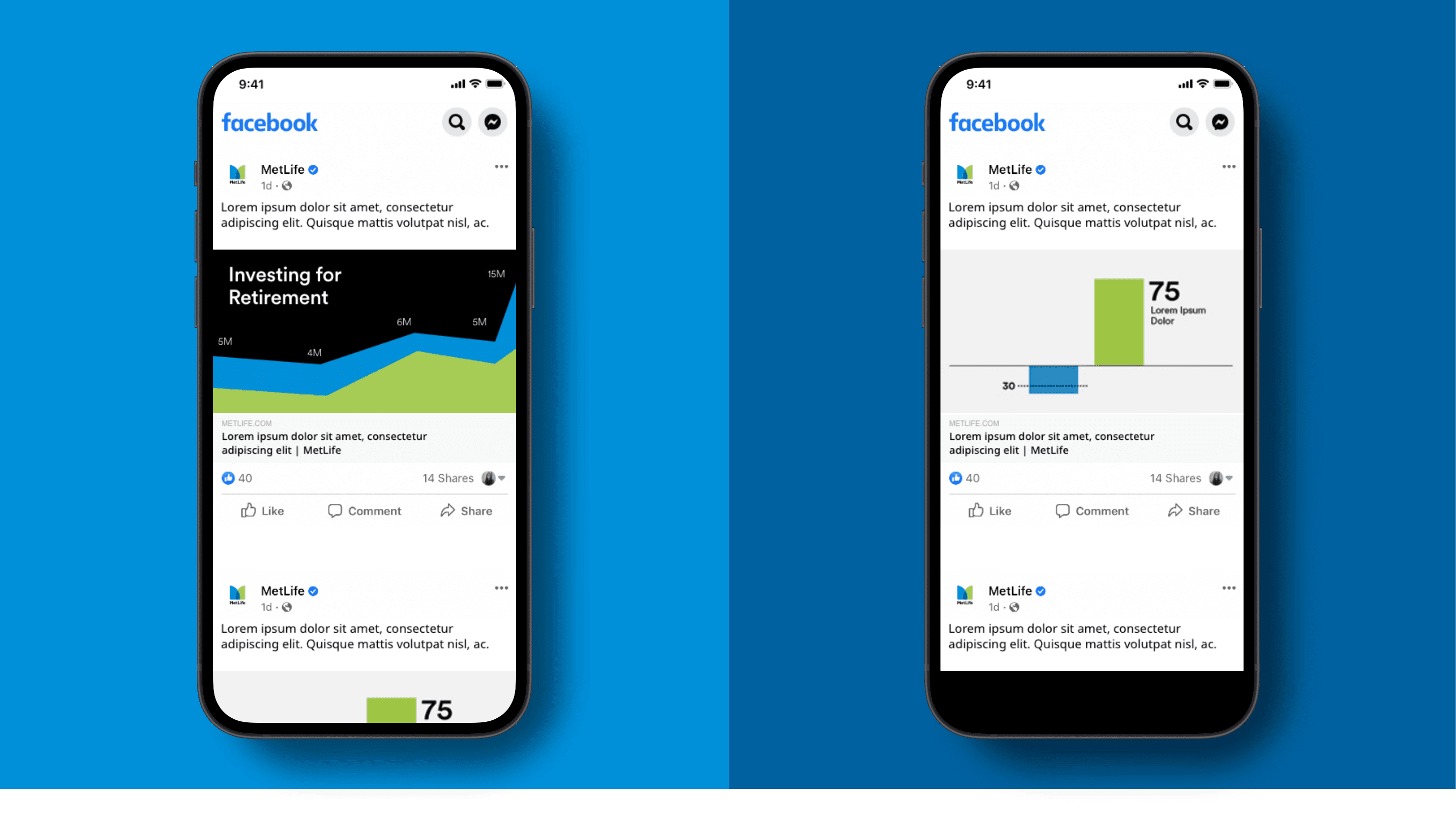
Our graphics serve to add a sense of depth and brand recognition, which is crucial when it comes to standing out in people’s social feed.
Illustration
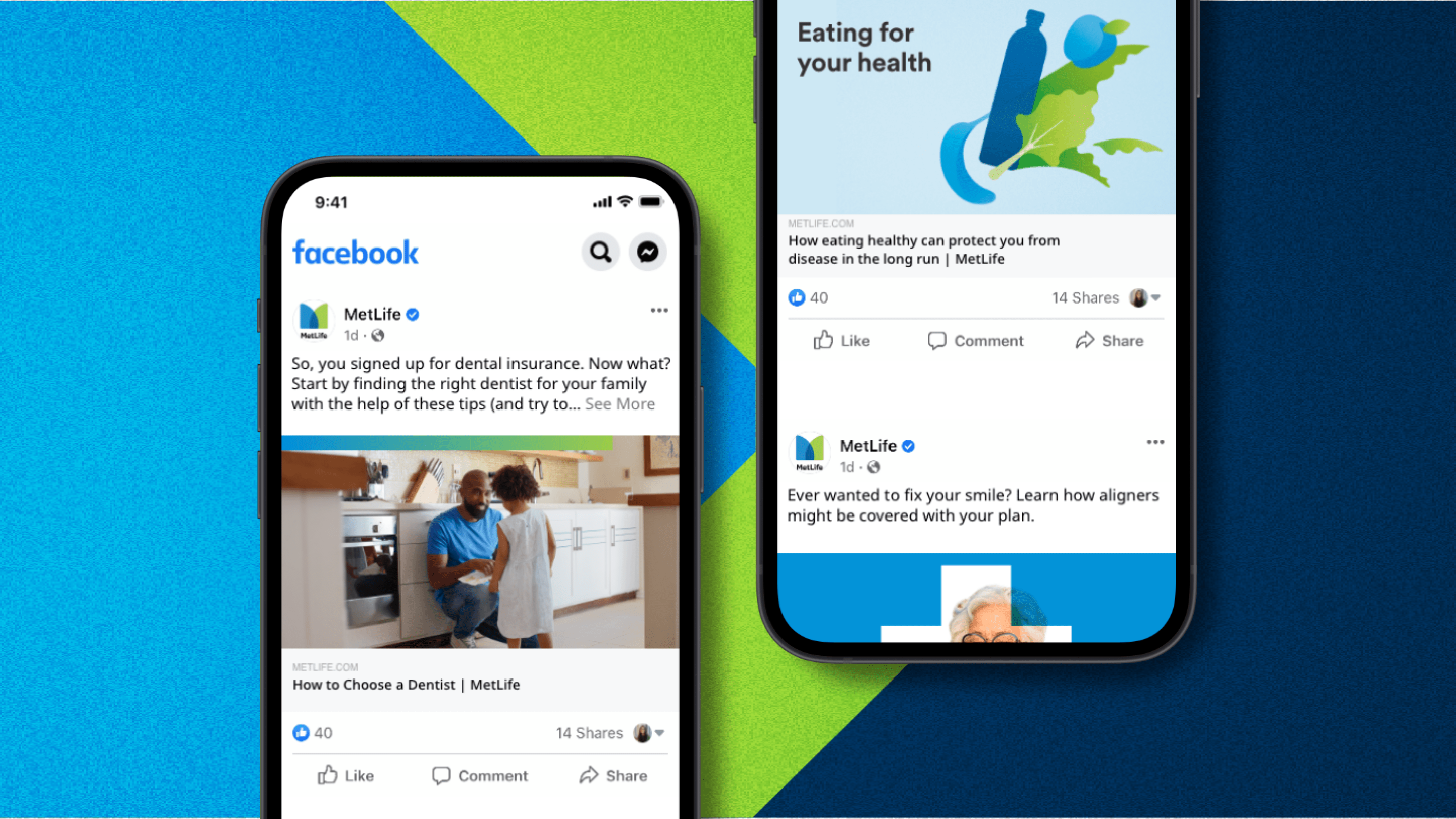
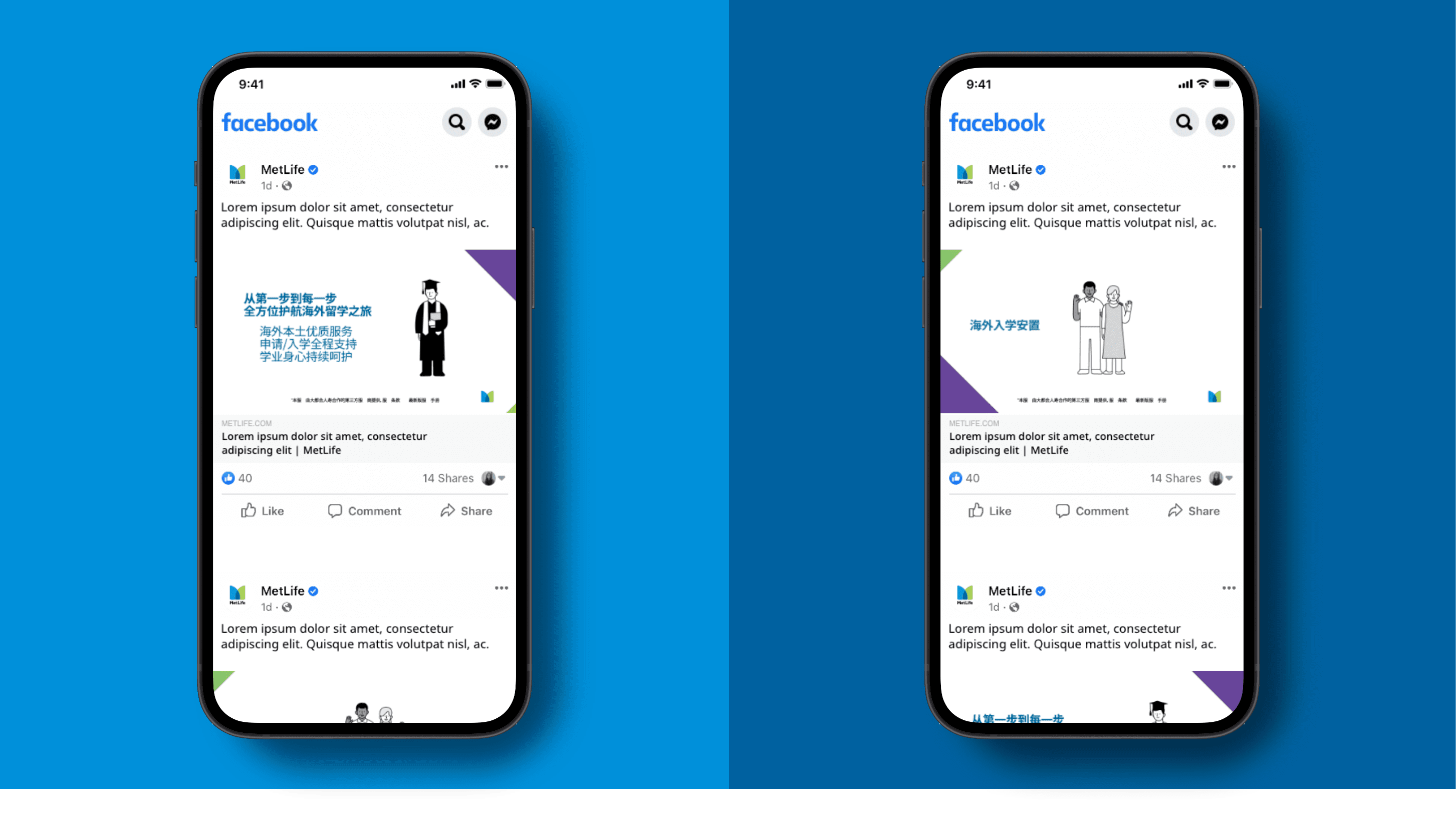
Our illustrations are extremely useful in helping us visualize our stories, can be very eye-catching on social media.
Animation
Animation can be used to simplify and complement complex messages, information, or tips. Keyframes should be 12 frames apart as a rule of thumb.
Video
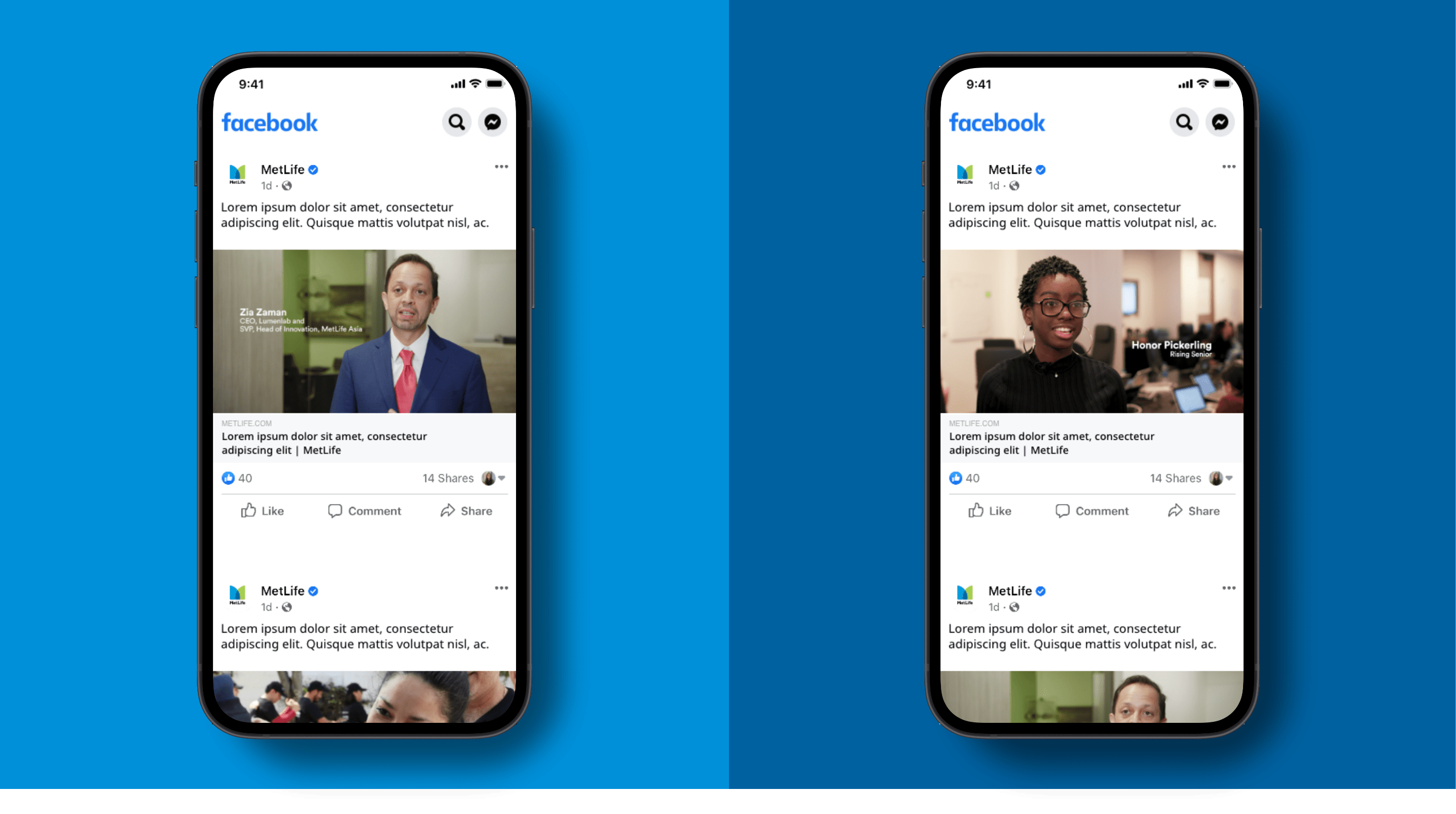
Video can be very effective in helping us tell stories on social, and the first three seconds are vital in getting a viewer’s attention. We use 16x9 on all channels. Videos should be under :30 in length and any videos with voiceovers or speakers must include closed captioning.
