CORE GUIDANCE
Icons
Overview
Our icons help users digest our digital content and navigate experiences, while adding some personality and visual emphasis to functional moments. We have created two icon libraries for specific use cases.
Utility
Our utility icons are used for functionality. Think wayfinding, navigation and social links. They’re used in small formats and should never be the main focus of a screen.
- Aid the user in navigating content.
- Not paired with supporting copy.
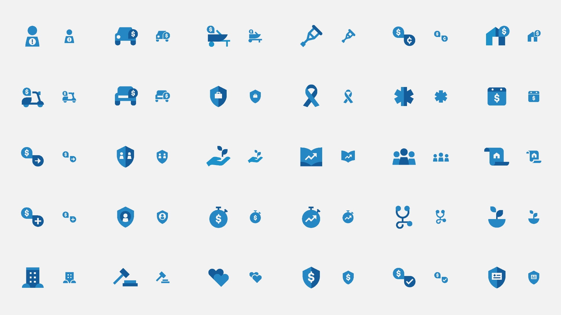
Expressive
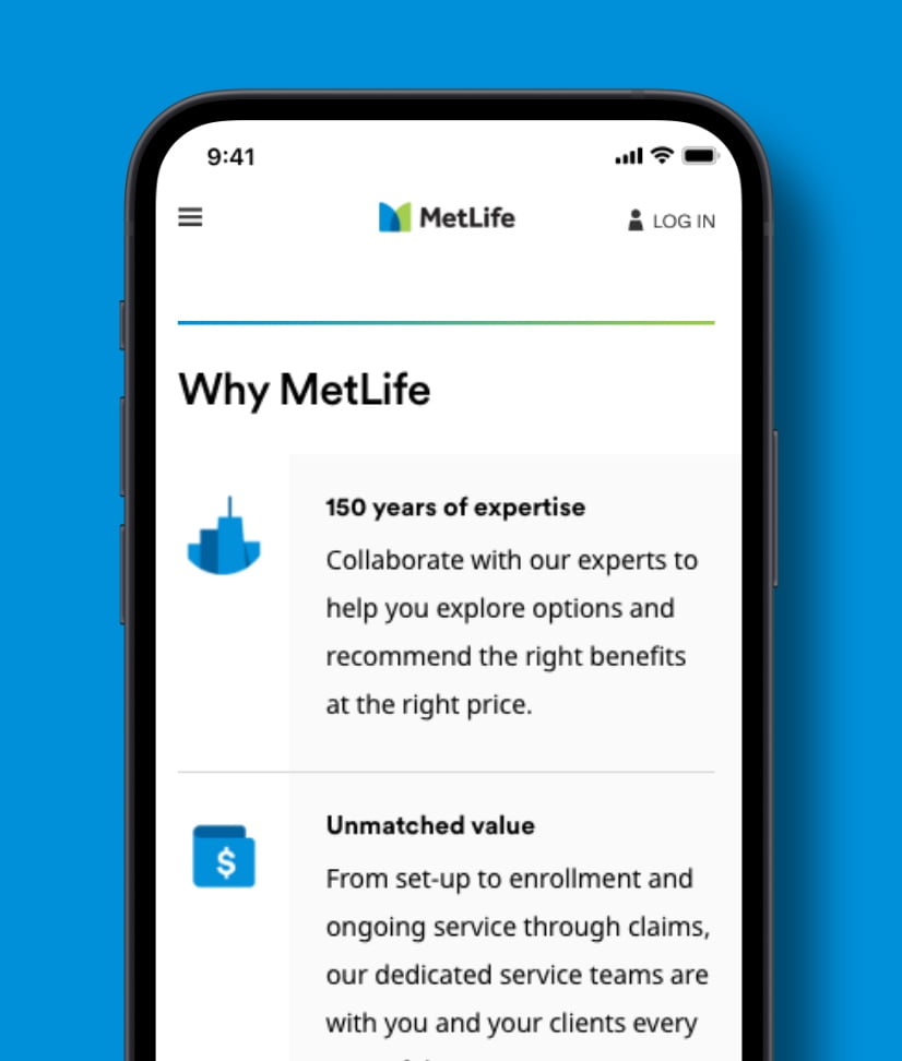
Our expressive icons are used to enhance storytelling. These icons add clarity and branding to more functional screen moments. They should never be used as a hero illustration or key graphic.
- Marketing device used for storytelling.
- Paired with supporting copy.
Guidance
Make sure to save and upload all icons as SVGs for optimal resolution across digital.
- Avoid saving in image formats like JPEG or PNG.
Utility Icons
Functional icons can be used in two colors, black or blue.
Use when utility is key.
- Utility icons should be understood without any supporting copy.
Use sparingly.
- Using too many utility icons in one layout will overwhelm a user with too many choices.
Use on simple backgrounds, and keep icons monochromatic.
- Utility icons should only be in MetLife Dark Grey or MetLife Blue.
- Enlarge above 16 px.
- Use multiple colors in one icon.
Expressive Icons
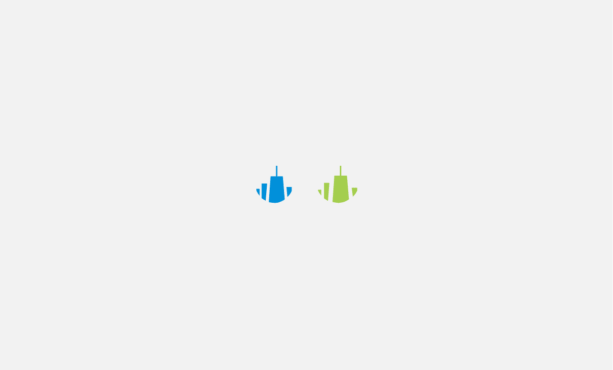
Expressive icons are available in two-color (dark blue/blue, blue/green) and one-color (blue) variants.
- Single color.
- Not to exceed 24px.
- Two Colors.
- No smaller than 24px and not to exceed 120px.
Use to make information more scannable.
- Applying icons as a replacement to a number or bullet is a great use of the set.
Be sure to pair icons with the correct concept.
- Our expressive icons have specific meanings, make sure they’re matched to the meaning you’re trying to convey.
- Modify or change icon colors.
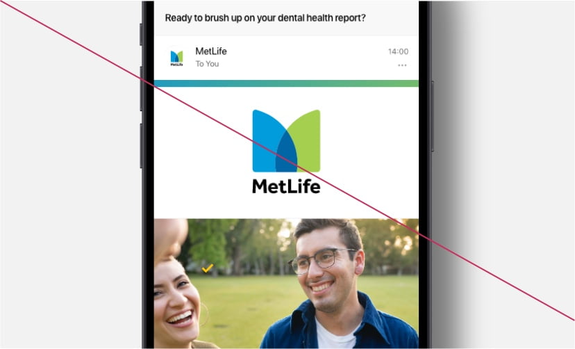
- Use expressive for storytelling moments. Icons should not take the place of photographs or illustrations.