CORE GUIDANCE
Conversational UI
Overview
A conversational interface simulates a natural language conversation between the UI and the user as a method for collecting data. This pattern is preferred over traditional forms in scenarios where a small amount of data is being requested – particularly in the context of an app or an introductory sequence before later, heavier sets of traditional forms.
Getting Started
Creating a conversational interface can be a powerful way to engage users and deliver a personalized experience. Here are some essential guidelines to get you started on creating a successful experience.
1. Define Clear Objectives
Before diving into the design process, outline the specific objectives of your conversational UI. Understand what problems it aims to solve and the goals it seeks to achieve.
2. Know Your Audience
Identify your target audience and understand their preferences, needs, and pain points. Gather user feedback to gain valuable insights and tailor the language, tone, and style to resonate with your audience.
3. Plan Conversational Flow
Map out the conversational flow in a logical and intuitive manner. Break down complex processes into smaller, user-friendly steps and guide users through the conversation by providing clear instructions and options.
Components
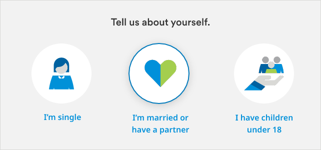
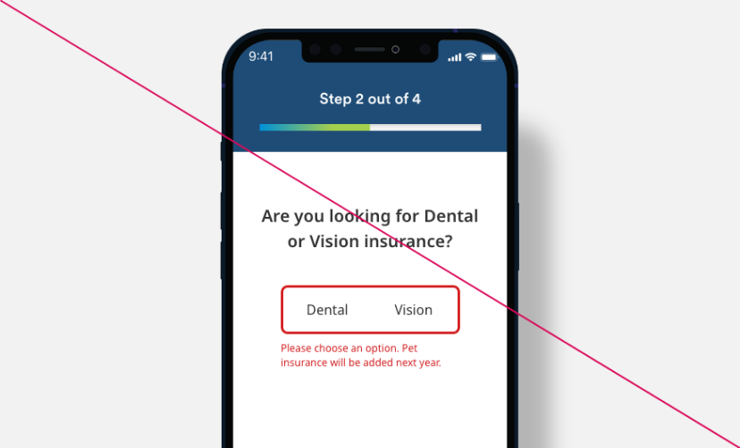
Pictograms may be used for both single- and multiple-selection within a conversational sequence. Use with a single question at a time on screen, and do not overuse this pattern within a given conversational sequence. Pictograms should only be used when they clearly represent answer choices, and must also always be paired with text labels for ADA Compliance.
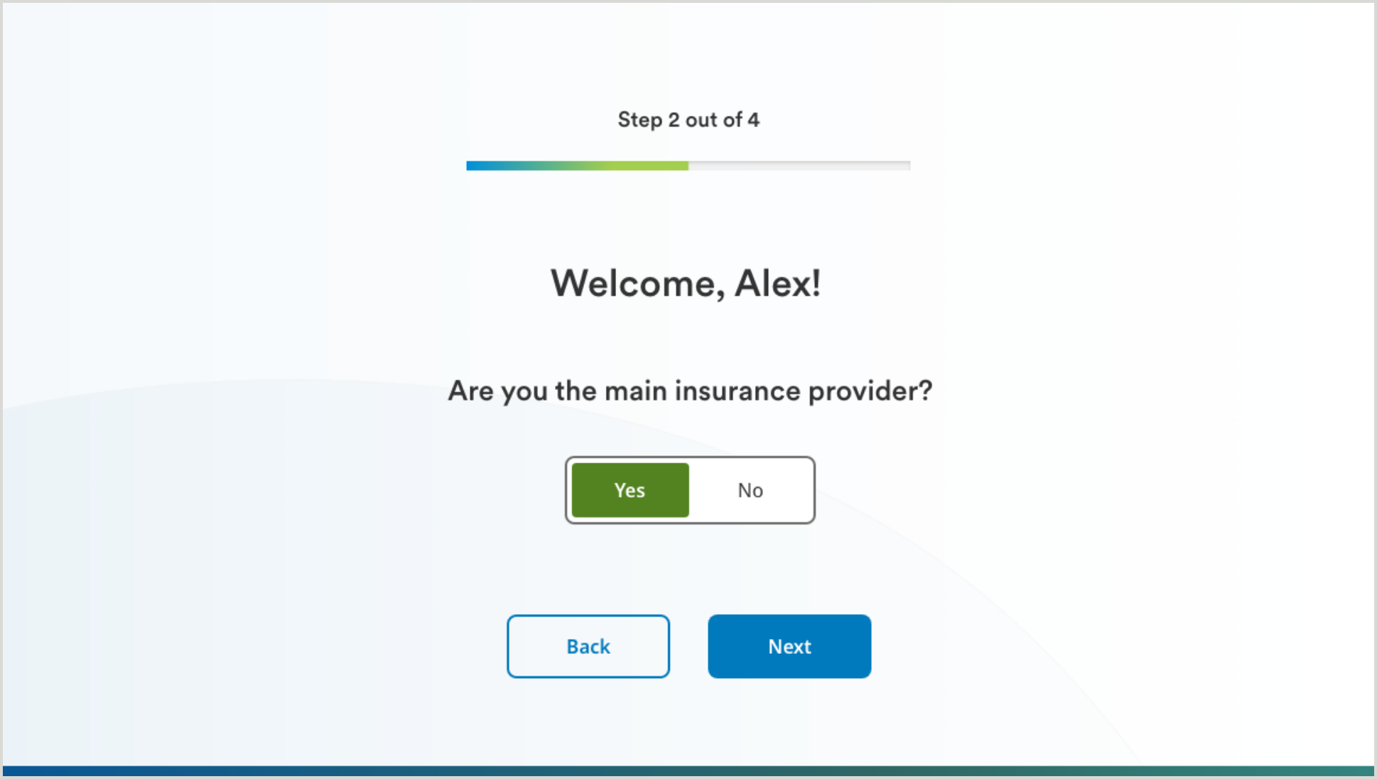
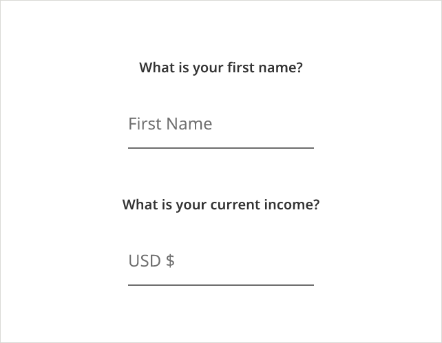
Underlined form fields should always be preceded by a single question in a large font – users should not have to depend on hint text alone to understand what is being asked.
Underline form fields can also allow users to input data on a field with a static default value. These fields include a predefined or pre-filled value that is already provided within a form element before the user interacts with it.
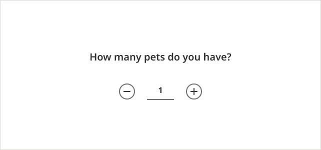
Counters are intended for use in conversational UI to add interactivity to an experience. Counter controls allow users to input a numeric value into the field by either typing or selecting using the +/– symbols. In certain conversation scenarios, users may need to make choices based on quantities or counts.
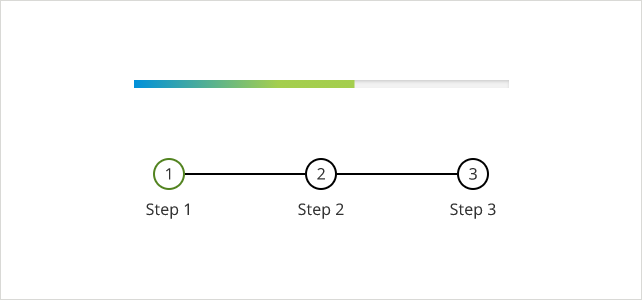
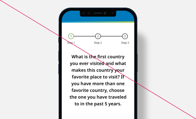
Progress indicators are visual or textual cues that inform users about ongoing processes, reducing uncertainty and providing feedback during interactions. They enhance user experience by reassuring that the system is working and managing their expectations about completion time.
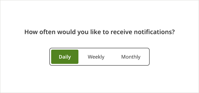
Segmented controls serve the purpose of providing users with a quick and intuitive way to make selections or choose from multiple options within the conversation. It presents options in a visually distinct and organized manner and allows them to make a single choice quickly and confidently.
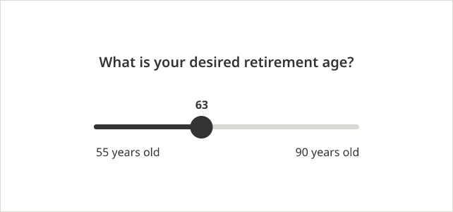
Slider allow users to provide more granular and interactive responses by selecting a value along a continuous scale. The slider provides a visual representation of the range of values, making it easier for users to understand the available options and the relationship between the values.
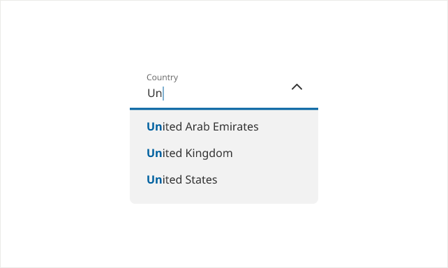
The purpose of a typeahead field in a conversational form is to assist users in quickly and accurately entering information by providing real-time suggestions or predictions based on what they have typed so far. As users select suggestions from the provided list, the chance of incorrect entries is minimized.
Usage Guidelines
Personalize your dialogue.
- Try to personalize your dialogue with information you get from user (ex: work their name into a subsequent question).Use graphics on cards that represent MetLife plans and/or agents.
Keep it simple.
- Keep the sequence short: try to complete the flow in 5 or less steps.
- User clear and concise language.
Auto-advance once answered.
- Where possible, auto-advance users from one question to the next once they have answered.
User natural language.
- Use natural language to replace typical form fields. (ex. “What’s your name?” vs “Name:_______”.)
- Include a natural and friendly tone.
Display results in a clear manner.
- As a general rule, try to place typography over a single color in a multi-colored graphic.
- Present results in a clear and concise manner.
- Emphasize important results or key takeaways.
- Don’t use error scenarios by conditional selection and if there is a need for error handling, keep the message simple.
- Don’t use lengthy instructions. Long paragraphs or verbose responses can overwhelm users.
User Flows