RESPONSIVE WEB GUIDANCE
Responsive Column Layout
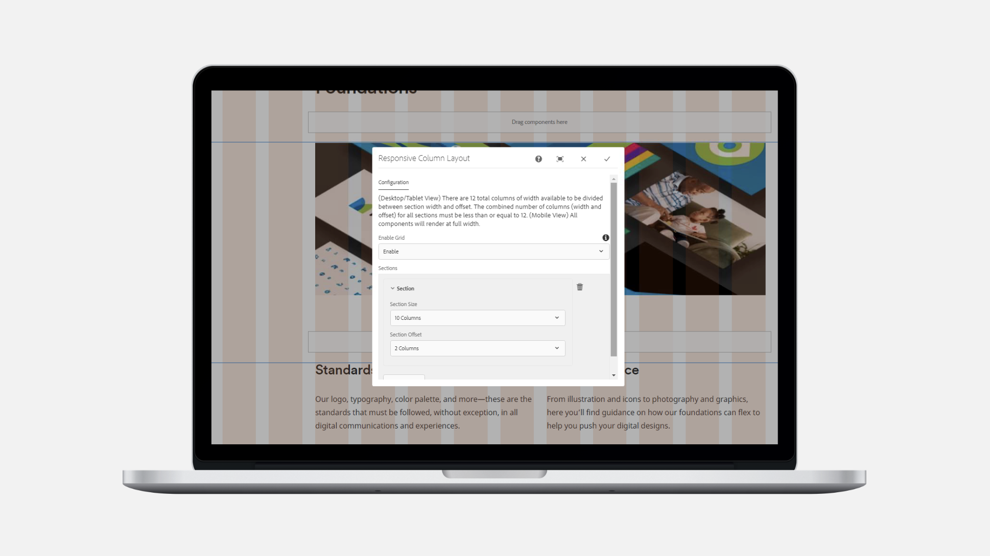
Overview
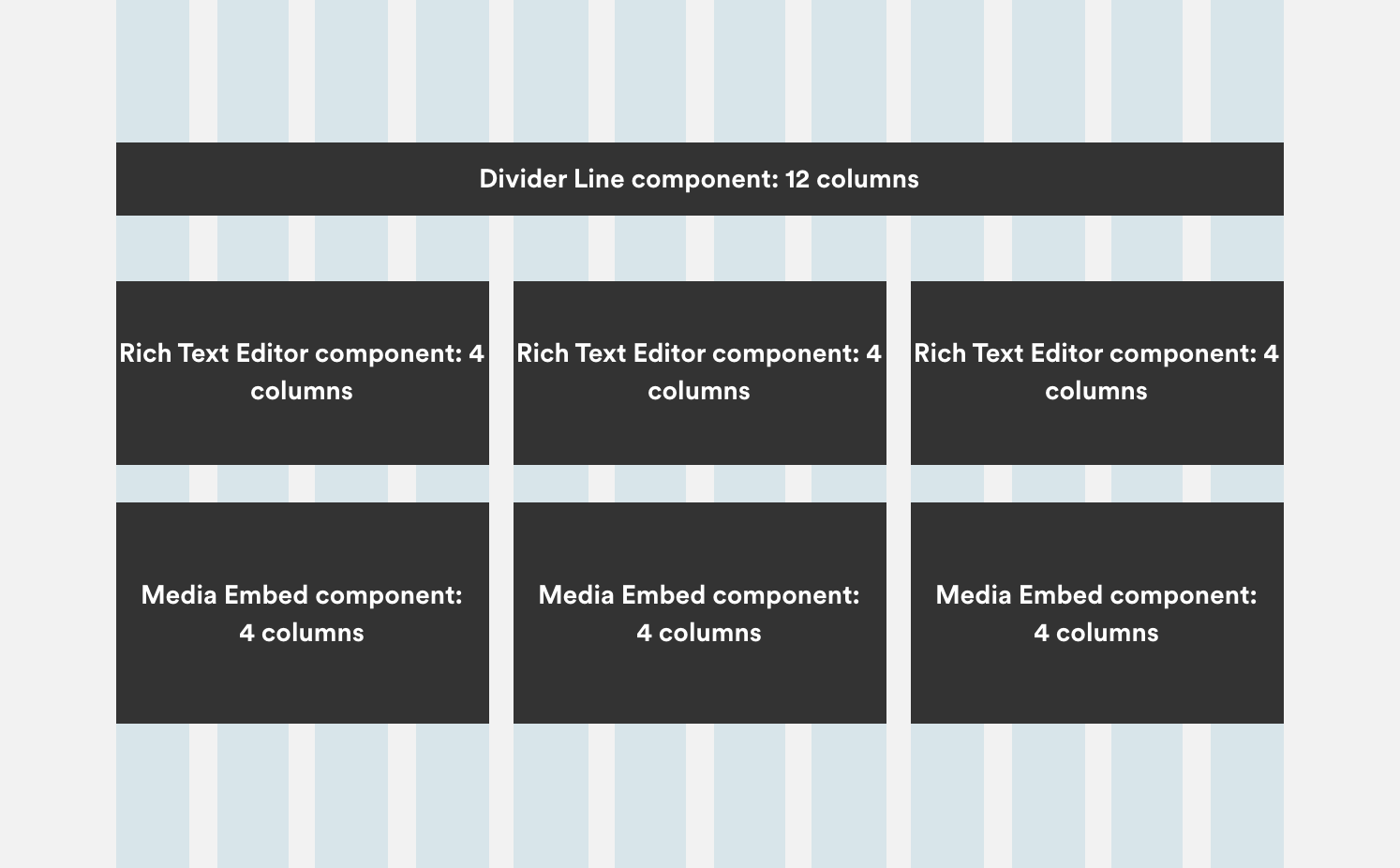
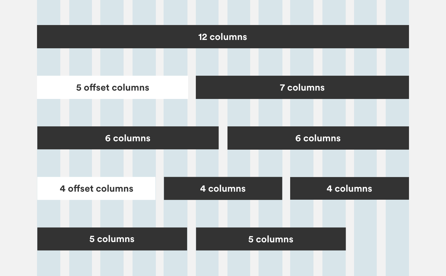
The Responsive Column Layout component allows several different AEM components on the 12-column grid, which scales responsively. It enables design teams to place components side-by-side without writing custom code.
Features
- Enables design teams to place components side-by-side.
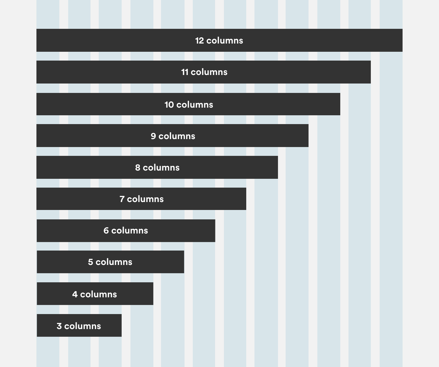
- Allows positioning of a 12-column grid in 1, 2, or 3 equal sections.
- Offsets content by up to 8 columns.
- On resizing, automatically updates to responsive mobile.
Usage Guidelines
Layout
Use the Responsive Column Layout to create pages using different components such as Media Embed and Rich Text Editor.
Column Width
You can resize the width of your component column from a minimum of 3 columns to a maximum of 12 columns.
Offset Components
Offset the components and create space by adding empty columns to either side.
Combinations
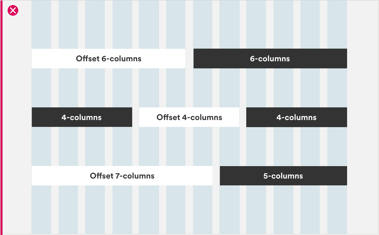
When placing these components in combination—and to avoid creating unusual layouts—do not offset columns or stagger components in excess.
Key Insights Component
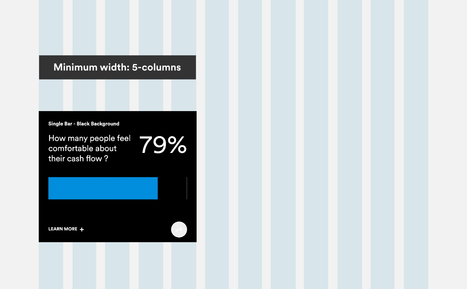
This component has a minimum width of 5 columns, highlights statistics, and provides pertinent information to customers.
Recommended Use
The following components are available in Adobe Experience Manager (AEM) code. We recommend their use with the Responsive Column Layout component. Please note this list is not exhaustive, and other components are applicable to the grid.
More on Layout & Grid
Documentation