NATIVE APP GUIDANCE
Components
Overview
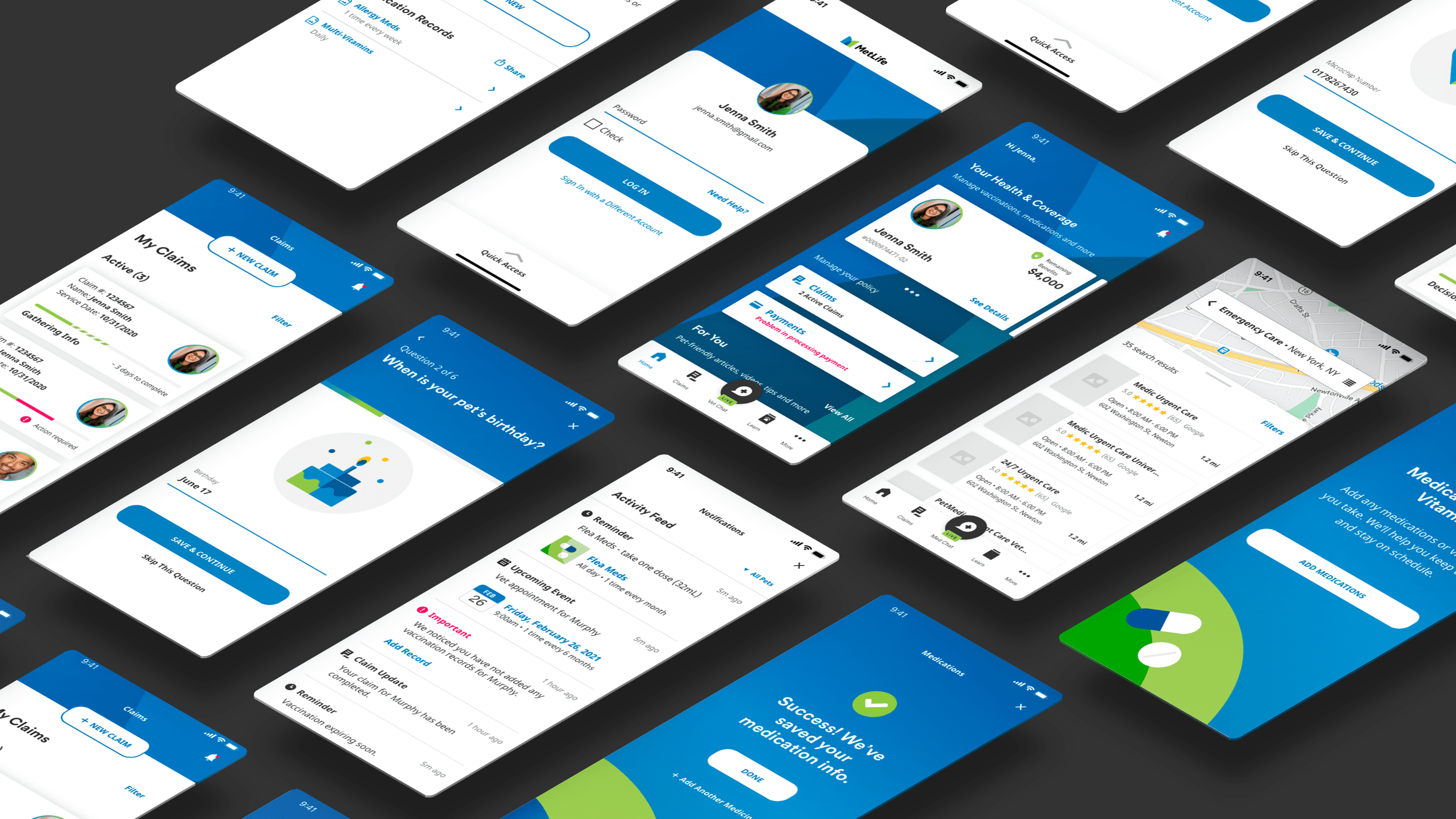
Native App components are ready-made building blocks that are preformatted and rendered for use on all mobile experiences we create. They make it easy for you to build faster and design specific functionality for seamless customer experiences. Use these components along with the standard MetLife user interface elements to jumpstart your native app design.
Native App Components
Contributing to the Design System
The resources on this site are always growing with iteration and input from teams at MetLife. Have something new other teams could use? Tell us your ideas.
Want to propose a new component?
Design Assets & Libraries
We have built all of our Responsive Web and Native App components in Adobe XD Libraries. You can follow the libraries linked below to automatically pull these components and their supporting elements into your project files. Any future updates we make to these libraries will be automatically represented in your files.
Our Responsive Web components are different across our Marketing and Sales & Servicing experiences. You can find each set in its own library below.
We just released an update to the Native App Components library. Updates include the recently completed foundation UI unification work. We recommend using the latest library when starting new digital experiences work.