STANDARDS
Typography
Overview
Typography helps us create consistency in our digital experiences and gives people a sense of familiarity with our brand. We use crisp, modern typography across all digital touchpoints.
Standards
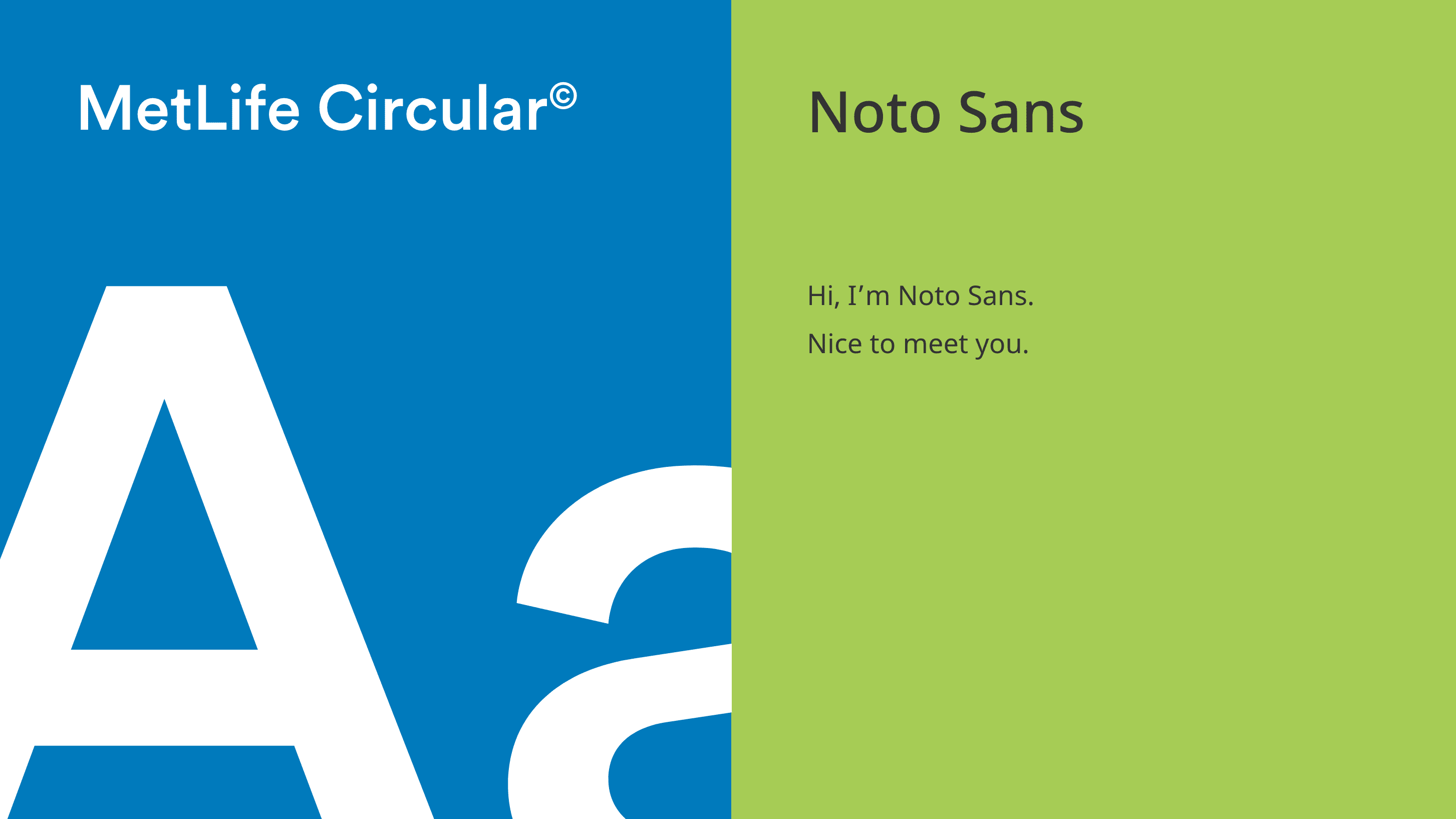
In digital, we use two sans serif typefaces—MetLife Circular© and Noto Sans. Their simple, clean lines reflect our straightforward and friendly approach to messaging.
MetLife Circular©
MetLife Circular© should be used for headlines and bigger brand moments.
MetLife Employees
Noto Sans
Noto Sans flexes well across several languages and should be used for body copy and more functional moments. It should not be used in large or display formats.
Noto Sans is a Google Font
When to use
Use MetLife Circular© Normal
- Large form numbers.
- Meta copy.
- Quotes.
Use MetLife Circular© Medium
- Headlines.
- Large form copy.
- Links.
Use Noto Sans Regular
- Body copy.
- UI forms.
- Error states.
Use Noto Sans Bold
- Links.
- CTA buttons.
Guidance
With type, we strive for legibility and clarity, so that we’re always complementing and elevating, not clouding, our message.
Use MetLife Circular© as our primary brand font.
- Use MetLife Circular© for headers, eyebrows, and primary brand moments.
- Use Noto Sans as body copy to support big titles and headlines, and always use it as the primary font in UI.
- Use MetLife Circular© Italic.
- Use all caps for headlines.
Marketing
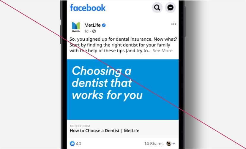
Typography in our digital marketing materials goes beyond just headlines. Using our two font families we can create engaging content, with a clear hierarchy that elevates the message that we want to communicate.
Keep it simple.
- Never use more than three type styles in the same piece of content.
- Keep CTAs short (2-3 words or fewer, if possible) and action-oriented.
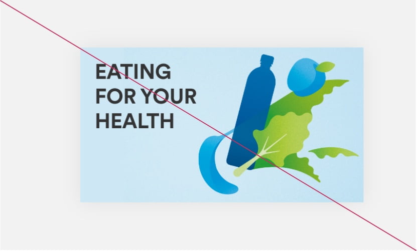
Play with type scale.
- Use different scales and sizes to create clear hierarchy and dynamic layouts.
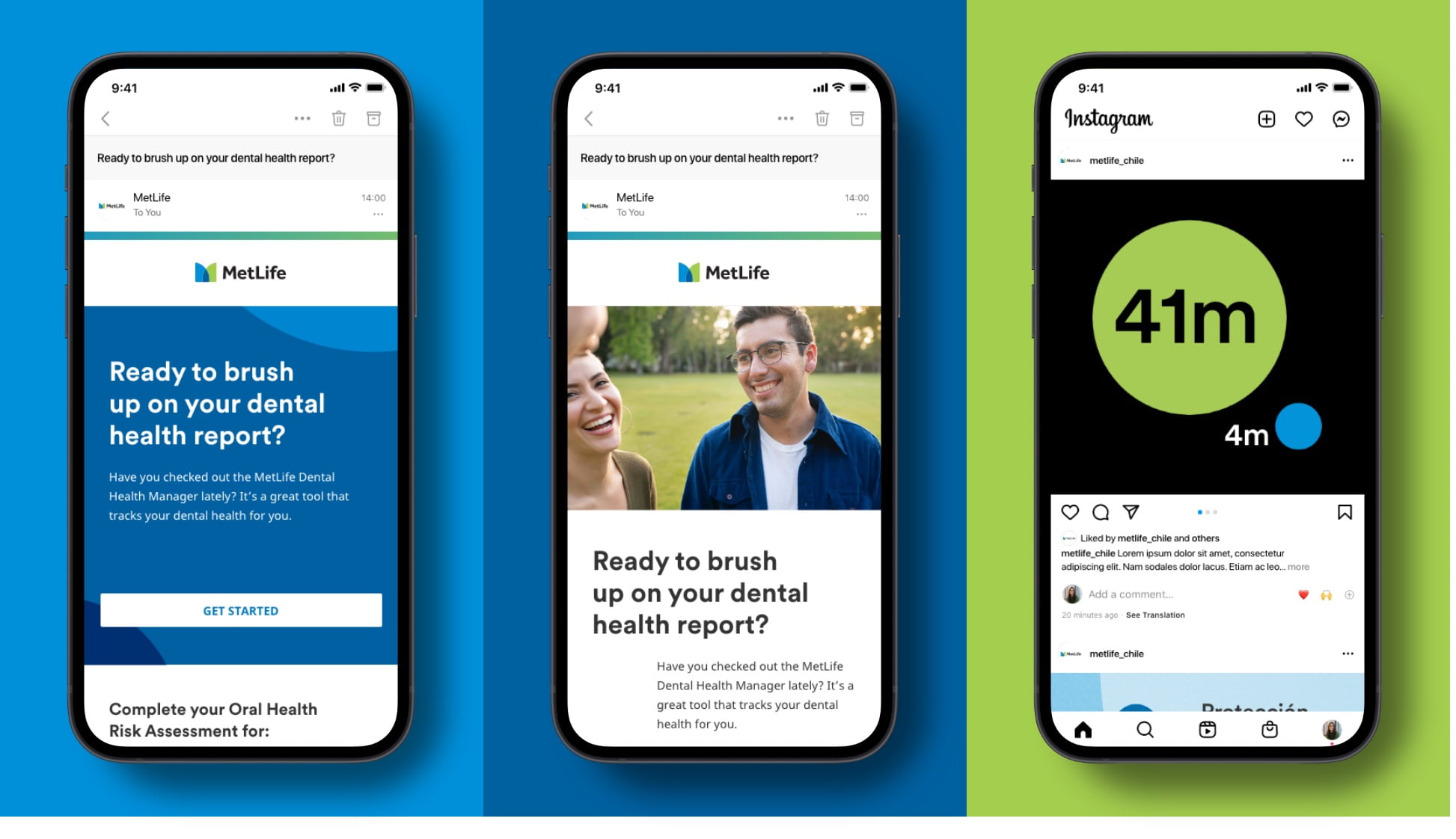
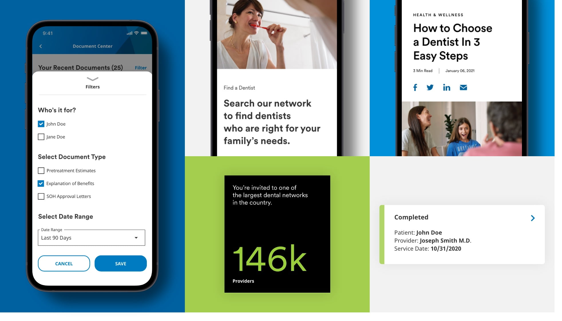
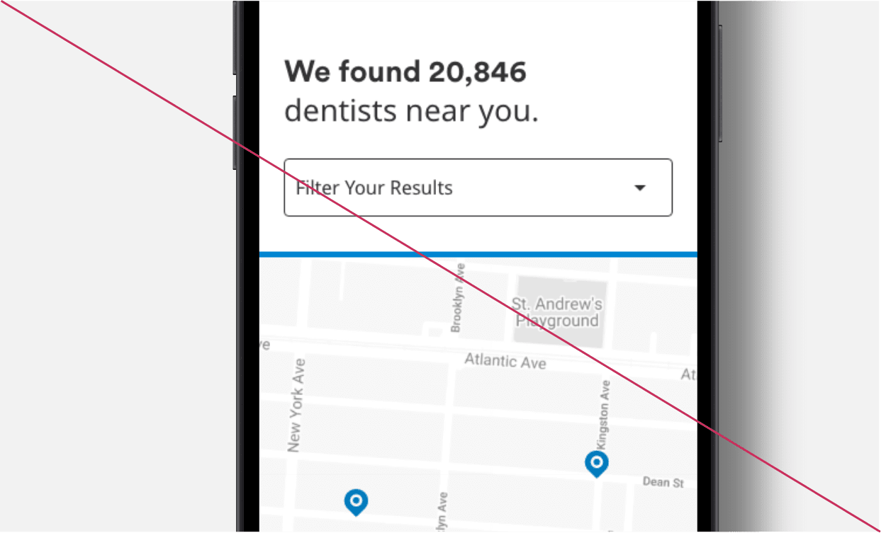
User Interface
When used in functional moments, type should play a supporting role, and always be clear, legible, and informative.
Use MetLife Circular© for hero moments and headers.
- While Noto Sans is used more often in functional UI copy, MetLife Circular© is still used—although less than in marketing material.
Use Noto Sans for functional moments.
- Use Noto Sans in buttons, text links, and forms.
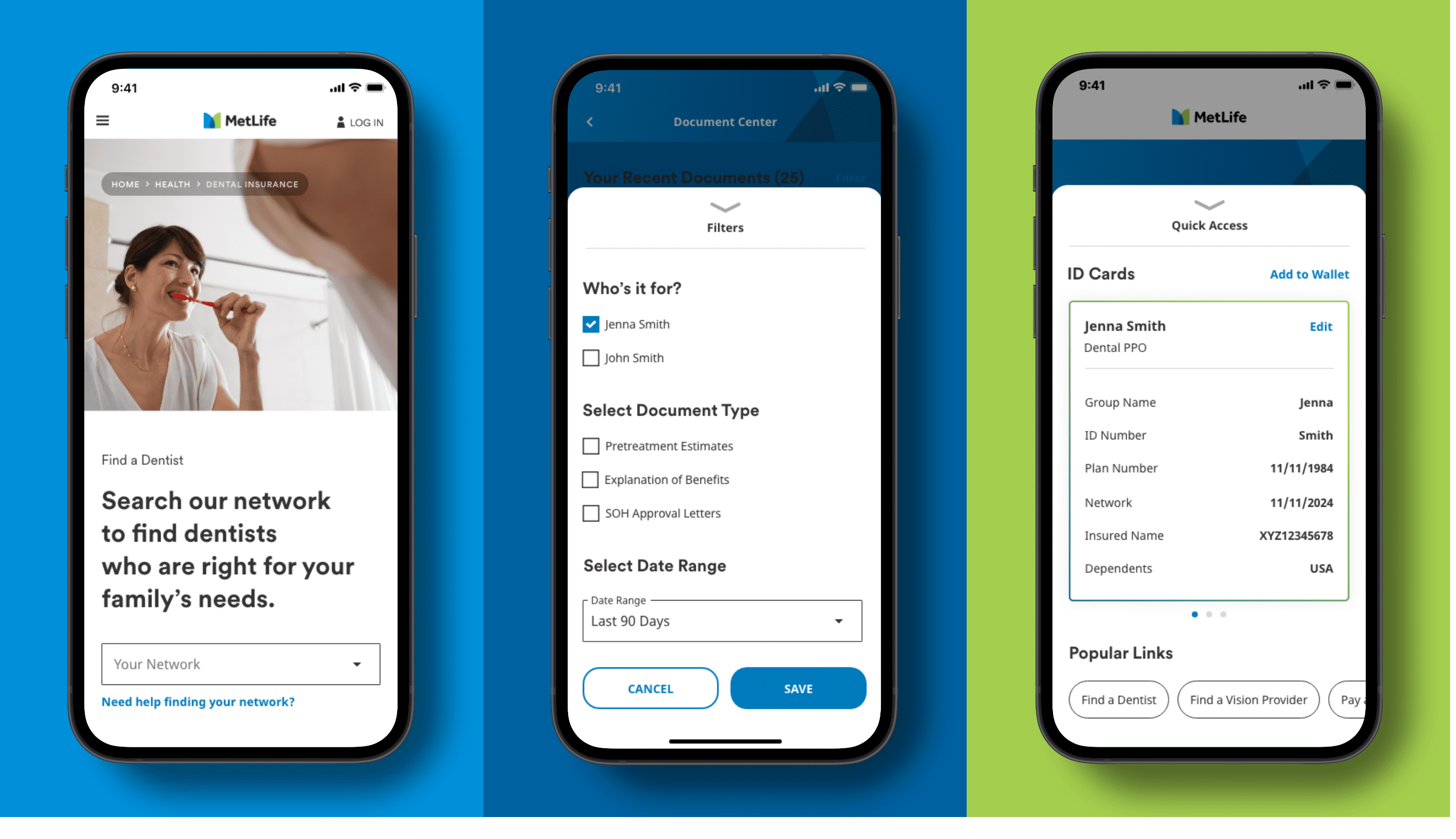
- Don’t mix font faces (MetLife Circular© and Noto Sans) in the same text line or paragraph.
Accessibility
MetLife is committed to designing and developing digital experiences that all our customers are able to use. Here’s what that means for typography.
Design for screen readers.
- When designing web and app experiences make sure to stick to established header hierarchies (H1, H2, H3, etc.) to ensure the experience is accessible to all.
Always prioritize legibility.
- Use body copy that is a minimum size of 14 px with leading set to 1.5x.
- Make sure headlines have enough breathing room. Follow the Marketing guidelines for line heights.
Color Contrast
Localization
Typography is treated a bit differently in markets that have received a brand localization. Refer to the following pages for typography guidance by country.