MEXICO
Typography
Overview
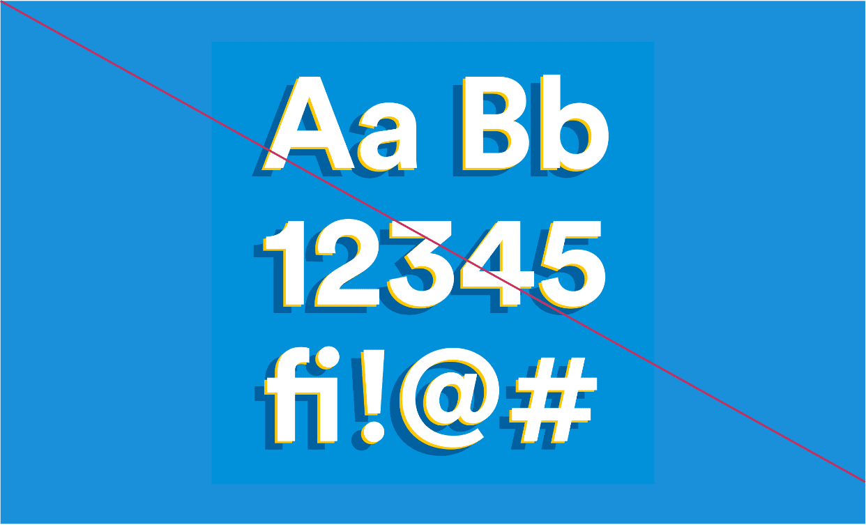
We put a unique spin on MetLife Circular© to create a typographic style that’s distinct to Mexico.
How it Works
We created a typographic style that refreshes our use of MetLife Circular© in a way that offers a unique expression without straying far from the global brand.
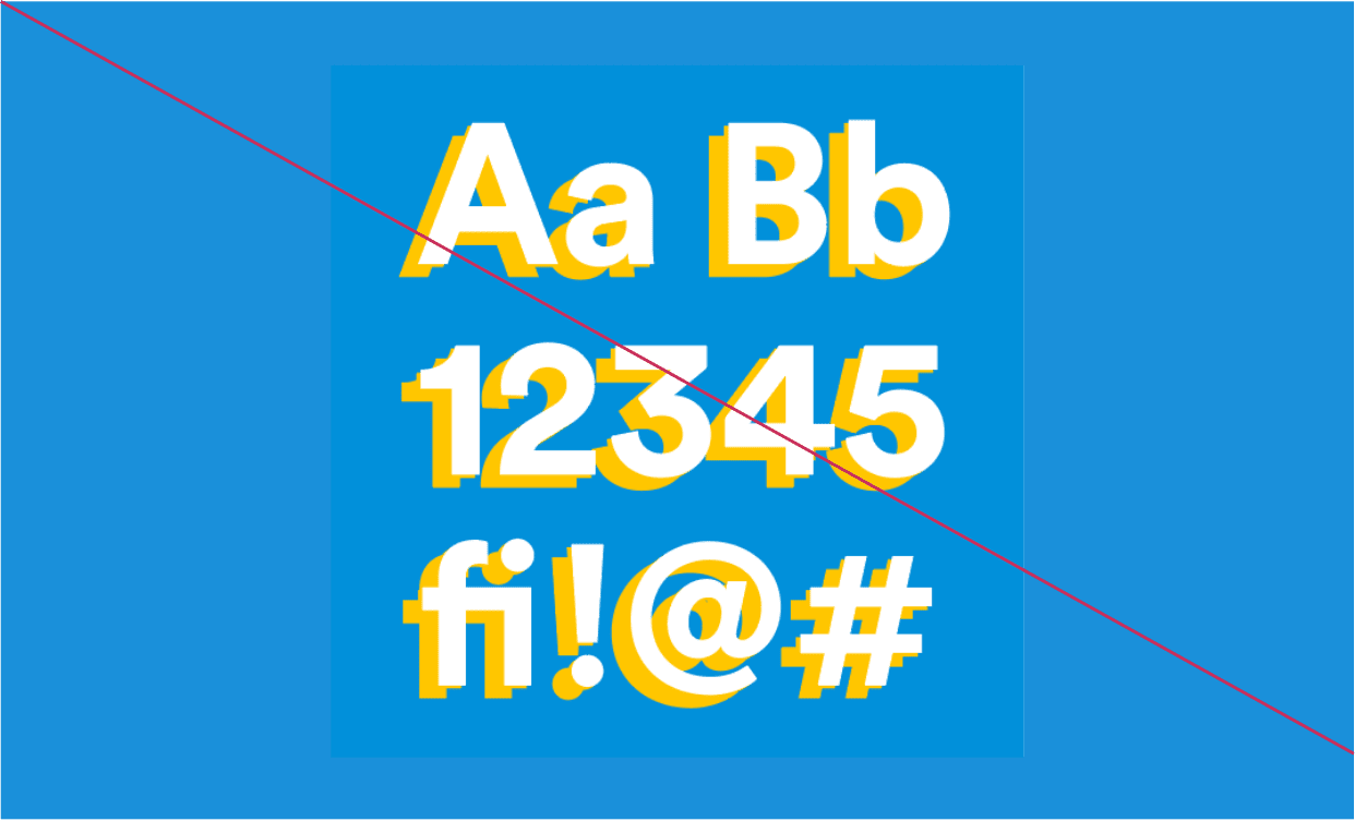
Inspired by hand-painted signage, a drop shadow is applied in a display format for different applications in digital.


1. Set Circular Bold copy in desired size, position + color. Convert type to outlines.
2. Step and repeat.
Offset vertical: 2% of text height.
Offset horizontal: -3% of text height.
Set type to layout background color.
3. Select original (top) layer, step and repeat.
Offset vertical: 7% of text height.
Offset horizontal: -10% of text height.
Set type to accent color.
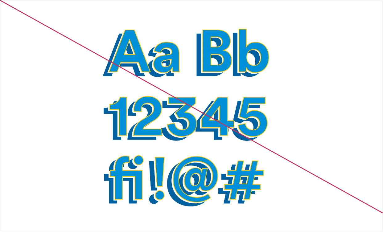
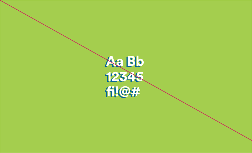
Error Message
1. Set Circular Bold copy in desired size, position + color. Convert type to outlines.
2. Step and repeat.
Offset vertical: 2% of text height.
Offset horizontal: -3% of text height.
Set type to layout background color.
3. Select original (top) layer, step and repeat.
Offset vertical: 7% of text height.
Offset horizontal: -10% of text height.
Set type to accent color.
Guidance
Do
Use contrasting colors that enhance legibility.
- On white backgrounds, match a darker top layer with a lighter shadow layer.
- On color backgrounds, match a lighter top layer with a darker shadow layer.
Do
Always match the middle layer to the background color.
- Make sure this layer is visible in the offset.
Do
Use this type treatment on headlines and big moments only.
- Avoid using this type treatment for body copy, buttons, or any other form of UI.
Don't
- Use a middle layer that doesn’t match the background.
Don't
- Add a stroke to any letters.
Don't
- Use the same colors on multiple layers, or use
similar colors that could harm legibility.
Don't
- Use this style on typography less than 40px.
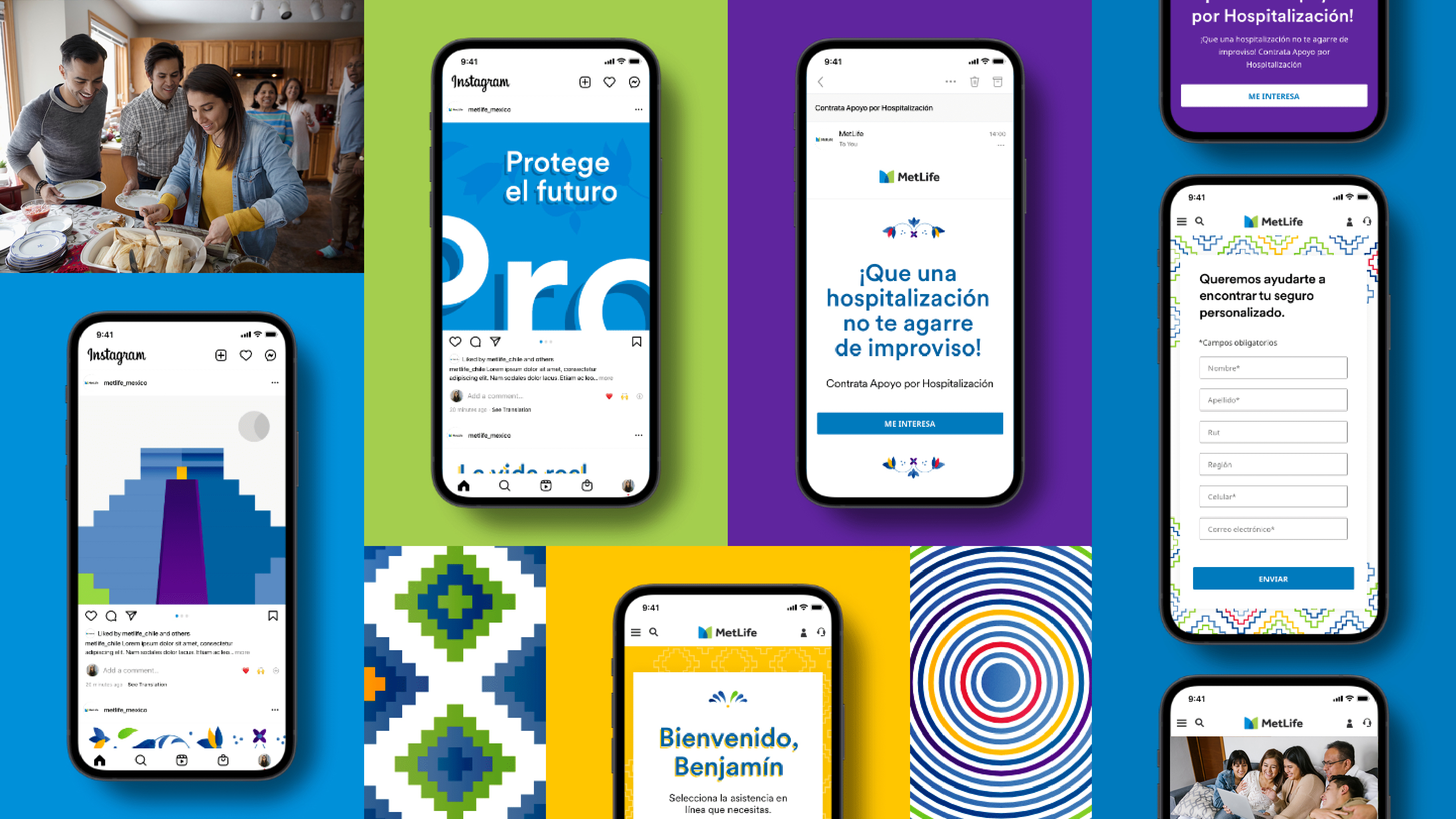
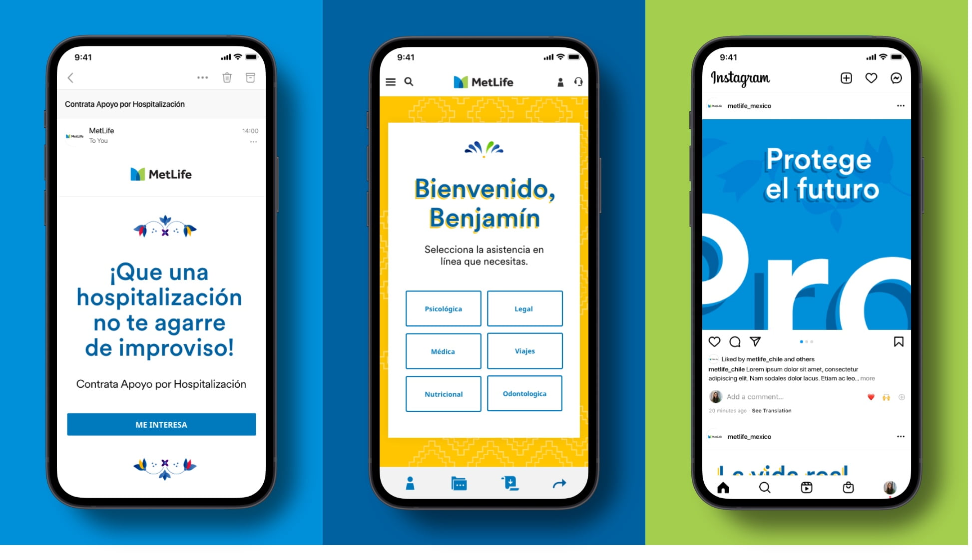
More from Mexico
Showcase