MEXICO
Graphics
Overview
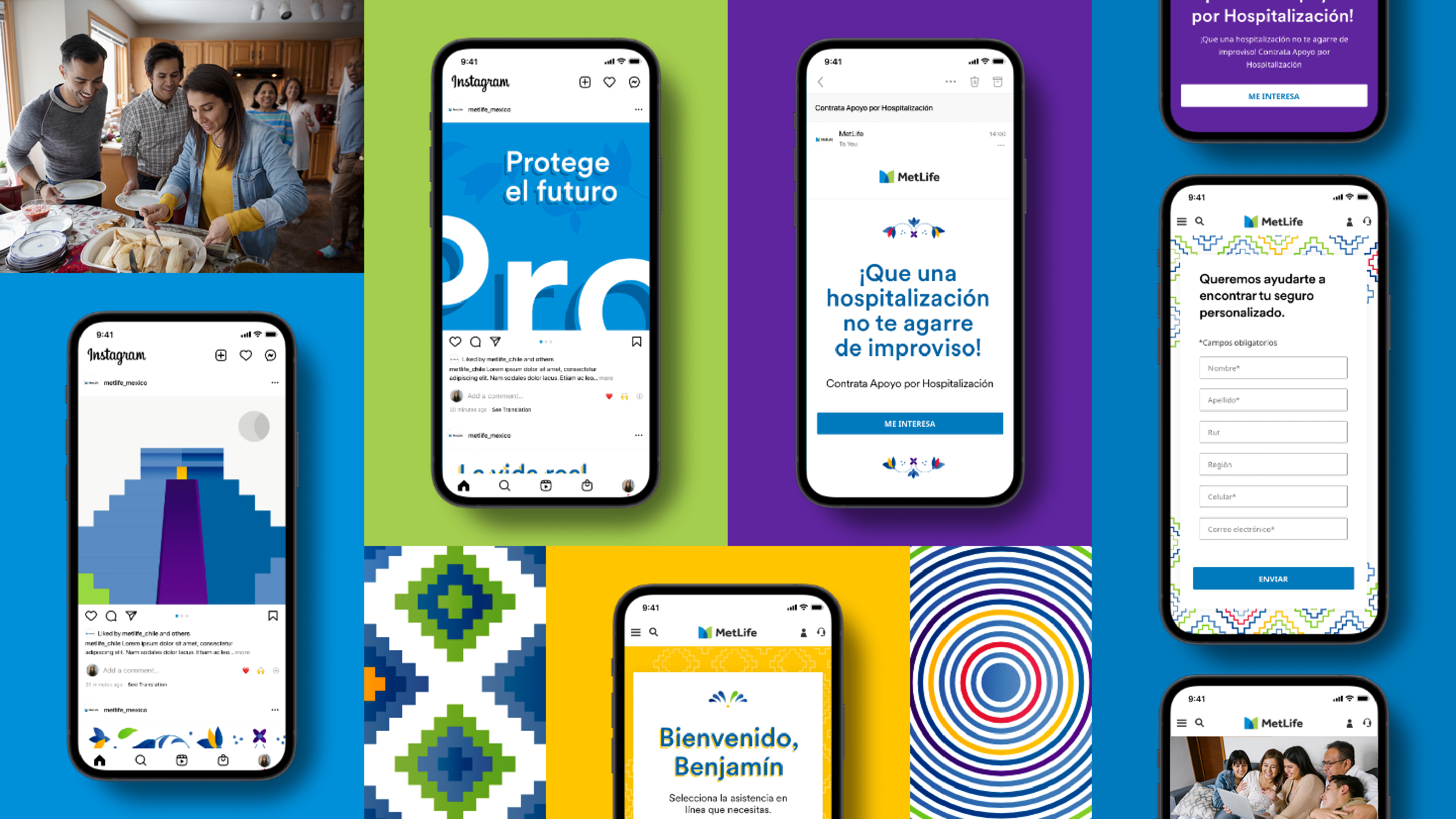
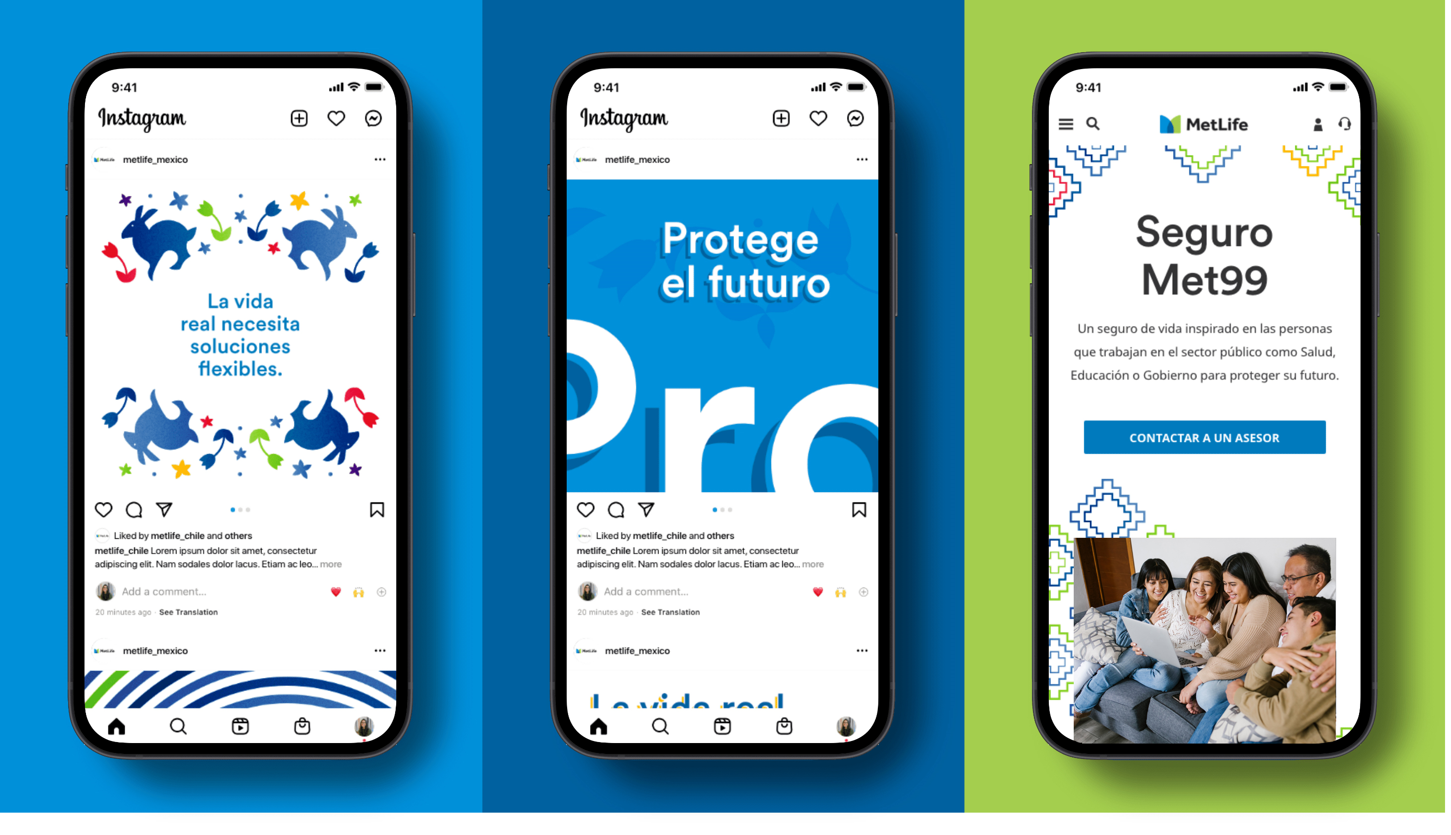
For the Mexican market, our graphics draw inspiration from patterns rooted in Mexican heritage. We’ve given them a modern lift and a MetLife spin.
Library
With an eye to tradition and authentic visual expression, we’ve modernized the graphics in our interpretation to fit with our global brand. It’s critical that the art feels like us and is firmly grounded in our strategic framework.
Animals
Animals
Arrows
Buildings
Circles
Columns
Diamonds
Flowers
Flowers
Lines
Horizontal
Lines
Horizontal
Lines
Vertical
Lines
Vertical
Berry
Blue
Purple
Teal
Guidance
Follow these guidelines when implementing graphics for the Mexican market.
Do
Apply patterns in a way that enhances backgrounds.
- Placing patterns over white, behind cards, can help add a touch of the Mexican look and feel to otherwise standard elements like forms.
Do
Use patterns and graphics in unique ways.
- Consider pulling pieces of graphics for things like bullet points in layouts.
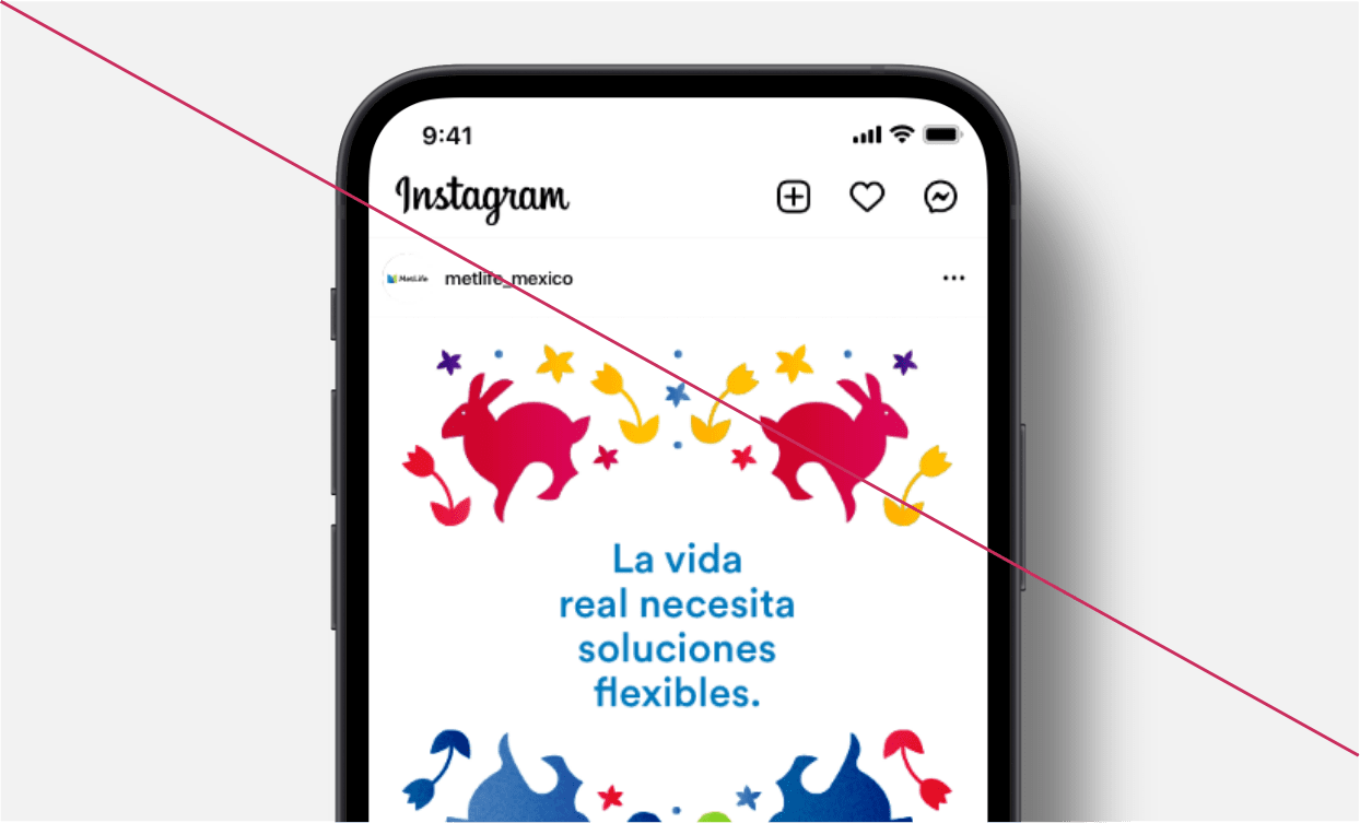
Don't
- Manipulate the colors of the illustrations.

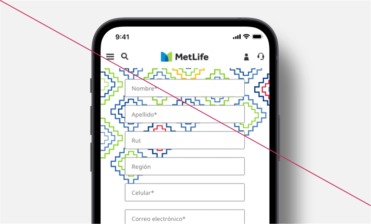
Don't
- Place visually complex patterns behind interactive elements or form fields.

Design Assets
More from Mexico
Showcase

