CORE GUIDANCE
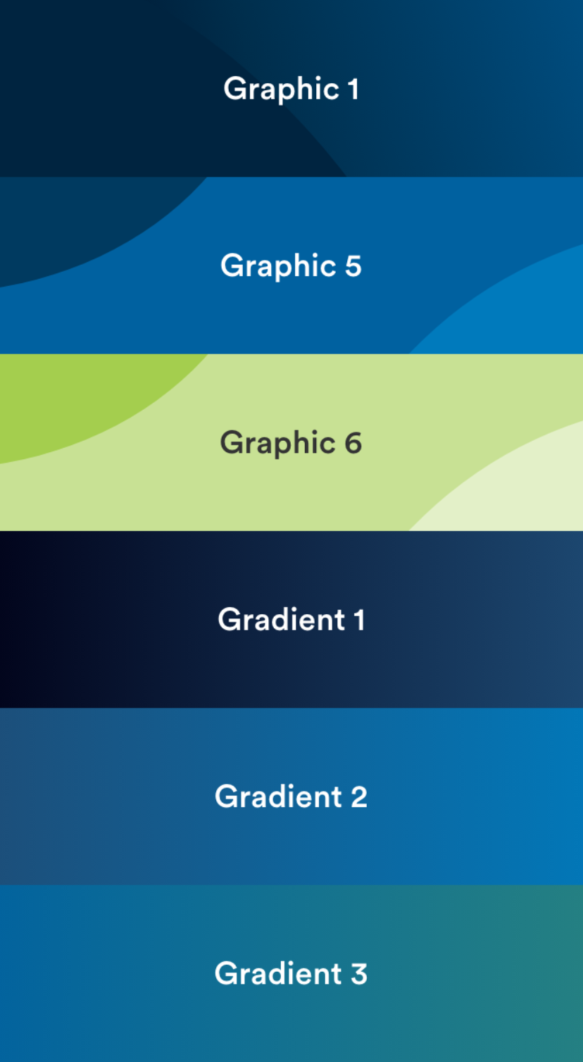
Graphics

Overview
Inspired by the overlapping shapes of our logo, our graphics showcase the MetLife brand and help bring it to life—using our calming and approachable color palette to create brand recognition. We have a broad set of assets that can be used across all digital communications.
Graphics
Gradients
Guidance
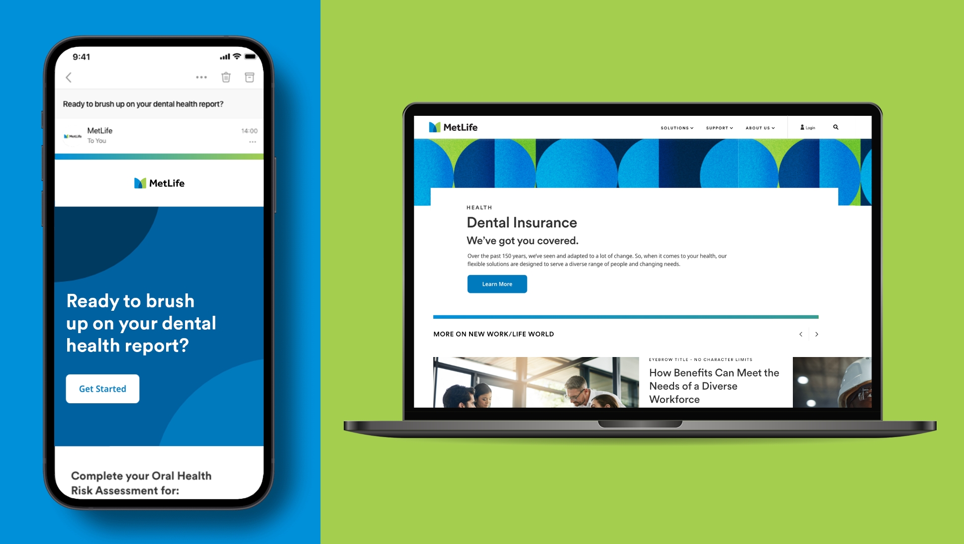
In digital, we use graphics to bring brand design elements into key moments—like headers and backgrounds—to add visual emphasis and create ownable moments in our communications.
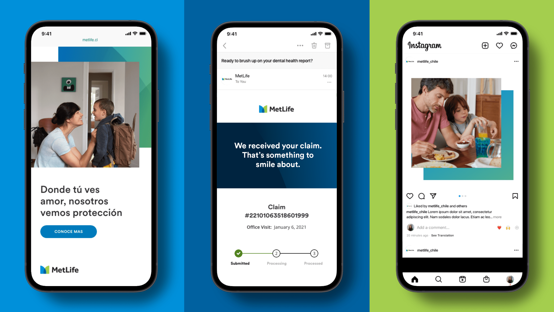
Marketing
When used in branded communications (e.g., social posts, digital ads or website headers), our graphics serve to add a sense of depth and brand recognition.
Create graphic and emotional moments.
- Pair graphics with text such as headlines and quotes to elevate branded communication.
- Adjust the layout, crop, and graphic pattern used to call focus to the main content.
- Use graphics behind elements like photography to create layers and therefore depth with visuals.
Surprise and delight.
- Use graphics to surprise and delight for success states throughout a communication.
Use graphics consisting of the primary color palette.
- Avoid darker or lighter graphics that aren’t our primary blues and greens.
- Graphics should never be the main focus of a layout.
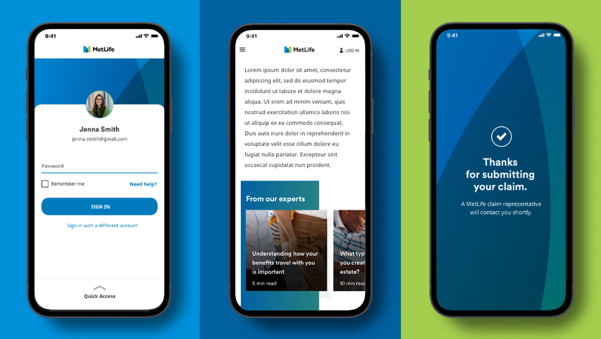
User Interface
Use graphic patterns as a subtle way to bring the brand through in digital interfaces.
Use graphics in main sections to draw emphasis.
- Use graphics on headers or backgrounds for main display moments.
- Use graphics on cards that represent MetLife plans and/or agents.
- Use full bleed background graphics for success states and other congratulatory moments.
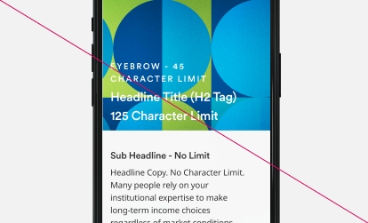
Be mindful of where type is placed over a graphic element.
- As a general rule, try to place typography over a single color in a multi-colored graphic.
- Overuse gradients or graphics. As a general rule, don’t use more than one in any screen moment.
- Manipulate a graphic’s shape or color.

Accessibility
MetLife is committed to designing and developing digital experiences that all our customers are able to use. Be sure to only use combinations of graphics and type color that pass accessibility standards.
Design using combinations of graphic elements and typography that meet accessibility standards for contrast.
- We follow the latest standards from the WCAG (Web Content Accessibility Guidelines), which require a contrast ratio of 3:1.
For background colors with foreground text, use these combinations.
Use our graphics and gradients as decorative elements or accent colors.
- Using the visual elements as embellishments can enhance the design without compromising our accessibility standards.
- Use graphics or gradients as backgrounds that don’t pass our accessibility color standards.