STANDARDS
Logo
Overview
Our logo represents the partnership between MetLife and our customers. Below you’ll find our standards for using our primary logo and logo reproductions, as well as various exceptions for specific channels.
Standards
Primary Logo
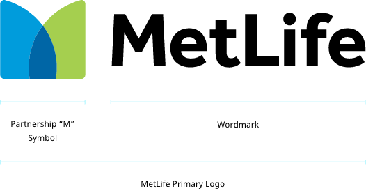
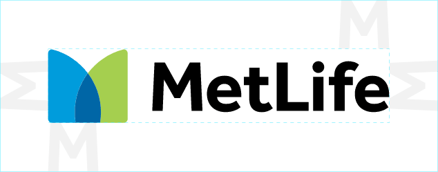
Our new symbol, comprised of two simple shapes that come together to create an “M,” represents our role as our customers’ trusted partner. The blue color reflects our brand heritage, while the vibrant green—new to our color palette—represents growth and vitality.
Secondary Logo
Reversed
Our reversed logo is white text, primarily on a black background, and used only when an application on white is not an option.
On Color
Our "transparent logo" is an all-white version used only on color backgrounds.
Other Use Cases
Stacked
Our stacked logo is the full-color Partnership “M” symbol with the MetLife word mark text below. This logo should only be used in special circumstances where the space for the logo is square and limited in size.
Website
Our Partnership “M” symbol may be used as a favicon on our websites. This is the only time that our symbol should appear without our logotype.
Clear Space & Minimum Size
Clear Space
Maintaining an appropriate amount of clear space around our logo creates a positive impression and impact. A minimum amount of clear space must always surround the MetLife logo, in order to separate it from other elements such as headlines, text, or imagery.
The clear-space area is equal to the cap height of the MetLife “M” and is proportional to the size of the logo being used. The same clear-space rule applies to all dual-language logos and tagline lockups.
Minimum Size
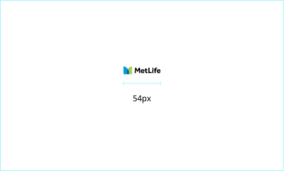
Careful consideration should be given when determining the size of the MetLife logo. If it is too small, it will be ineffective. The minimum size of the logo should be 0.75” wide (19mm) for print materials and 54px wide for digital applications.
Dual-Language Logos & Taglines
There are four approved dual-language logos: Japanese, traditional Chinese, simplified Chinese, and Arabic. All other regions should use the English logo.
Dual-language logos and tagline lockups are provided as master artwork, and proportions should not be altered in any way.
Lockups in other countries may differ based on operating names and legal entities. These situations will be addressed on a case-by-case basis.
Japanese
Traditional Chinese
Simplified Chinese
Arabic
Guidance
Use our Primary Logo whenever possible.
- Always use our symbol and our word mark together.
- Whenever possible, reproduce our logo in full color on a white background.
Use our stacked logo on social media.
- Always use our stacked version for social media profile pictures.
Use localized logos.
- Use dual-language logos & taglines depending on the region.
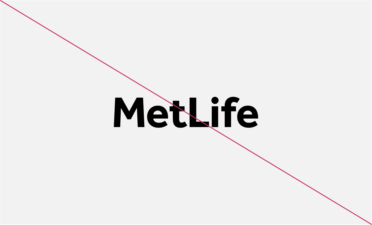
- Use any other color combination.
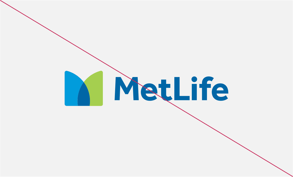
- Remove any part of the logo
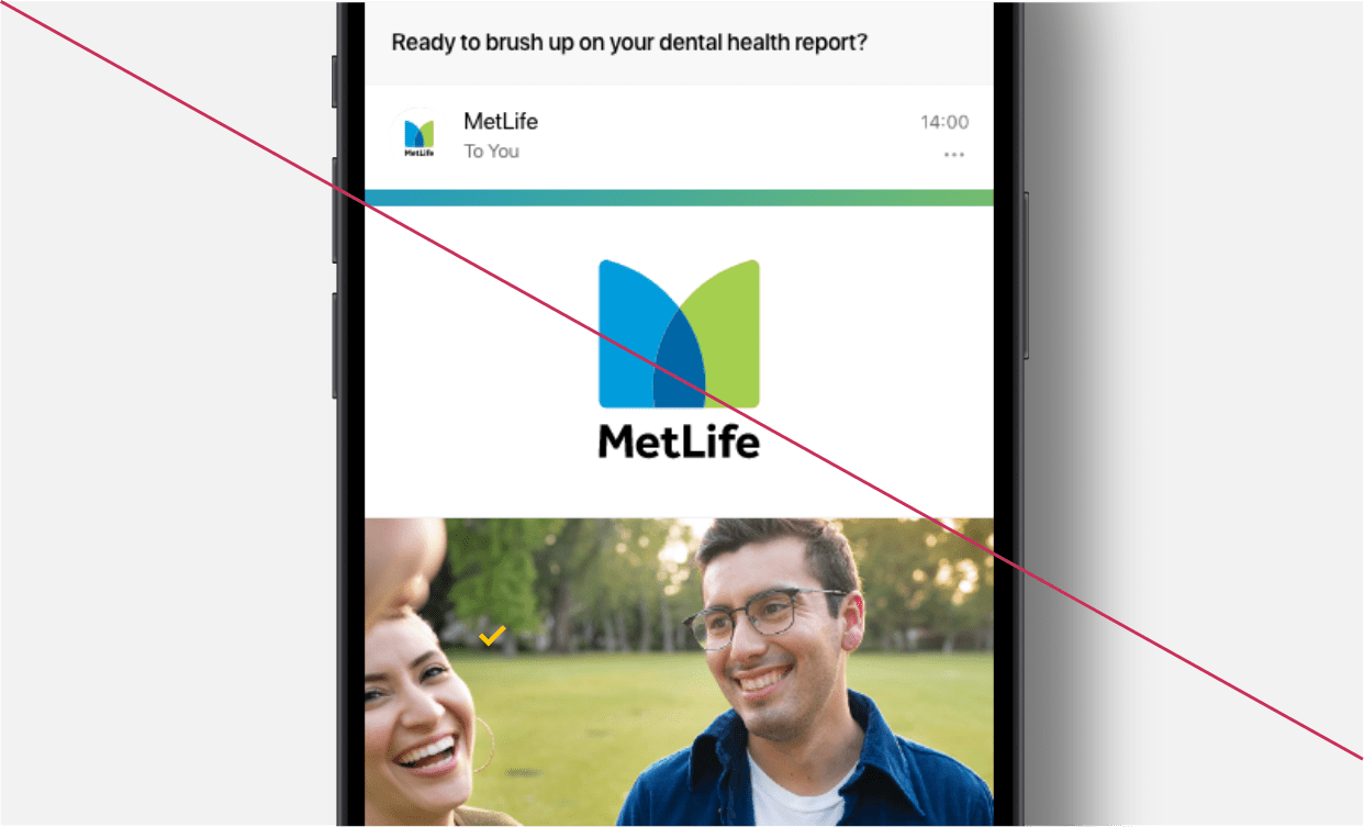
- Overuse our stacked version. It should only be used when the space for the logo is square and limited in size.
- Isolate the “M” symbol.
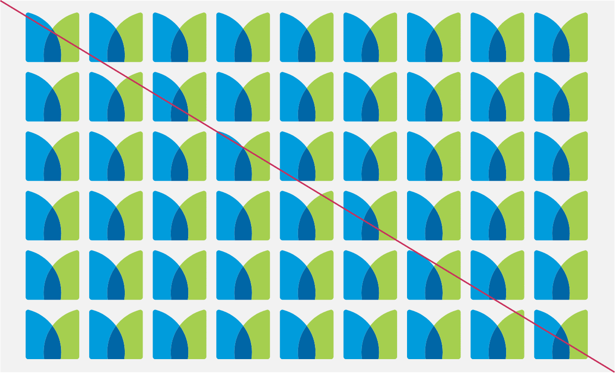
- Create a repeat pattern with the “M” symbol.
- Use the “M” symbol as a supergraphic.
Products & Services
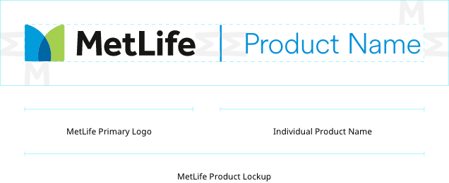
Product lockups signify the relationship between MetLife and our individual products and help us create consistency across our portfolio.
MetLife Product Lockup
The MetLife logo is locked up with the product name and has the same hierarchical prominence. This mutually reinforced relationship is critical moving forward. Products should never be separate and distinct from MetLife.
Co-Branding & Sponsorship
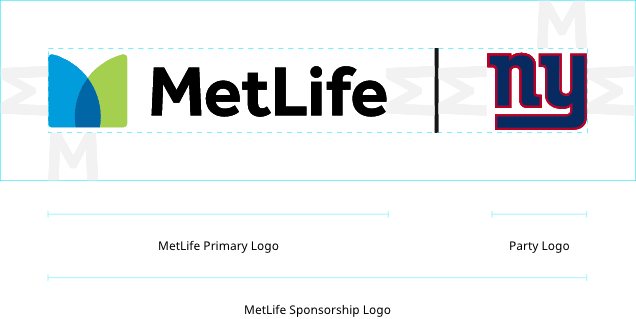
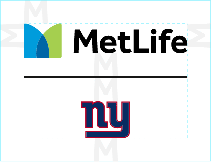
When MetLife sponsors another party, MetLife is the lead brand. Our logo is locked up with the other company’s logo/name and has the same hierarchical prominence.
All third party trademarks and/or service marks (including logos and icons) referenced by MetLife remain the property of their respective owners. Unless specifically identified as such, MetLife’s use of third party trademarks does not indicate any relationship, sponsorship or endorsement between MetLife and the owners of these marks. All references by MetLife to third party marks are to identify the corresponding third party goods and/or services and intended to constitute nominative fair use under applicable trademark laws.
Horizontal Lockup
Vertical Lockup
Short Company Name
Long Company Name
