South Korea

South Korea Digital Brand Expression

13 Min Read
Sep 30, 2021

To better connect with customers in Korea, we stretch the global MetLife digital brand in a few different ways. Here you’ll find digital examples and guidance to help you bring communications to life in the Korean market.

Overview

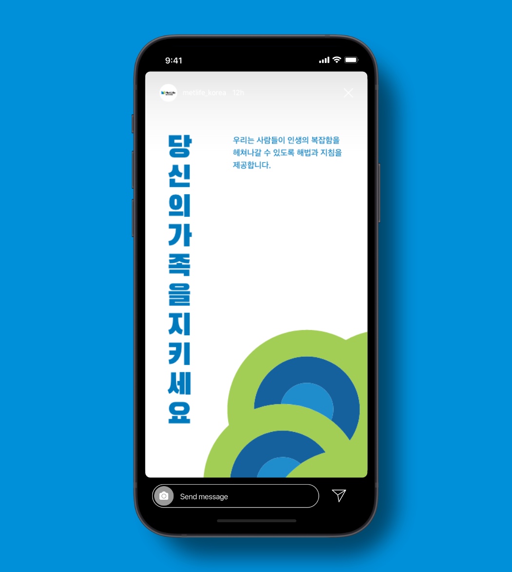
In Korea, the extended MetLife brand should always come across as trustworthy, expert, optimistic, and on my side.

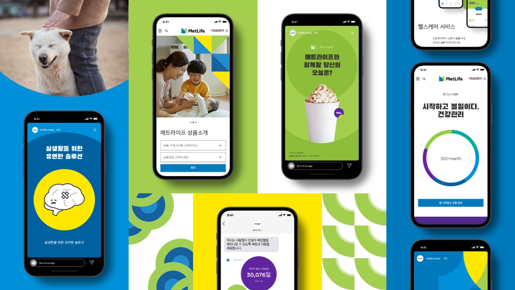
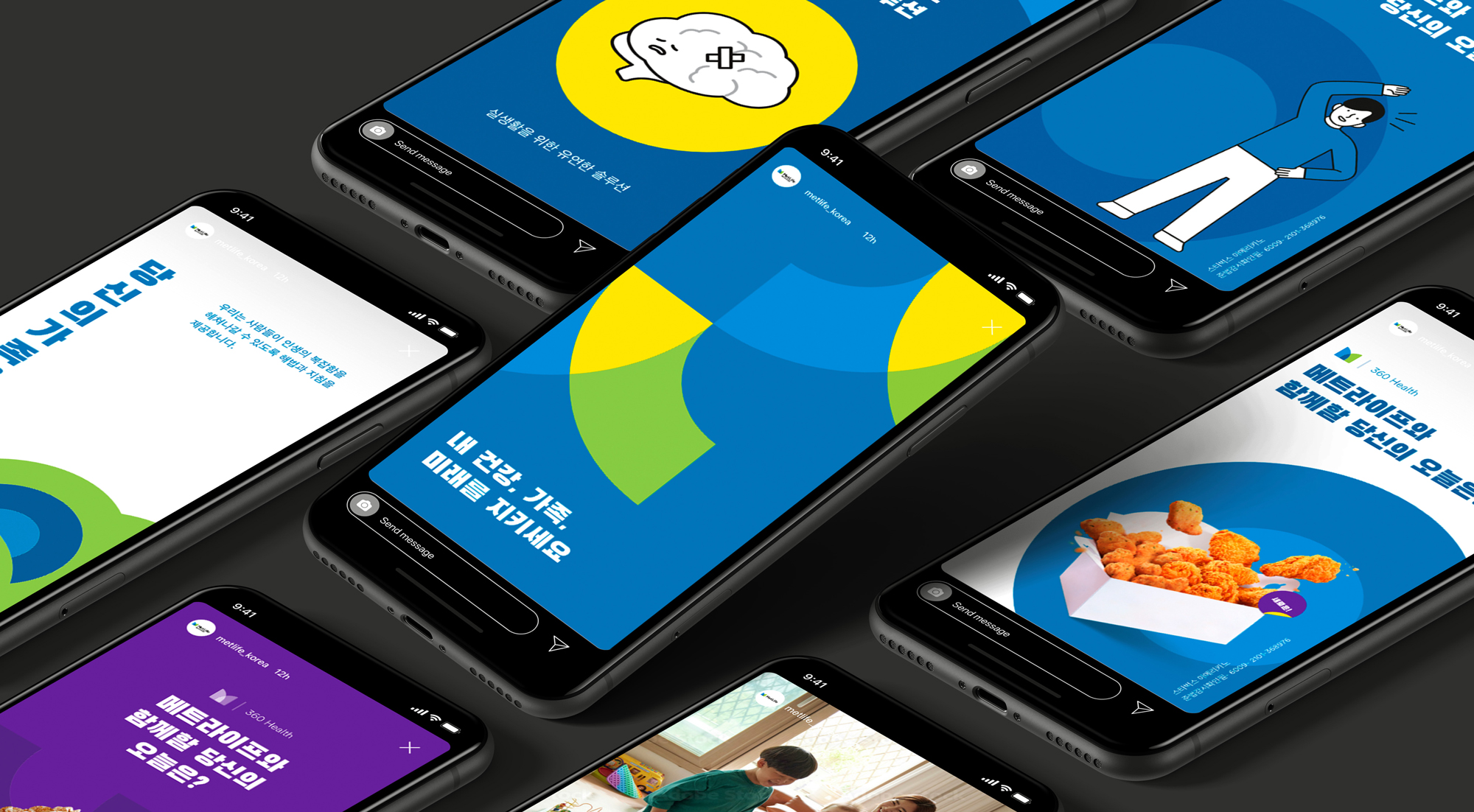
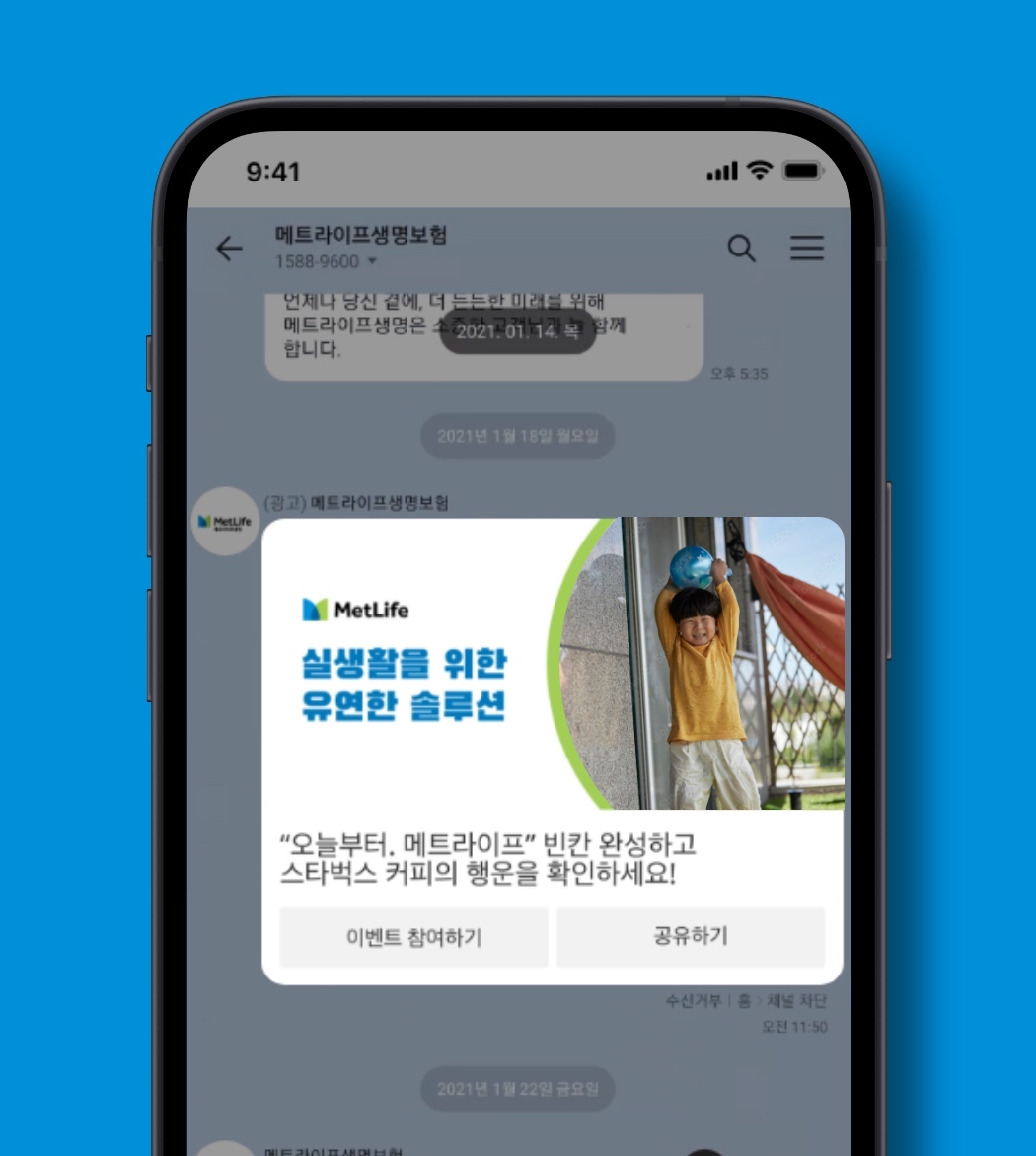
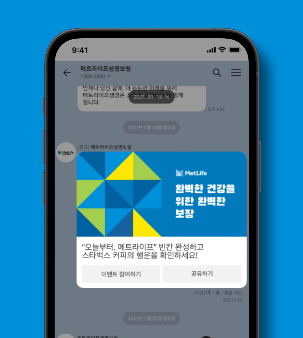
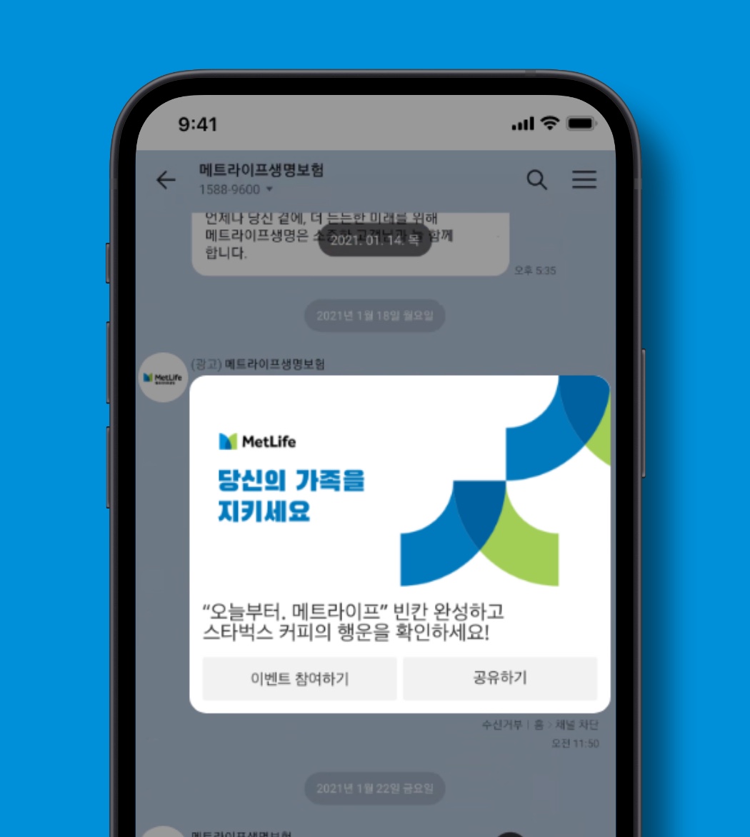
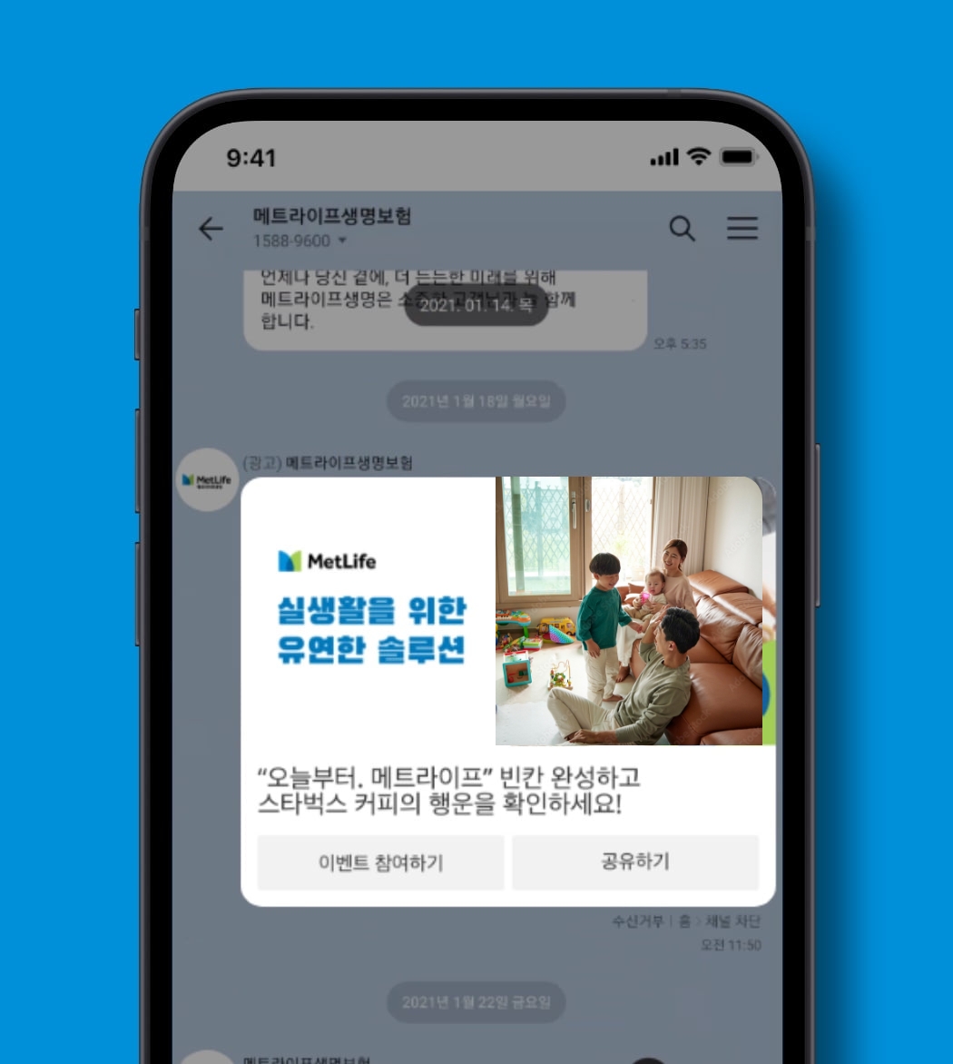
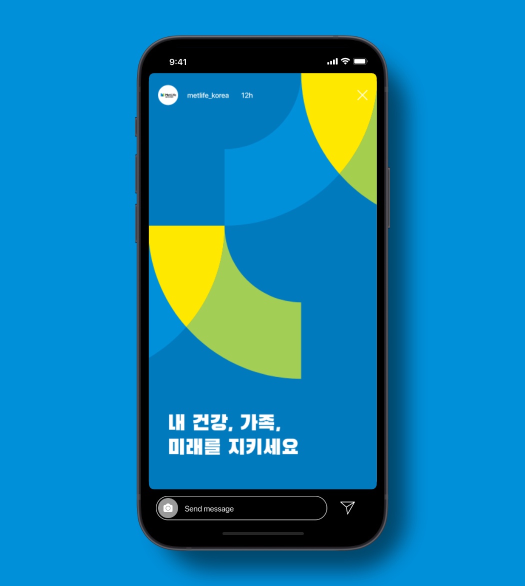
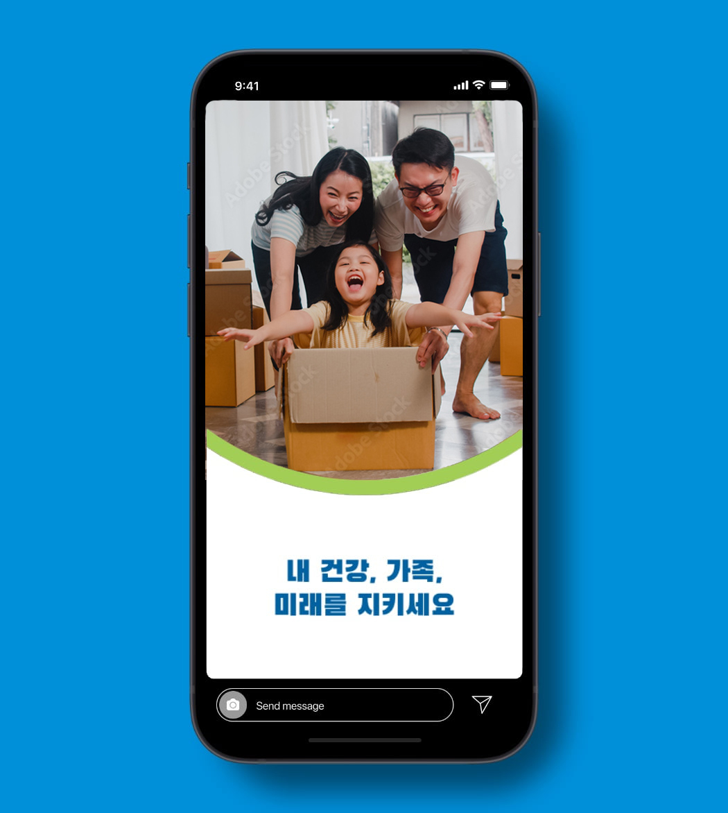
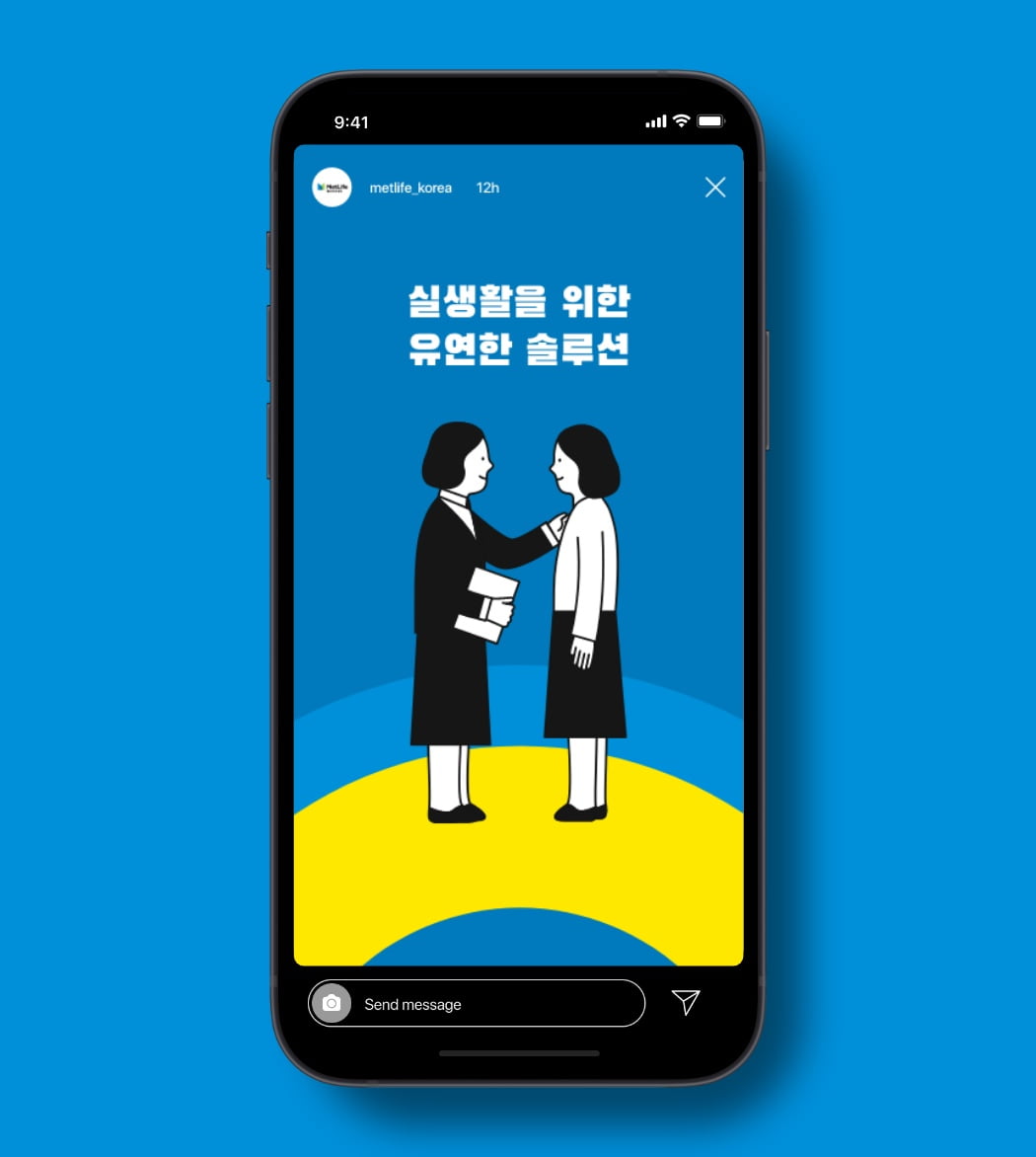
The digital expression of the Korea brand should be rooted in Korean heritage, yet be bold and modern. We introduce a new, bolder color that brings in warmth and vibrancy, and allow our illustrations speak to MetLife’s expertise. Photography should always be optimistic, and portray authentic human connection.
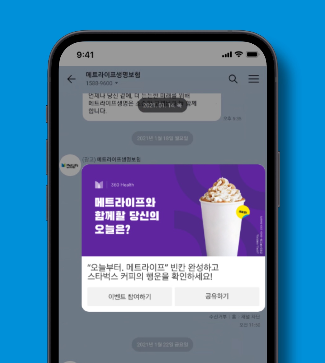
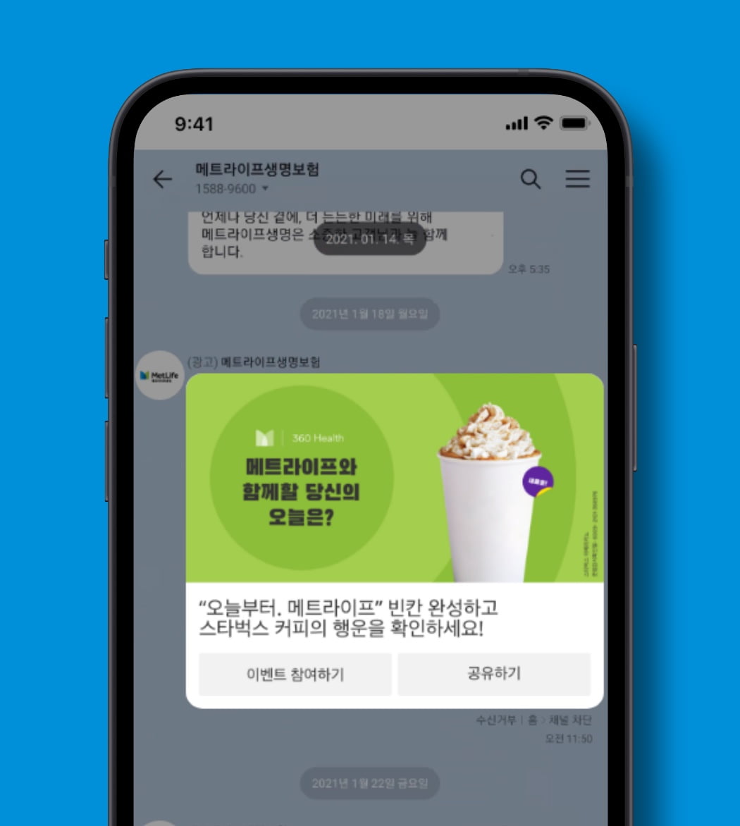
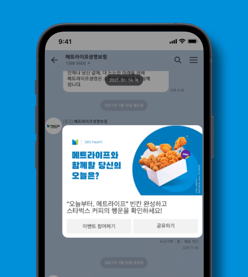
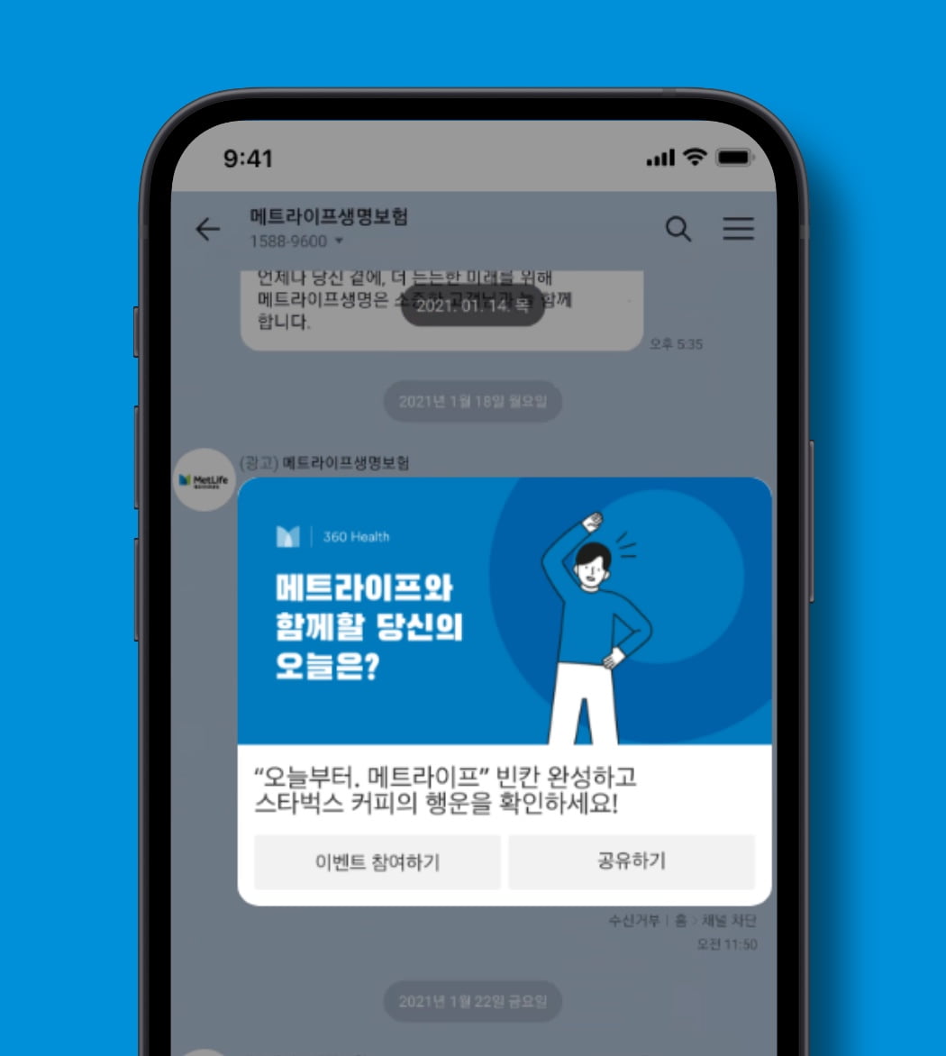
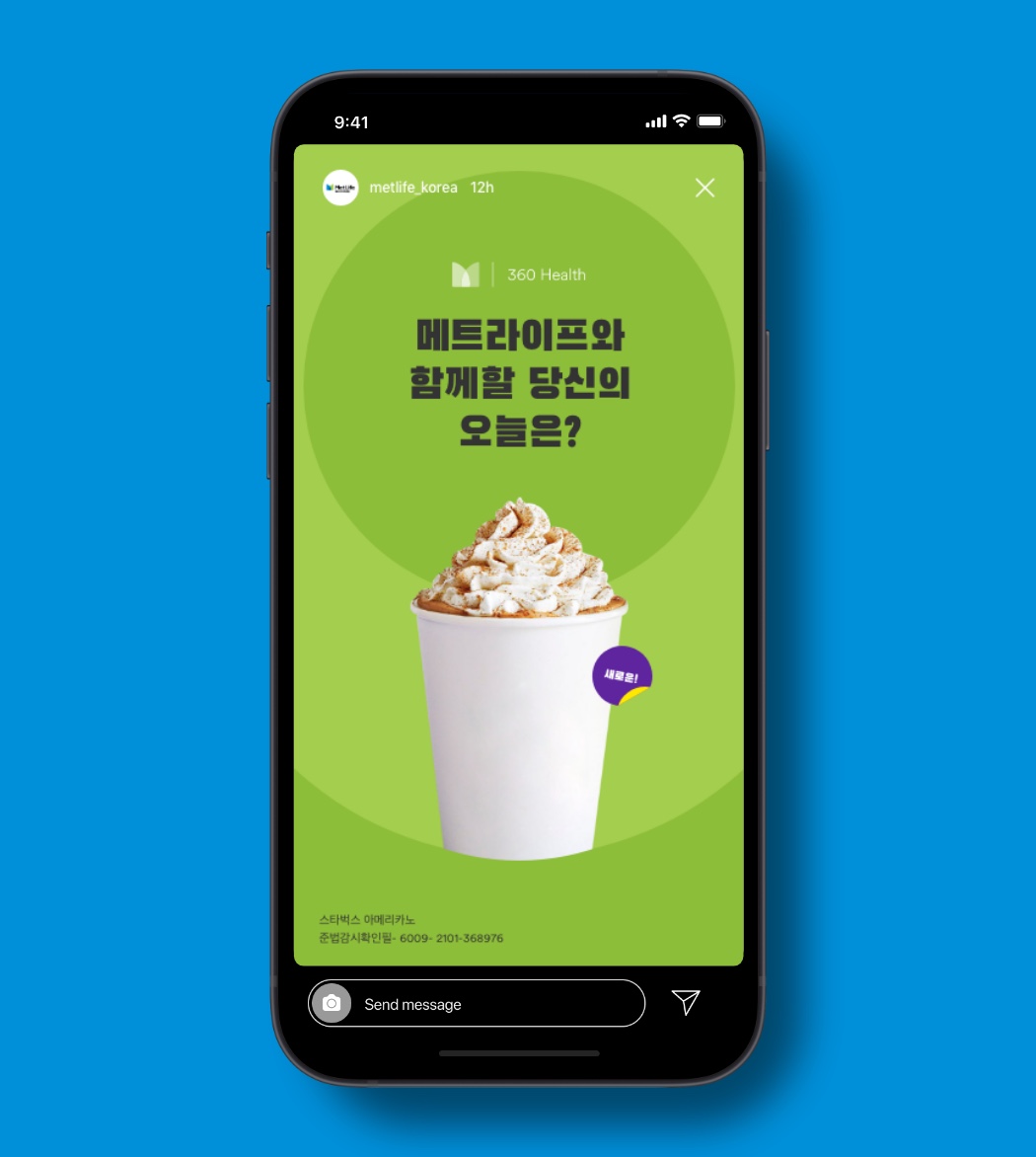
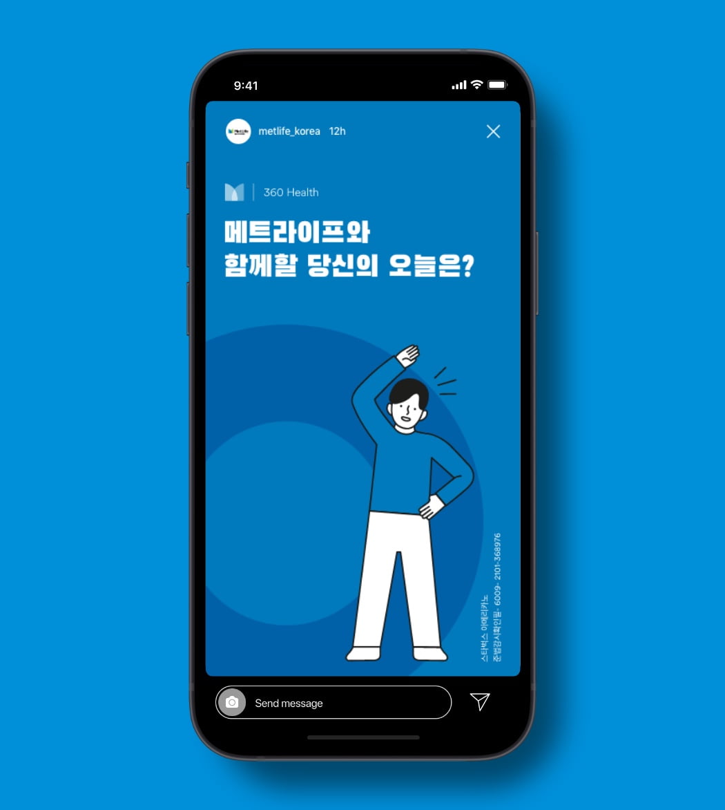
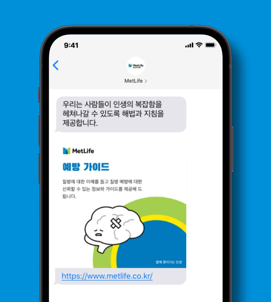
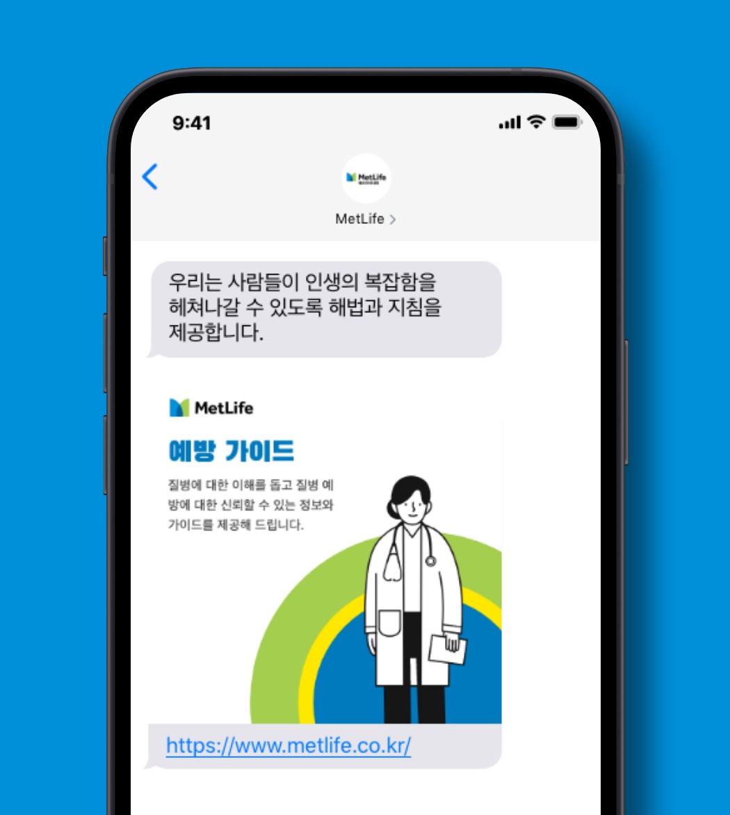
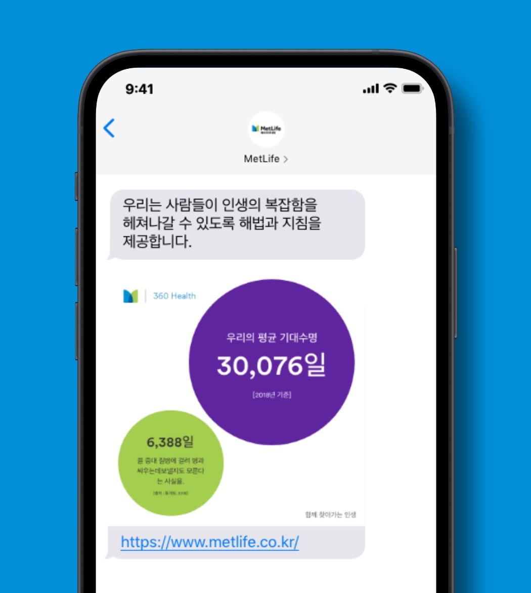
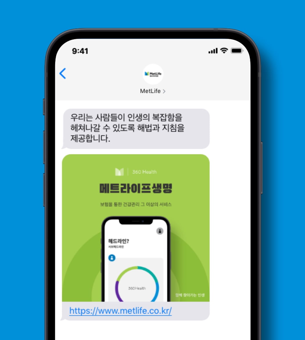
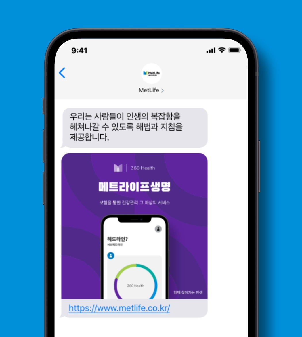
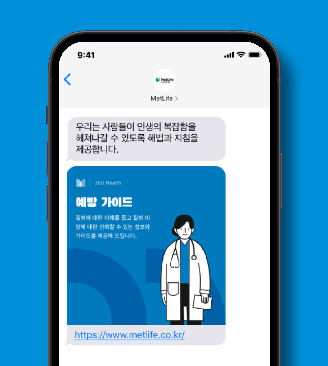
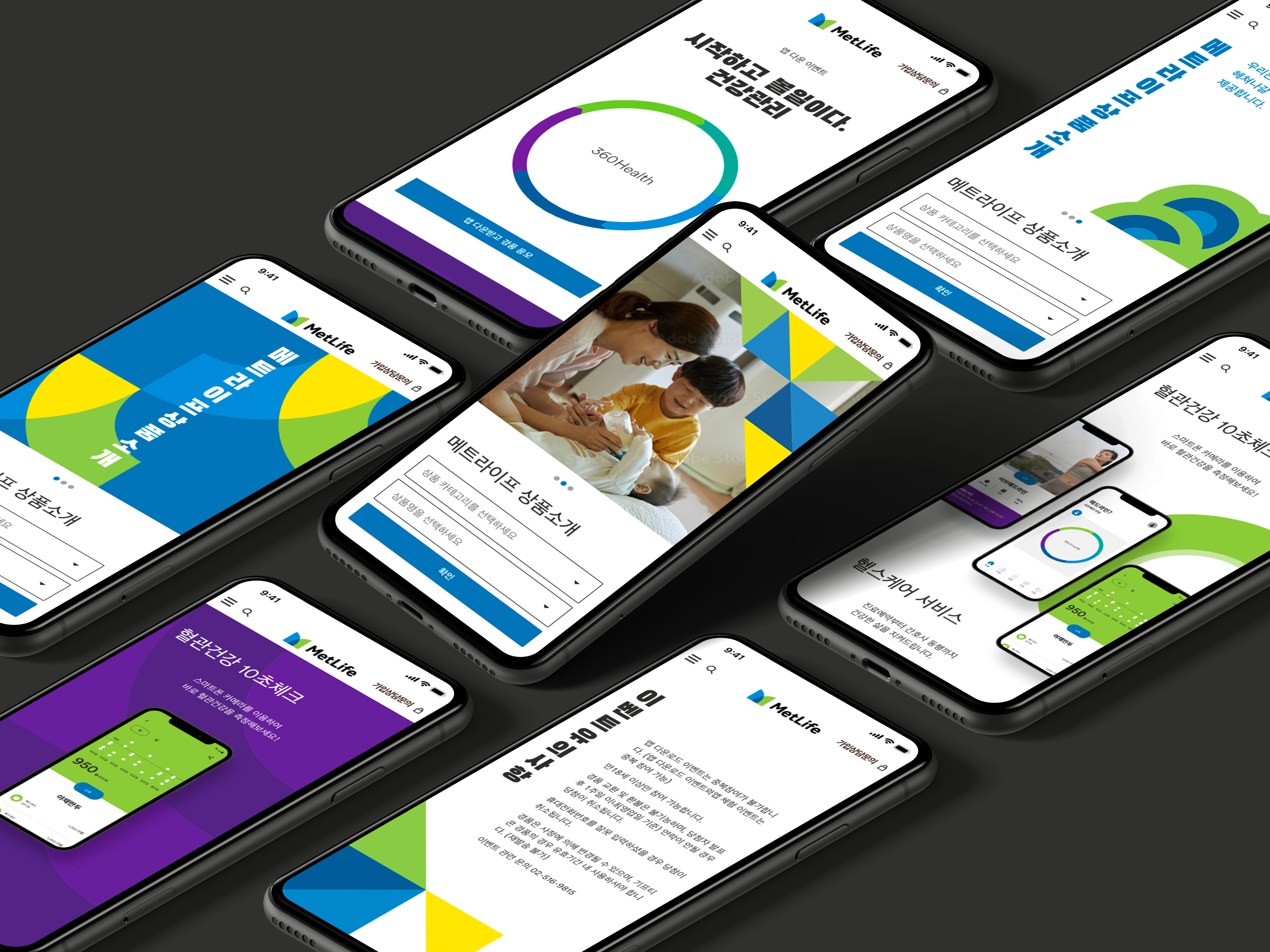
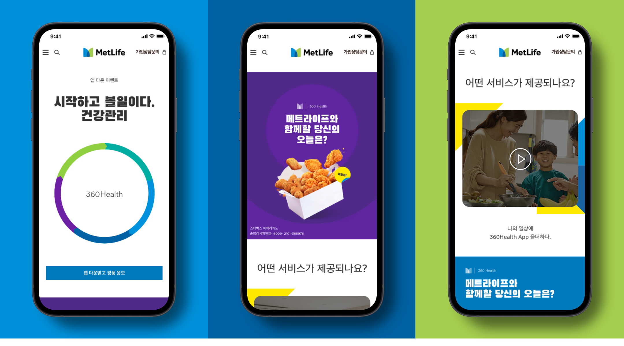
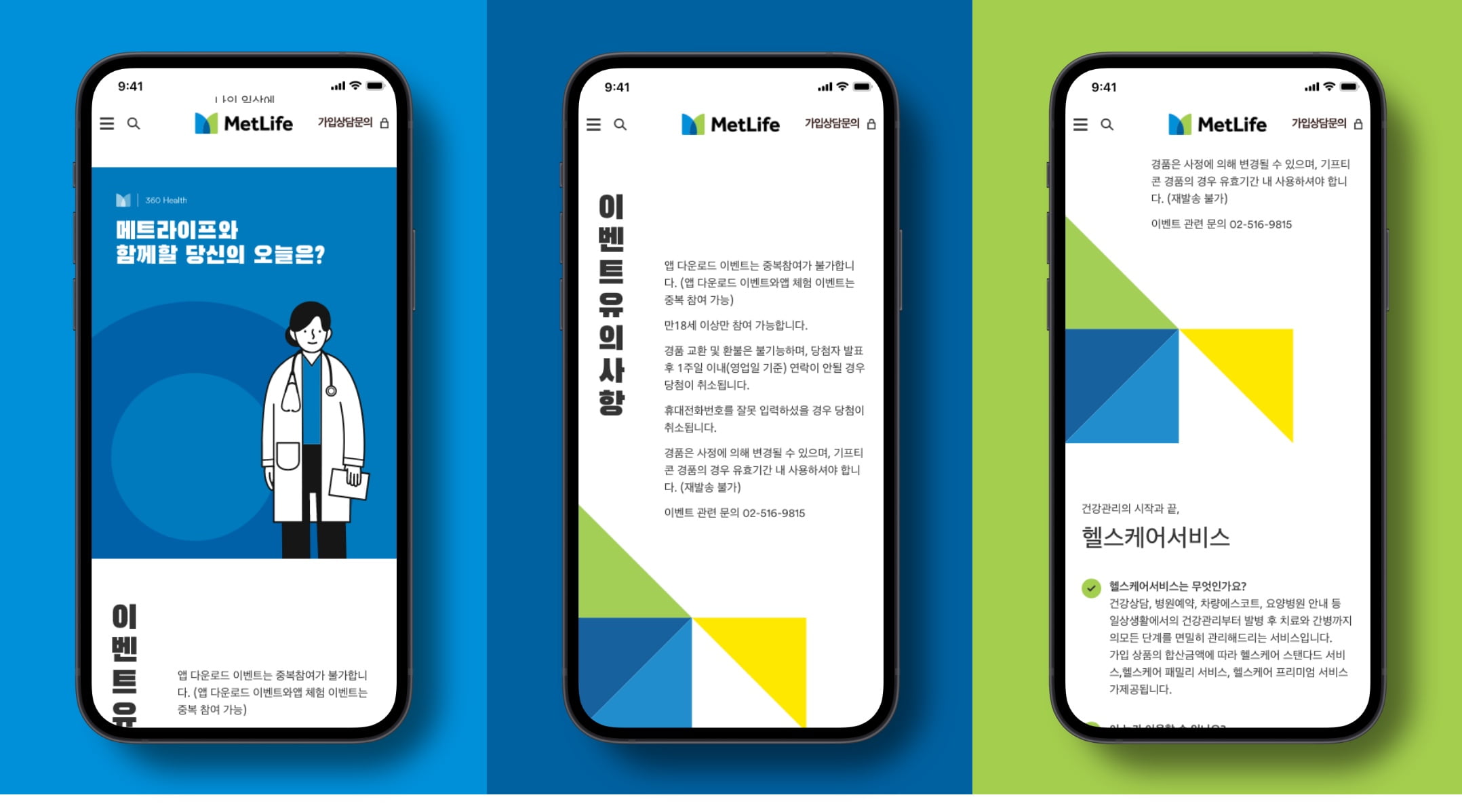
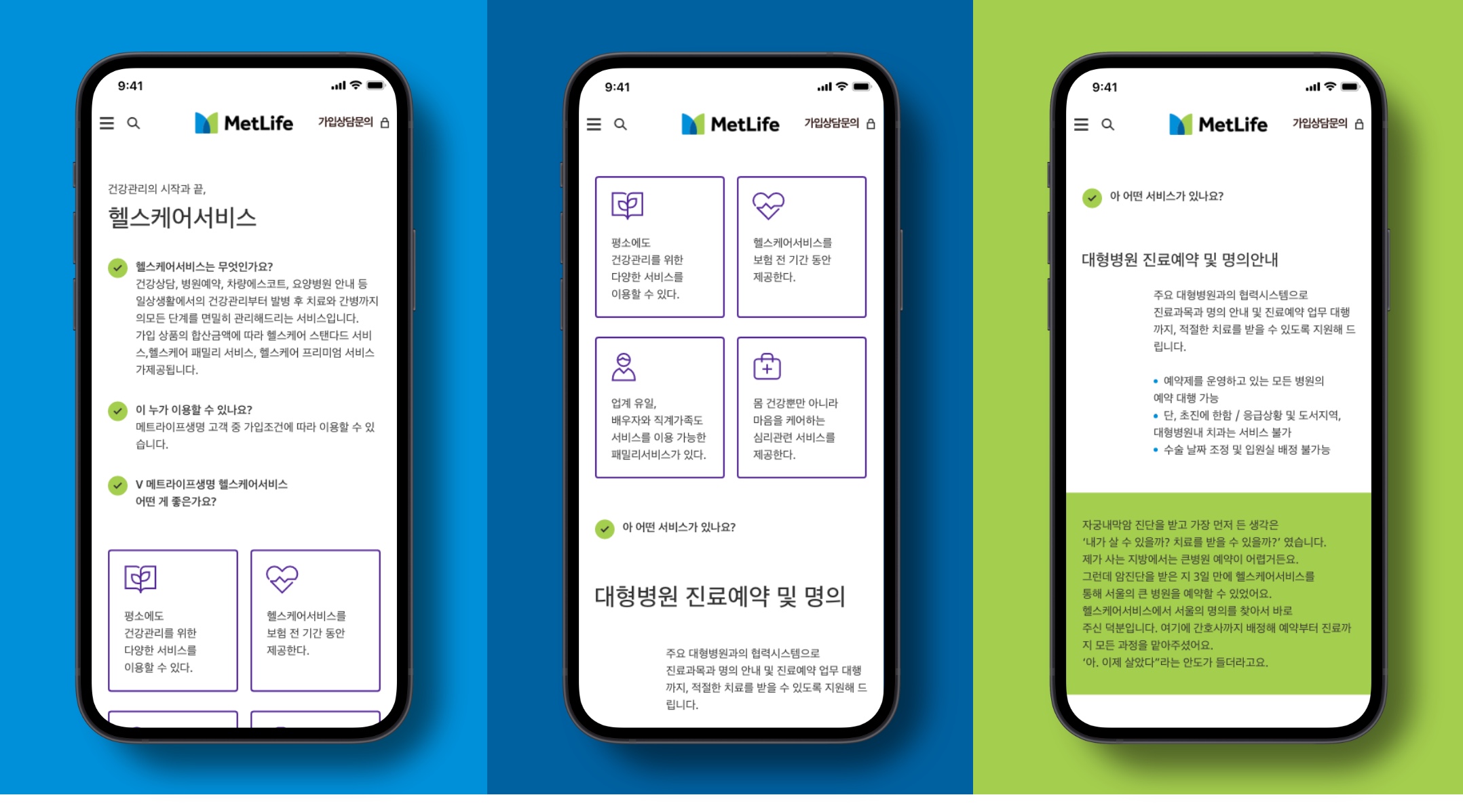
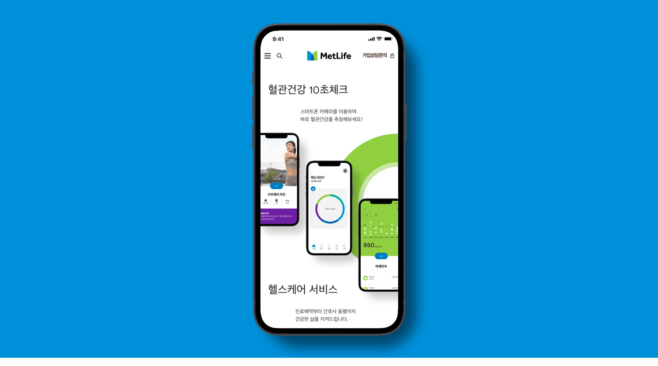
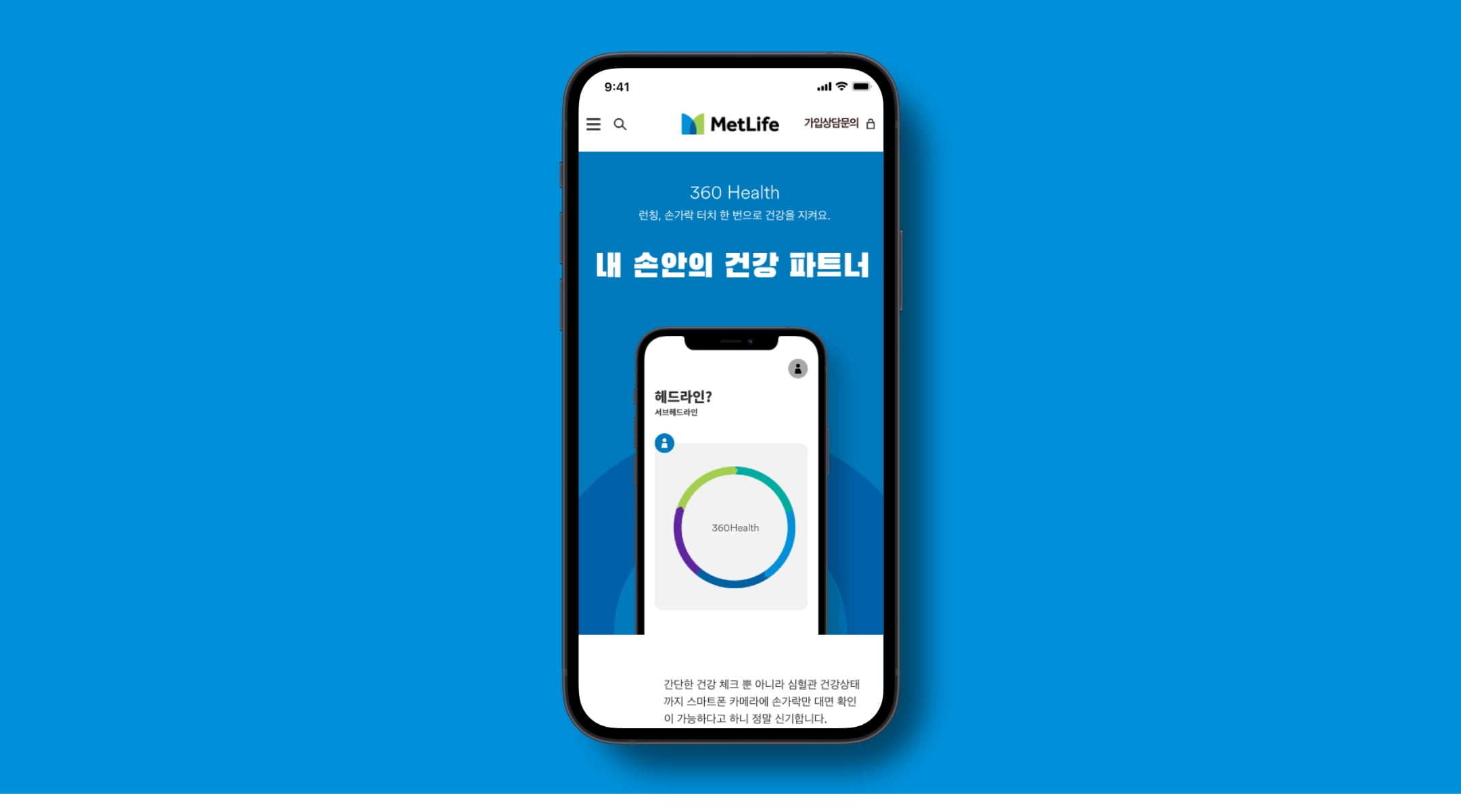
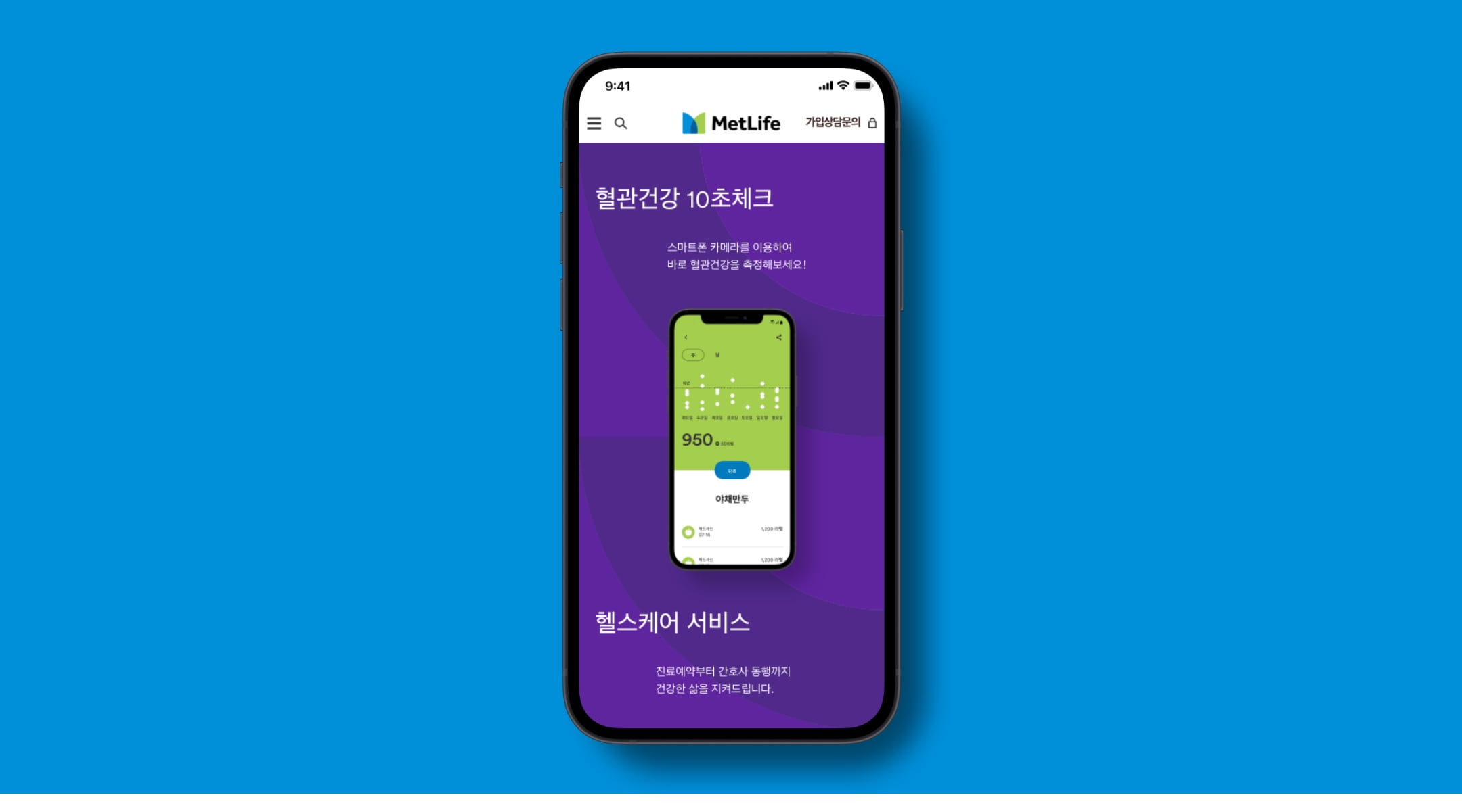
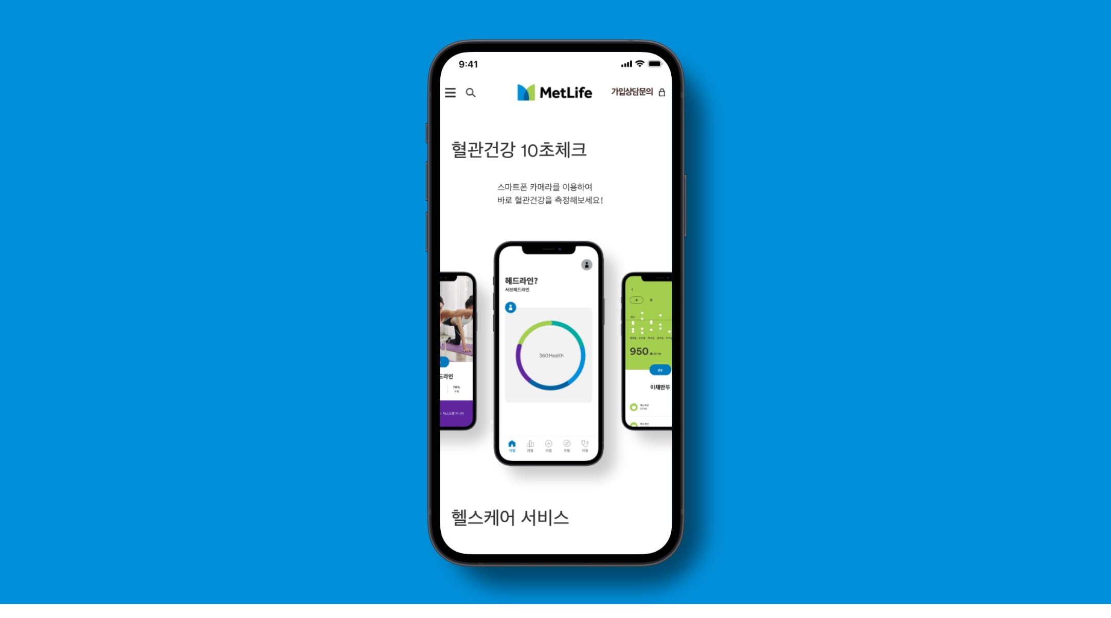
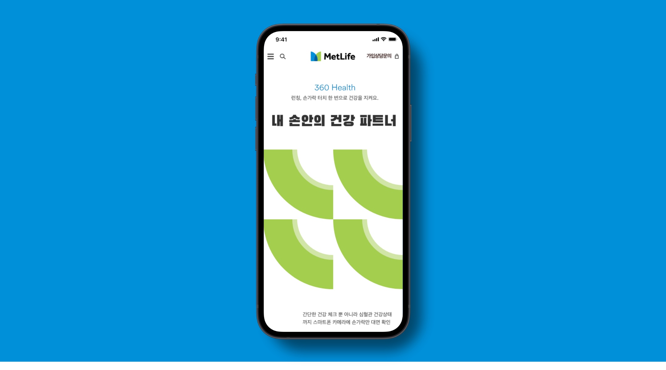
360Health

Included below are examples of how the brand comes to life via 360Health communications. For these moments, we increase the use of the circle motif, reduce the use of the bright yellow, and (when possible) tie our color choices back to the 5 Care Pathway layers of service.

Collage of phone screens with photography, typography, illustration, and color.

Digital Guidance

Explore these pages for specific guidance on how to use our brand elements in the Korean market.

Social

In social, we keep designs minimal and focused, allowing the key message to be easily understood. While each post is focused, we use a mix of bold color, vertical typography, illustrations and photography across our posts to create a sense of vibrancy and dynamism. When running a promotion, we integrate the promo message directly into the MetLife brand.

Collage of phone screens showing design examples of social media content.

Kakao

Instagram

SMS

In text based communications, we are more restrained with our use of brand. We understand that in these moments delivering a higher amount of information is key so we create simple, functional visuals that use just enough branding to be recognizable but never get in the way.

Website

In more functional moments on the web, we use color and graphics to draw the user’s eye down the page and complement key information with photography and illustration. We’re always intentional with where and how much of the brand is brought in. For example, header moments introduce the brand, so they can be more expressive, whereas input fields are about utility, so the brand should not get in the way of the task a user is looking to accomplish.

Collage of phone screens showing design examples in context of a website.

Campaign Landing Page

Product Landing Page

Homepage