SOUTH KOREA
Color
Overview
Inspired by the traditional Korean color spectrum Obangsaek, we’ve added Yellow as a warm, vibrant accent color that nods to nature and everyday life.
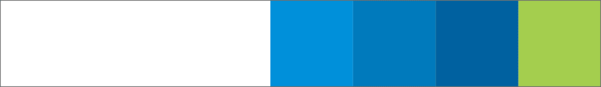
Primary
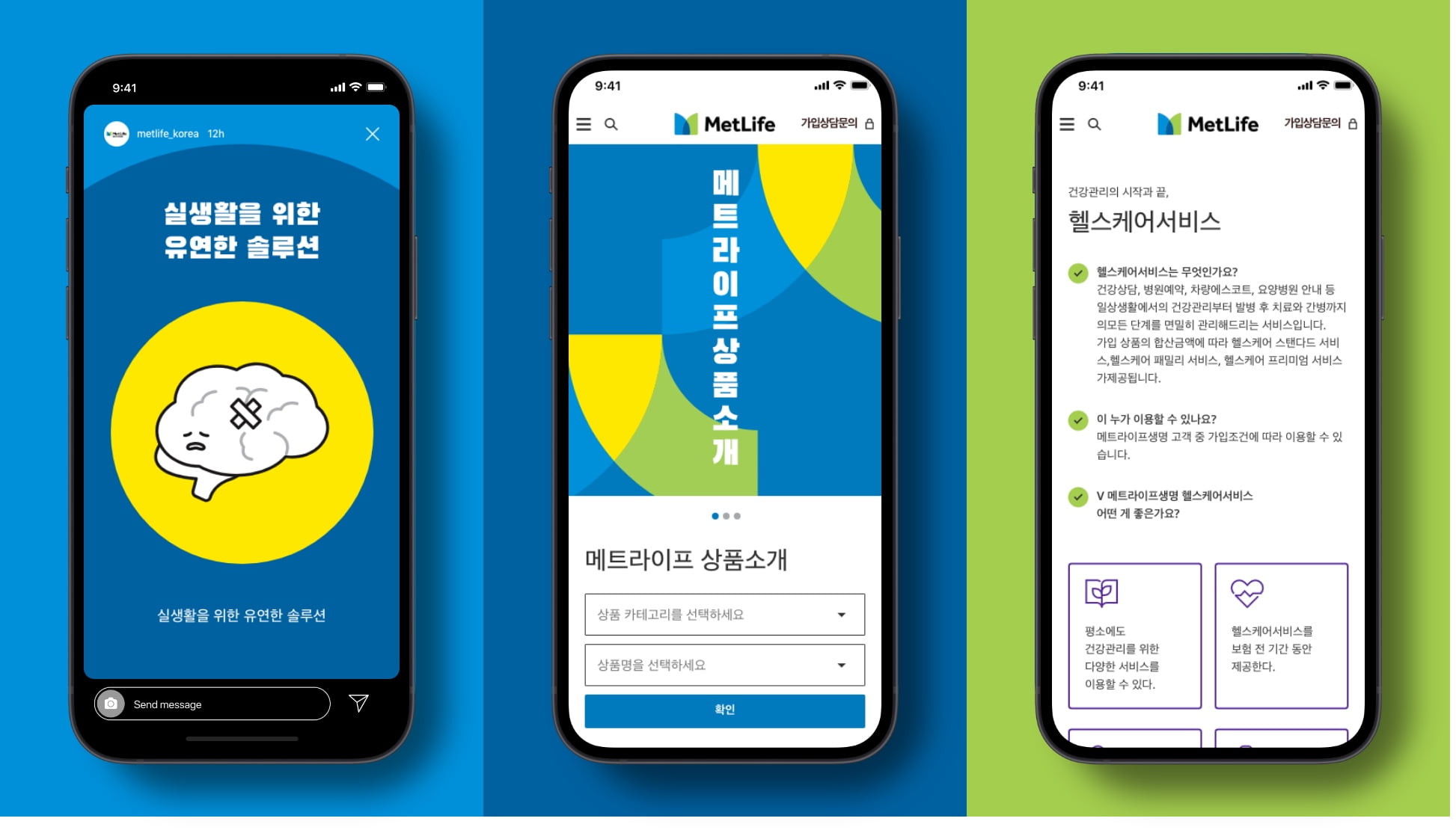
Our primary color palette features calm and refreshing blues and greens that reflect expertise and trustworthiness. All digital applications should start from a base of white, with blue as the primary color and green used slightly less.
Neutrals
Neutrals are how we always start a layout (almost always on white). Use neutrals as a canvas, and to ground all elements in a clear and legible way.

Secondary
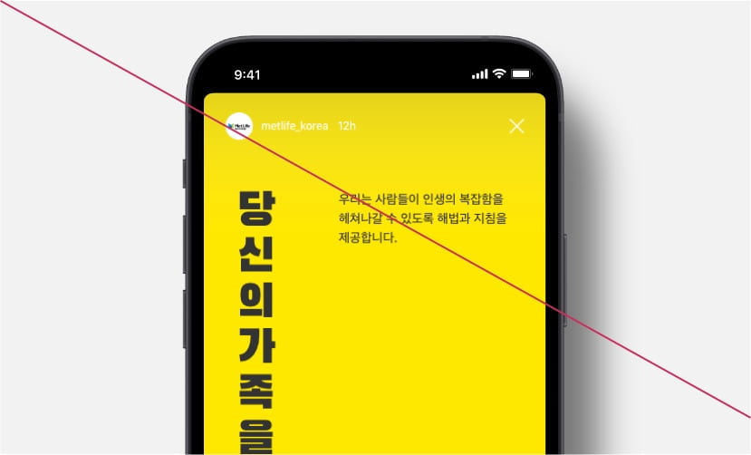
Yellow is introduced as secondary palette color to help create vibrancy. This color should be used sparingly to accent our primary palette.
Guidance
Use Yellow to accent our primary palette.
- Use Yellow on graphics to help create vibrancy.
- A maximum of 1/4 of the page should be Yellow.
- Use secondary colors in large proportions.
- Use secondary colors in any text.
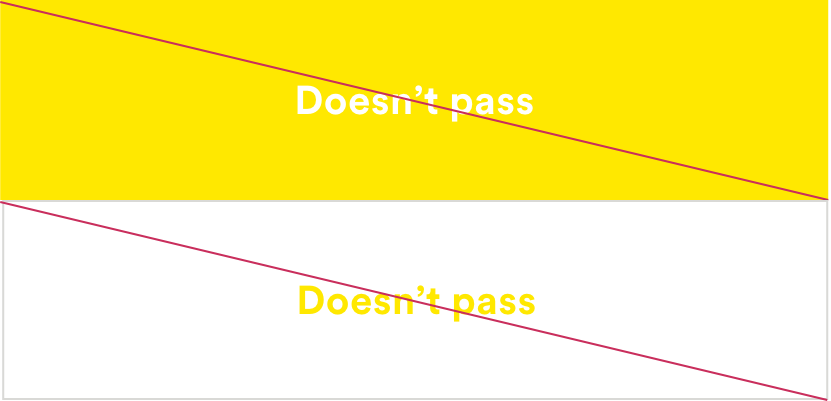
Accessibility
MetLife is committed to designing and developing digital experiences that all our customers are able to use. We stick to contrast ratios that meet WCAG 2.1 (Level AA) standards.
Design using color combinations that meet accessibility standards for contrast.
- Use our guide below to help with decisions regarding color combinations with typography. We follow the latest standards from the WCAG (Web Content Accessibility Guidelines).
- A contrast ratio of 4.5:1 for normal text below 24 px is required.
- A contrast ratio of 3:1 for large text above 18 px and bolded, or 24px or larger for non-bolded text.
- Use these color combinations.

- Use these color combinations.
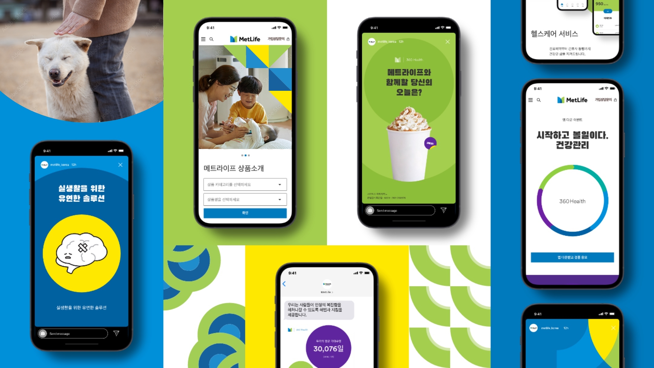
More from Korea
Showcase