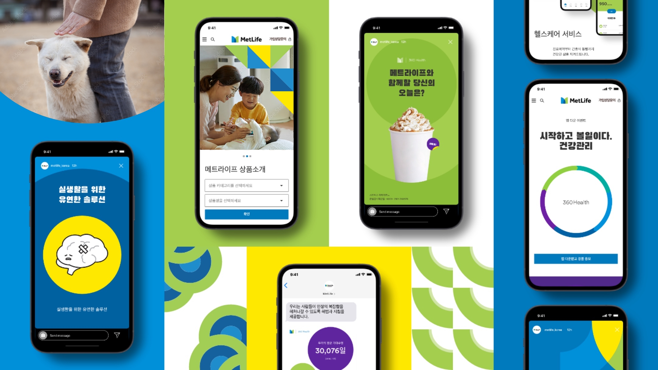
SOUTH KOREA
Typography
Overview
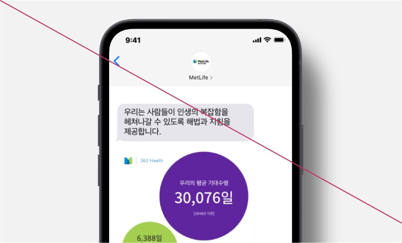
In Korea we introduce Black Han Sans as a new font for headlines and use Noto Sans as the primary font. We only use MetLife Circular© for numbers in the Korean market.
Black Han Sans
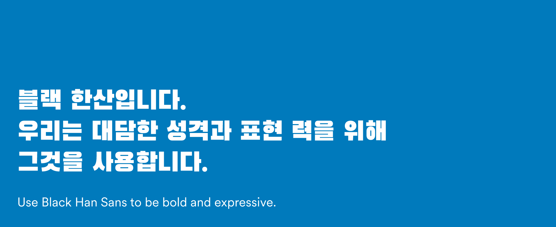
Black Han Sans
Black Han Sans is a Google font. You can download it from the Google Fonts site.
Download
Guidance
Do
Use Black Han Sans to be bold and expressive.
- Use Black Han Sans for headlines.
Do
Use Noto Sans on any other type of text.
- Use Noto Sans on sub headlines, eyebrows, and body copy.
Do
Use MetLife Circular© on English characters and numbers.
- Use MetLife Circular© on numbers.
- Use MetLife Circular© on any messaging that is written in English.
Do
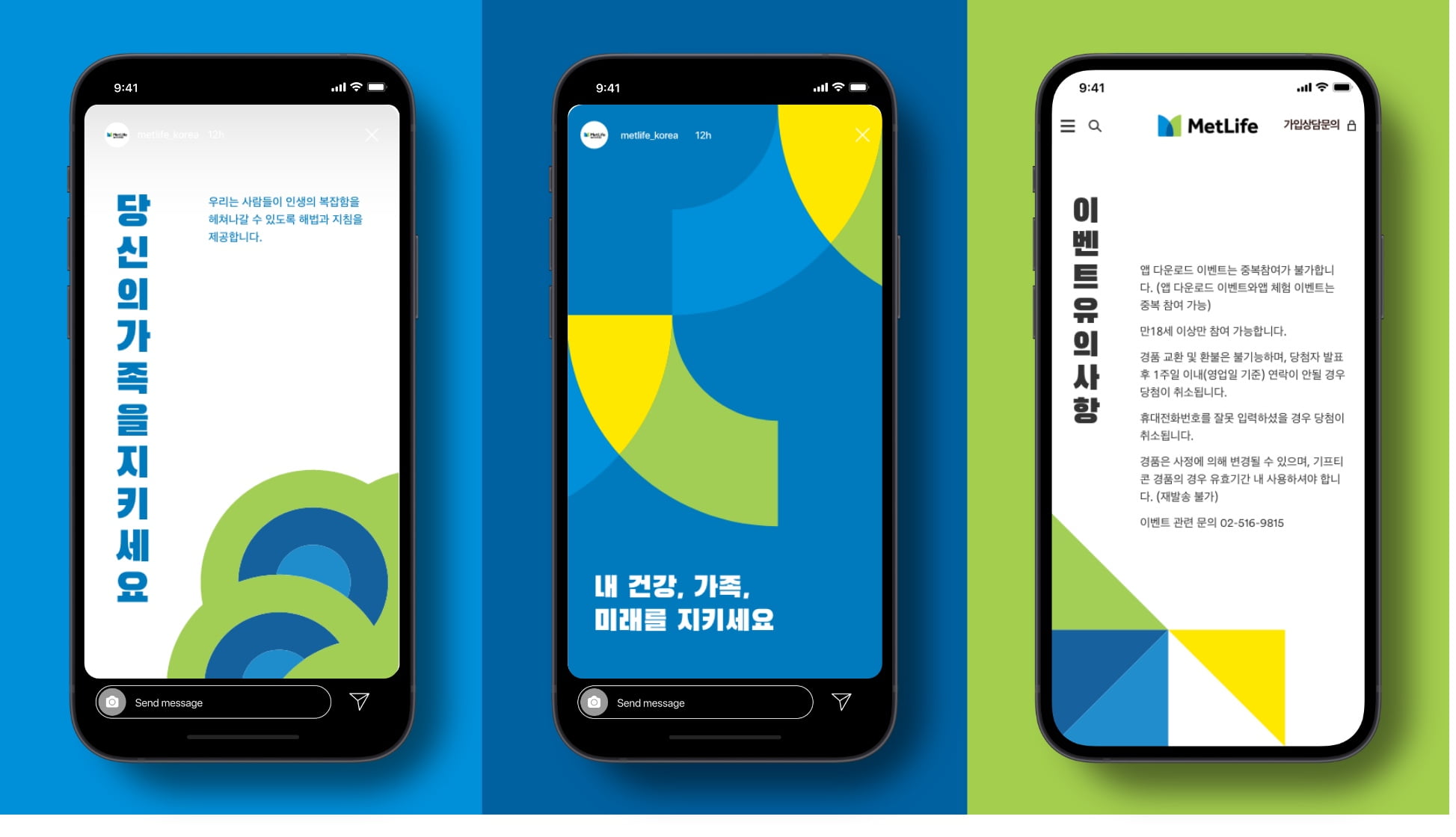
Create clear hierarchy using horizontal and vertical typesetting.
- Write vertically in headlines to be emotional and demonstrate our understanding for the culture.
- Write horizontal everywhere else. It’s mandatory for sub headlines and long-form copy.
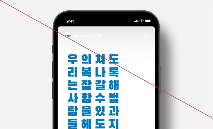
Don't
- Display long headlines vertically.
Don't
- Display numbers in Noto Sans.
Design Assets
More from Korea
Showcase