JAPAN
Typography
Overview
In Japan we deviate from the global brand by using Noto Sans as our primary font. We only use MetLife Circular© for numbers in the Japanese market.
Guidance
Do
Use Noto Sans as the primary font.
- Use Noto Sans for every type moment. That includes headlines, sub headlines, eyebrows and body copy.
Do
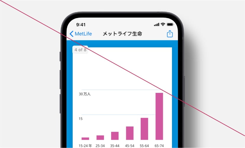
Use MetLife Circular© for English characters and numbers.
- Use MetLife Circular© for numbers.
- Use MetLife Circular© for any messaging that is written in English.
Do
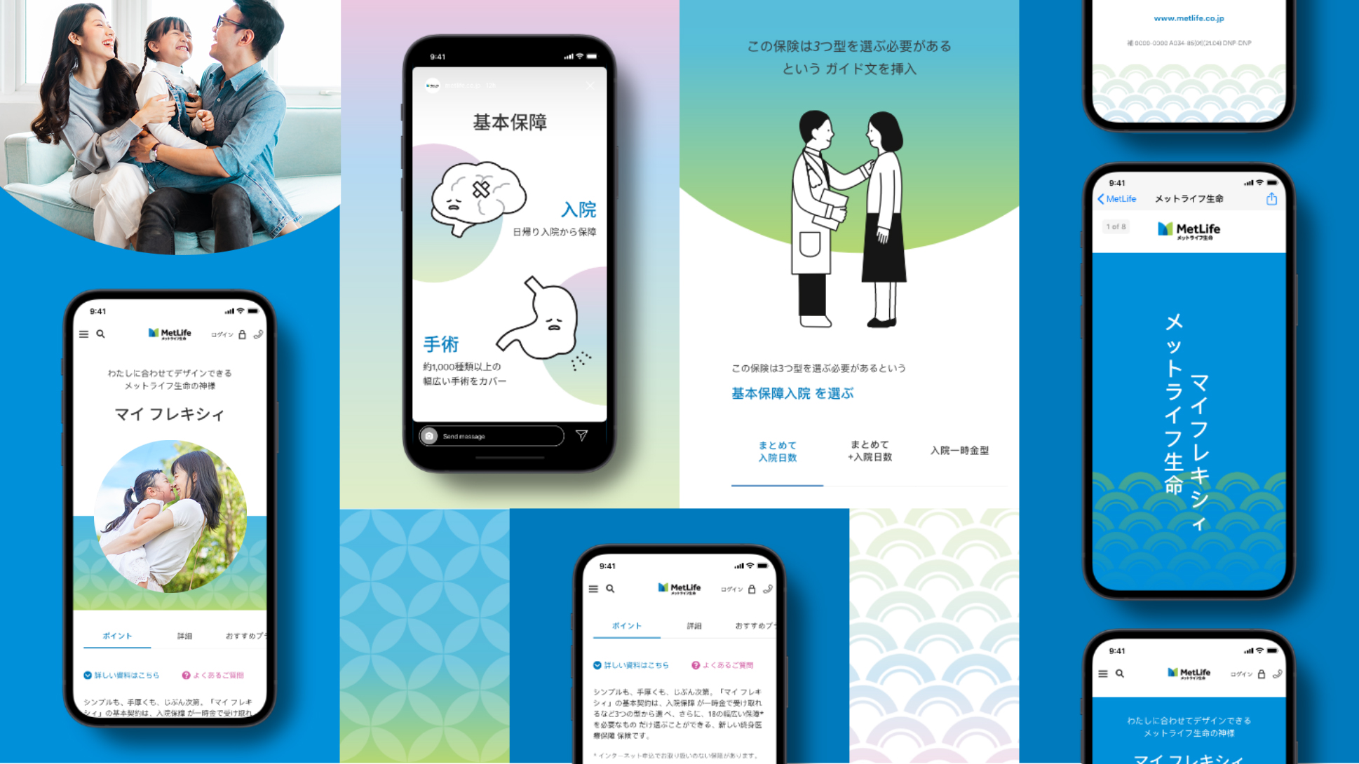
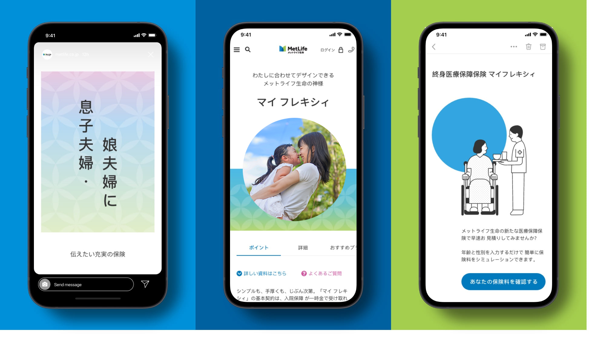
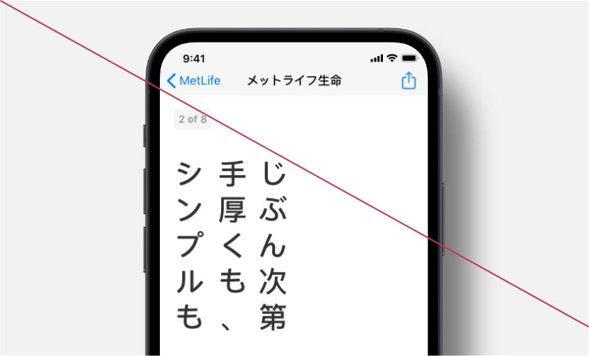
Create clear hierarchy using horizontal and vertical typesetting.
- Write vertically in headlines to be emotional and demonstrate our understanding of the culture.
- Write horizontally everywhere else. It’s mandatory for sub headlines and long-form copy.
Don't
- Display long headlines vertically.
Don't
- Display numbers in Noto Sans.
More from Japan
Showcase