JAPAN
Color
Overview
In communications for Japan, we use a warm color palette with gentle gradients, while maintaining a sense of harmony with our color system.
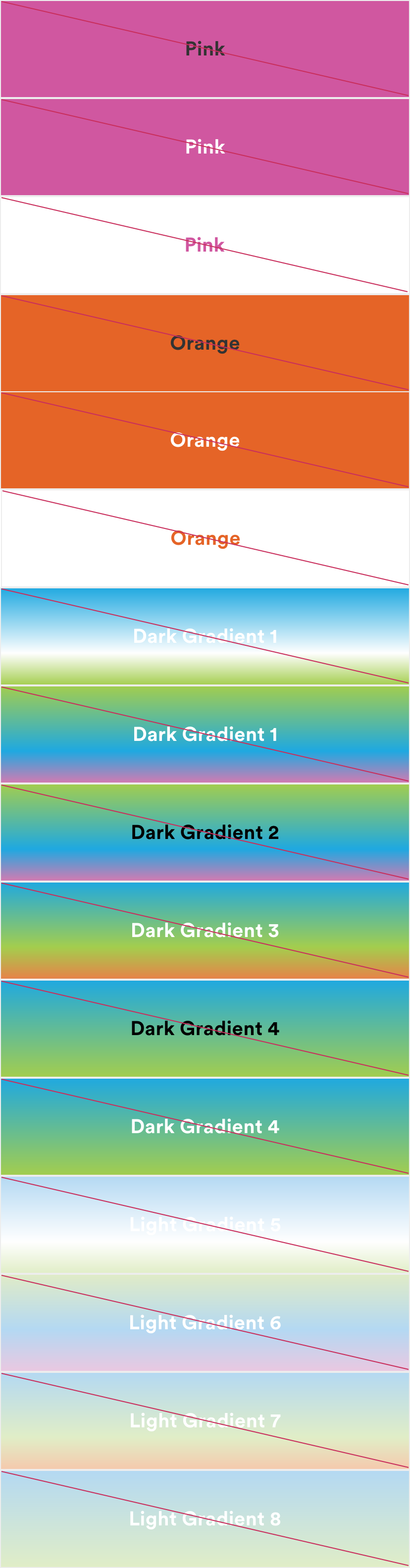
Primary
The primary color palette is the same for Japan as it is for the global MetLife brand. These colors are the primary colors used in any digital application, in equal amounts, with plenty of white space to add modernity and freshness.

Neutrals
Neutrals are how we always start a layout (almost always on white). Use neutrals as a canvas, and to ground all elements in a clear and legible way.

Secondary
Pink and Orange are introduced as secondary palette colors to help create vibrancy. These colors should be used sparingly to accent our primary palette.
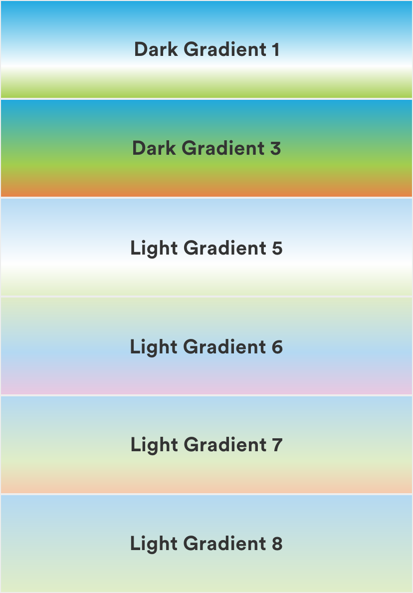
Gradients
Gradients are used to add vitality and energy to a composition. They are most suited for use in marketing and key moments within an experience.
Guidance
Color breathes life into the digital experiences we design and helps create an association with the brand. Here are a few things to keep in mind as you work with color.
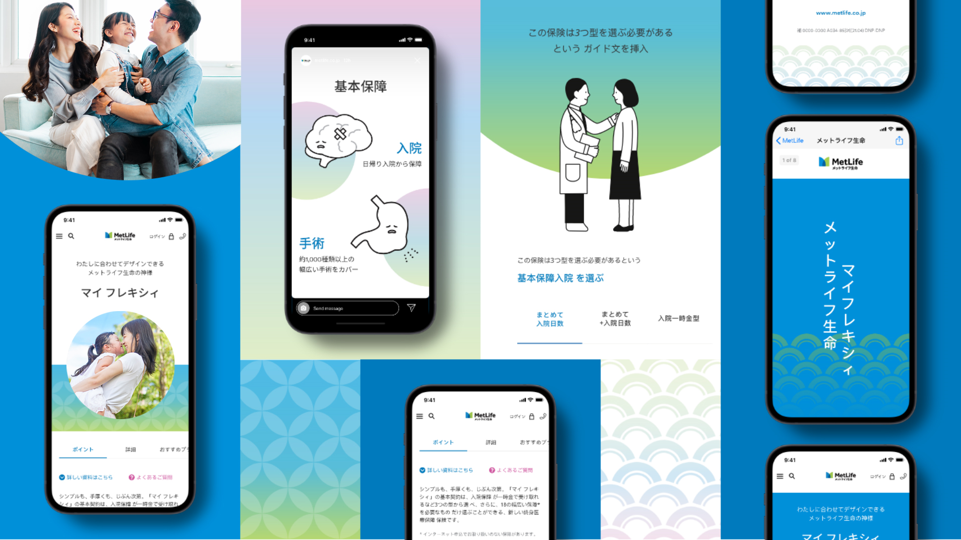
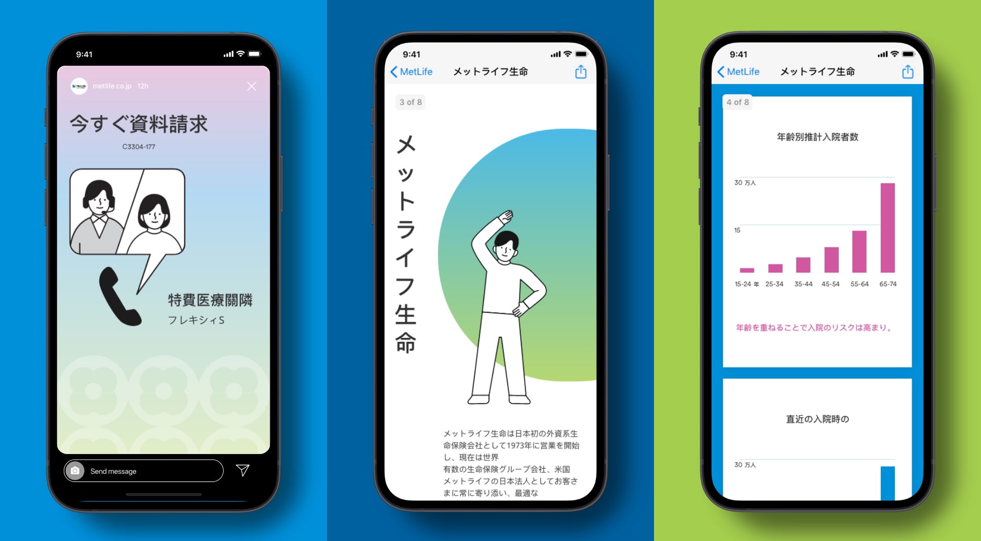
Marketing
Here are some helpful guidelines for flexing our color system in communications for the Japanese market.
Build warmth.
- Use light gradients subtly when a more subdued palette is required.
- Use dark gradients to add vitality and energy to a composition.
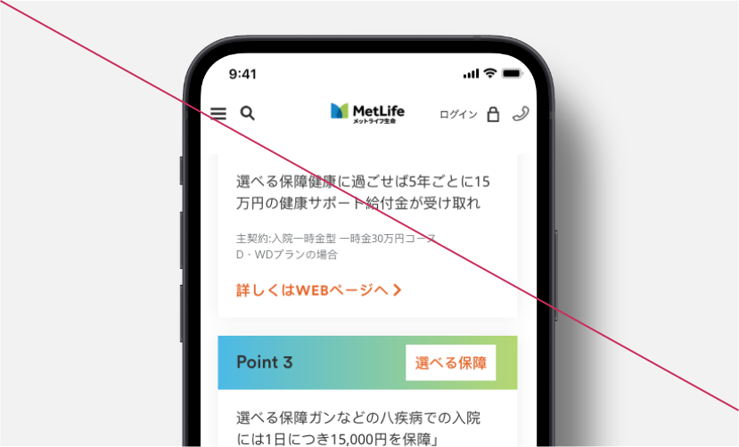
Use gradients to introduce a new section.
- Combine cropped gradients and illustrations to introduce a new piece of content or section.
Use secondary colors to represent data.
- Use bold secondary color palette to focus on the main graphic information.
- Use secondary colors as brand ambassadors.
- Create new gradients. Stick to existing ones.
User Interface
We can also use color differently in UI moments to cater to our customers in Japan.
Use gradients on hero moments.
- Combine gradients and illustrations to introduce a new piece of content or section.
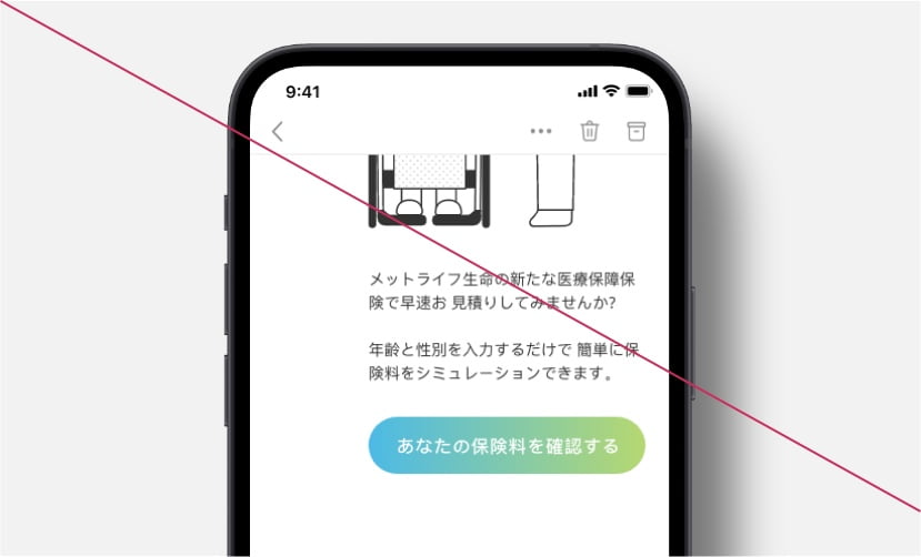
Call to action with gradients.
- Use gradients on strokes in secondary CTAs.
- Use gradients on card headers.
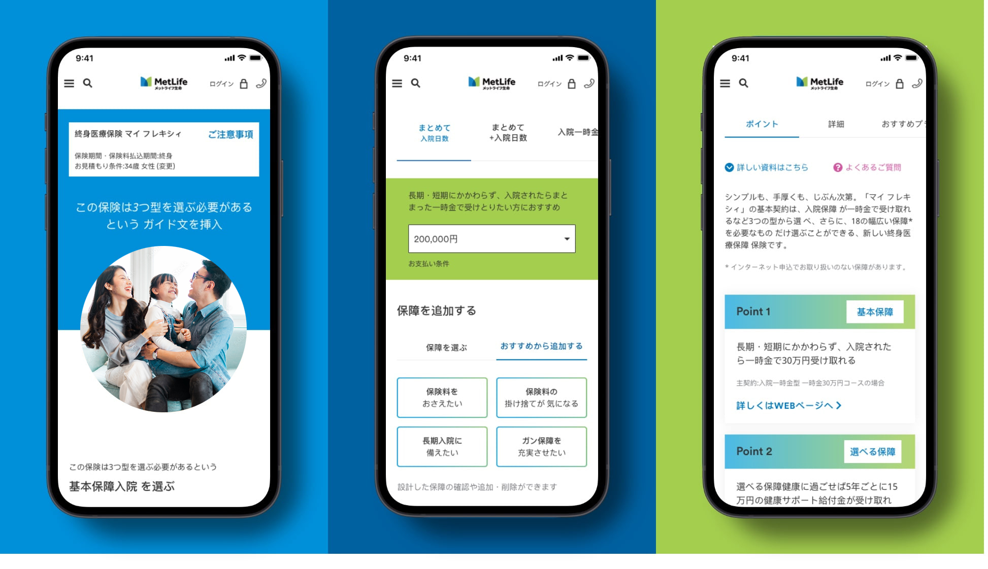
- Use secondary colors on actionable items.
- Use gradients on primary CTAs.
Accessibility
MetLife is committed to designing and developing digital experiences that all our customers are able to use. We stick to contrast ratios that meet WCAG 2.1 (Level AA) standards.
Design using color combinations that meet accessibility standards for contrast.
- Use our guide below to help with decisions regarding color combinations with typography. We follow the latest standards from the WCAG (Web Content Accessibility Guidelines).
- A contrast ratio of 4.5:1 for normal text below 24 px is required.
- A contrast ratio of 3:1 for large text above 18 px and bolded, or 24px or larger for non-bolded text.
- Use these color combinations.
- Use these color combinations.
More from Japan
Showcase