STANDARDS
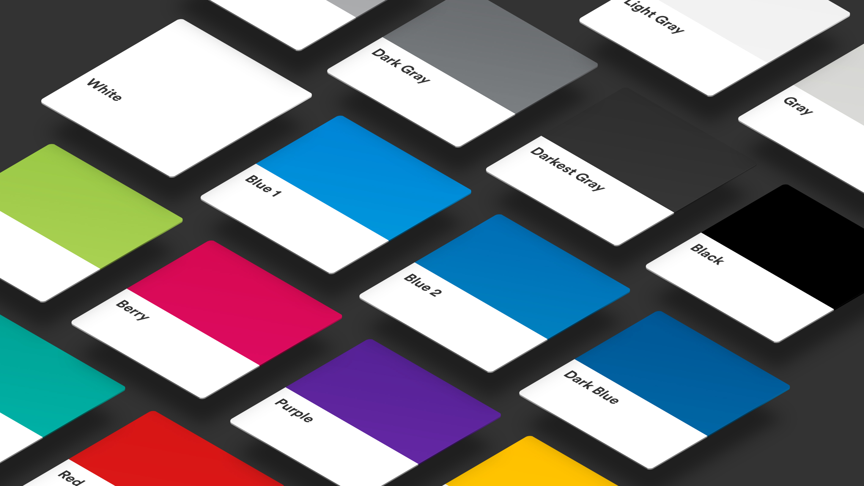
Color
Overview
Color is often the first thing a user notices when interacting with the brand, especially in digital spaces. Our colors are bold, bright, and expressive—making MetLife instantly recognizable.
Standards
Primary
Our primary color palette features calm and refreshing blues and greens that reflect expertise and trustworthiness. All digital applications should start from a base of white, with blue as the primary color and green used slightly less.

Neutrals
Neutrals are how we always start a layout (almost always on white). Use neutrals as a canvas, and to ground all elements in a clear and legible way.

Secondary
Secondary colors help bring vitality to our brand. While generally used sparingly in the global brand, some localized markets amplify these colors in digital.


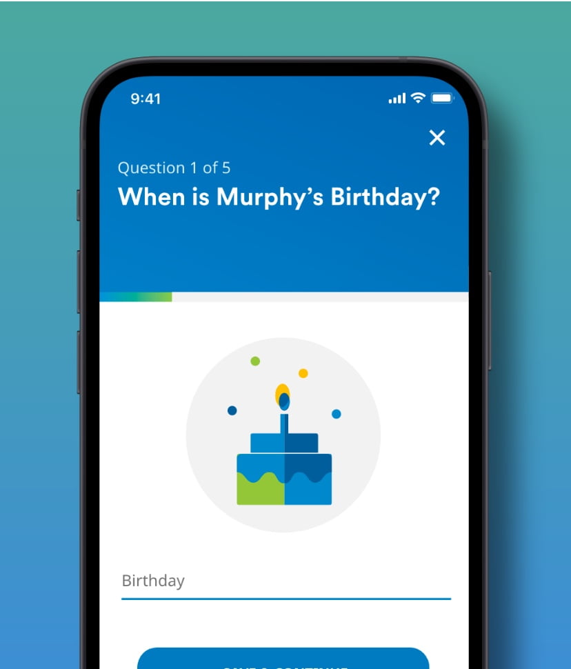
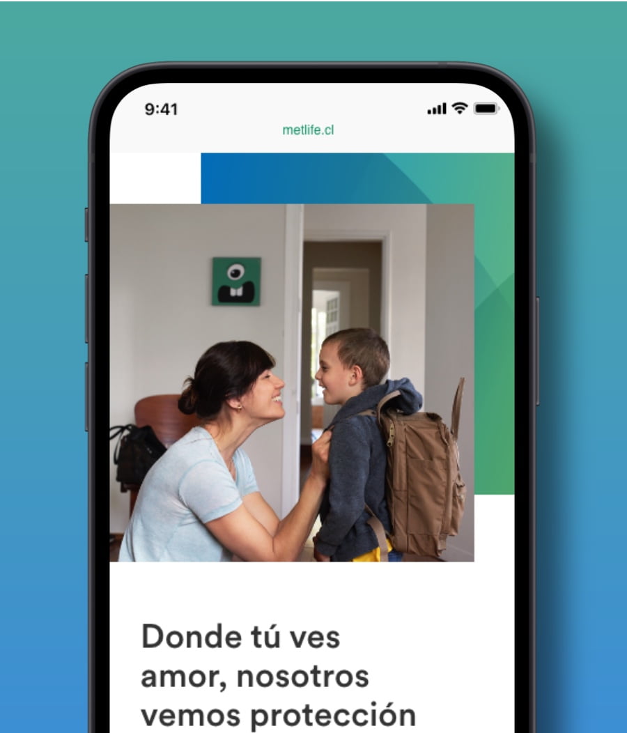
Gradients
Gradients are used to add vitality and energy to a composition. They are most suited for use in marketing and key moments within an experience.

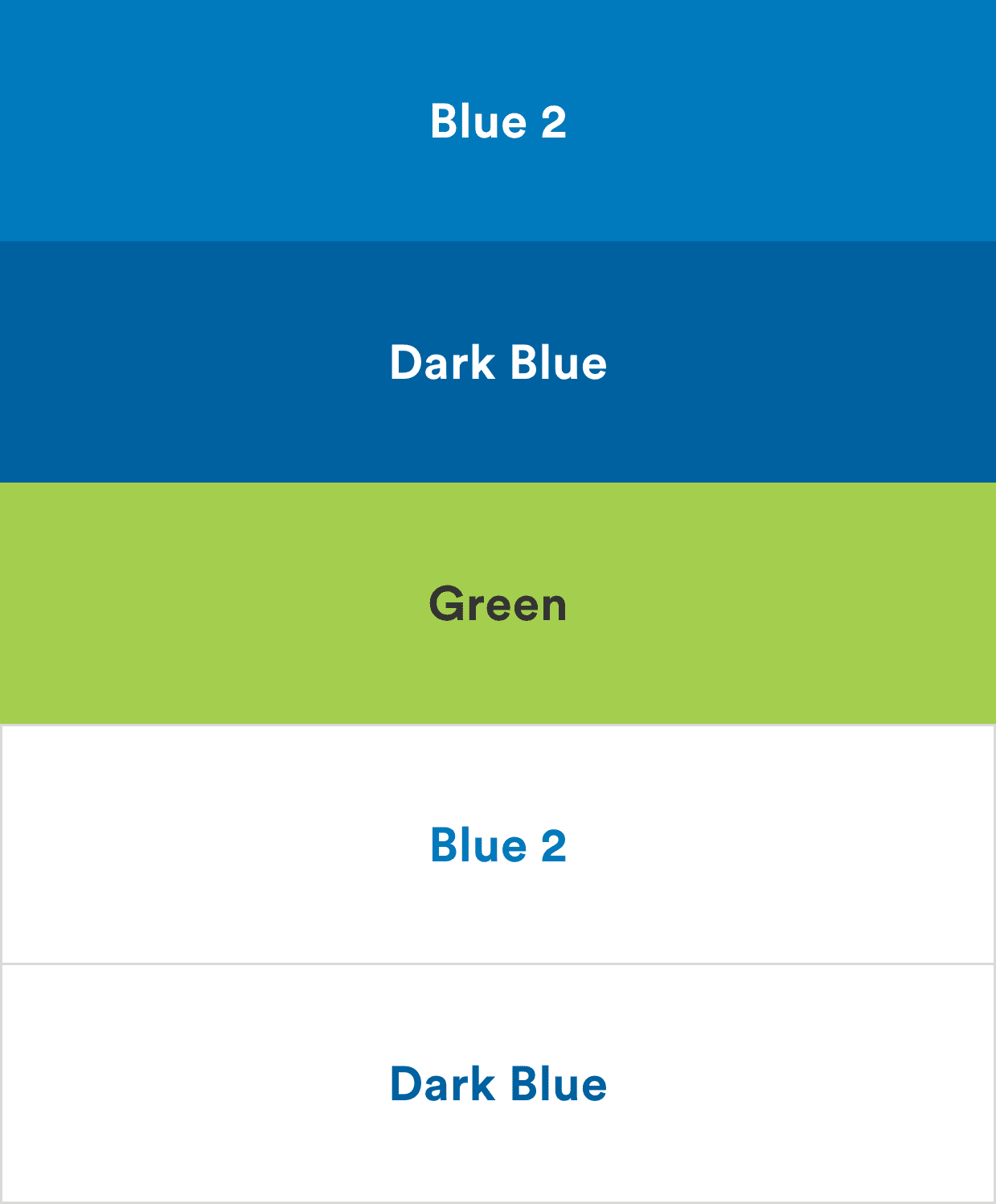
Swatches
Guidance
Color breathes life into the digital experiences we design and helps create an association with the brand. Here are a few things to keep in mind as you work with color.
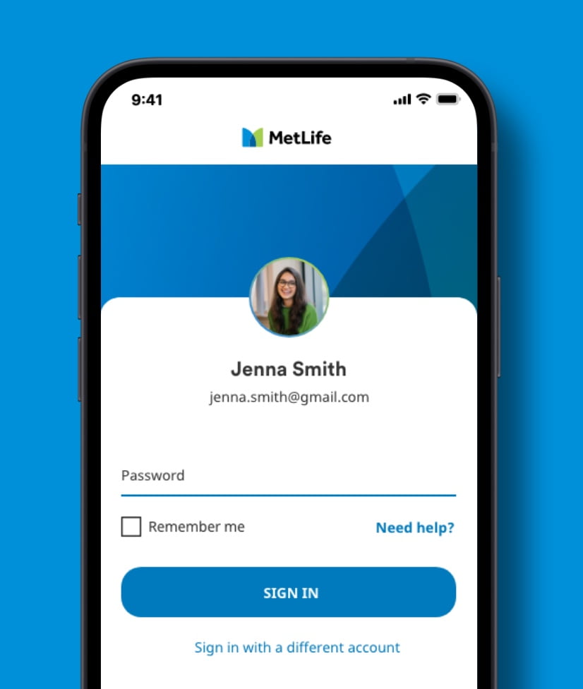
Start with White and Darkest Gray.
- As a general rule, layouts should start from a base of white space to add modernity and freshness.
- All text should be Darkest Gray, never Black.
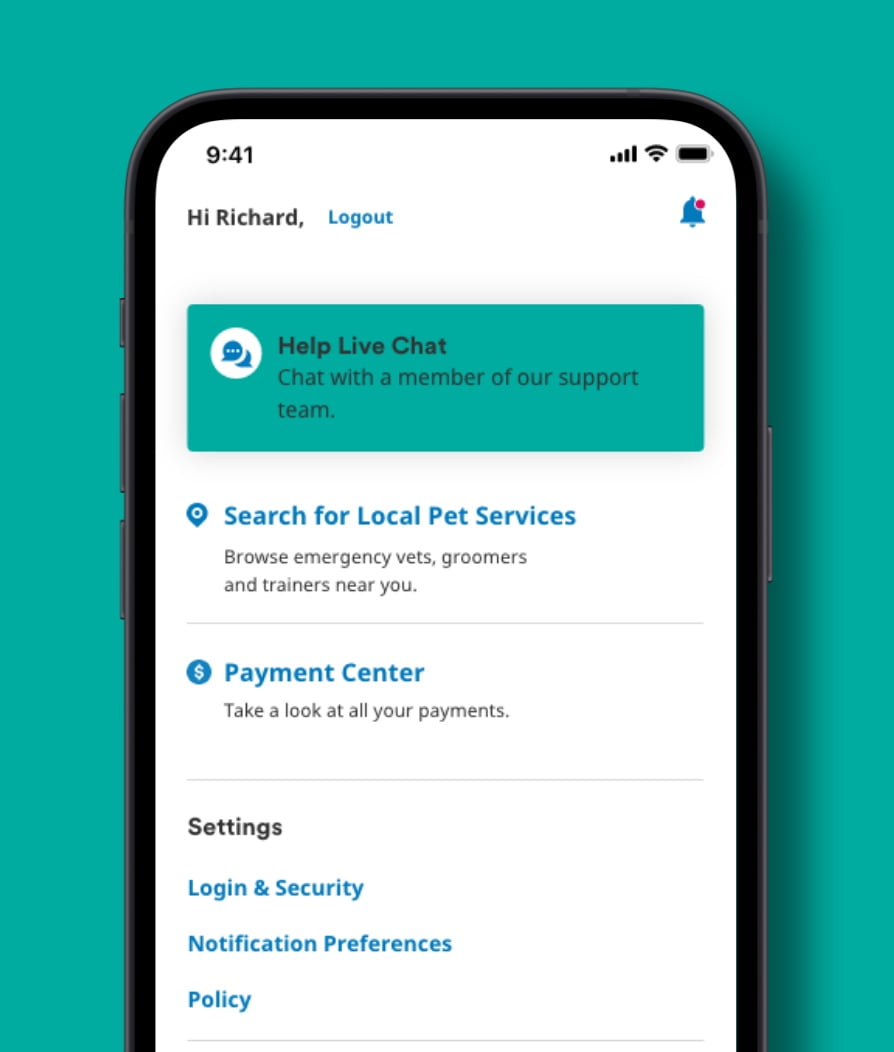
Use MetLife Blue and Green in the highest proportions.
- Use MetLife Blue 1, Dark Blue, and Green on illustration, graphics and backgrounds.
- Use MetLife Blue 2 on actionable items.
- Try to maintain a 70% Blue, and 30% Green relationship between the two main colors.
Accent with secondary colors.
- Use MetLife Teal, Purple, and Yellow (sparingly) to accent our core color palette.
- Make secondary colors the hero.

- Make text Green, or Blue, or Black. Always use Darkest Gray.

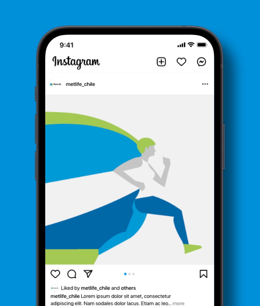
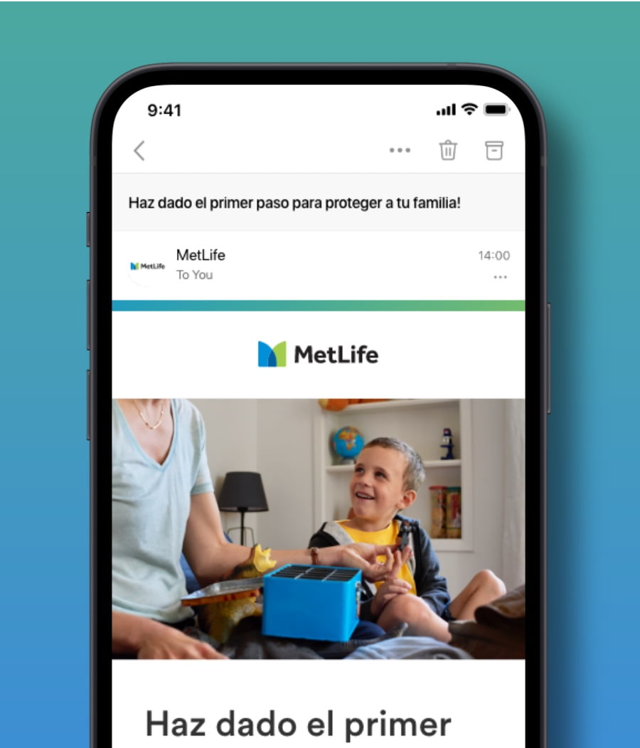
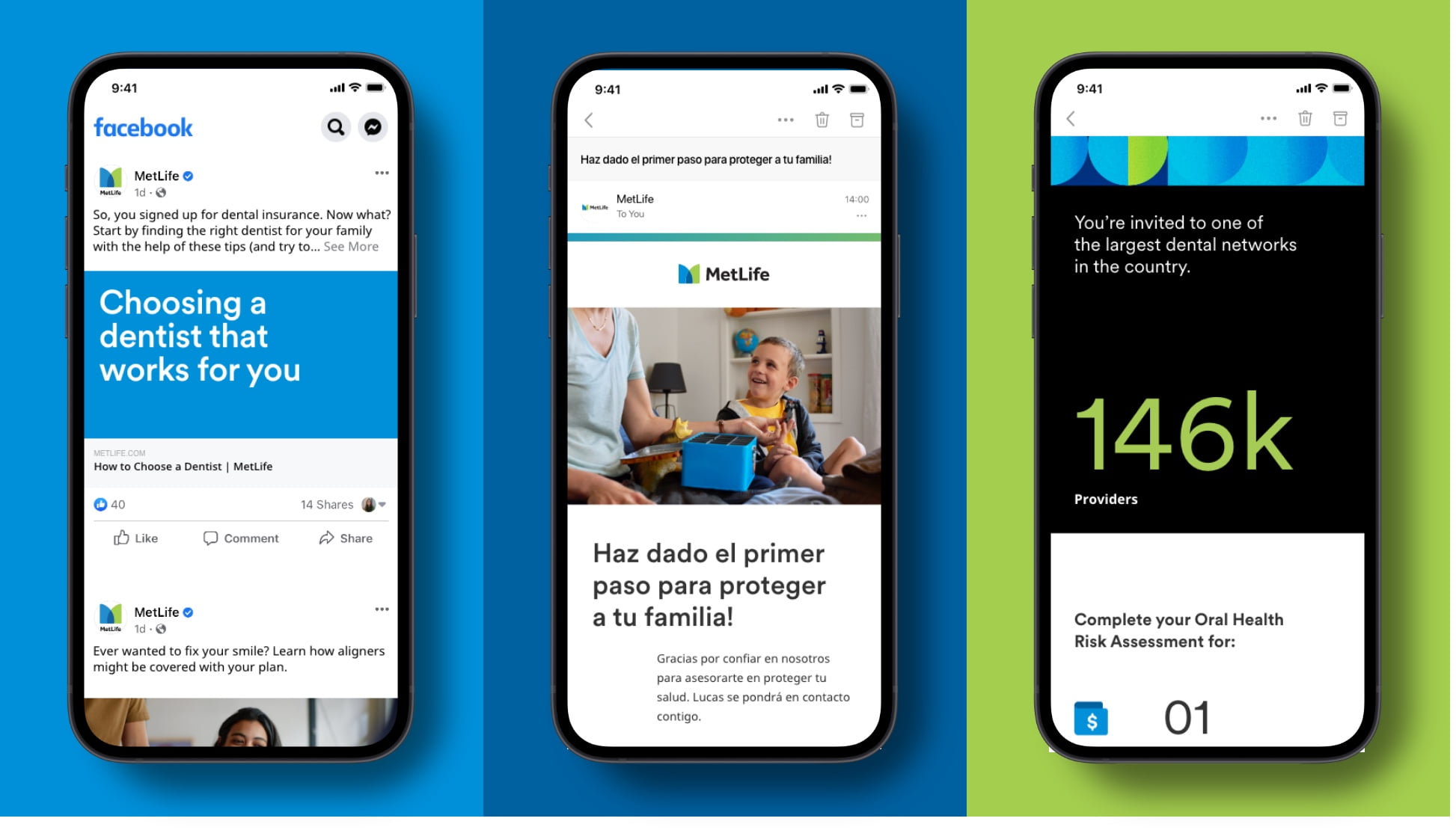
Marketing
Whether you’re making a digital ad, posting new content on social, or sending a welcome email, you can use our primary color palette to help evoke emotion and build a deeper relationship with our customers.
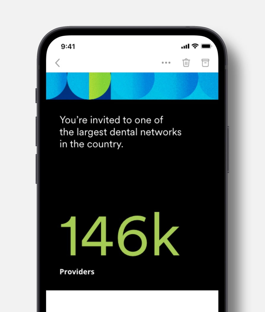
Be bold with Blue 1.
- Use MetLife Blue 1 to be bold and introduce the brand in social media.
Use gradients to represent progress and add a sense of motion.
- Combining subtle gradients with photography is a great way to create modern visuals and harmony between our colors.
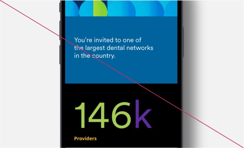
Use Black to signal expertise.
- Use Black as an expertise signal, in data visualization or cards for agents.
- Overuse color. Never use more than three colors in one screen moment.
- Don’t add gradients to typography.

- Use type smaller than 18 pt when combining Blue 1 with white type.
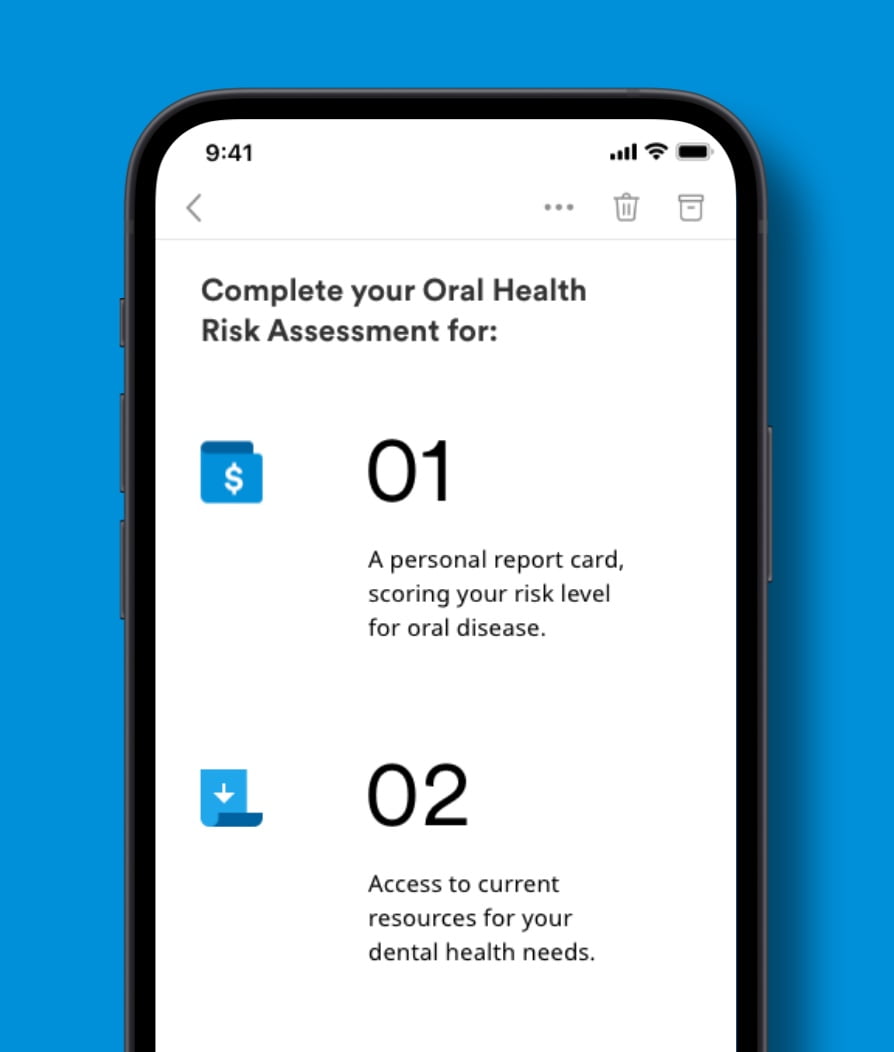
User Interface
Color can be functional, too. Here are some tips for using primary and secondary colors to visually guide our users through digital experiences.
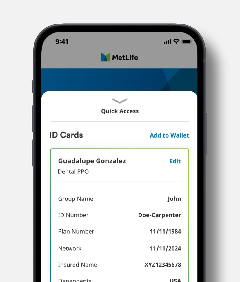
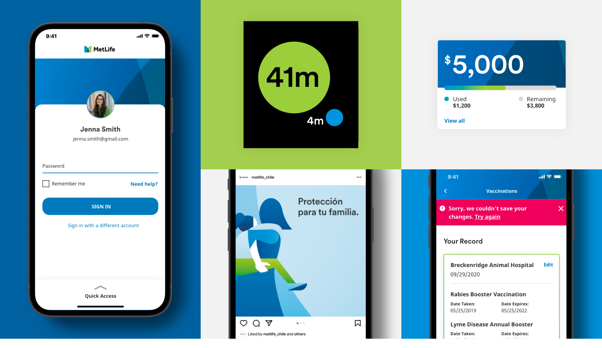
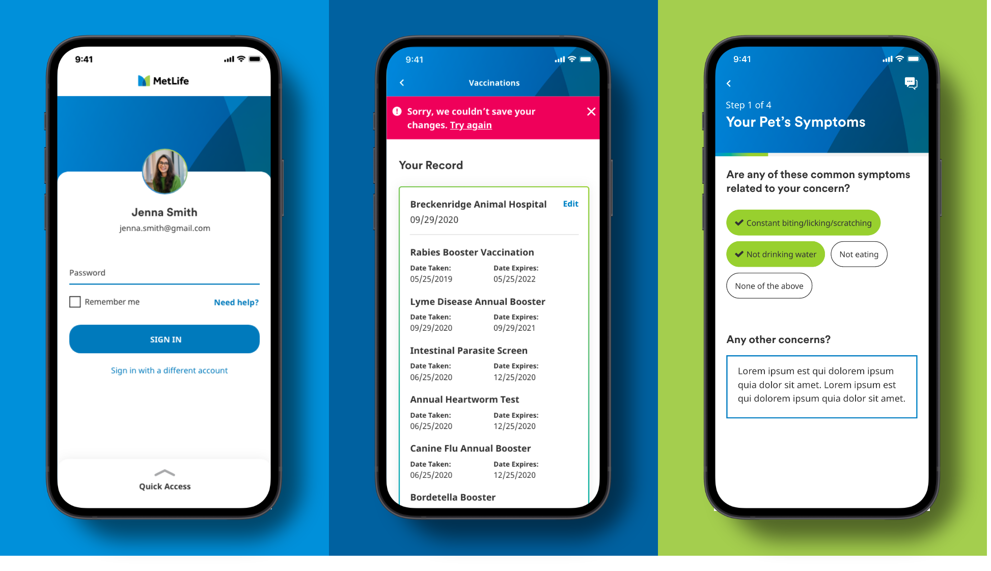
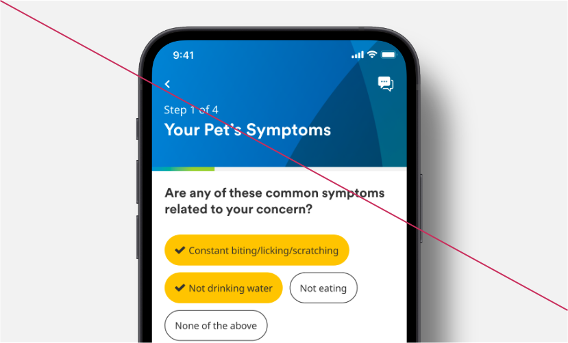
Show success with Metlife
- Use MetLife Green on select functional moments as well as notifications, validations, progress and data viz.
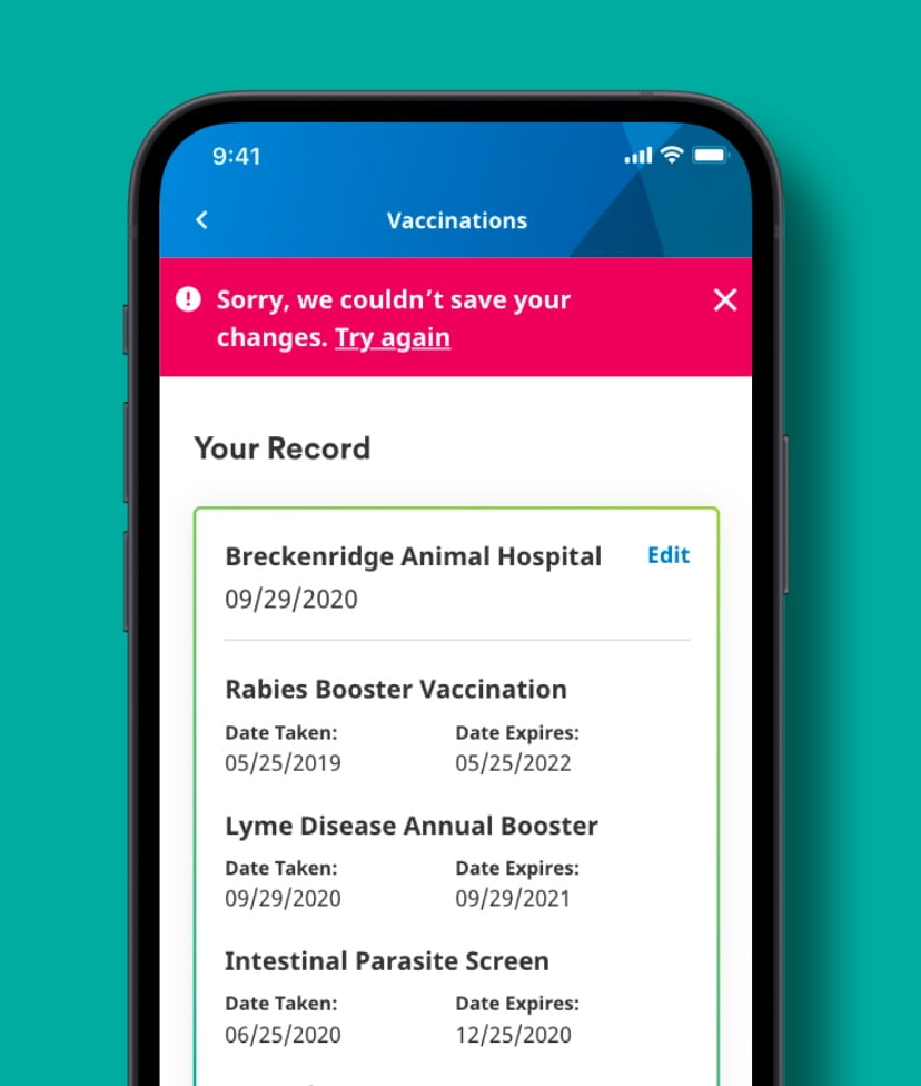
Use secondary colors for alerts.
- Use MetLife Berry on alert notifications.
- Use MetLife Red on errors or uncompleted tasks.
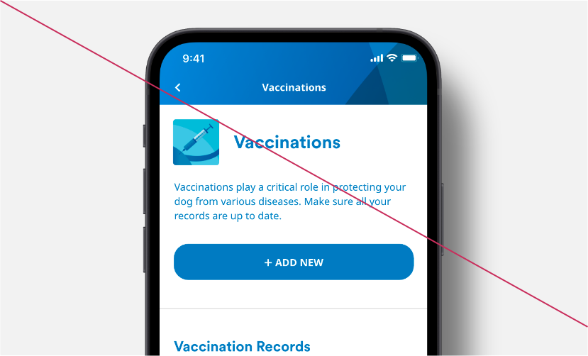
Use gradients as subtle accents that nod to the brand.
- Use gradients to show progress on bars.
- Use gradients on strokes in secondary CTAs.
- Don’t use Blue for active states or noninteractive type.
- Don’t use secondary colors on actionable items.
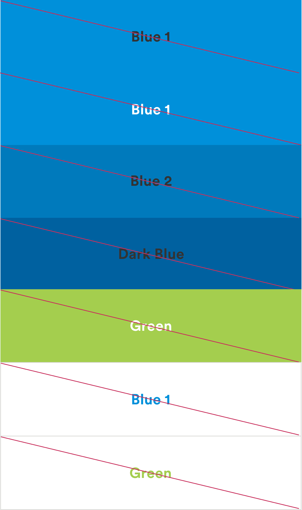
Accessibility
MetLife is committed to designing and developing digital experiences that all our customers are able to use. We stick to contrast ratios that meet WCAG 2.1 (Level AA) standards.
Design using color combinations that meet accessibility standards for contrast.
- Use our guide below to help with decisions regarding color combinations with typography. We follow the latest standards from the WCAG (Web Content Accessibility Guidelines).
- A contrast ratio of 4.5:1 for the normal or bold text below 18 px is required.
- A contrast ratio of 3:1 for large text above 18 px and bolded, or 24px or larger for non-bolded text.
- Use these color combinations.
- Use these color combinations.
Localization
Color is treated a bit differently in markets that have received a brand localization. Refer to the following pages for color guidance by country.