STANDARDS
Experience Principles
Overview
Our experience principles help guide how we design enduring and remarkable experiences for our customers. They help us make sure the design choices we make add up to consistent experiences for our customers across products, channels, and touchpoints. Refer to the below standards and guidance as you build out your next experience.
Principles
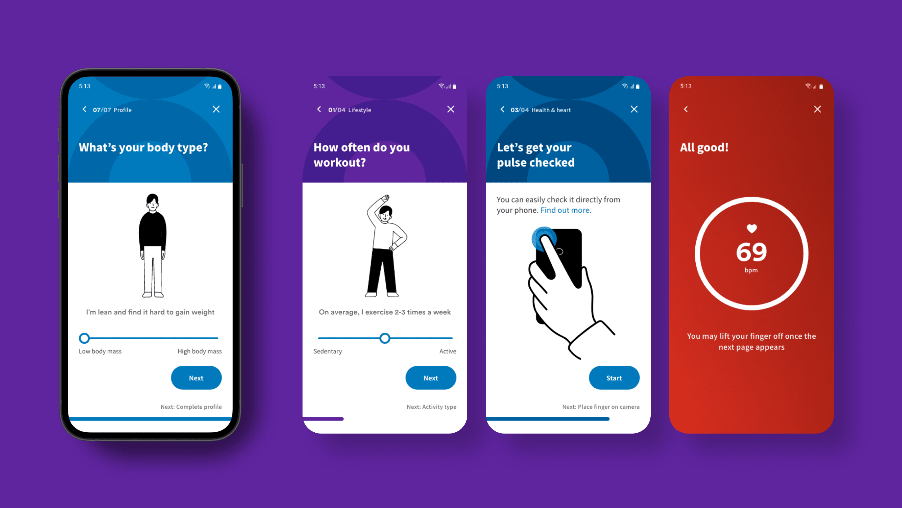
Make it effortless for me
We free up your time and mental workload with experiences that are simple, clear, intuitive, and seamless.
What that means for digital design: We keep it simple by removing unnecessary steps, information, and technical complexity. We bring clarity with our language and visuals, to create intuitive experiences that are easy to use and seamlessly guide people along the customer journey.
Pre-populate customer data.
- Pre-populate known information and have smart defaults to make it easy for customers to submit information.
Display error messaging.
- Give clear instructions on the next step to take when an error has occurred.
Make it fast.
- Enable people to buy a policy that covers what they need, in the fewest possible steps.
- Allow customers to find what they’re looking for quickly and intuitively, however they choose: phone, web, mobile, chat.
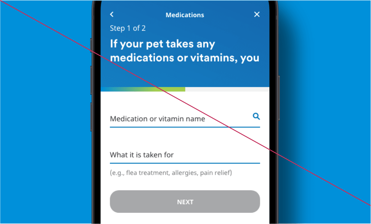
- Use disabled buttons. Have a clear next step for users to take. If there are errors, give users clear feedback to help them complete the task and move on to the next step.
Be transparent with me
We openly share relevant information on products, costs, and processes so you always know what to expect.
What that means for digital design: We don’t hide the details from people. We deliver the information we know they are looking for right up front, and make sure additional information is only one step away when people need it.
Be clear.
- Show the information customers need to know in the simplest and most digestible way.
- Make it clear that our agents have customers’ best interests in mind whenever you’re displaying costs and agent’s commission.
Keep interaction conversational.
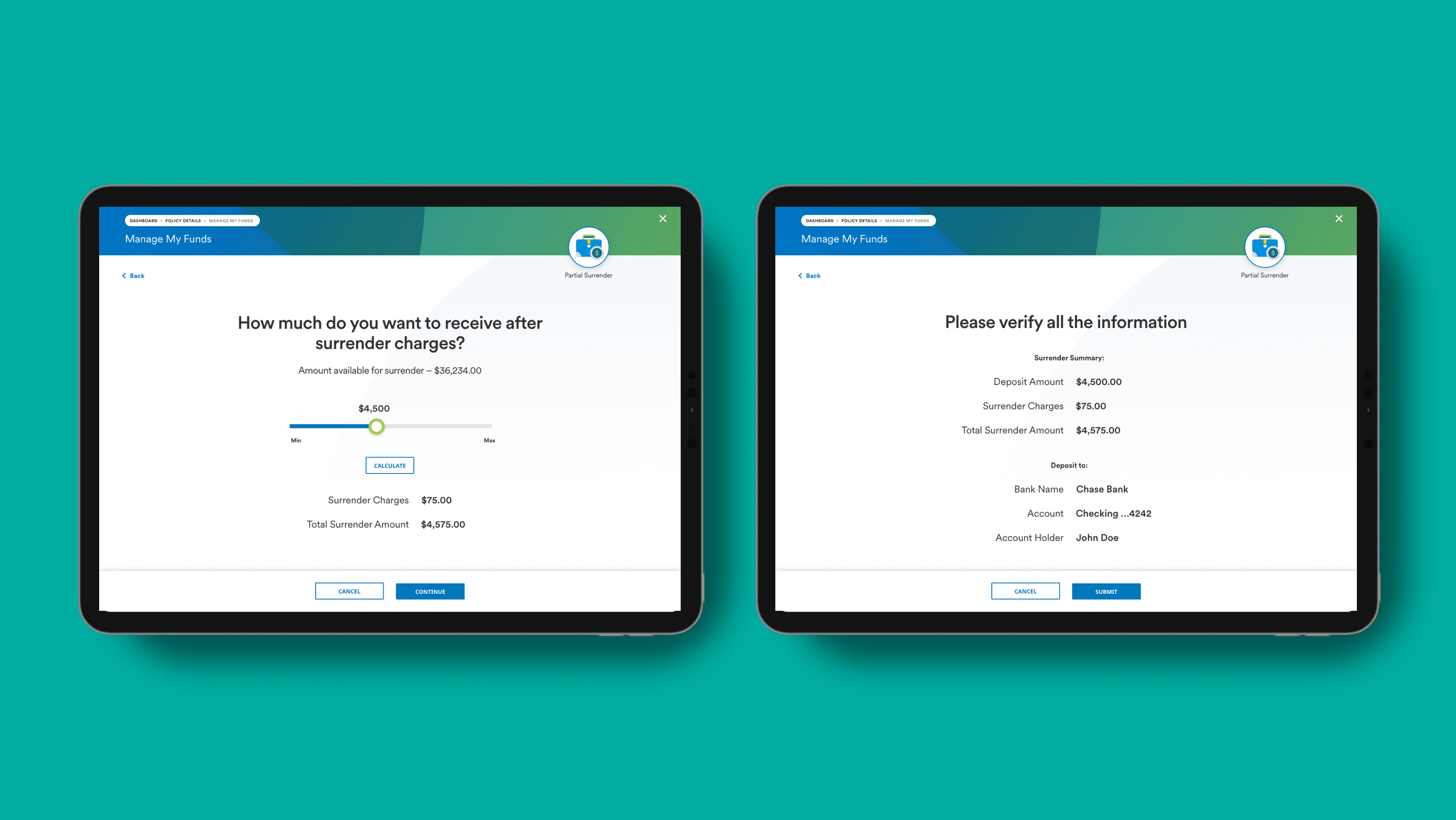
- Simple step-by-step interfaces can make it easy for customers to understand information.
- Spot illustration can keep conversational screens simple and fun.
- Multiple questions can be asked at once as long as they are on the same topic.
Use clear status messaging.
- Keep customers informed on their progress and be transparent about any errors that may occur.
- Loading animations should make it clear when content is being processed or loading.
- Progress indicators should be used when there are multiple steps to complete.
- Alerts and notifications should be used to communicate important information in the moment.
Hide important details.
- Avoid hiding important information about what is covered on a customer’s policy or claims.
Grow with me.
We stay ahead of changes in your life and world to ensure you feel prepared.
What that means for digital design: We anticipate our customers’ needs and personalize content and communications to help guide them on their journey. We use data responsibly to be ready with innovative, flexible products that can serve them along the way.
Cross-sell and upsell to our customers.
- Proactively offer content people might care about and recommend adaptive solutions.
- When customers are faced with policy choices, point them in the right direction based on their current and future needs.
- Proactively connect with customers about their experiences to improve or provide a better policy within their life stage.
- Allow for grace periods when selecting a policy.
Help me in unexpected ways.
We generously support you every day, even beyond what you think is possible.
What that means for digital design: We facilitate conversations with agents in whatever ways customers prefer to communicate. We provide content that helps people feel confident about taking care of what is important to them and we use technology to deliver the unexpected.
Support every action.
- Offer quick decisions and recommended alternative packages if a customer is turned down.
- Provide data and insights to intelligently inform customers’ decision making.
Be creepy with data.
- Keep privacy in mind when using data signals to reach our customers. Take special care when crafting creative that uses sensitive data.
Empower my progress.
We inspire you to achieve more in life and work to make it happen.
What that means for digital design: We communicate with our customers about their goals and work to understand the barriers we can help them overcome. We proactively demonstrate the ways our products can help our customers achieve more.
Recommend the right coverage.
- Ask what the customer’s goals are or what they are trying to overcome.
- Proactively notify people about underutilized benefits and demonstrate how they can truly help.
- Help guide people toward holistic packages that deliver everyday utility, along with insurance.
Sell more coverage than is needed.
- We’re not pushy. Get to know the customer’s needs and avoid selling the most expensive product over what will bring them the most value in the future.


