CORE GUIDANCE
Layout & Grid
Overview
MetLife’s grid system for the web is based on Bootstrap and is fully responsive, from desktop through phone viewports. This grid system applies to responsive web design only.
Responsive Layout
A responsive layout system is a combination of philosophies that solve the ever-changing landscape of digital devices. This is a design system that responds to a website’s layout for multiple screen resolutions using fluid grids. Images and media are flexible while content stays intact at any resolution. A breakpoint is a width at which the design “breaks” or starts to look bad. Using CSS, the layout is optimized to look good at each breakpoint.
Mobile-First Design Approach
Mobile-first is a philosophy that prioritizes the mobile platform when designing user experiences. Mobile is more restrictive due to reduced real estate. If you can support the worst-case scenario from a real estate perspective, you can support anything.
Specification and Breakpoints
Column-Gutter-Margin
The responsive layout grid is made up of three elements - columns, gutters, and margins.
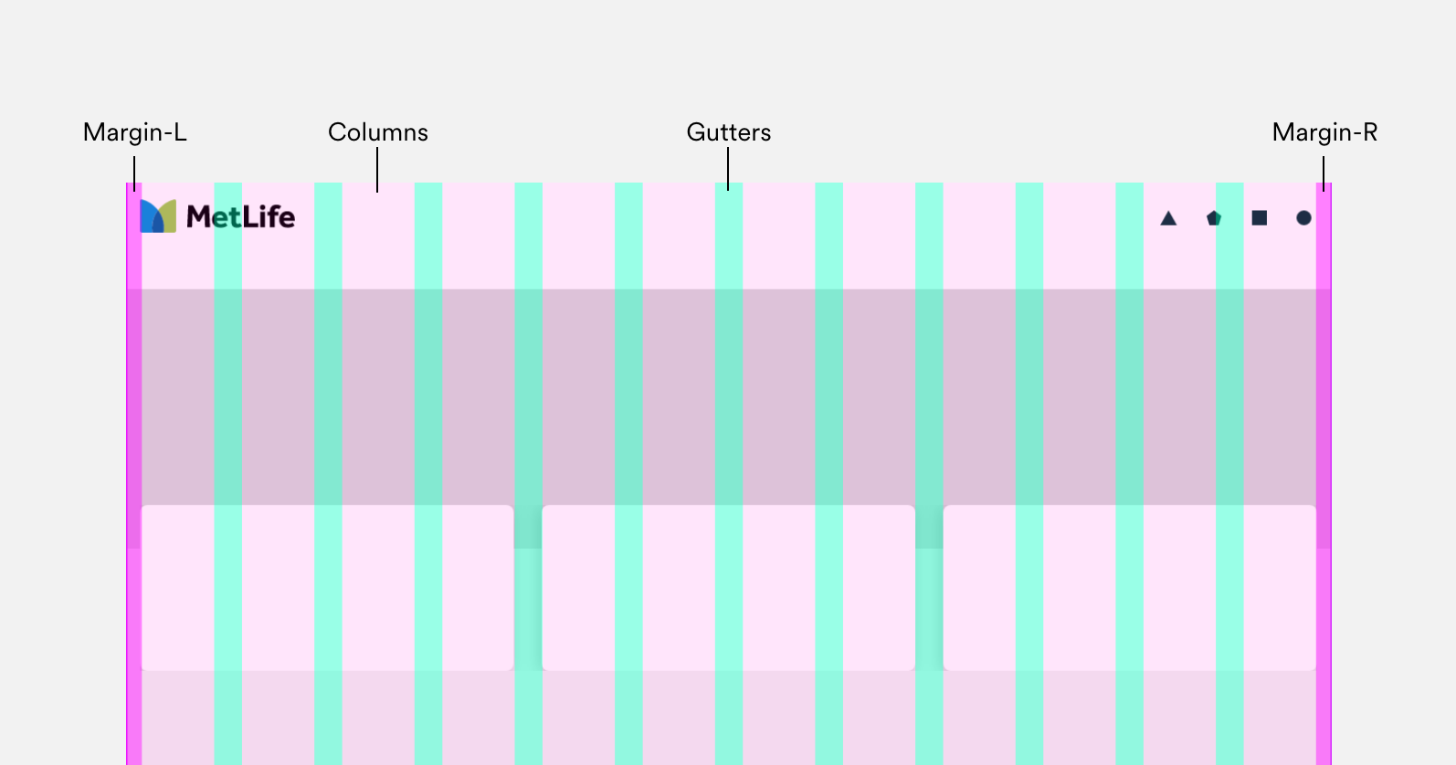
Columns: In responsive layouts, column width flex and have to define with percentages. Content sitting on these columns will responsively adapt to screen sizes. The number of columns displayed in the grid is determined by the breakpoints range.
Gutters: a gutter is a space between the column and in responsive layout width of the gutter is fixed at each breakpoint range. Gutter width creates horizontal space between page elements in the layout. To use space appropriately design system gutters are wider (32px) for a larger screen and narrower(16px) for smaller mobile viewports.
Margins: Margins are the spaces between the content and edges of the viewport both left and right sides. Margins are fixed or scaling values at each breakpoint range and are different for each breakpoint to adapt better to the viewport width.
Breakpoints
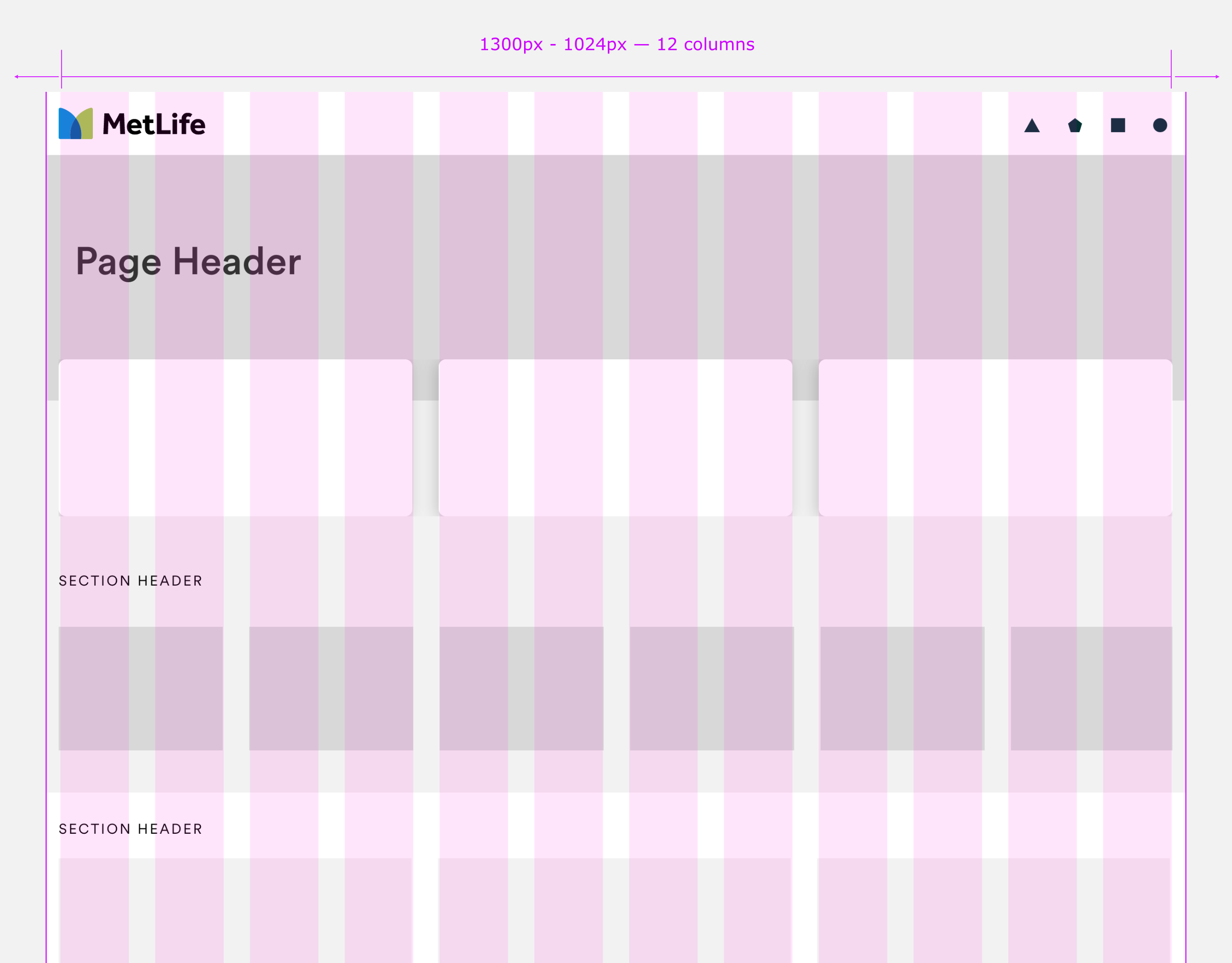
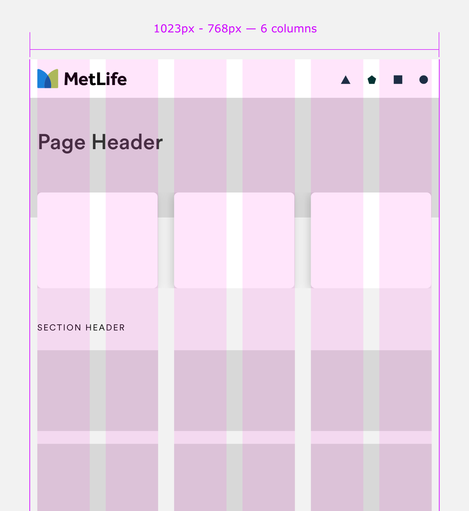
Design system components are created with three breakpoints in mind desktop - tablet (portrait) mobile. All the layouts are designed with a maximum width of 1300px and min screen size is 320px.
However desktop viewport width can be set up larger than 1300px (1366px or 1440px). Your components will not expand beyond 1300px width but full bleed background will strech to full width of the viewport.
Column widths are fluid, gutters are fixed widths, and margins can be fixed or scaling depends on viewport width:
- DESKTOP : 1300 px (max)- 1024 px(min) - 12 columns (fluid) - 32px gutter (fix)
- TABLET: 1023 px (max)- 768 px(min) - 6 columns (fluid) - 32px gutter (fix)
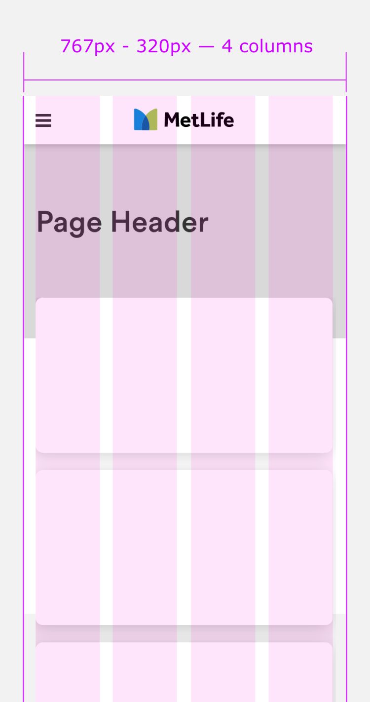
- MOBILE: 767 px (max)- 320 px(min) - 4 columns (fluid) - 16px gutter (fix)
Desktop Grid:(1300px - 1024px) - 12 columns (fluid) - 32px gutter (fix)
Tablet Grid:(1023px - 768px) - 6 columns (fluid) - 32px gutter (fix)
Mobile Grid:(767px - 320px) - 4 columns (fluid) - 16px gutter (fix)
Spacing
Spacing is the negative area between elements in your layout as well as within components. Metlife's design system space tokens help create consistent vertical spacing between elements in UI, margin/padding for any components, and vertical and horizontal space between different elements within components as well.
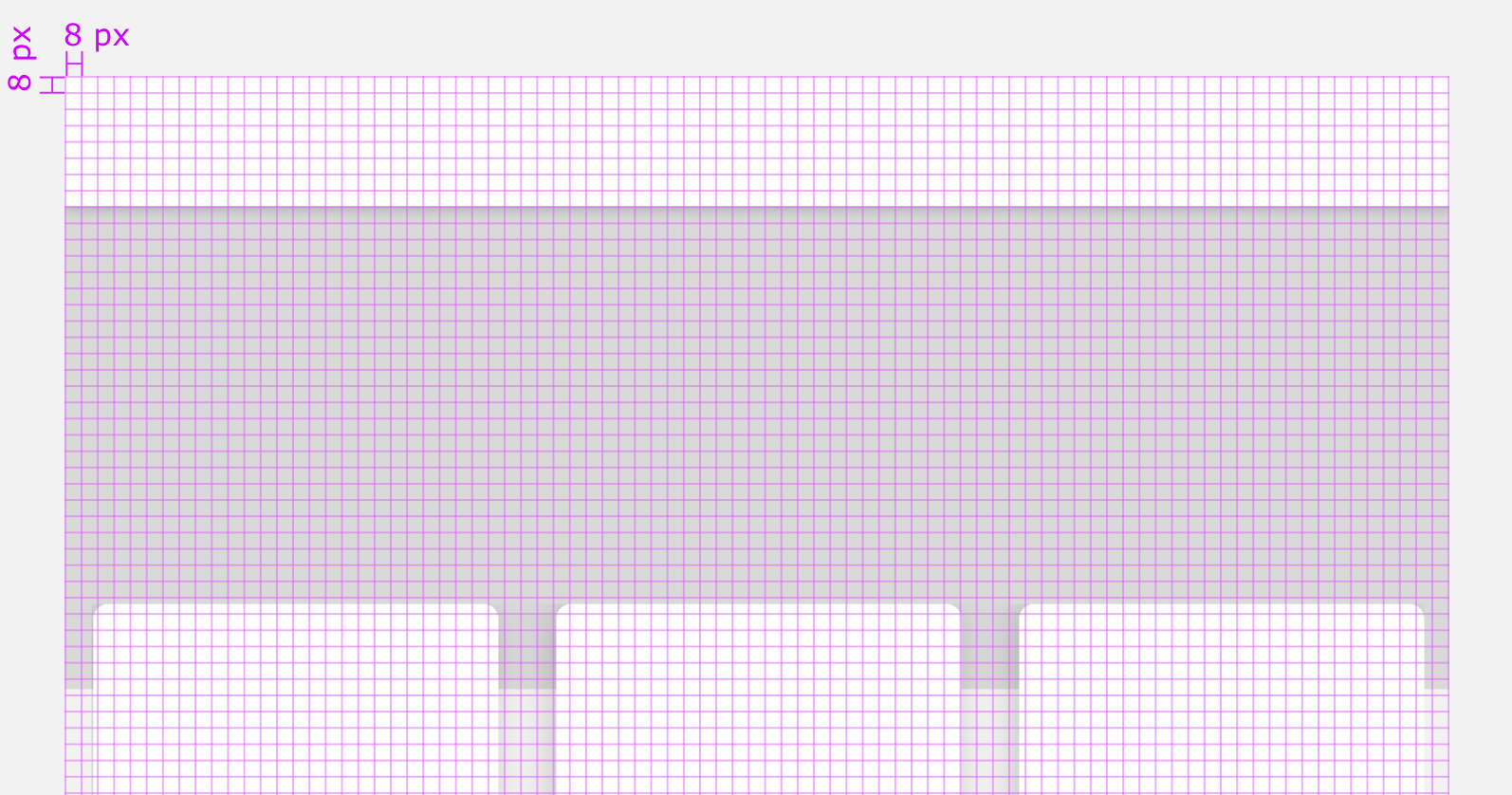
8px grid: In Metlife design system components aligns to an 8px square baseline grid for mobile, tablet, and desktop. Icons, copy, and some smaller elements within components can align to a 4px/2px grid.
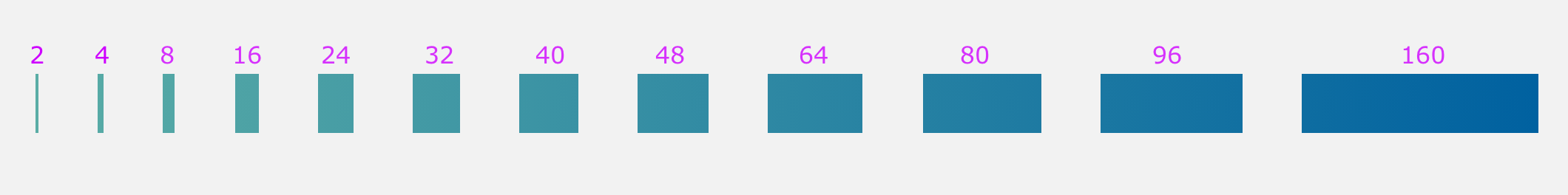
Spacing Token: Different spacing values can be used for different sizes and scales as needed to create components as well as page layouts using vertical spacing between components.
Tools for Designers
Check your designs on a responsive grid
Here are some recommended tools to check your layouts, templates, and components on the design system's responsive grid. This list also has browser plugins to help you validate the developed UI against your design on our grid.