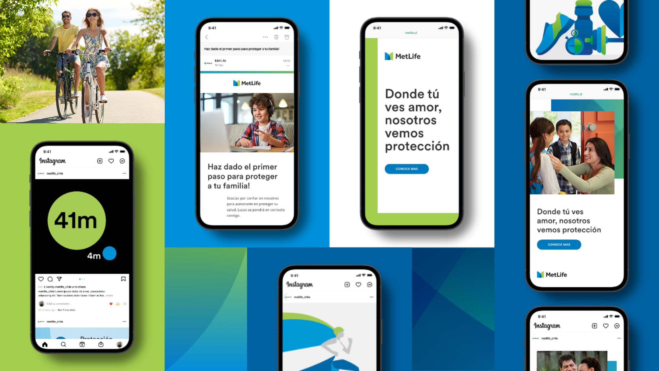
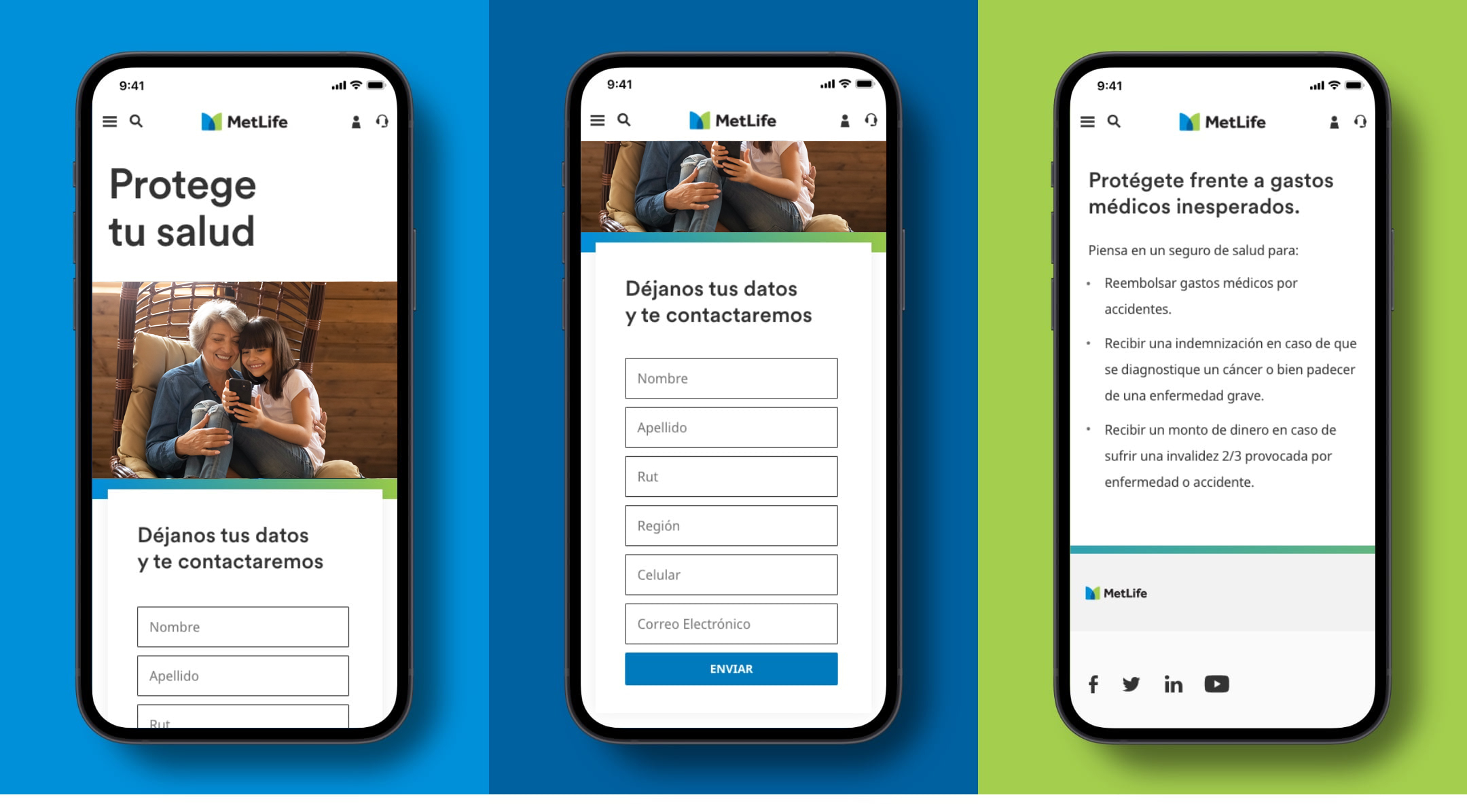
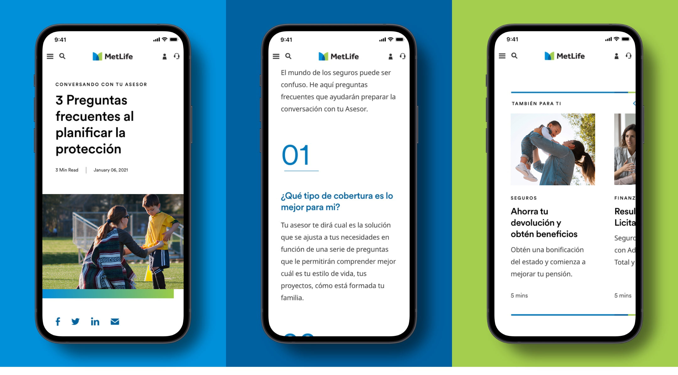
In Chile, the MetLife brand is expressed through the lens of the global brand. To illustrate how the global brand can be brought to life in the Chilean market, we’ve created a wide range of cross-channel digital examples to guide future communications.
As a refresher, click here to view the MetLife global design standards and guidance
Marketing
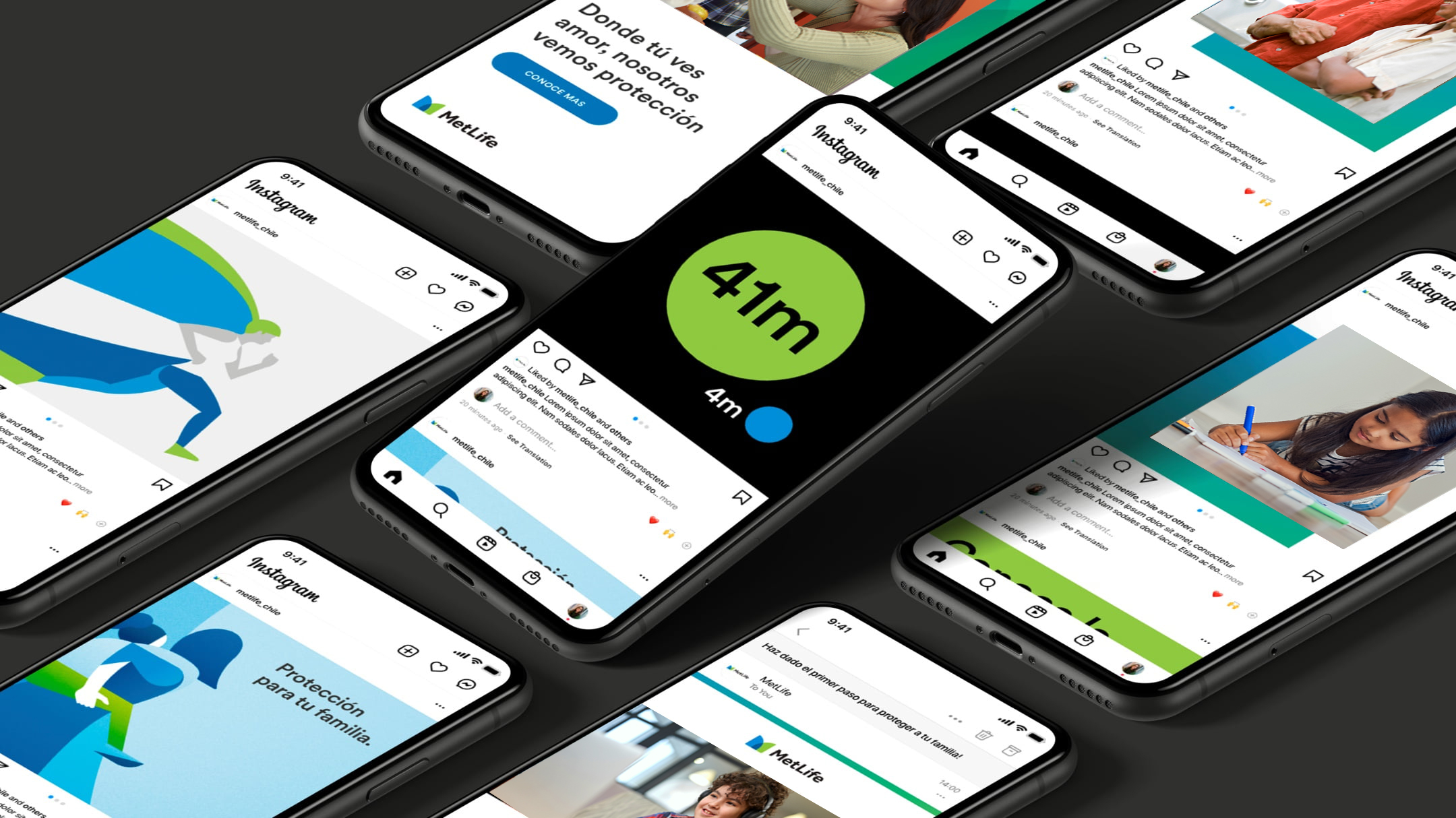
Across social media and digital advertising, we strive to create visuals that are simple, focused, engaging, and ownable by MetLife. We do this with bold use of our primary color palette and gradients, punchy headlines, engaging photography, branded illustrations and impactful data visualization.To keep our content feeling dynamic, it’s important that we don’t over-index on one type of post (i.e. photography), but rather that we use a variety of visuals.
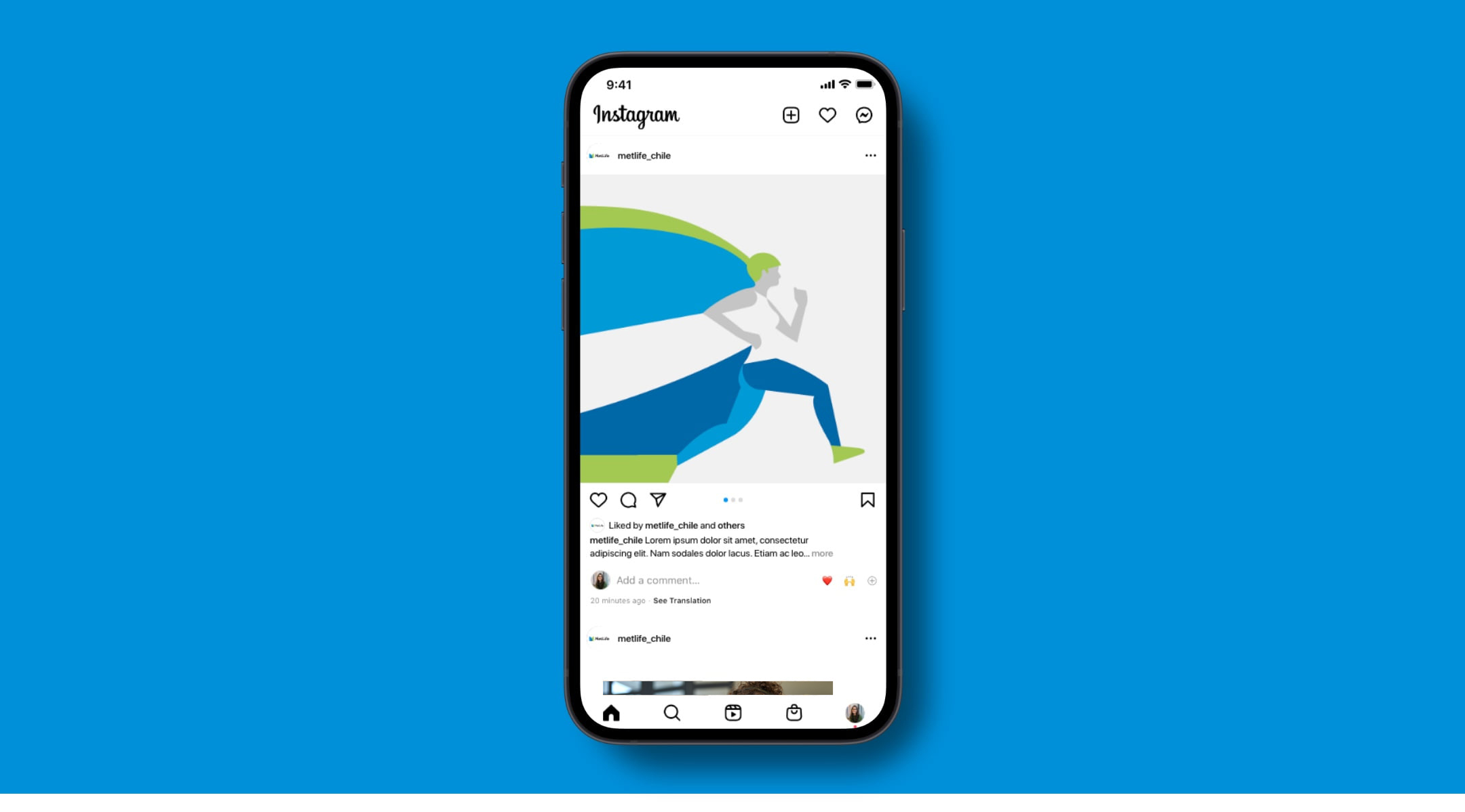
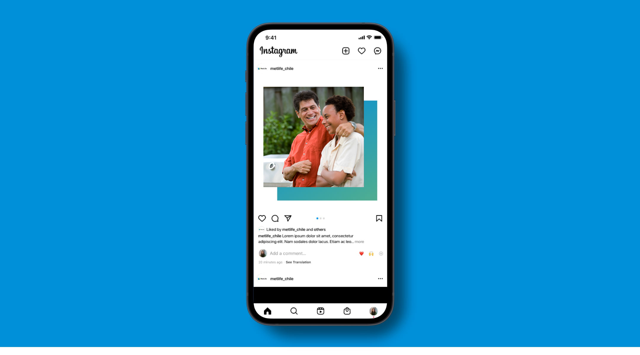
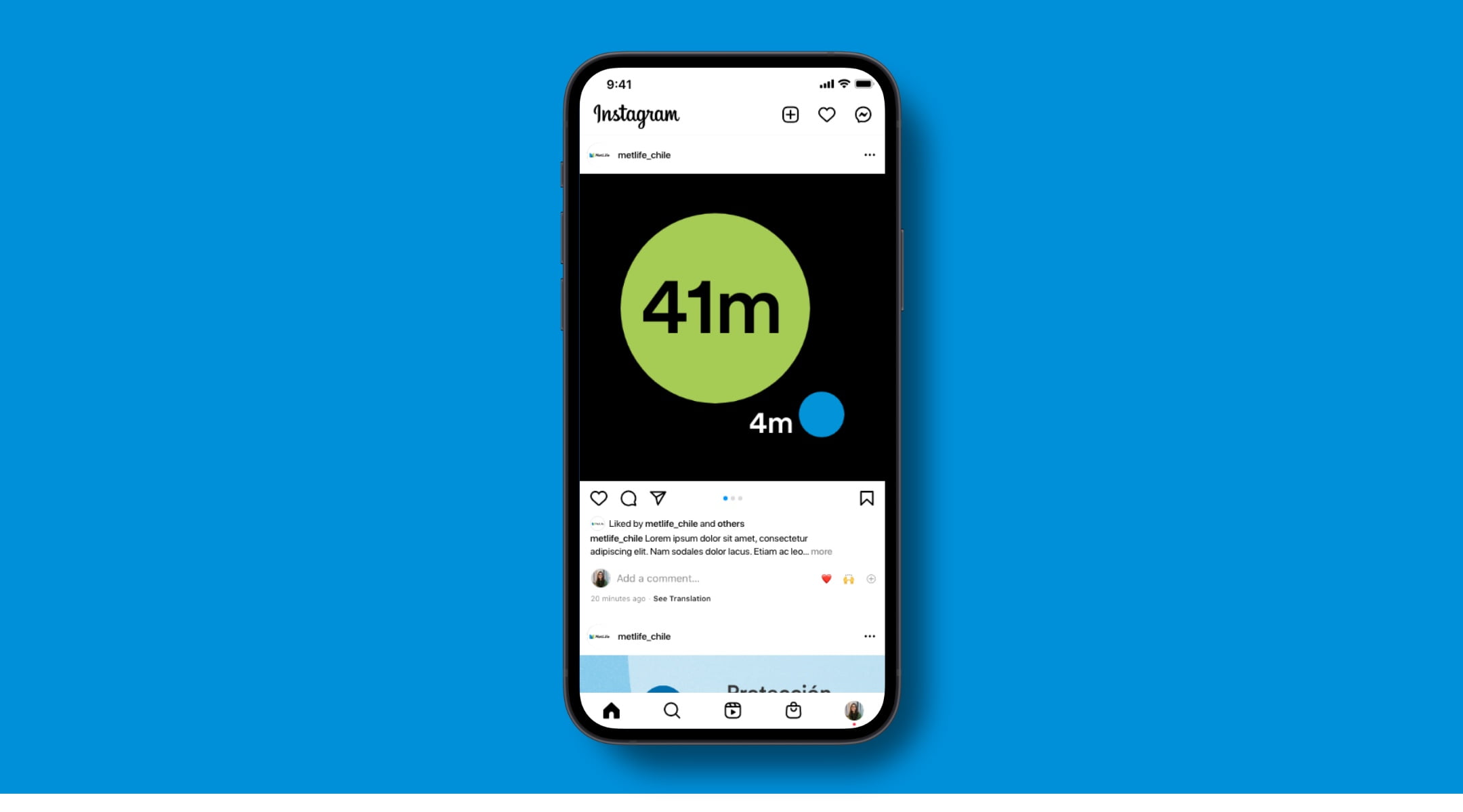
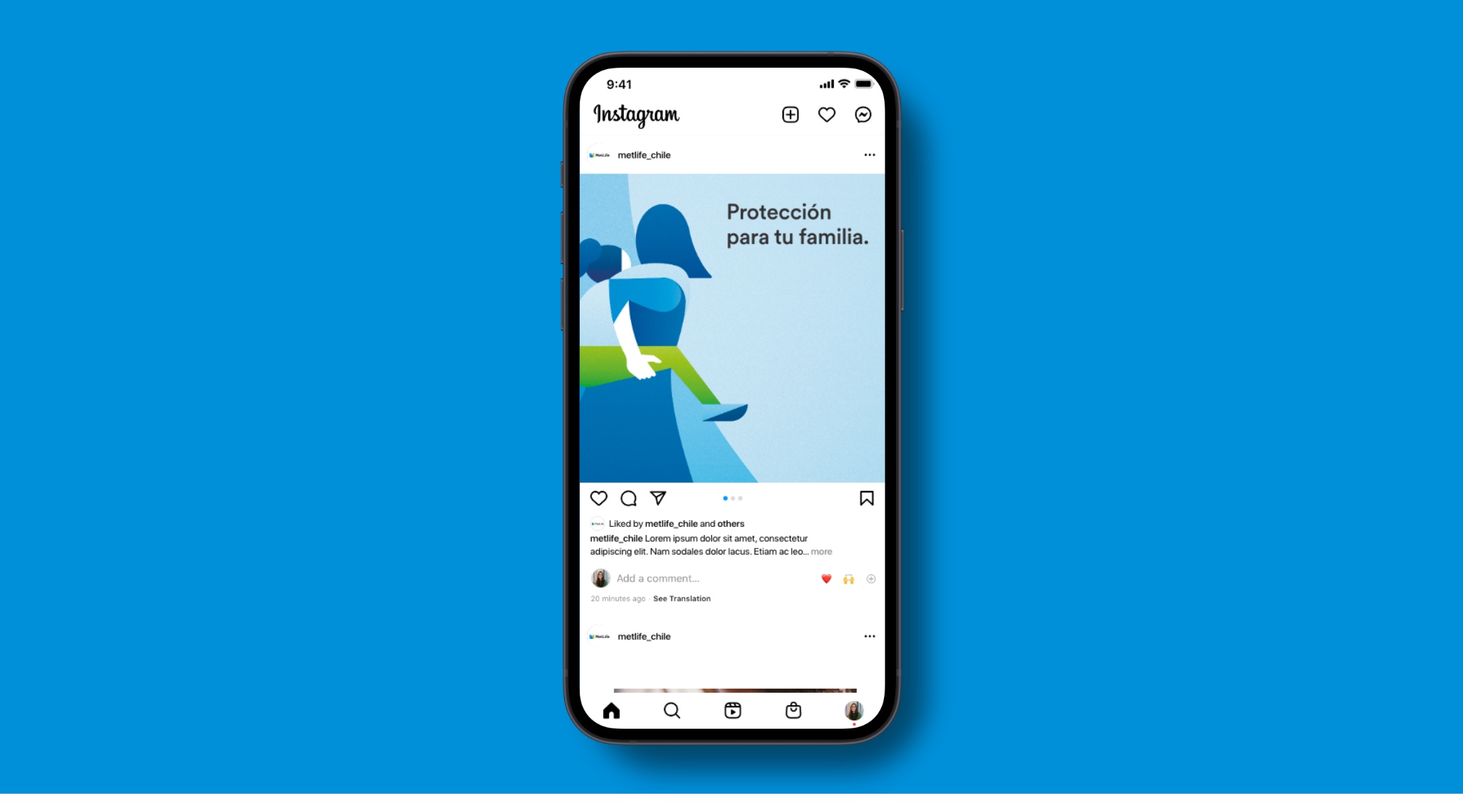
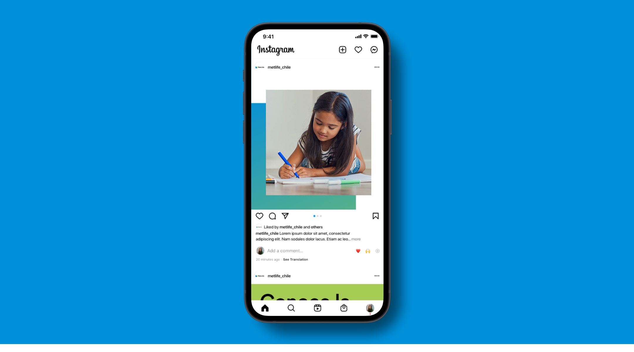
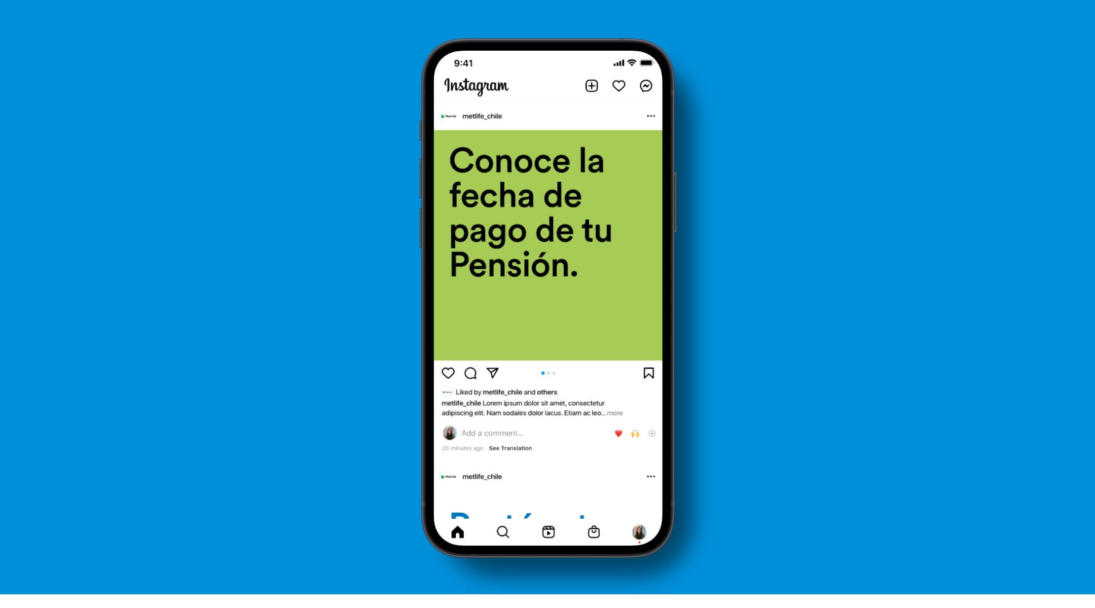
Digital Advertising
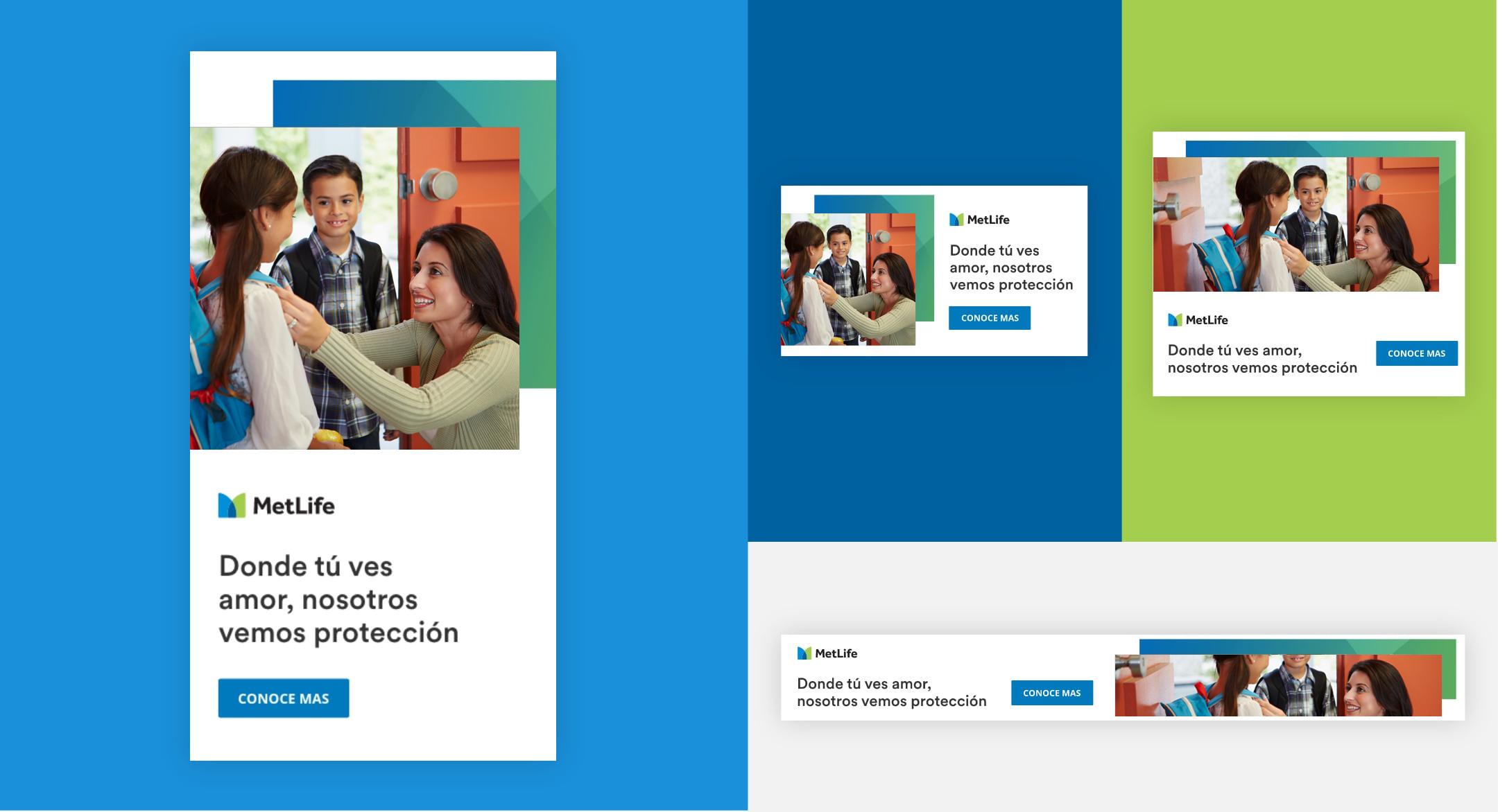
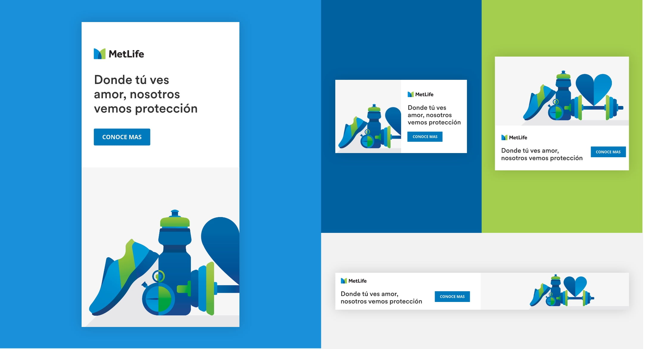
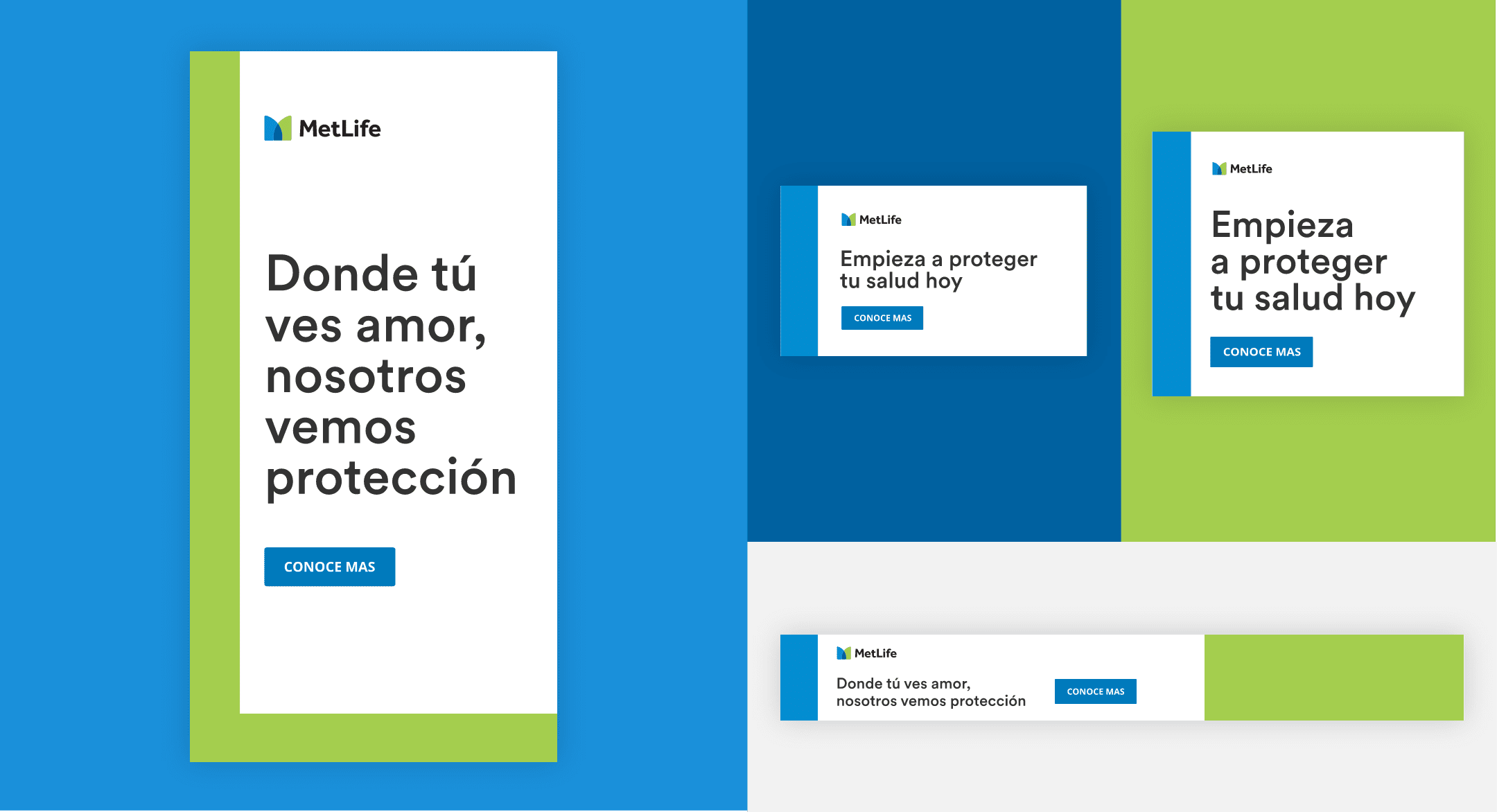
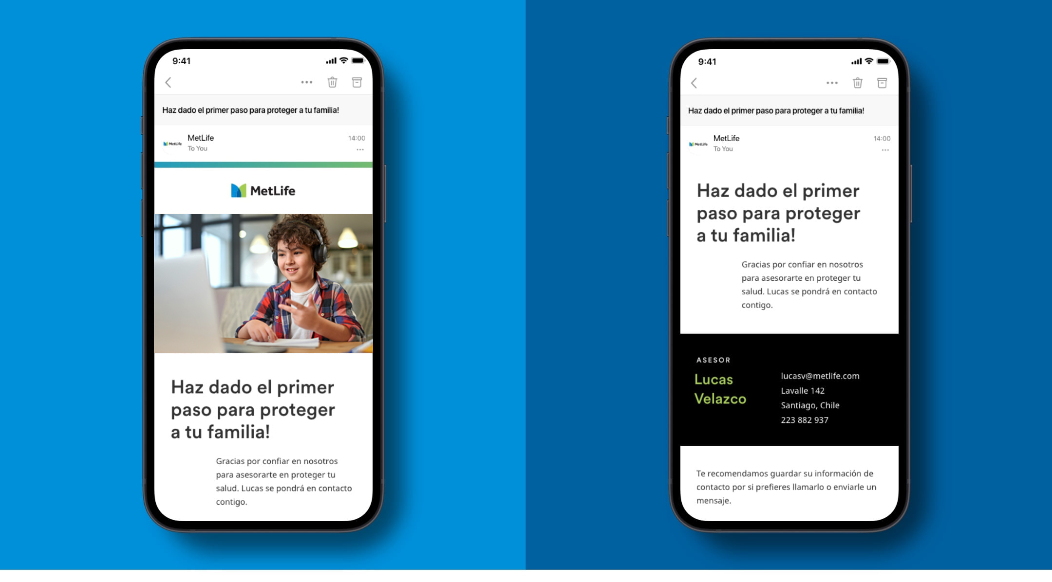
For email communications, we pair back the use of branding and let the focus fall on the content itself. We bookend all emails with the MetLife brand with a minimal gradient bar across the header and footer. In the body of the email, we adhere to email best practices by keeping image sizes small, avoiding the use of background images, and making sure that our headlines always fall above the fold.
Website
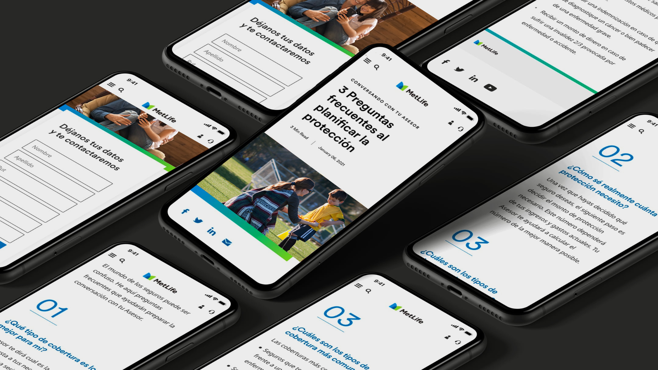
In more functional moments, like on the website, we seek to balance more emotional/brand-driven moments with more functional/utility-driven moments. For example, header moments introduce the brand, so they can be more expressive, whereas input fields are about utility, so the brand should not get in the way of the task a user is looking to accomplish. But even in more utility-driven moments, it’s important to find subtle ways to bring the brand through (i.e. background graphics, gradient borders on cards, etc.).
Landing Page
Article
