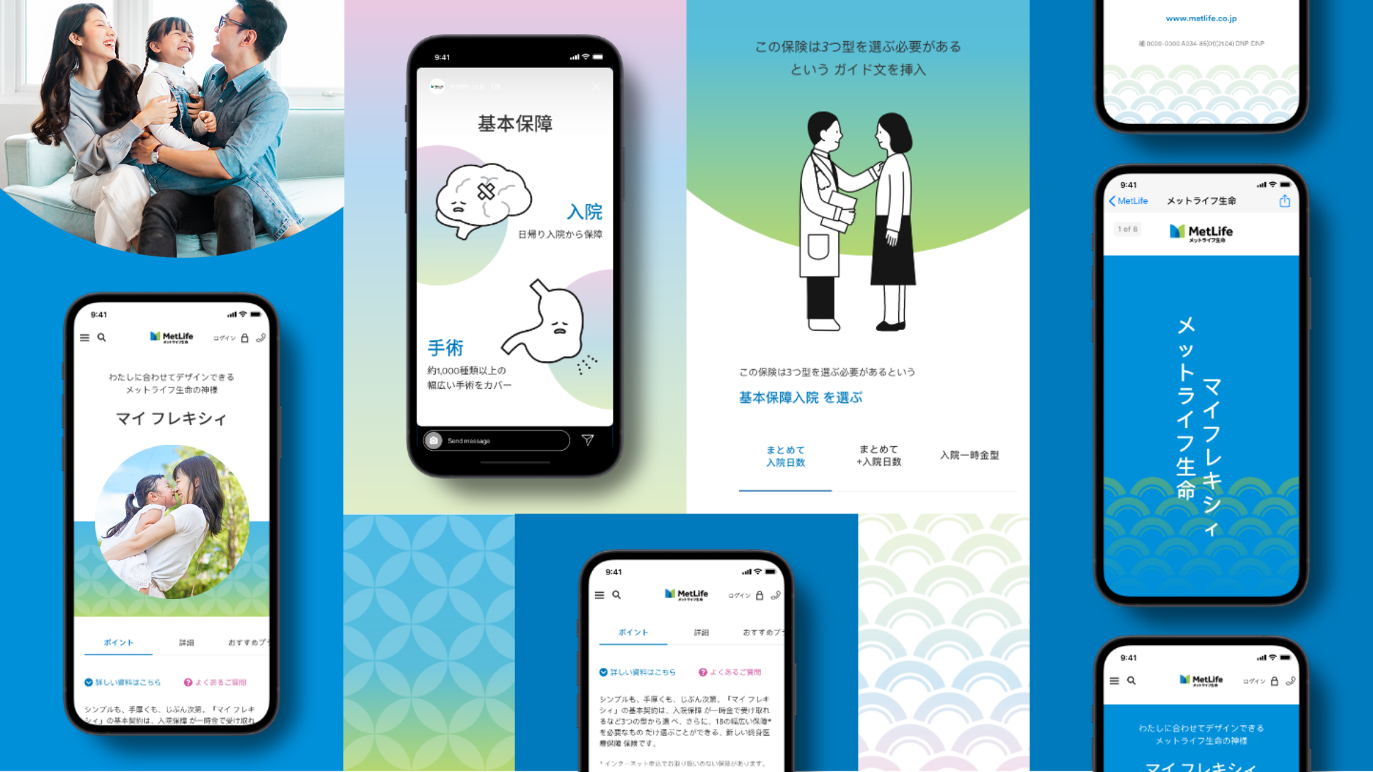
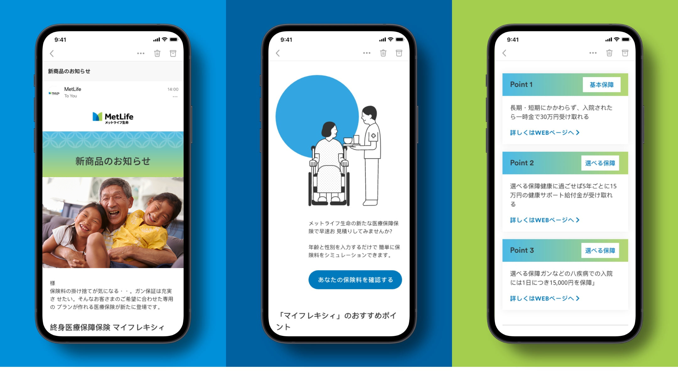
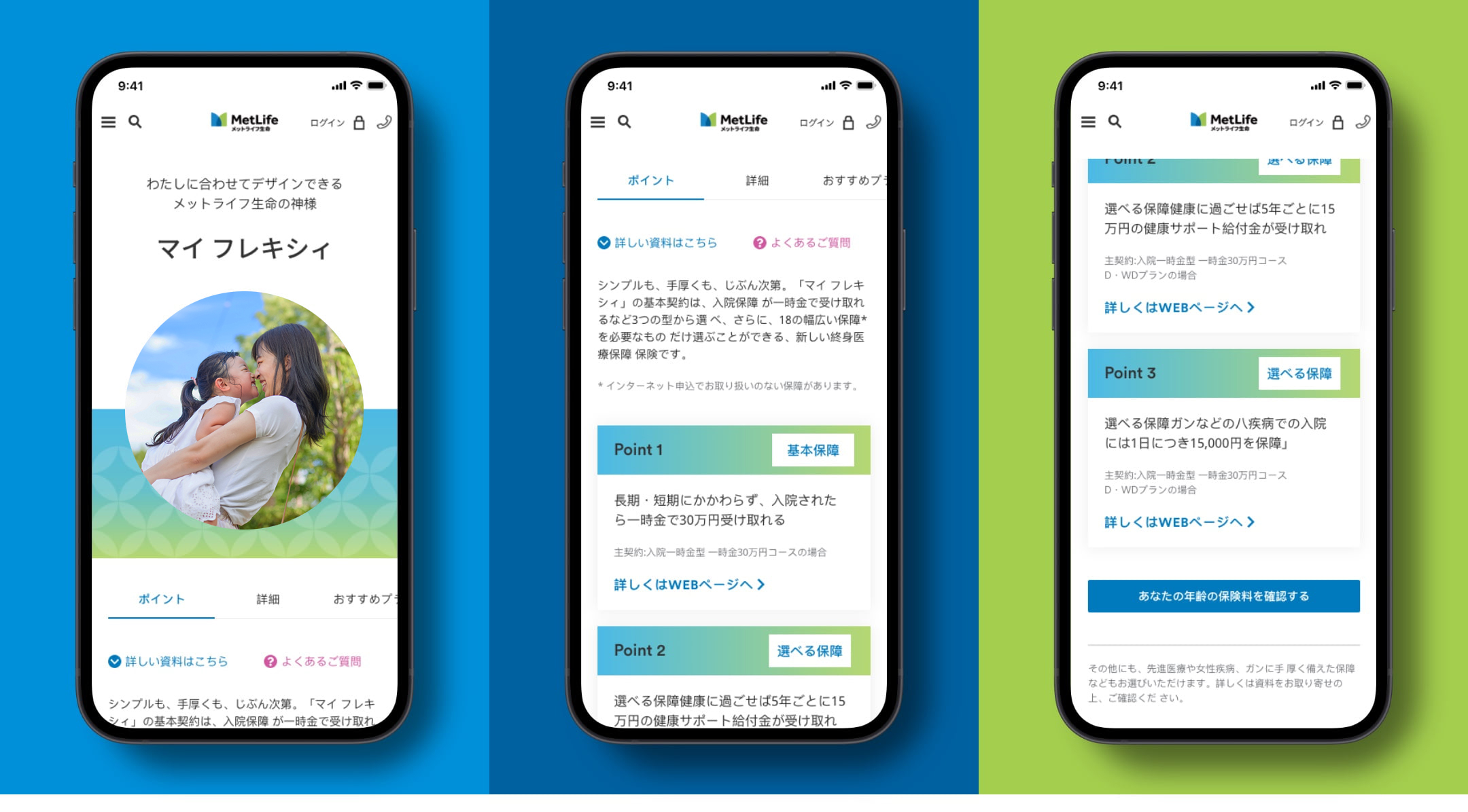
To better connect with customers in Japan, we stretch the global MetLife digital brand in a few different ways. Here you’ll find digital examples and guidance to help you bring communications to life in the Japanese market.
Overview
In Japan, we strive to be simple, expert, and trustworthy, while expressing warmth and optimism.
The idea of harmony is important in Japanese culture, so we look to create communications that feel warm and gentle, rather than too bold or overwhelming. We use patterns that are rooted in traditional Japanese heritage to create ownable designs. The photography we use is inviting, authentic, appropriately aspirational, and features genuine family interactions.
Digital Guidance
Explore these pages for specific guidance on how to use our brand elements in the Japanese market.
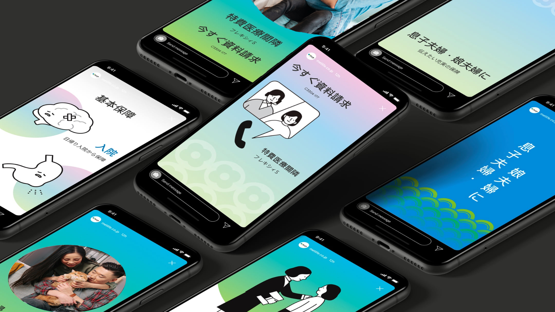
Social
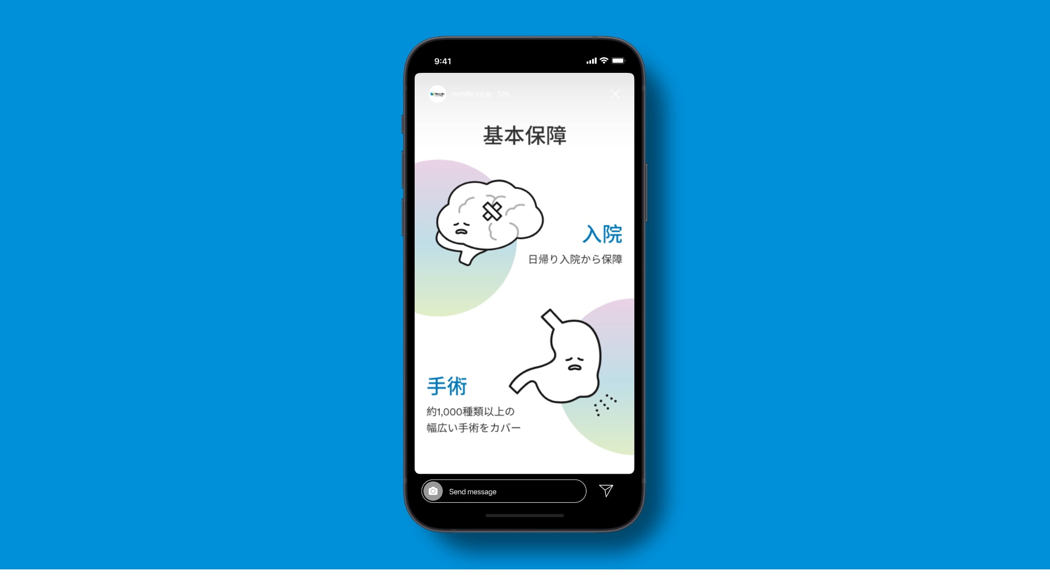
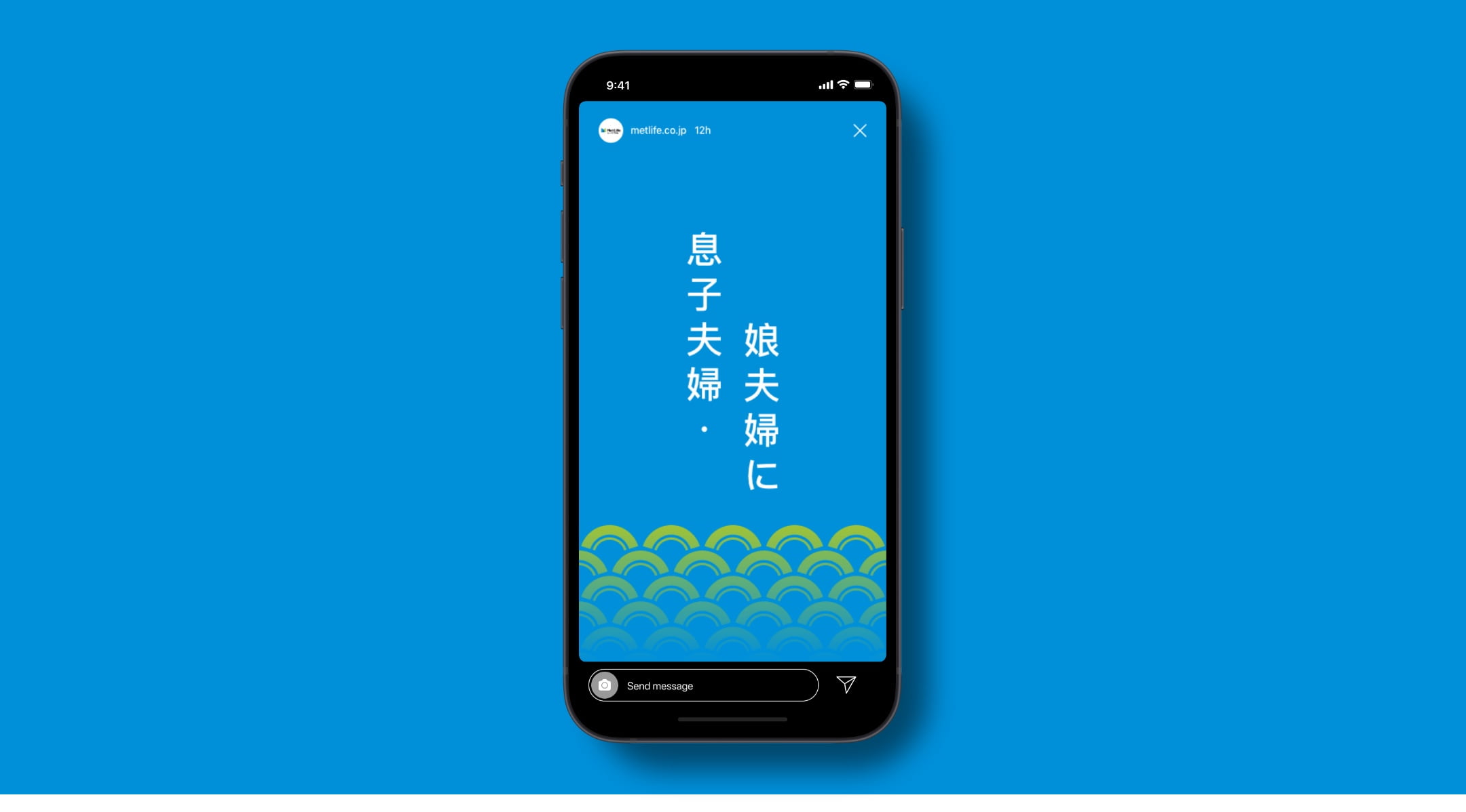
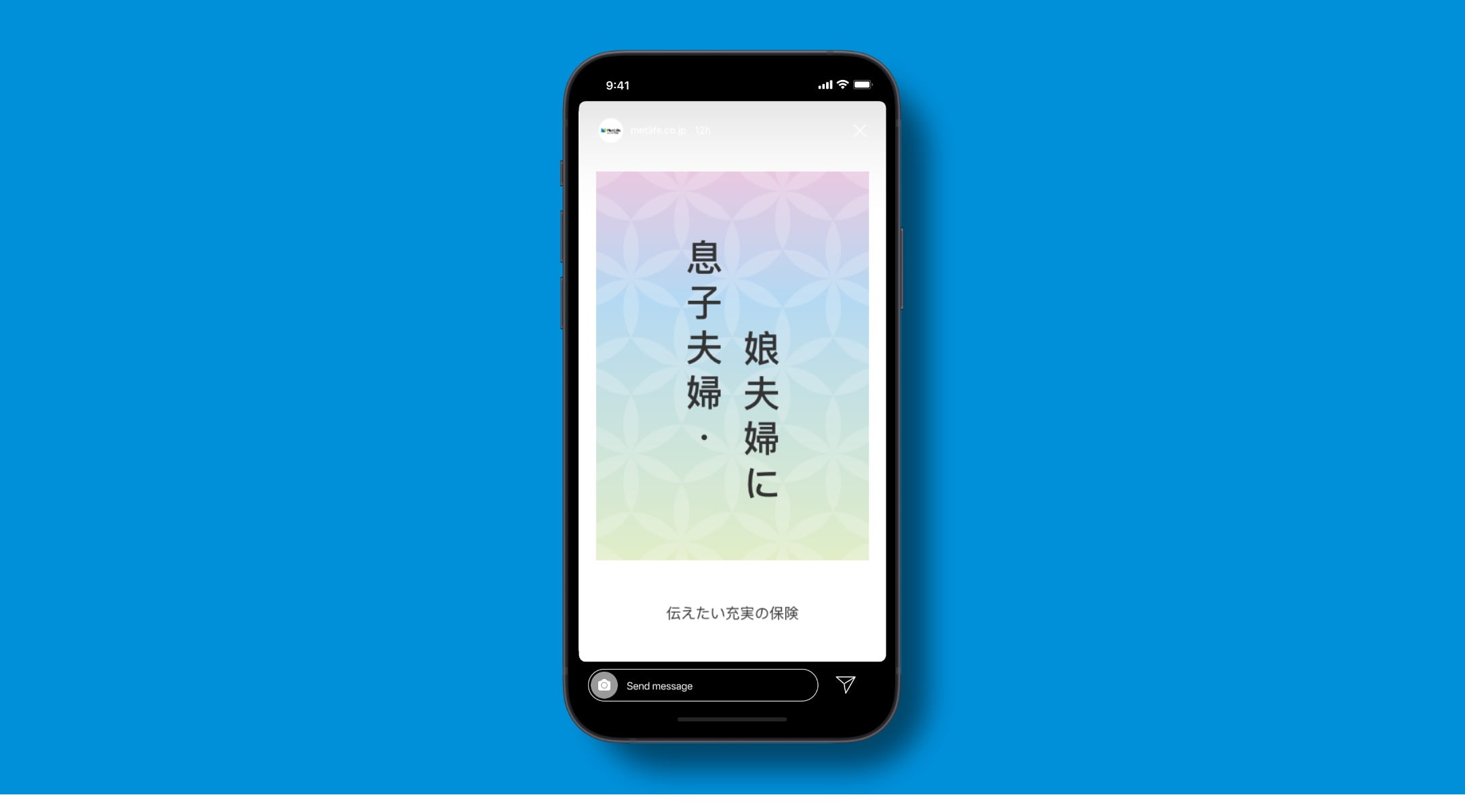
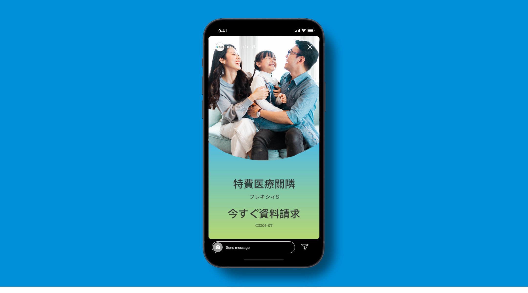
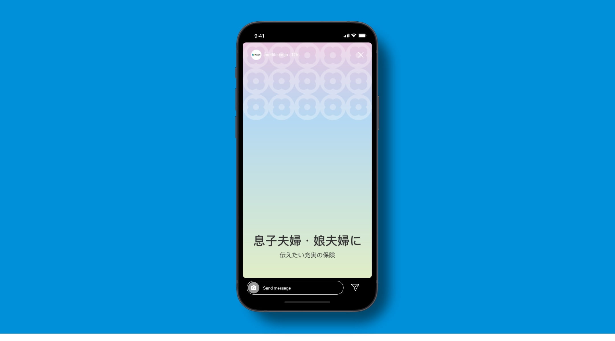
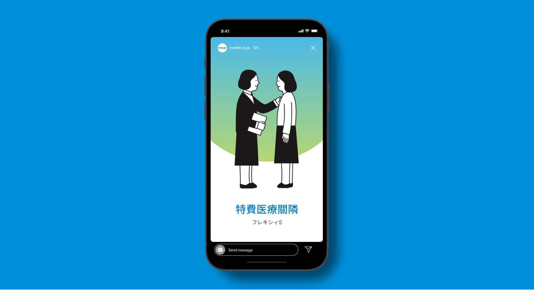
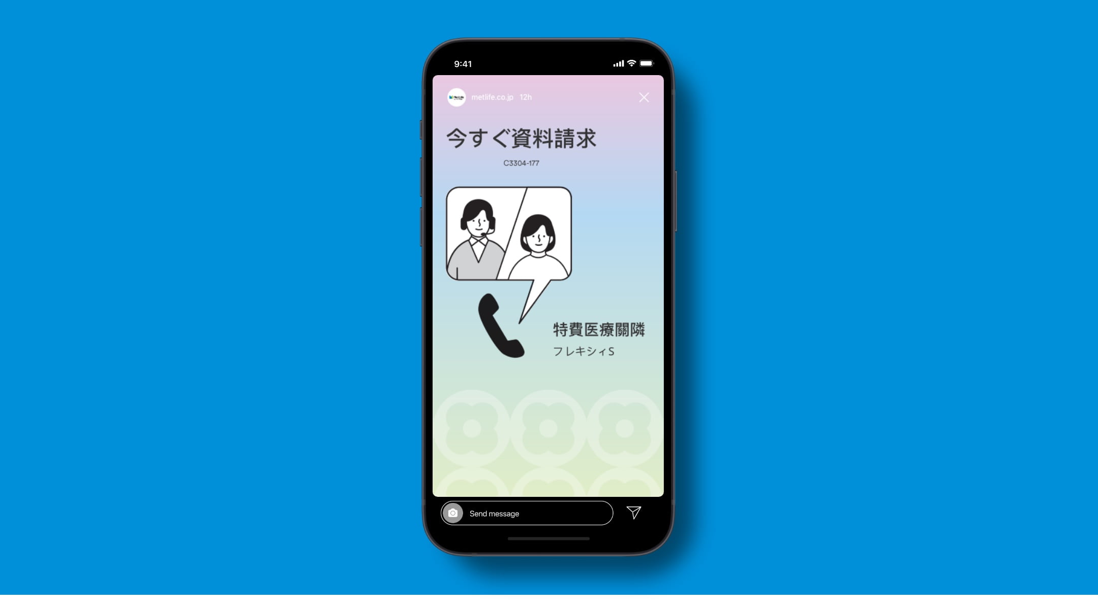
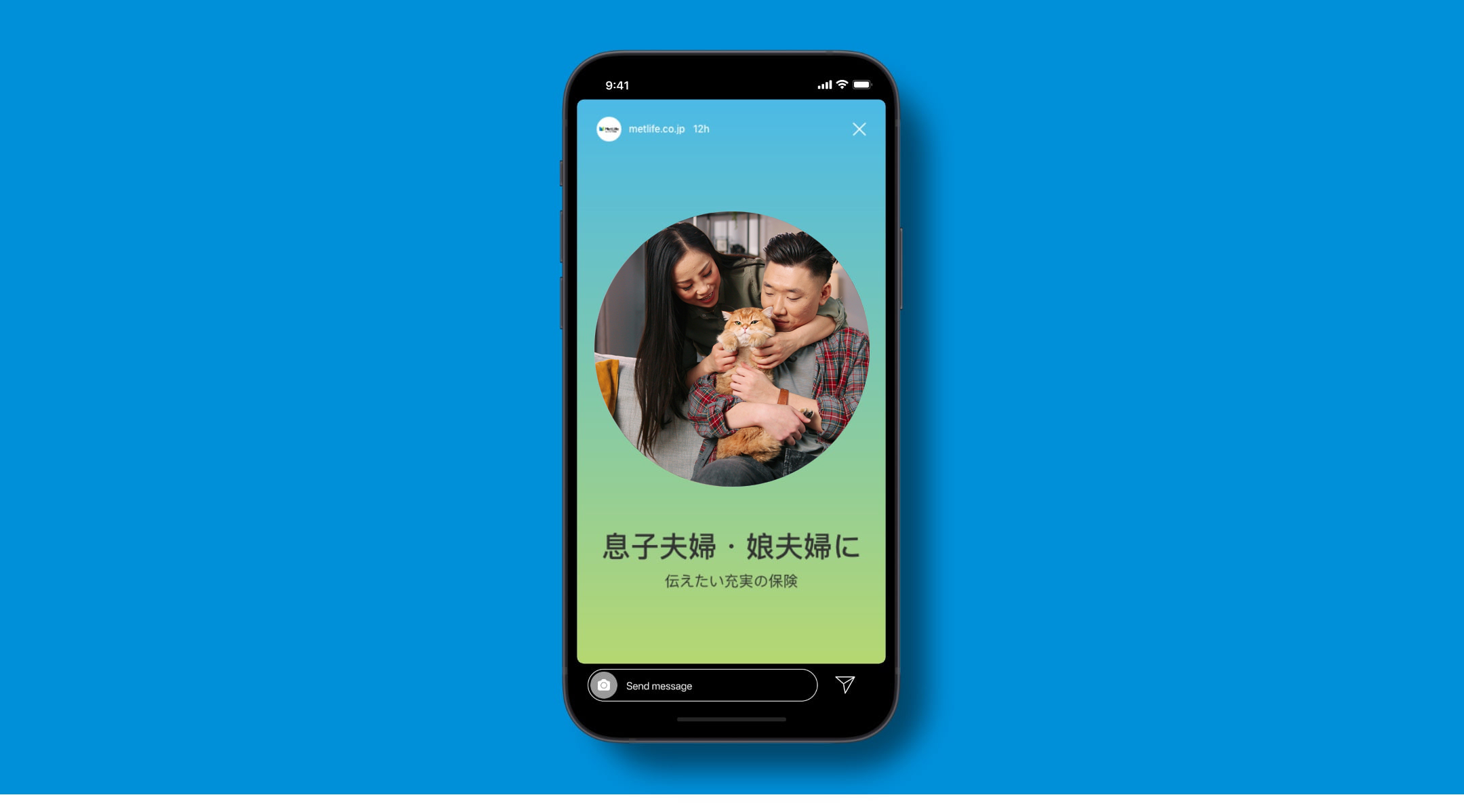
In social, we use brand elements to communicate key concepts in a simple, straightforward way. We choose visuals based on subject matter. For example, if we’re covering a difficult or complex subject, we might use softer colors and illustration, and if we’re trying to convey warmth or optimism, photography can be the right choice. Messages that are more straightforward are best communicated with strong brand colors and bold type.
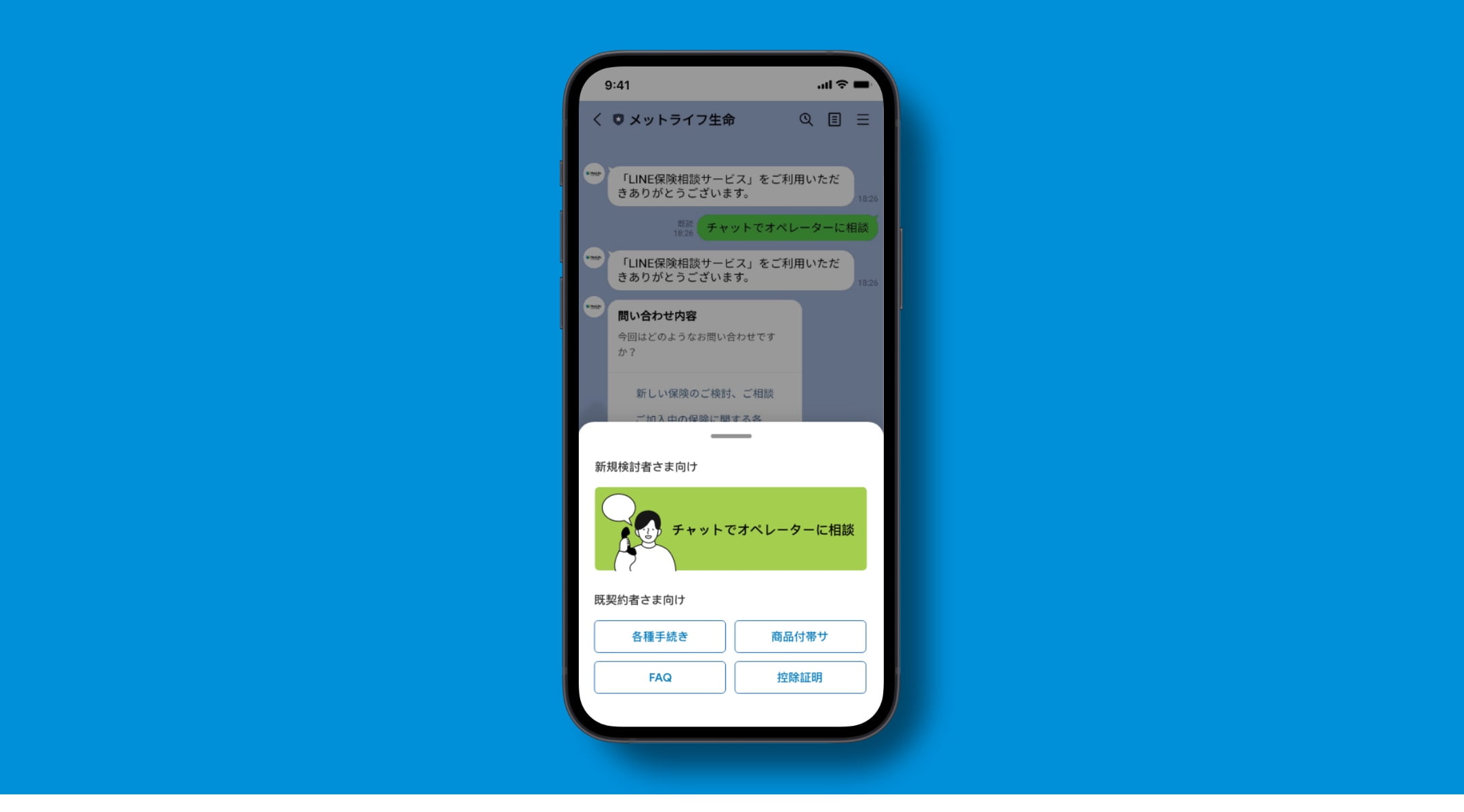
Line Chat
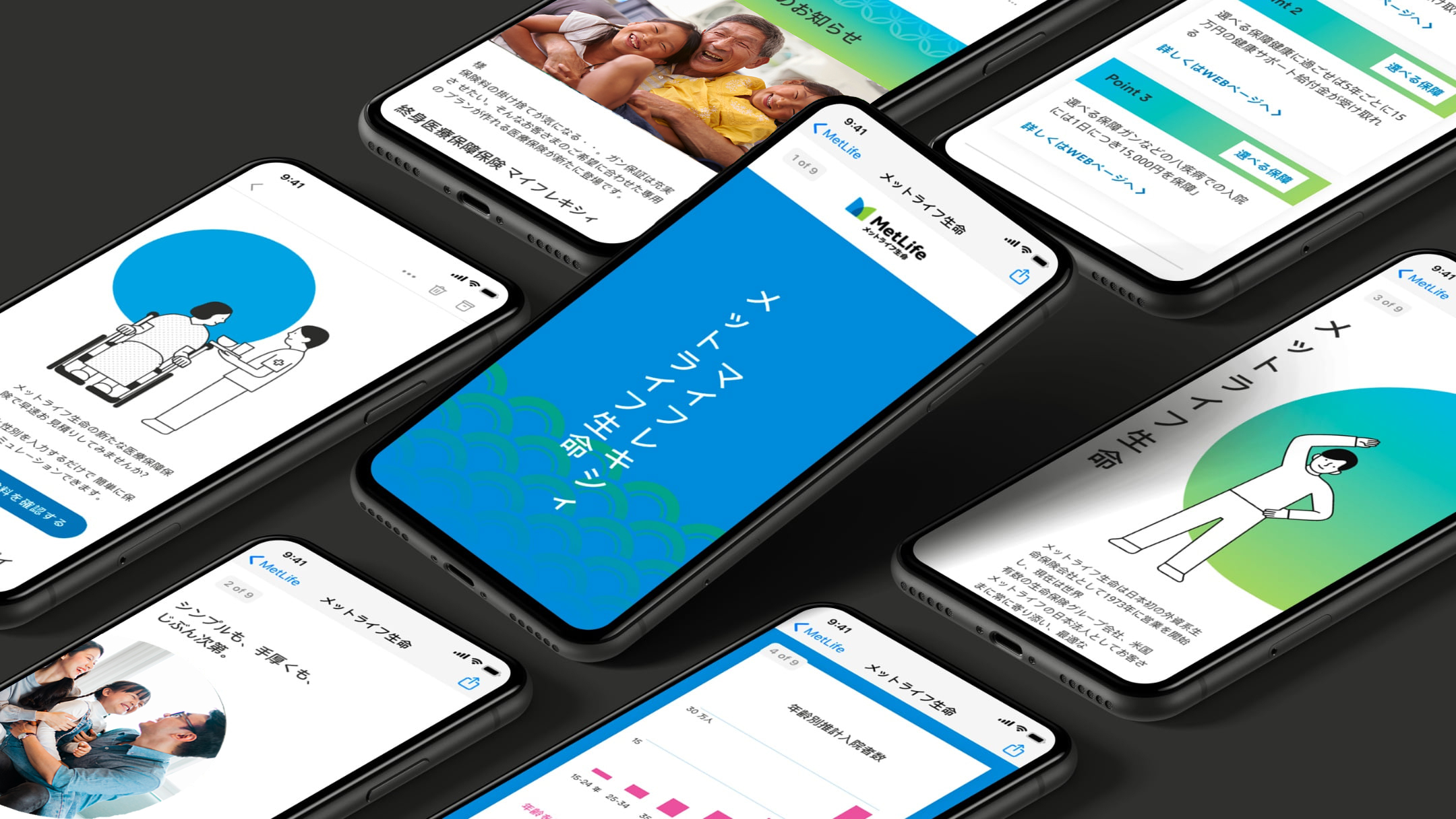
Branded Communications
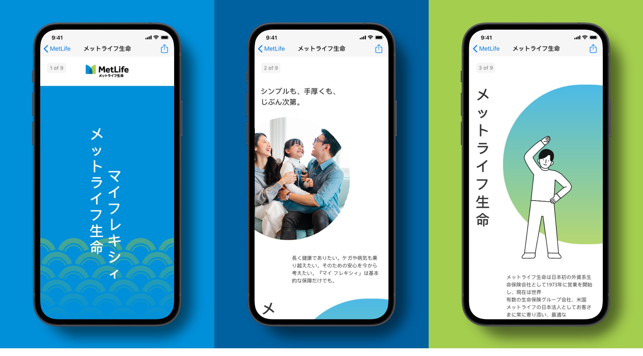
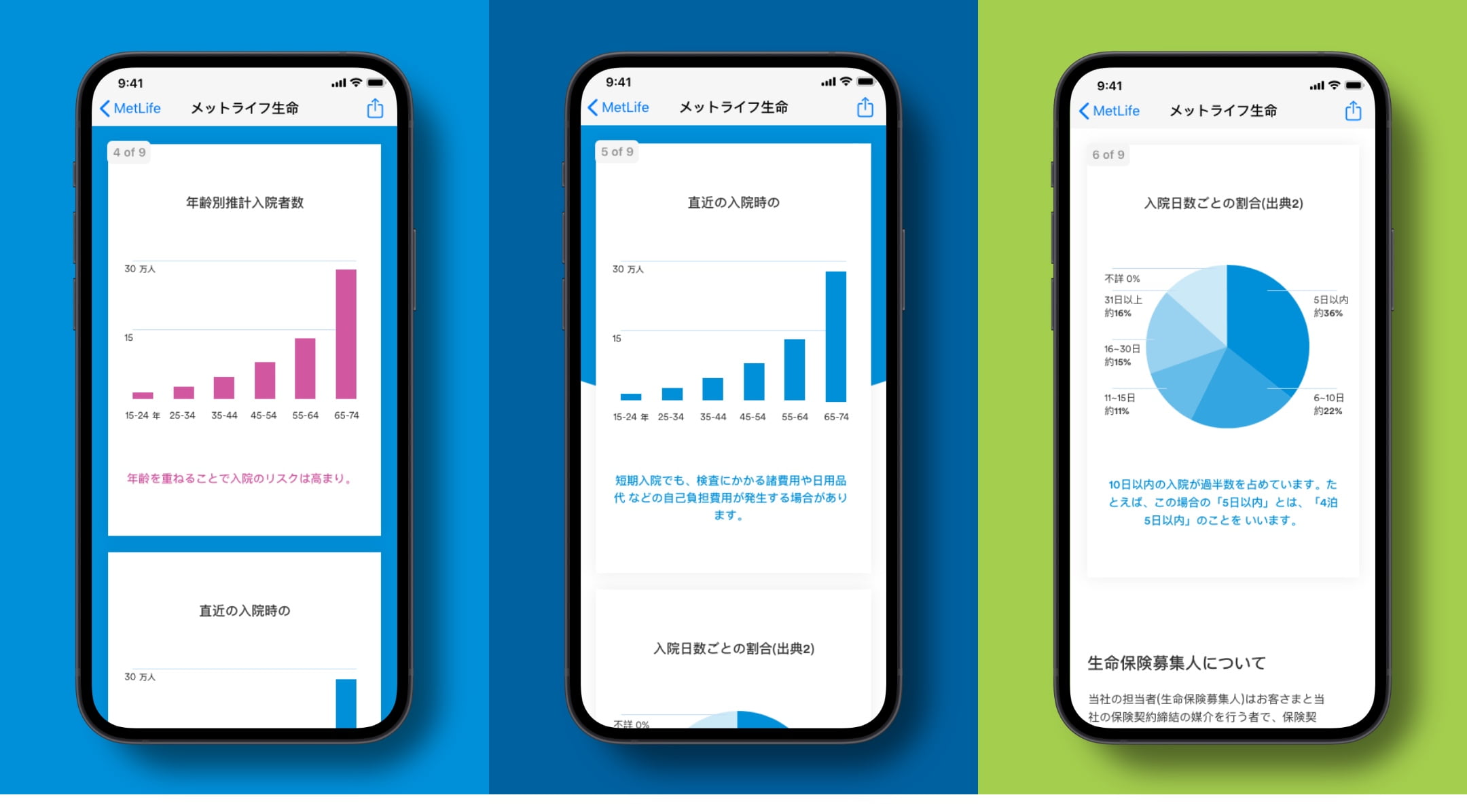
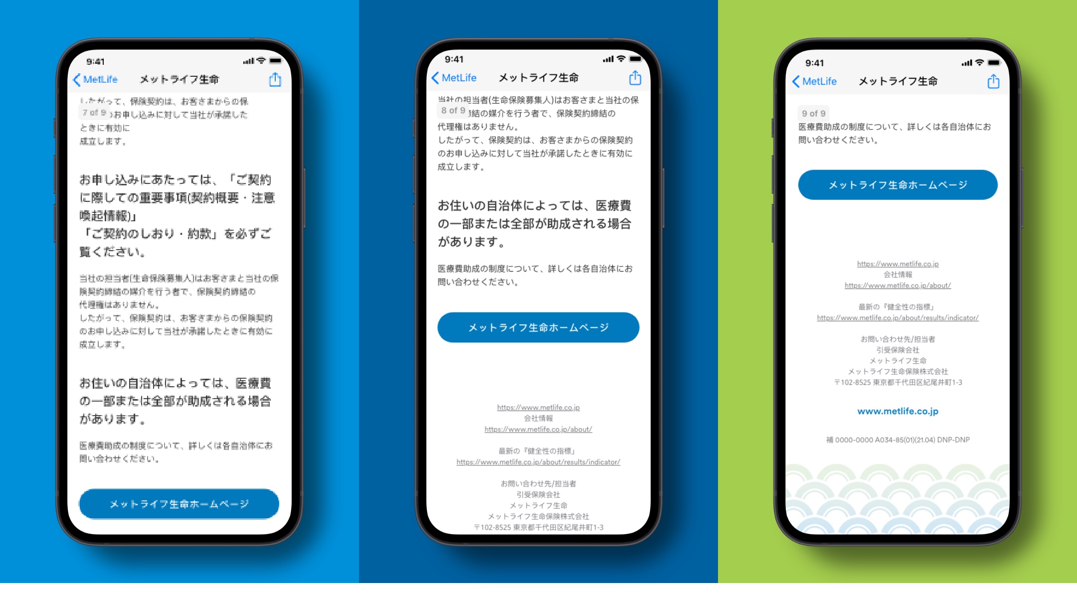
In marketing communications (email, digital pamphlets, etc.), we use our brand elements to complement our messages. Because these moments generally convey more information than a social post, we use color and patterns less often, but always very intentionally to draw focus to key points.
Digital Pamphlet
Website
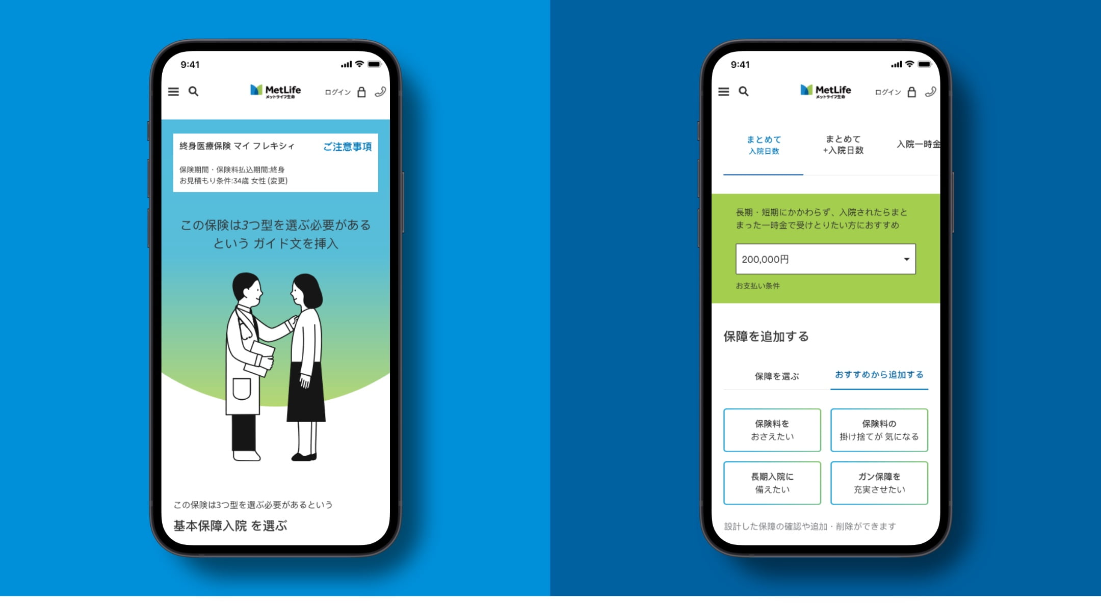
In more functional moments, like on the web, the branded elements of our system play more of a secondary role. They should be used to support, but never distract from key information. Use a generous amount of white space to create a clear information hierarchy, while using patterns and gradients to guide the users attention down the page.
Product Page
