MARKETING & ADVERTISING GUIDANCE
Online Ads
Overview
Guidance
Do
Be bold.
- Stand out with bold use of our primary color palette and gradients.
Do
Keep headlines concise.
- Short headlines are easier to quickly read, and allow for larger typography in small ads.
Do
Diversify content.
- Approach creative explorations with diverse content. We should look for opportunities to move beyond headlines, creating engaging content with a clear hierarchy.
Do
Design one key visual per campaign.
- Start by designing one size of an online, with final verbal and visual design. Then resize for multiple banner sizes in your media plan.
- Use content and typography to create movement in compositions, engaging the reader in a deeper conversation.
- Curate and use photographs that live at many levels from wide-angle shots to intimate close-up— reinforcing the human story. Consider our message and its intended audience.
Do
Design an area of focus.
- Create an area of focus with typography, elevating the message that you want to communicate.
- When using photography, find a clear area of focus, cropping imagery to emphasize an idea or moment that aligns with your message.
Do
Use buttons for CTAs.
- Use simple calls to action that are visibly tappable with a button or other indicator to drive engagement and improve click-through.
Do
Target and personalize when possible.
- Personalize headlines to your audience segment to drive increased engagement.
Do
Use the filmstrip to add dimension.
- Create a scene with a film strip and photography. Select and combine images into scenes that enhance our storytelling.
- Use the filmstrip for cinematic intention and message prominence, rather than decoration. It should be utilized with purpose as an information container or to indicate movement across scenes.
Do
Use illustration to create emotional connection.
- Create illustrations of authentic moments to reinforce your message. Compositional and supporting elements add an additional layer of depth and emotional connection.
- Use illustrations of objects to communicate ideas in a straightforward manner, when they are more documentary in nature and simple in composition.
- Create illustrations of abstractions to distill high level concepts, such as our brand principles, into simple, yet powerful graphics.
In Use
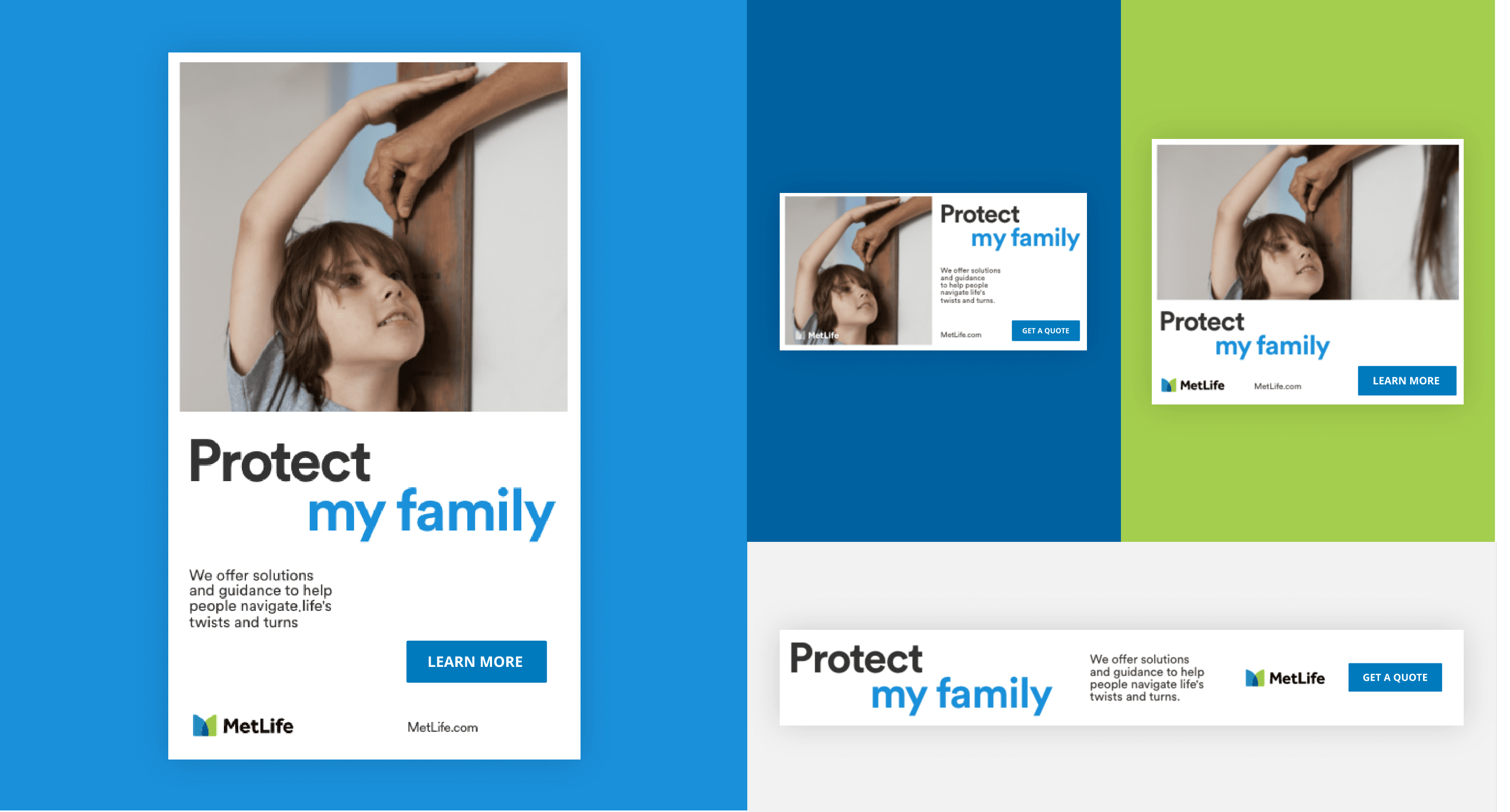

Example of an online ad using photography.
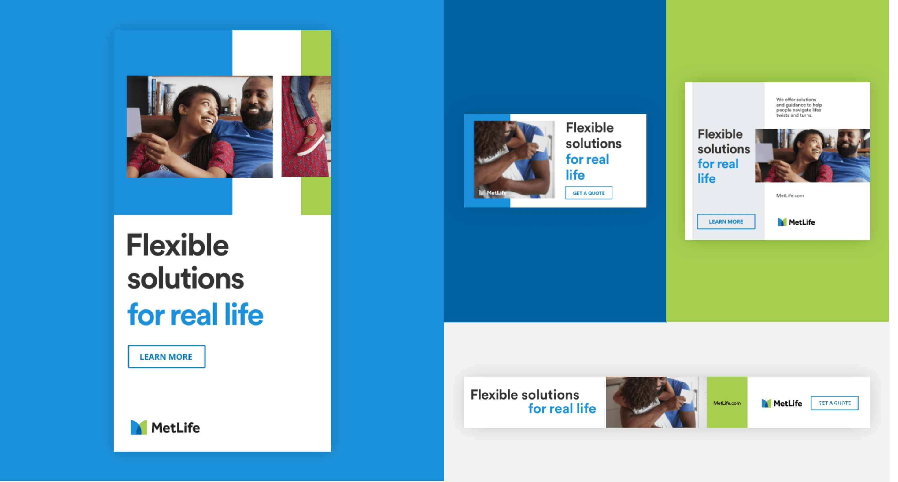
Example of an online ad using the film strip and photography.
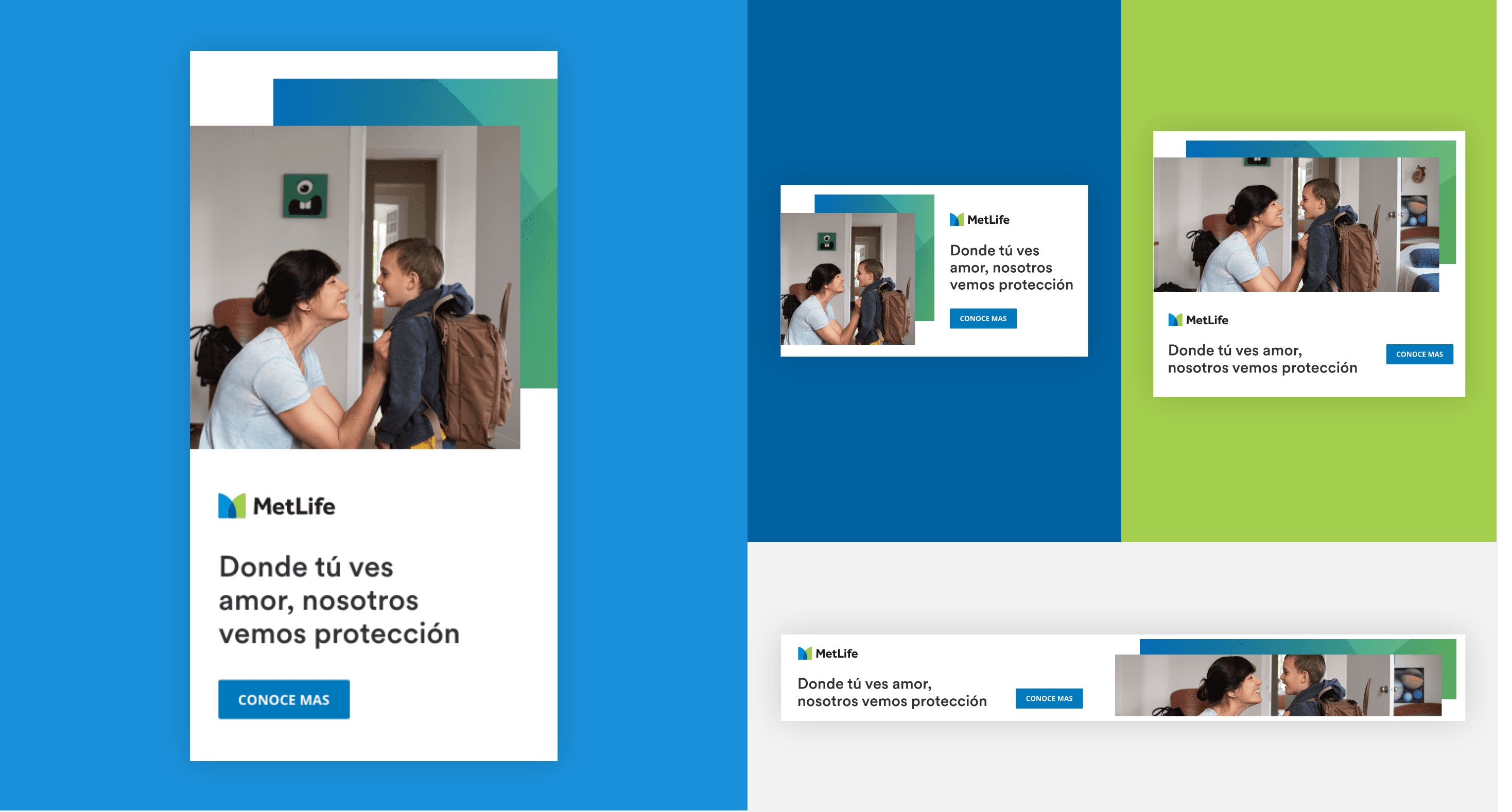
Example of an online ad using photography and graphic patterns.
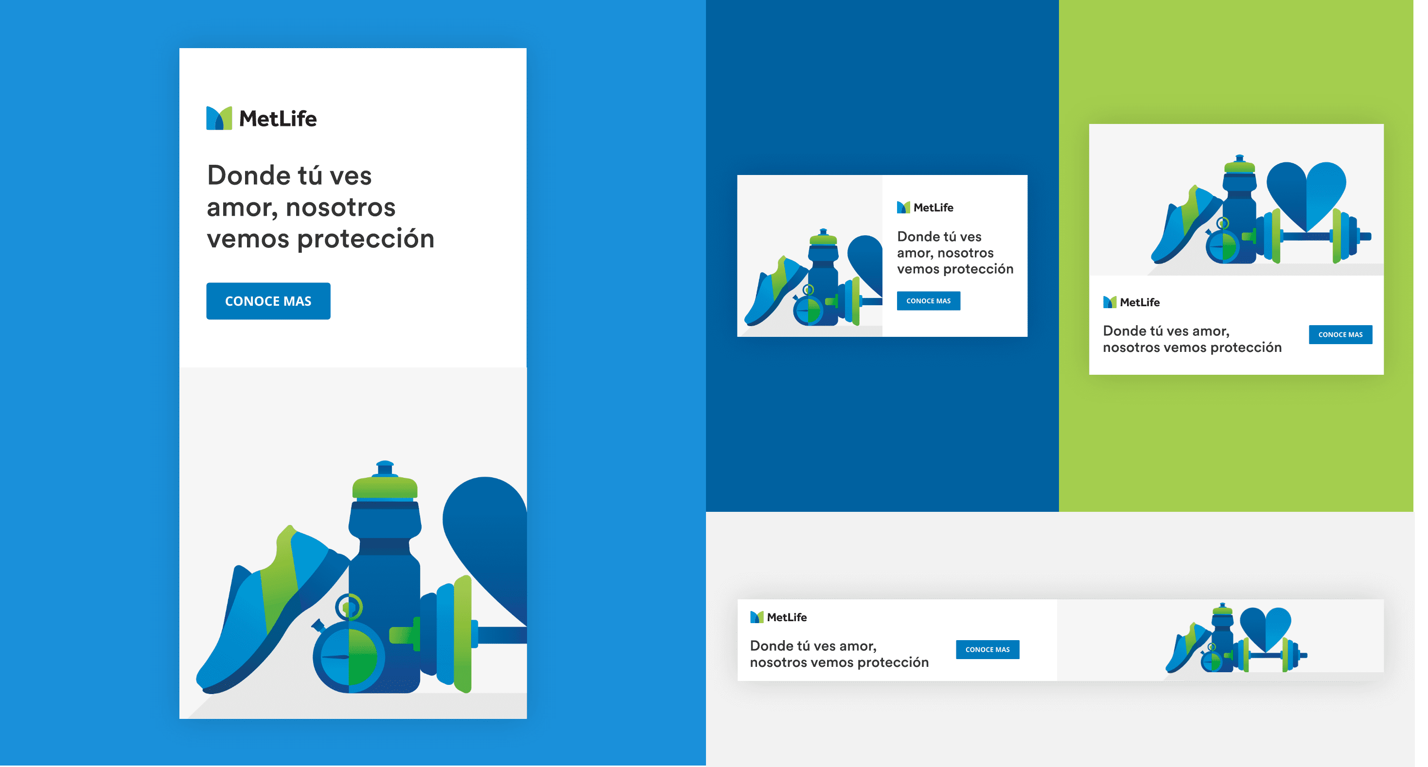
Example of an online ad using illustration.
Example of an online ad using the film strip and typography.
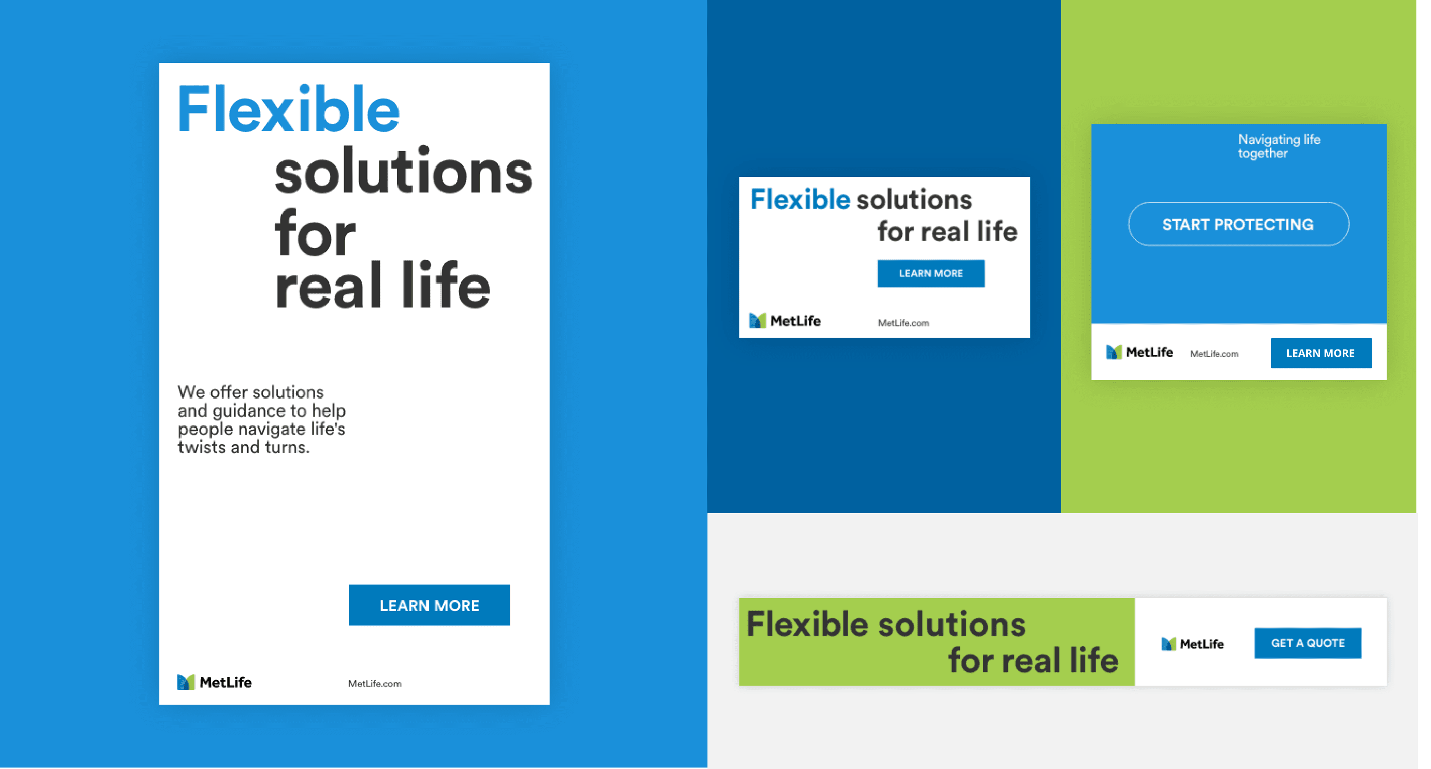
Example of an online ad using dynamic typography.
Error Message
Example of an online ad using photography.
Example of an online ad using the film strip and photography.
Example of an online ad using photography and graphic patterns.
Example of an online ad using illustration.
Example of an online ad using the film strip and typography.
Example of an online ad using dynamic typography.
