CORE GUIDANCE
Photography
Overview
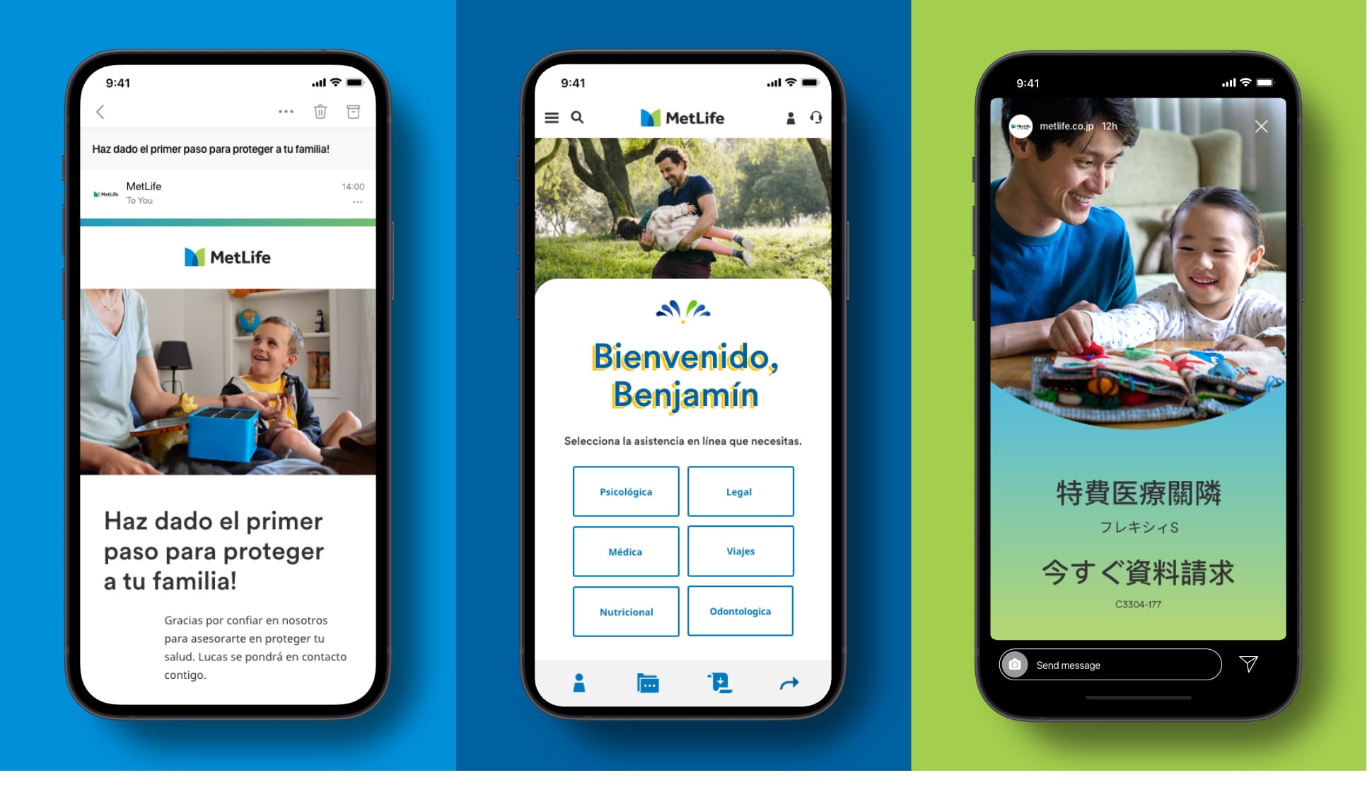
Photography is essential to conveying the human benefit of our products and services. In digital, we use photography that is candid, warm, and authentic.
Selecting Images
We have extensive image libraries from photoshoots we have done in different markets. When possible, choose from those libraries. Sometimes, stock photography is needed. If so, images can be purchased from Getty Images or Adobe Stock.
Our Libraries
- Reference this set before going to stock.
- Make sure to utilize localized market shoots.
Stock Photography
- Use our guidance to help choose stock imagery.
- Check previous usage of already approved stock.
Guidance
Here’s how you can use photography to help make our digital communications relatable, honest, and empathetic.
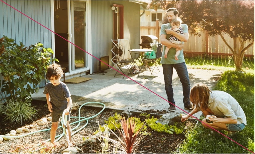
Choose photographs that are candid, not overly staged.
- Choose moments that feel authentic.
- Choose images with natural lighting and ambience.
- Avoid images with people that are looking directly into the camera, or that have their backs to the camera.
Choose photographs of people that are representative of the market.
- MetLife is a global brand and we strive to represent all our customers.
- Certain markets have libraries of photos that are more representative of the people from that market, so first look to those libraries before searching for stock.
Choose photographs that are vibrant and in full color.
- Only use black and white photography in approved scenarios.
- Manipulate photography.

- Place typography, patterns, or other elements over focal points—like people’s faces, for example.

Image Libraries
We’ve built up libraries of images approved for use in each of our markets. Below are a few select samples and links to these libraries, available through our Digital Asset Manager.
United States
We find moments of balance between life and work. We highlight unique points of view and interesting moments to bring authenticity and character into work/life environments that can otherwise feel forced and unnatural.
Mexico
We punch up the color saturation and steep in the cultural richness of Mexico. We focus on families expressing love openly and warmly, supporting each other through all of life’s highs and lows.
Japan
In Japan, we use photography that creates a sense of optimism and is aspirational for consumers of all ages. Photos portraying relatable moments and genuine interactions within a multigenerational family resonate very well.
China
Our photography in China includes a range of understated moments of family life at home, with depictions of people’s personal journeys at work.
South Korea
In Korea, our photography features subject matter that creates a sense of optimism and has an aspirational feel for consumers of all ages.
United Kingdom
In the UK, we take opportunities to incorporate moments of sport, outdoor scenes, and people leading healthy lifestyles into our photography.
Stock
In some scenarios, you may have to go with stock photography for your digital designs. Please follow these guidelines when searching for stock images.
Choose photographs that feel authentic and genuine.
- Choose images where interactions between people and environments feel real and relatable.
- Choose closer and more interesting crops, and lean toward warmer colors that give a sense of friendliness and intimacy.
Search for variety in the images that you choose.
- Choose images that expand upon our existing library.
- Consider images that represent places outside of major metropolitan areas.
Choose images with warmth, richness, and focus.
- Find images that have a clear focus or focal point.
- Choose images with warm color palettes and rich tones, but avoid photos that are overly saturated.
- Use photos with cold tones or showing environments that feel overused. This scene feels staged and isn’t genuine.

- Choose images that show the backs of people’s heads or that aren’t unique representations. This example also lacks focus and has a cool color palette.

- Choose images that are oversaturated. This image also lacks a focus in its crop.

- Choose images that are washed out or that lack vitality. This image appears overly staged and the subject doesn’t feel natural.

Accessibility
MetLife is committed to designing and developing digital experiences that all our customers are able to use. Be sure to only use combinations of photography and type color that pass accessibility standards.
Account for screen readers when uploading photography.
- Descriptive language in the filename and metadata helps the visually impaired understand the role photographs and other visuals play in digital designs. Make sure to account for this.


