STANDARDS
Accessibility

Accessibility for Visual Design
At MetLife, we’re all about helping people from all walks of life. When it comes to design, we strive to embody that philosophy by baking inclusivity into every experience we create. Globally, we want everyone to be able to interact with and benefit from our digital products—whether they have limited vision, hearing, or mobility, or have cognitive challenges. To help us get to truly inclusive, accessible design, we look to the recommendations of experts in the field, like the W3C. These guidelines inform how we design and improve our digital experiences for all.
Standards
Global Guidelines
MetLife digital design work around the world should follow the W3C recommendations under WCAG 2.1 (Level AA). The MetLife Global Design System has been created with these standards in mind. While some countries* may have slightly different or additional standards, beyond the W3C recommendations that are important to reference before launching new work, our commitment to accessibility is universal. For detailed guidance please see the WCAG 2.1 Guidelines.
Note: Developers should also use these guidelines to help ensure we are building accessible experiences.
* US and EMEA Markets are required to follow WCAG 2.1 (Level AA) at a minimum.
Color & Contrast
Color
Color is a fantastic tool for conveying information visually on the web, but it is important to consider users who have difficulty distinguishing one color from another due to limited vision or color blindness.
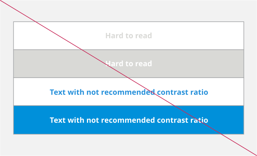
Design using color combinations that meet accessibility standards for contrast.
- We follow the latest standards from the WCAG (Web Content Accessibility Guidelines).
- A contrast ratio of 4.5:1 for normal text below 24 px is required.
- A contrast ratio of 3:1 for large text above 18 px and bolded, or 24px or larger for non-bolded text.
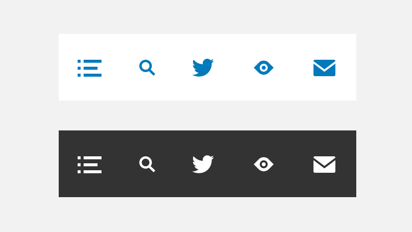
- For icons, a contrast ratio of 3:1 is required.
- The text and background colors do not follow the color contrast ratio recommendations and are not legible against their background colors.
- When creating text-based titles in a video, make sure to follow all other accessibility recommendations. Titles still need proper color contrast for those with limited vision.

Offline Documents
Accessibility standards must be followed when creating PDFs, PPTs, or other documents.
- Apply the same accessibility standards to documents that live offline.
Additional Visual Cues
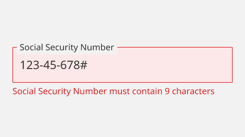
Include other design elements in addition to color to help ensure that colorblind users understand visual cues. Use elements such as strokes, indicators, patterns, texture or text to describe actions and content.
- Use more than one visual cue to communicate a text field error state. This example provides the text field stroke and color, along with an error message below the field.
Designing for Assistive Technology
Working With Screen Readers
When creating a digital experience, it is important to consider customers that will access the experience with a screen reader. Screen readers assist the visually-impaired by reading page content and image descriptions aloud. Working with your technical team to provide a clear description of image-based media will make for a more inclusive and accessible experience for everyone.
- Provide ALT Text for image-based media for all digital experiences. Descriptions should summarize the content in a photo, or illustration to paint a mental picture for those without vision. Any rasterized text must be included in the “ALT Text” description of the image.

Closed Captioning
When creating video content, you should not only follow color and contrast rules, but also provide captions for all pre-recorded audio. Captions allow the user to take in the content of the video without having to hear the audio. They can also give your video a wider audience if language translations are provided.
- Apply captions (in the primary language) to all videos.

Facilitating Usability
Alternative Browsing
Optimize your site for keyboard navigation and alternative methods of browsing, to allow users to move through the experience without a mouse.
- Have clear focus states for all calls to action and work with technical teams for clear page hierarchy.

Designing Inclusively for Responsive Web
Different people will be able to use certain devices more easily than others. We should always strive to design digital experiences that can be interacted with through multiple devices and screen views, without limiting their features or functionality.
- Keep design and functionality consistent between different levels of zoom.
Ex: Someone may view a desktop experience at 400% zoom to help them see better. We should ensure that the same features and functionality are available to them.
Tools for Designers
To check your design for color contrast accessibility
Here are some recommended tools to check for visual accessibility compliance. While our design system components are designed with WCAG 2.1 AA standards, it is always best practice for designers to run accessibility checks on their comps.
More on Accessibility