MEXICO
Color
Overview
For the Mexican market, we amplify our secondary color palette in our designs and graphical elements, to lend a vibrancy that’s distinct to the region.
Primary
Our primary color palette features calm and refreshing blues and greens that reflect expertise and trustworthiness. All digital applications should start from a base of white, with blue as the primary color and green used slightly less.

Secondary
While we still use MetLife Blue and Green in highest proportion, secondary colors are able to take a more prominent position in material in Mexico.

Neutrals
Neutrals are how we always start a layout (almost always on white). Use neutrals as a canvas, and to ground all elements in a clear and legible way.

Guidance
Marketing
Here are some guidelines to help you use color effectively in communications for the Mexican market.
Amplify the secondary color palette in bold ways.
- Colored backgrounds and patterns enhance the Mexican system and make it distinct.
- However, make sure it is paired with at least one color from the global primary color palette.
When using pattern, in general, put it on white and give it ample space.
- Patterns can also be used over colors, but not full color. In this instance, use a monochromatic version of the pattern with the color block.
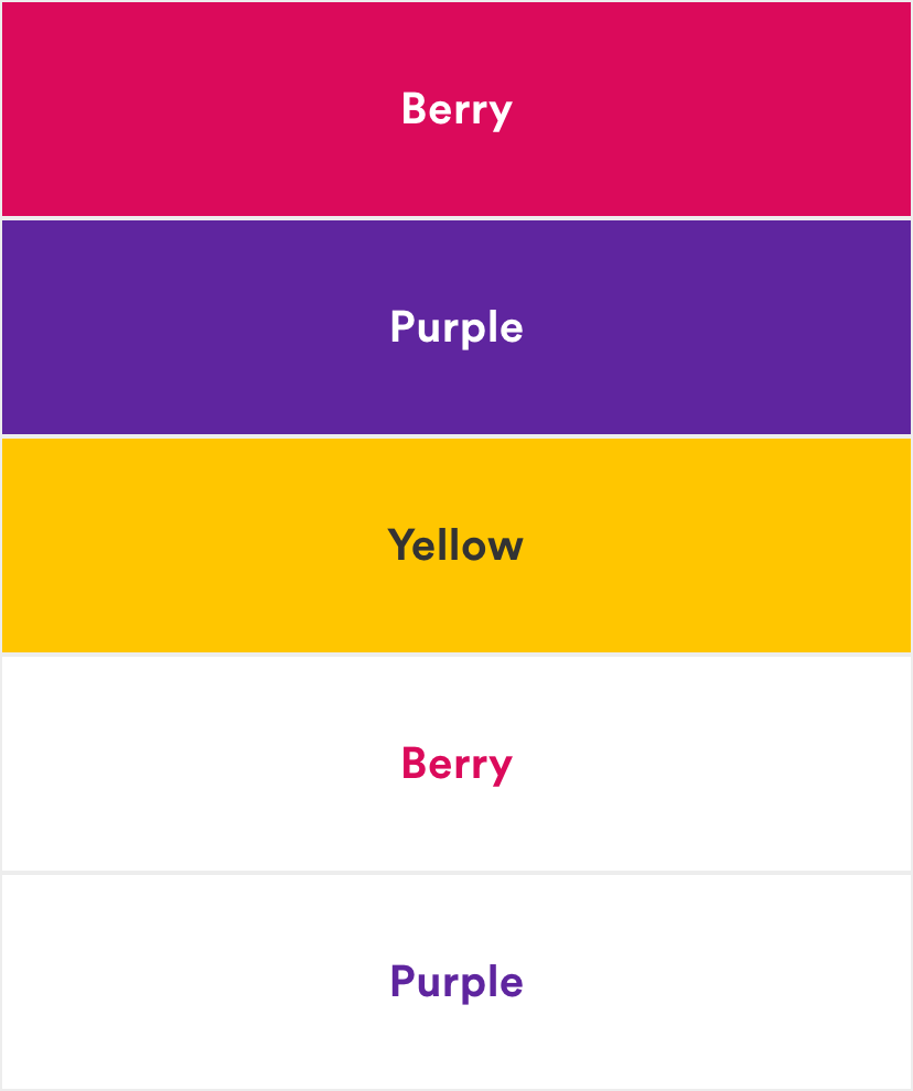
When creating the unique type style for Mexico, make sure you pair colors with enough contrast.
- Examples include Teal and Purple, Purple and Yellow, Blue 1 and Blue 2.
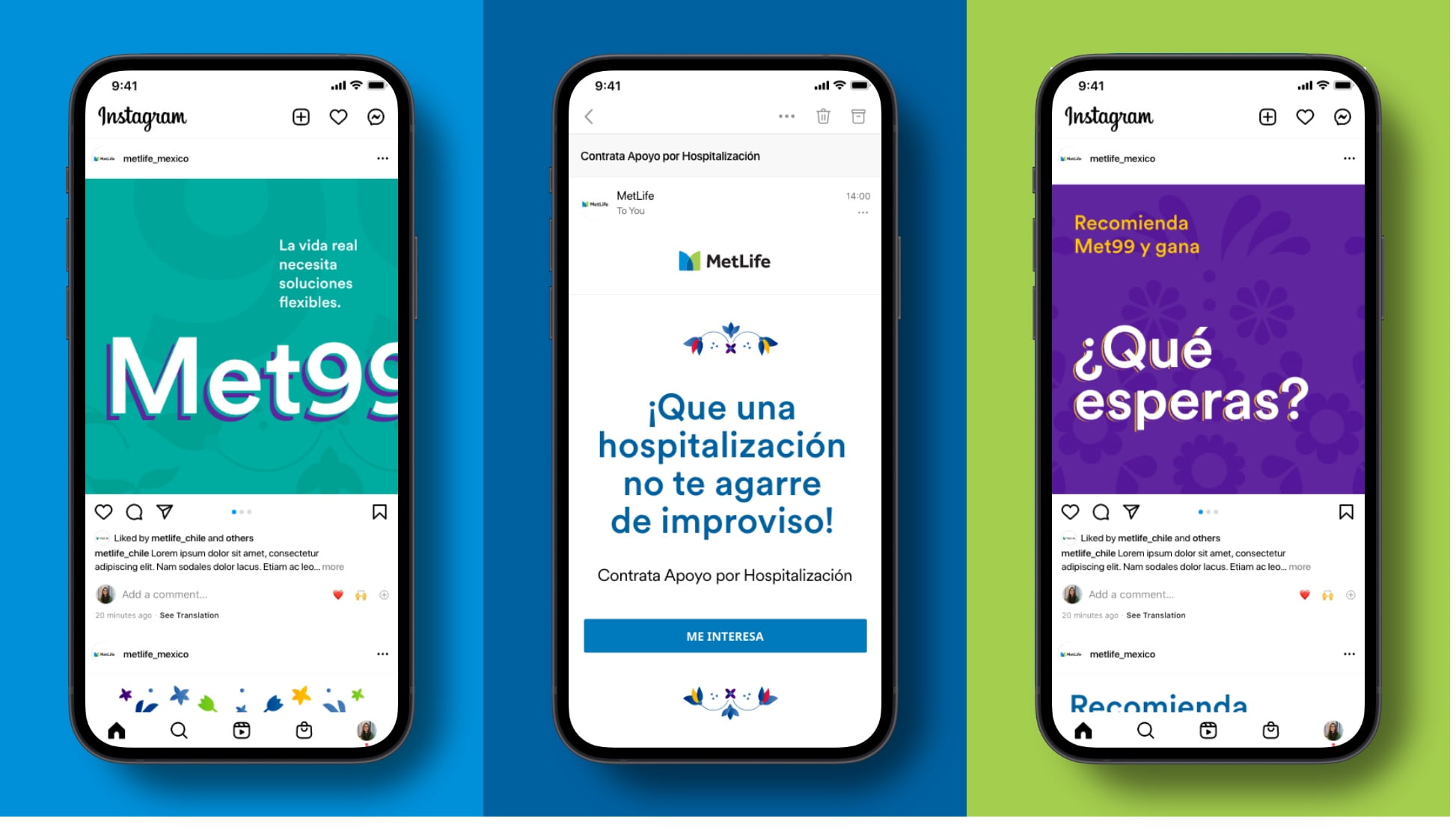
- Use the secondary color palette on typography in headlines.
- Overuse MetLife Berry.
User Interface
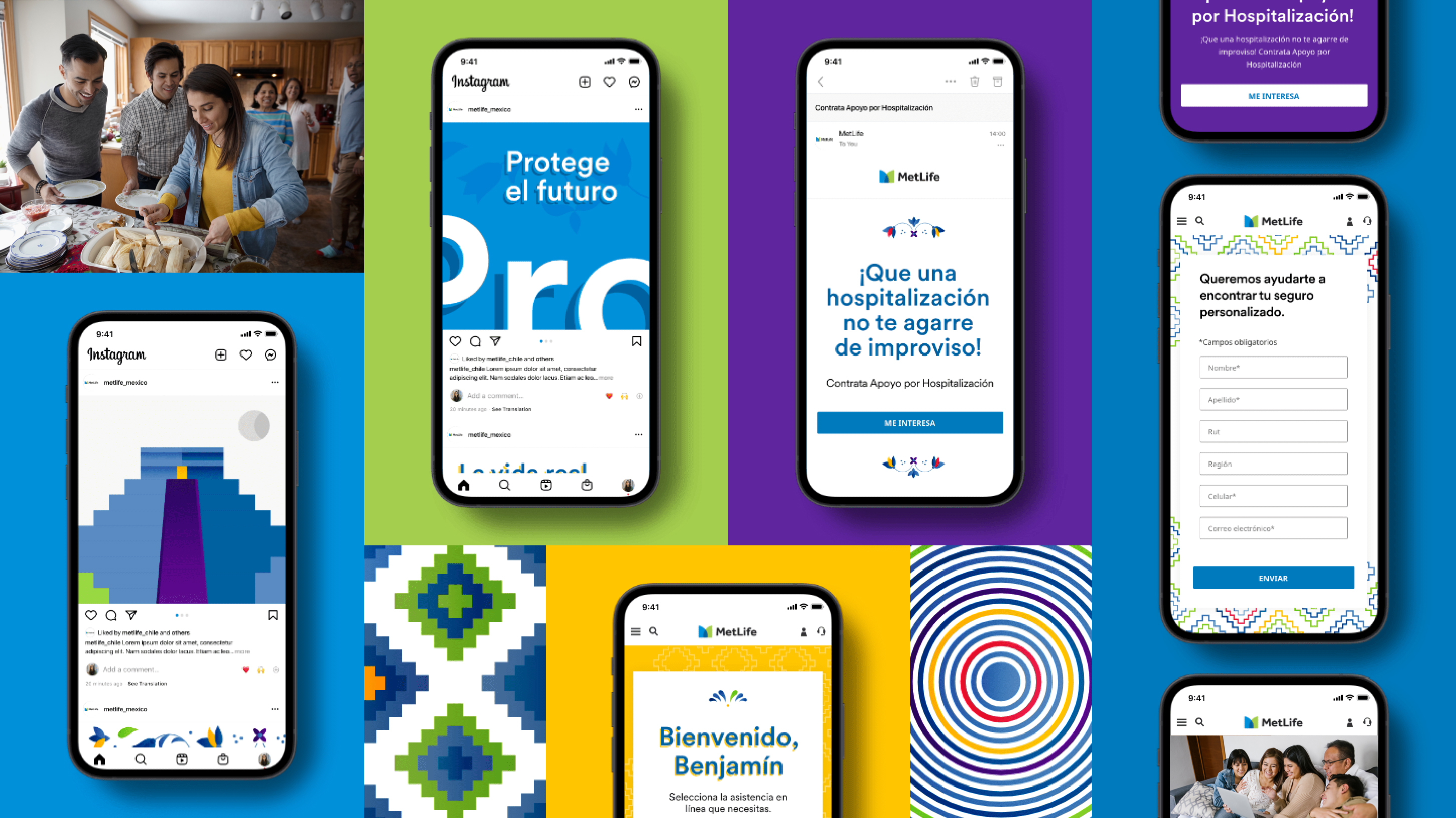
Mexico’s localized system is full of color and pattern. In digital interfaces, we look to incorporate both without sacrificing simplicity and legibility.
Use blocks of color to help separate sections on longer pages.
- Colored backgrounds can help divide information in a way that creates visual interest throughout a page.
Start with White, just like the global brand.
- Although Mexico’s localized system uses more color than the global system, we still prioritize simplicity and legibility.
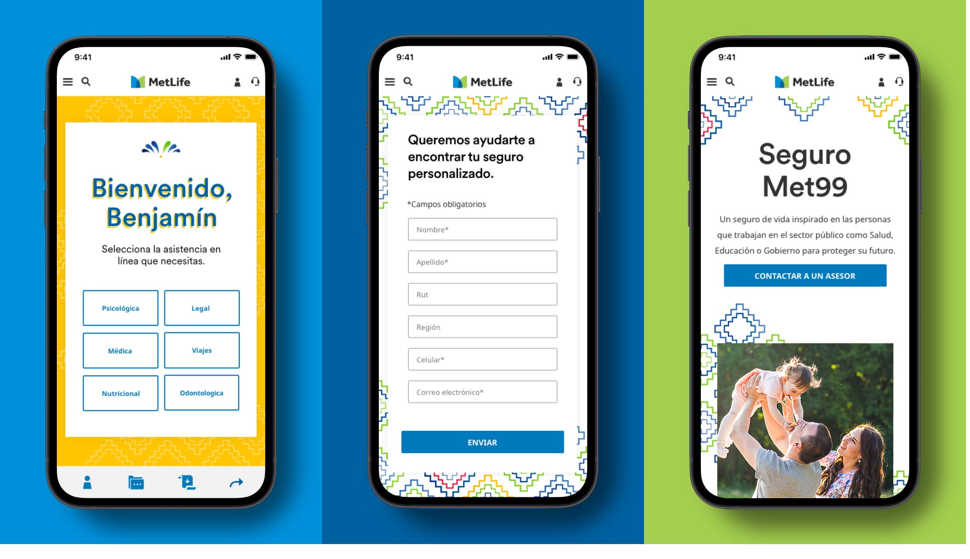
- Manipulate colors of global brand elements, like icons or pictograms.
- Use any of the secondary color palette on things like buttons.
Accessibility
MetLife is committed to designing and developing digital experiences that all our customers are able to use. We stick to contrast ratios that meet WCAG 2.1 (Level AA) standards.
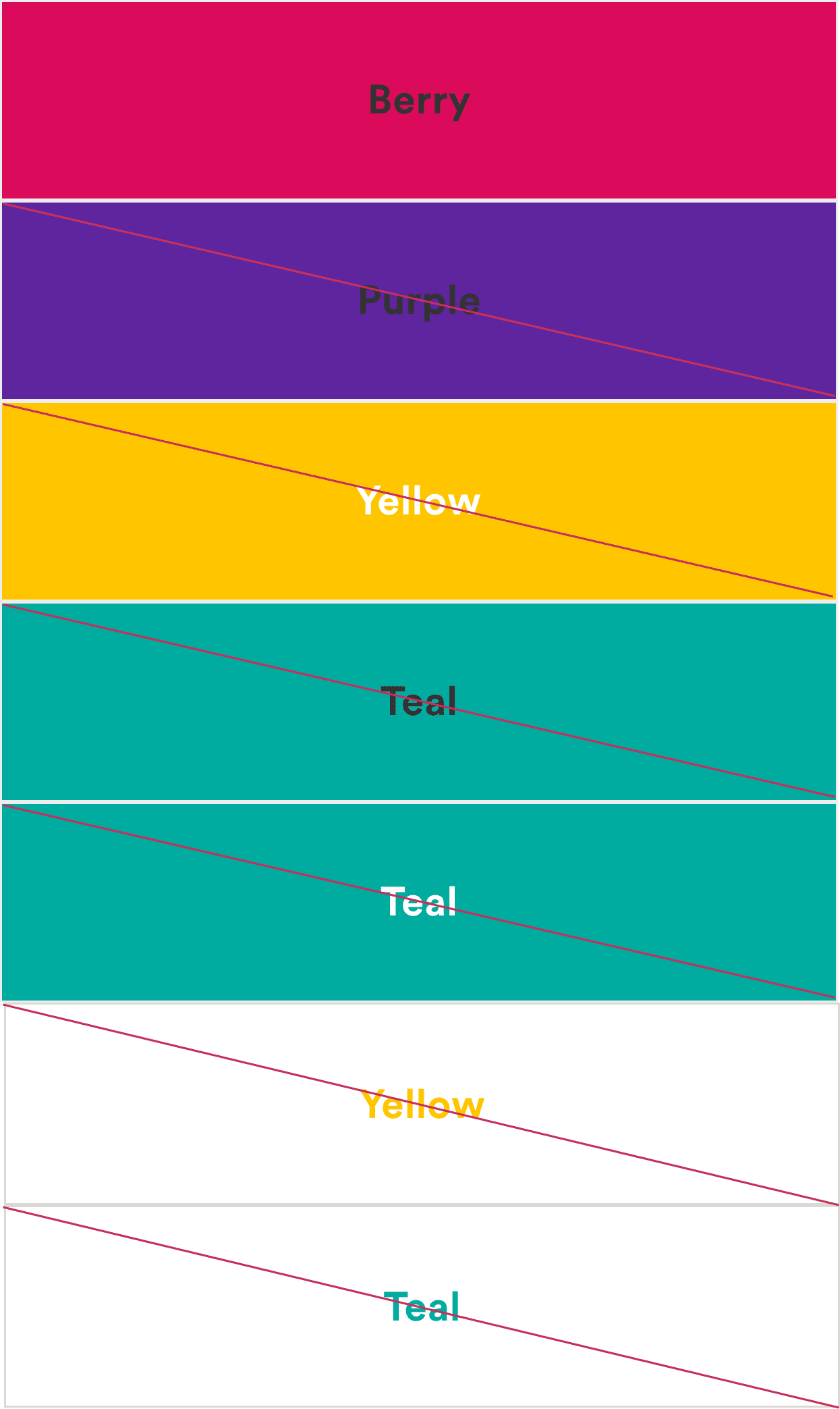
Design using color combinations that meet accessibility standards for contrast.
- Use our guide below to help with decisions regarding color combinations with typography. We follow the latest standards from the WCAG (Web Content Accessibility Guidelines).
- A contrast ratio of 4.5:1 for normal text below 24 px is required.
- A contrast ratio of 3:1 for large text above 18 px and bolded, or 24px or larger for non-bolded text.
- Use these color combinations.
- Use these color combinations.
More from Mexico
Showcase