NATIVE APP USER INTERFACE ELEMENTS
Navigation
Overview
From universal anchored navigation bars to More Menus, our navigation components allow the user to more easily find what they're looking for throughout MetLife mobile experiences.
Variations
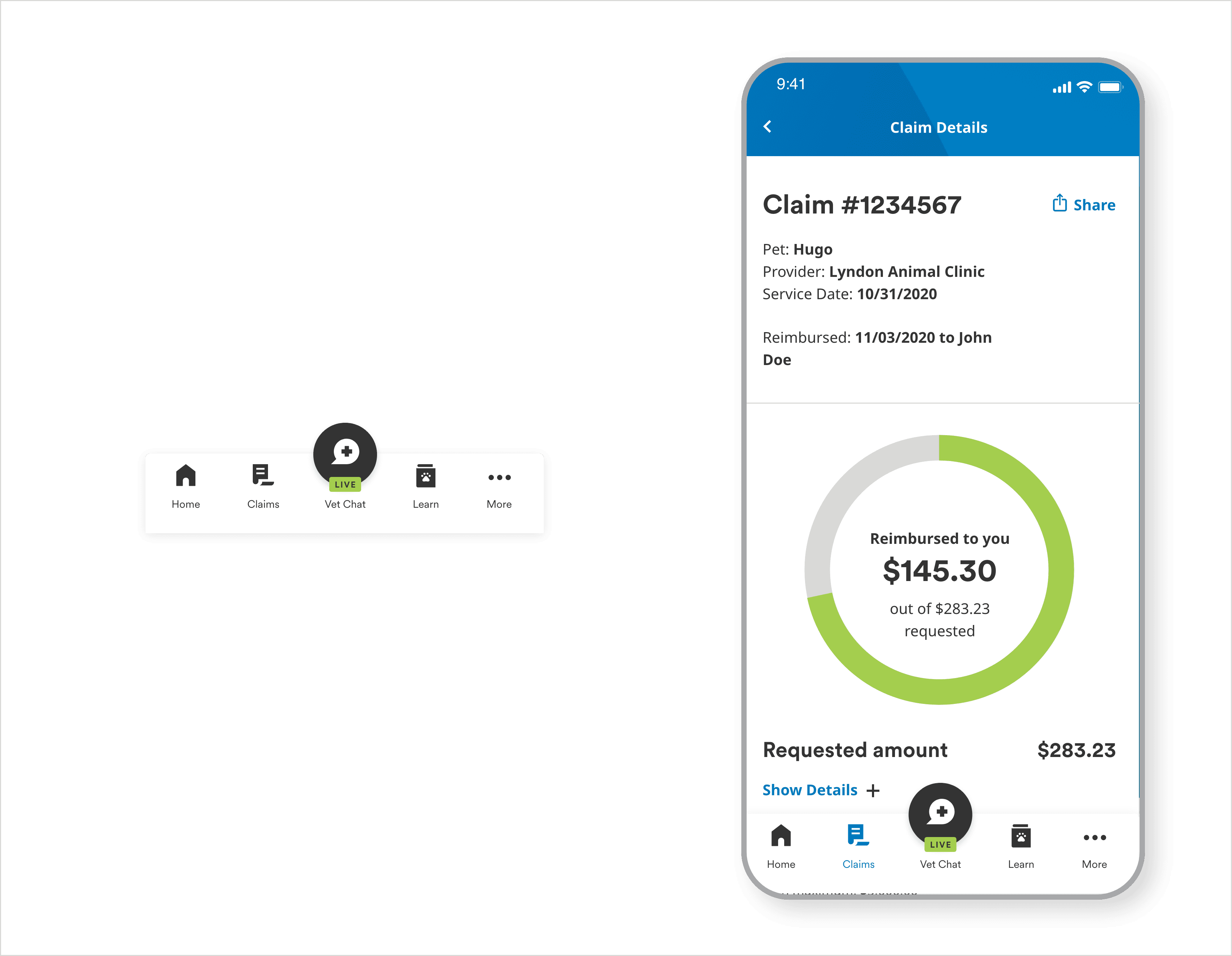
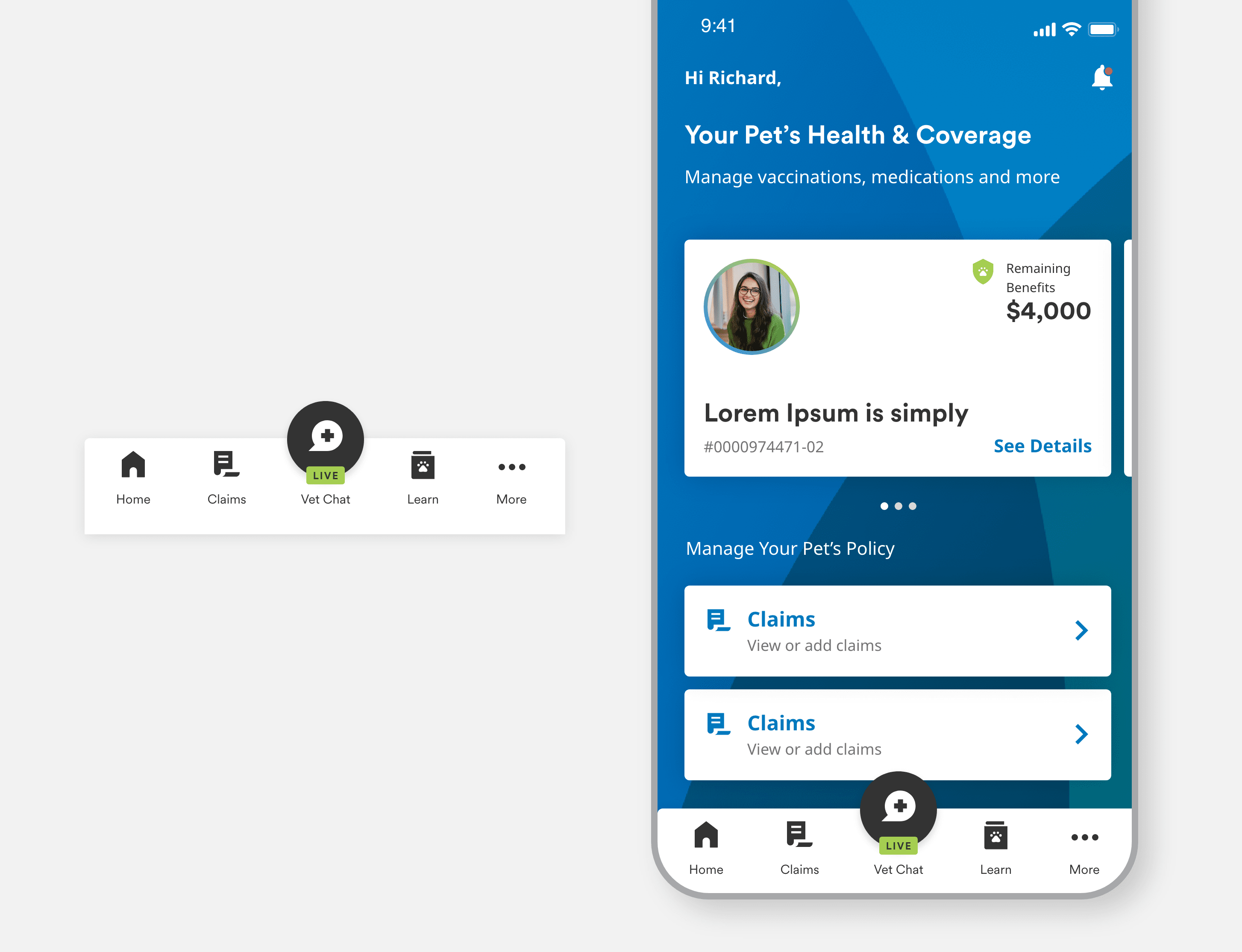
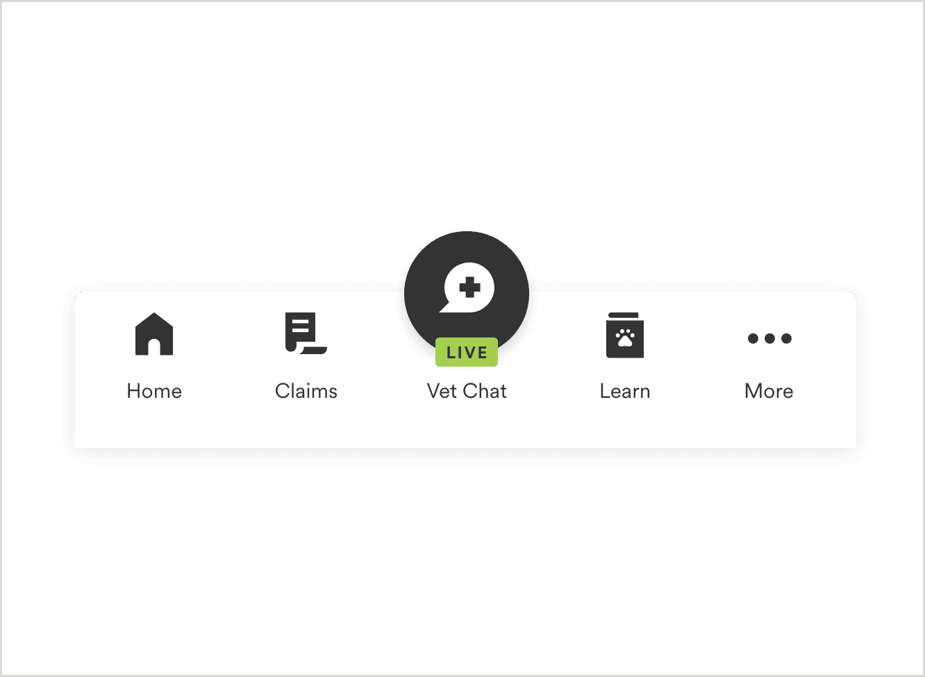
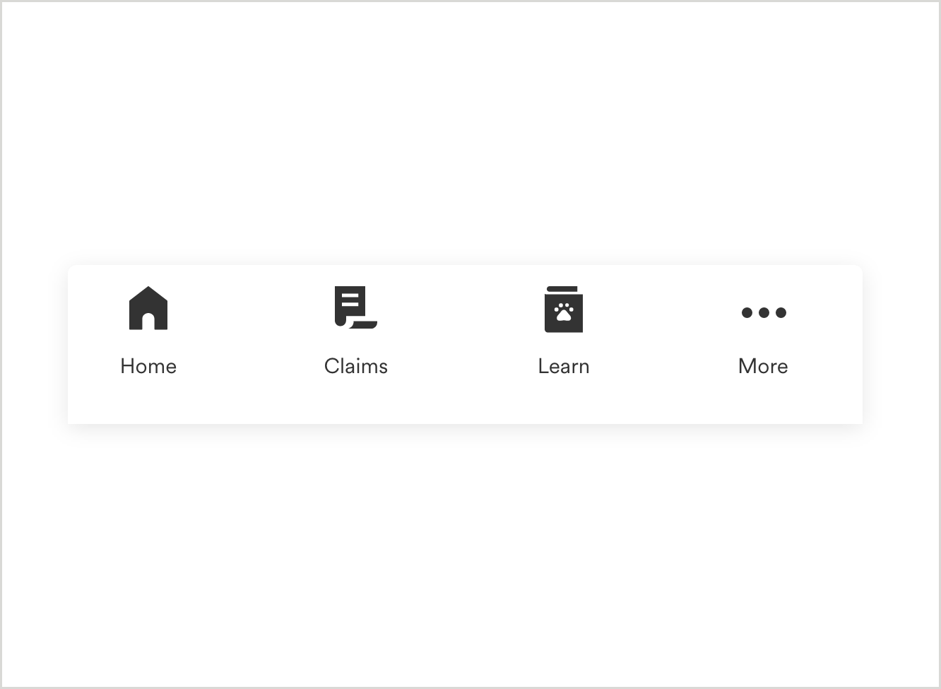
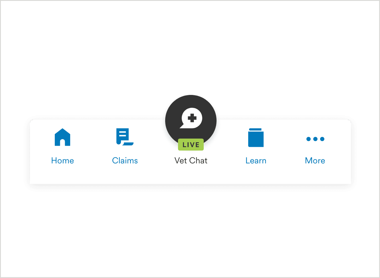
Global Nav - The navigation bar is anchored to the bottom of the screen, that gathers the primary navigation links. With a simple tap, users can intuitively explore and navigate between top-level destination pages in the app. We recommand using 3 to 5 items in global navigation including "More" for ideal experience. One of the center items can be a critical quick link if required for the app (ex: Live chatbot, initiate global quick links like file a claim, access ID card etc.)
Global Nav
Global Nav Without Chat
Global Nav - Selected/Active State
More Menu - building Blocks
"More" Menu - The more menu allows users to access content that is not accessible from the top-level bottom navigation menu. These are some of the secondary links which users don't use frequently in the app (ex: profile settings, account settings , privacy and terms etc.)
More Menu - Link Group

More Menu - Link Block

Usage
More Menu
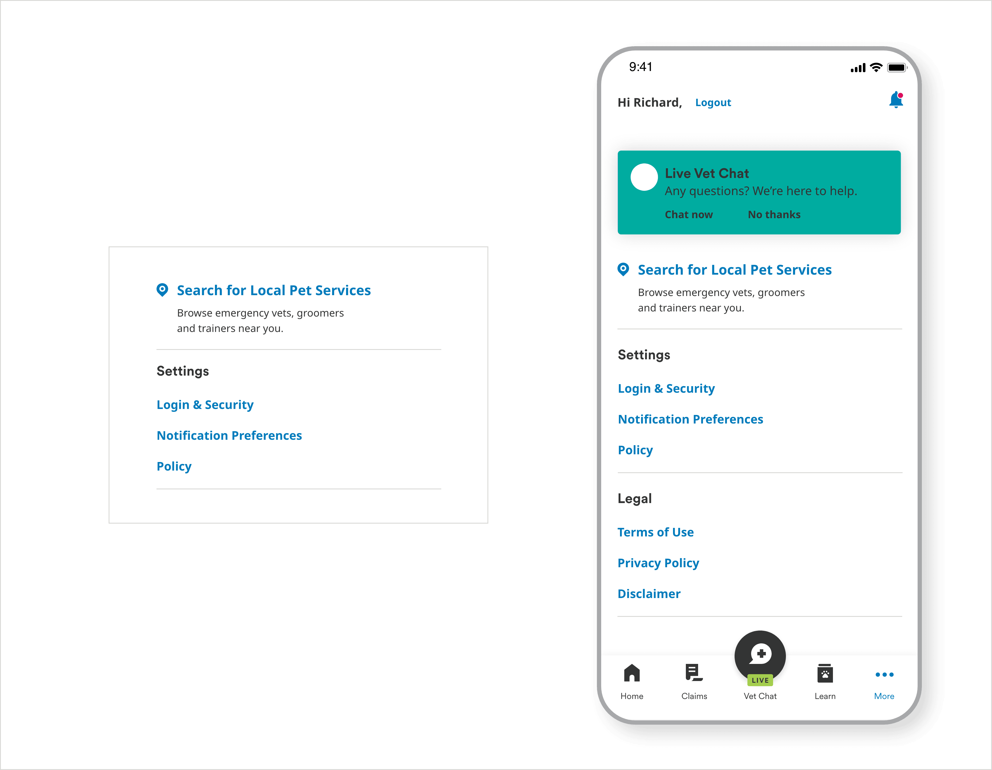
Global Nav