NATIVE APP USER INTERFACE ELEMENTS
Cards
Overview
Cards group together and call out vital information. Cards are a great way to aggregate individual pieces of information in one place. Cards can help users notice immediately when the user can swipe them horizontally which is a common interaction in mobile apps.
Variations
We have a variety of cards for different purposes, which helps provide varied focuses based on the information you want to highlight over others. The colors from our brand palette can be used for a variety of purposes for these cards. Keep in mind, the foundation of these cards should remain the same by following our design system standards for example 8px radius, shadow color-opacity, X & Y offset, etc.
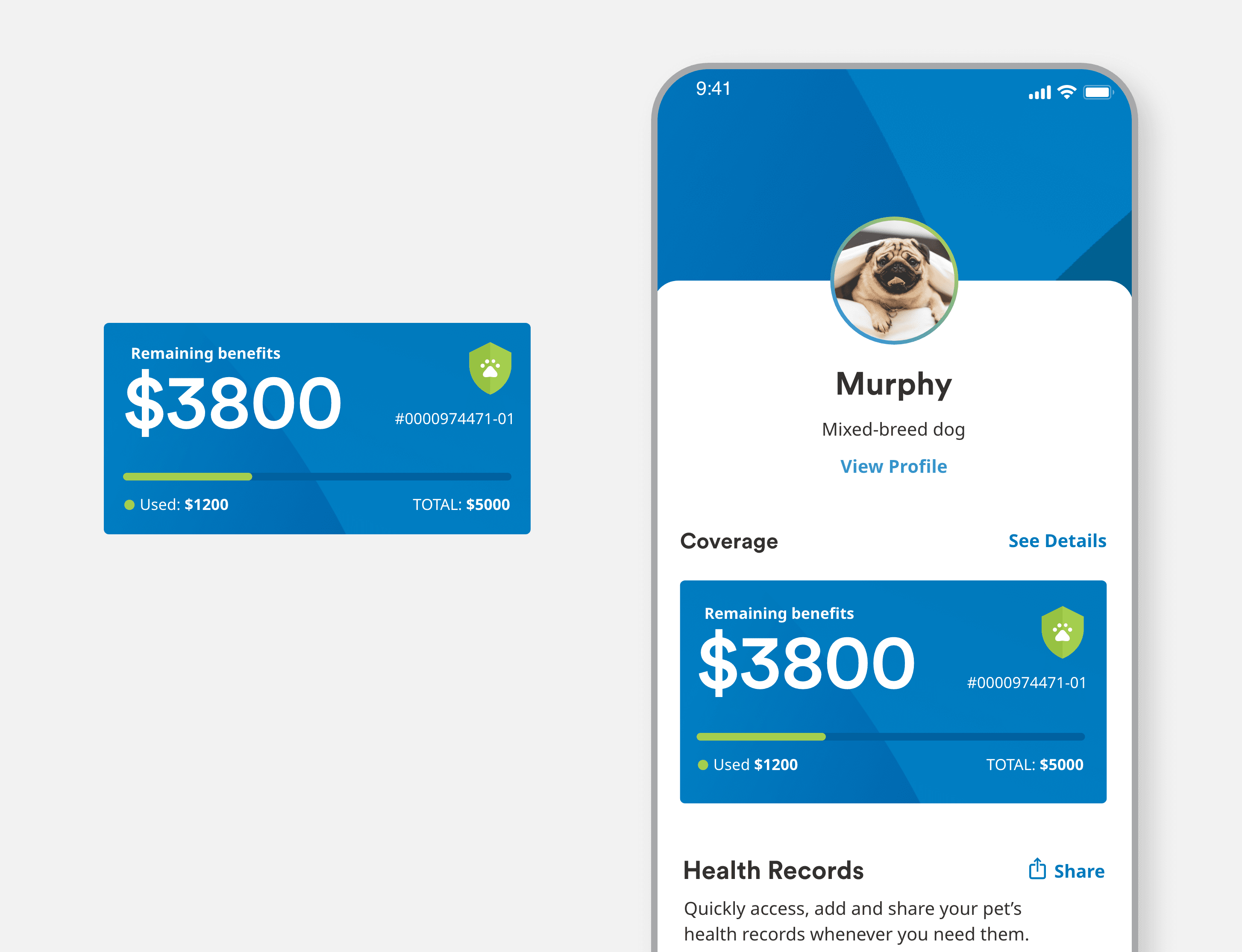
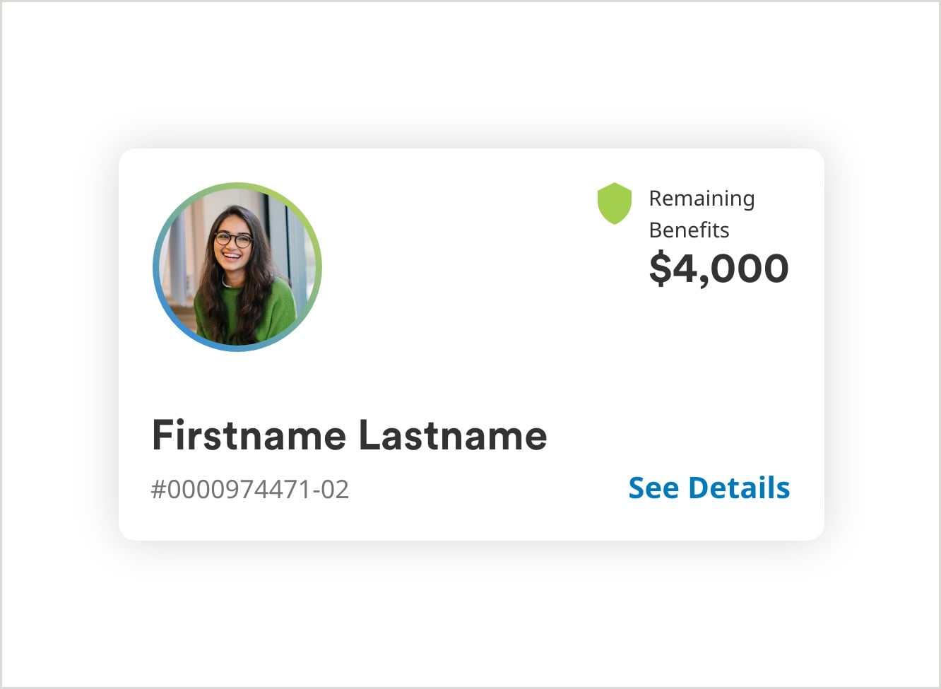
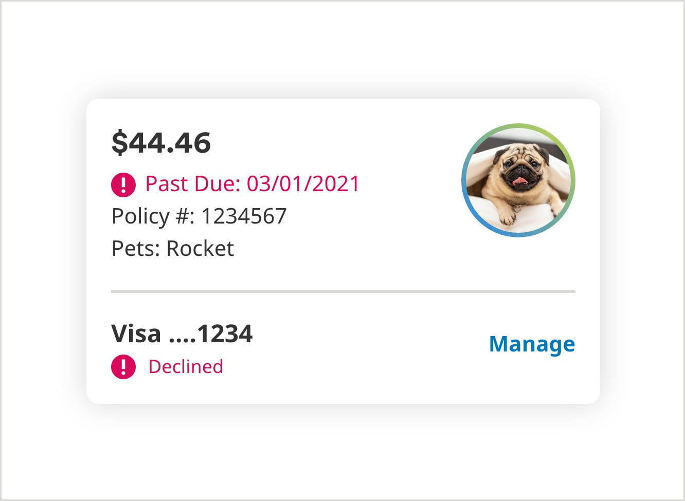
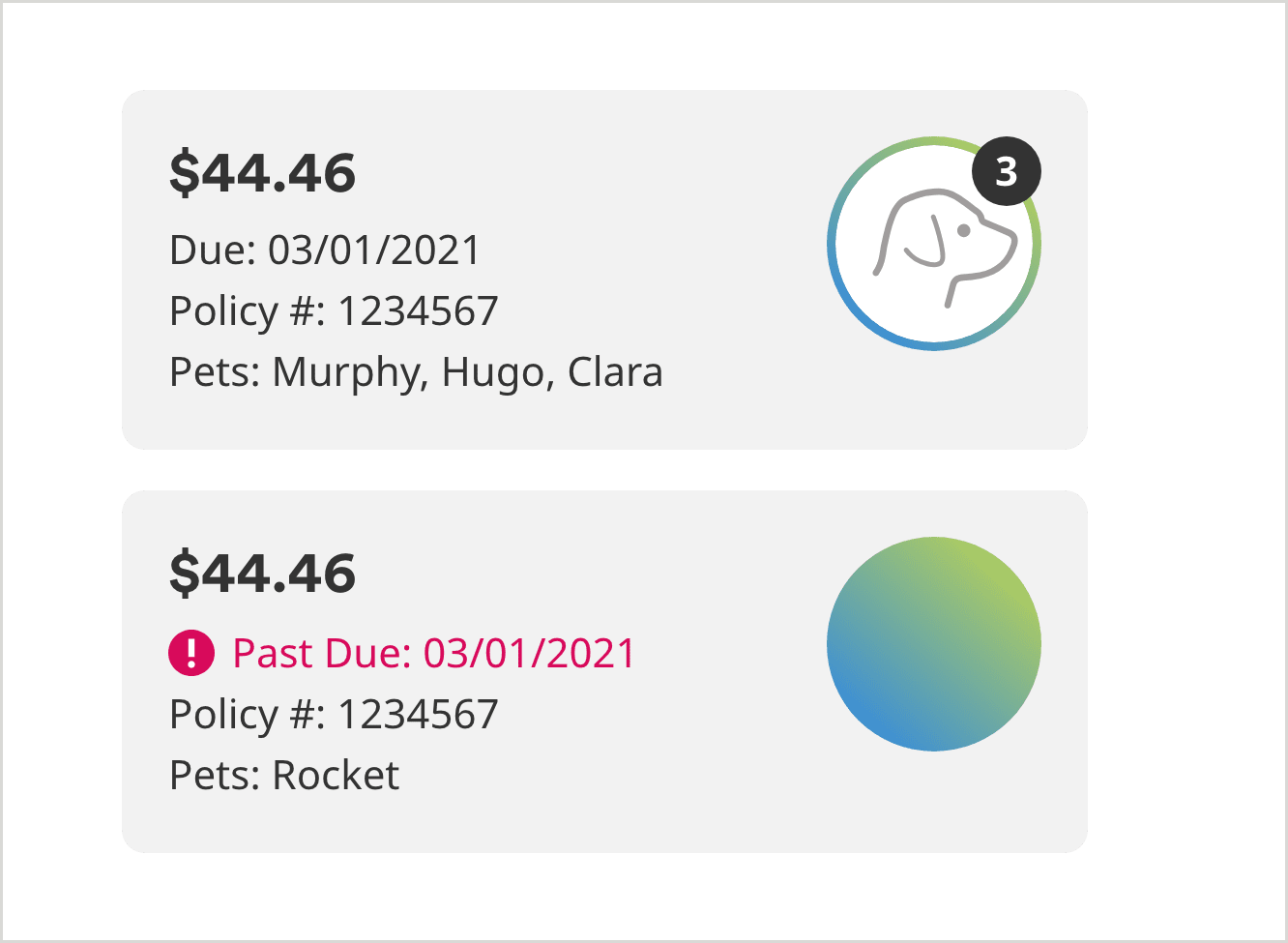
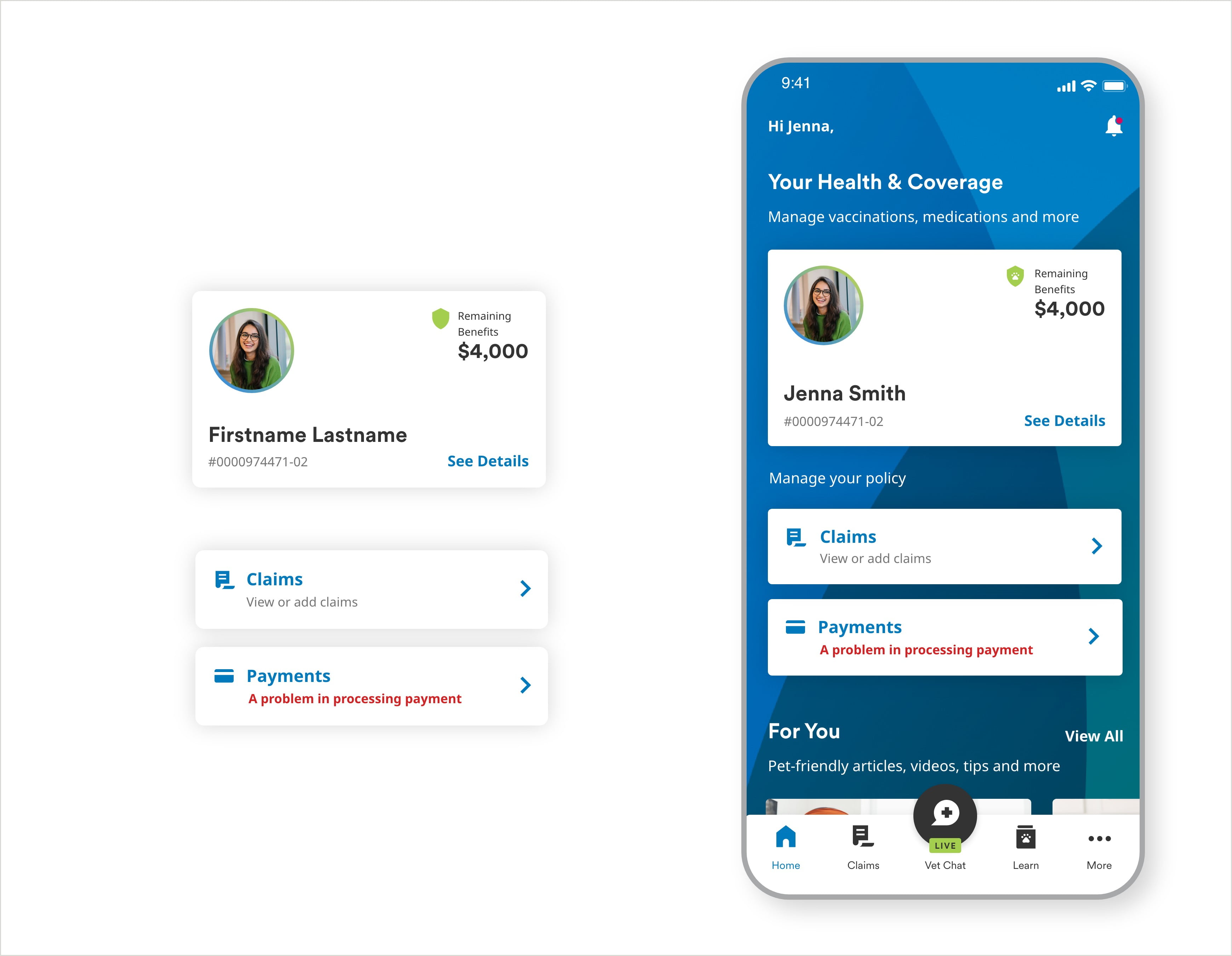
Policy Card
Dashboard Notifications
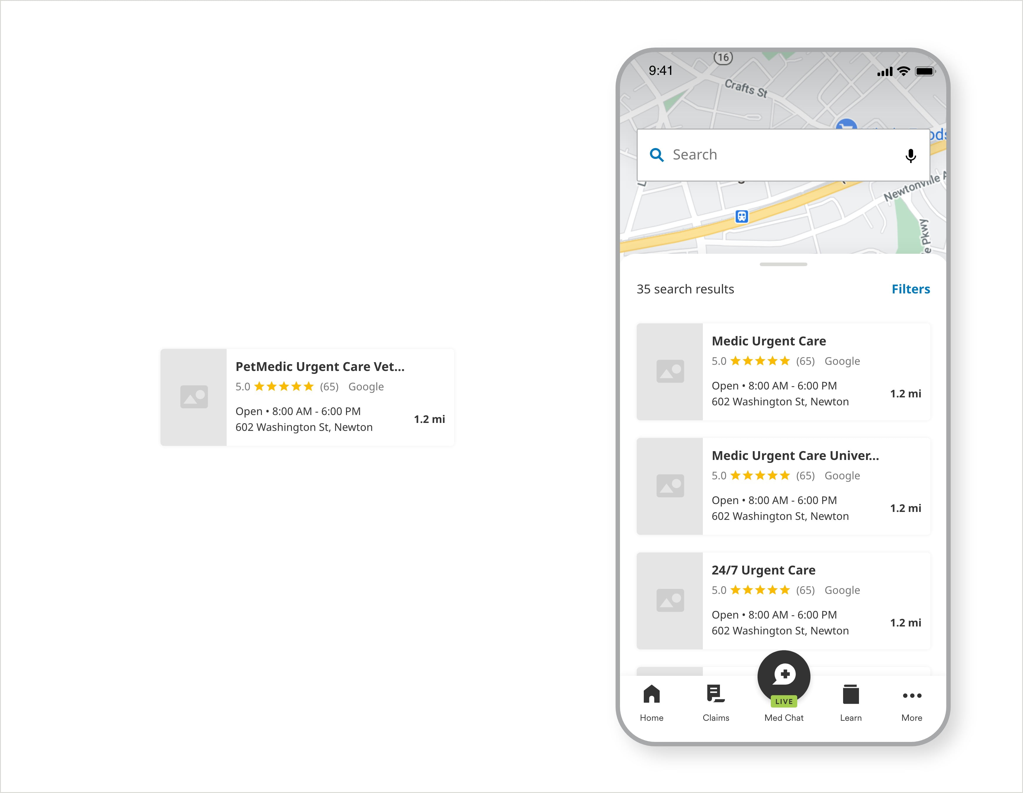
Provider Result Cards (Map / List View)

Payments Card
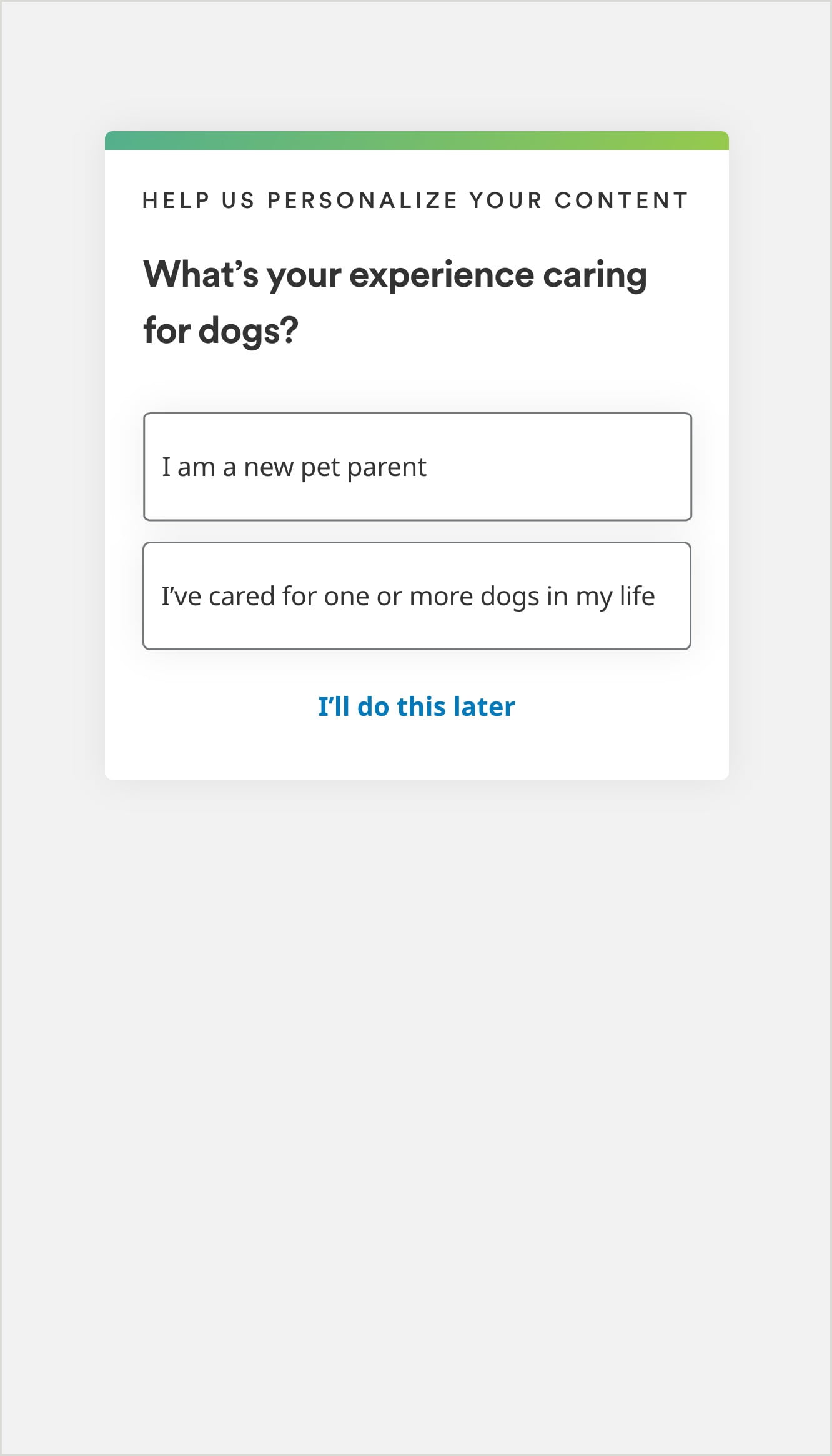
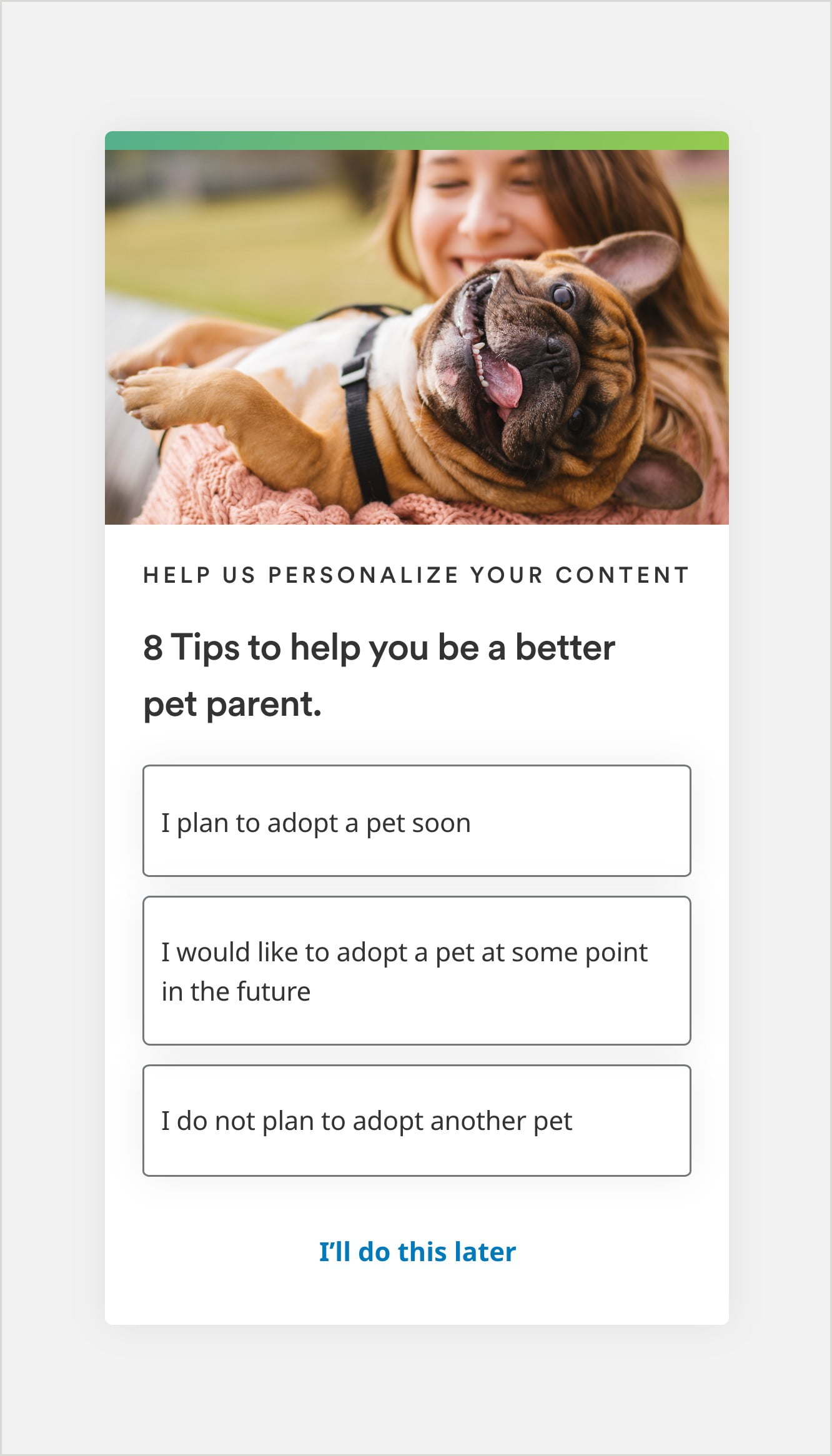
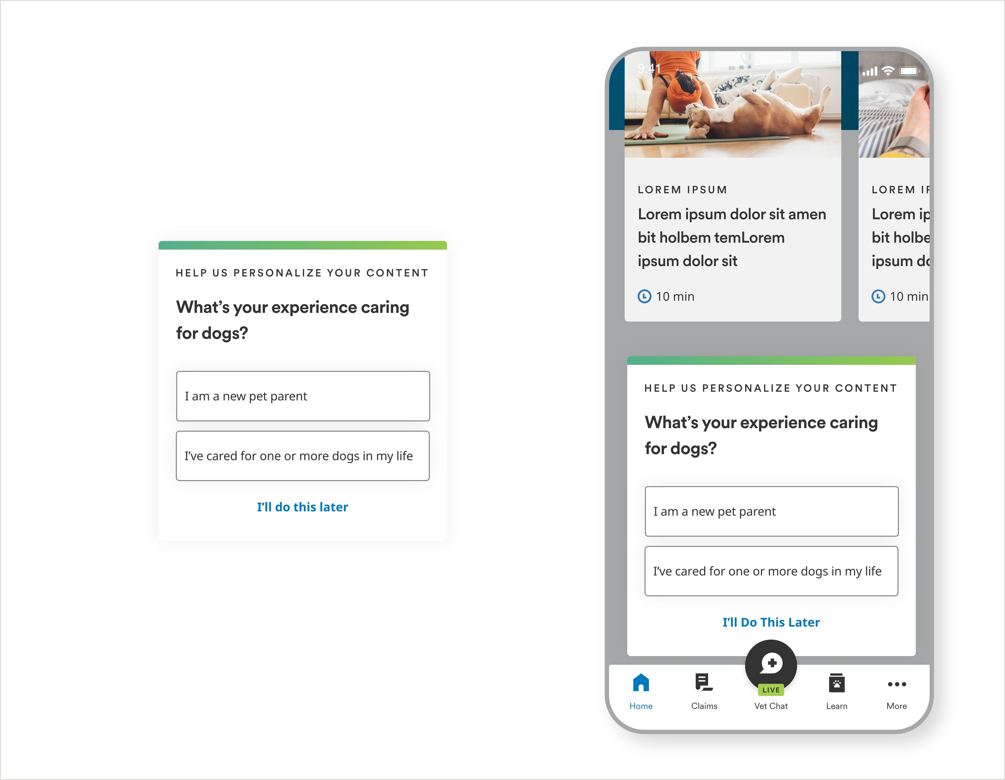
Quizlet Card
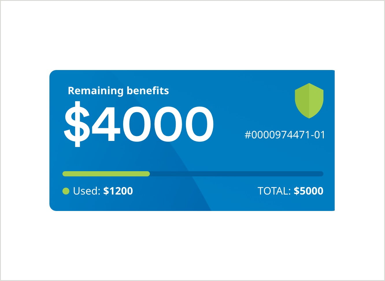
Coverage Summary Card
Feature Cards

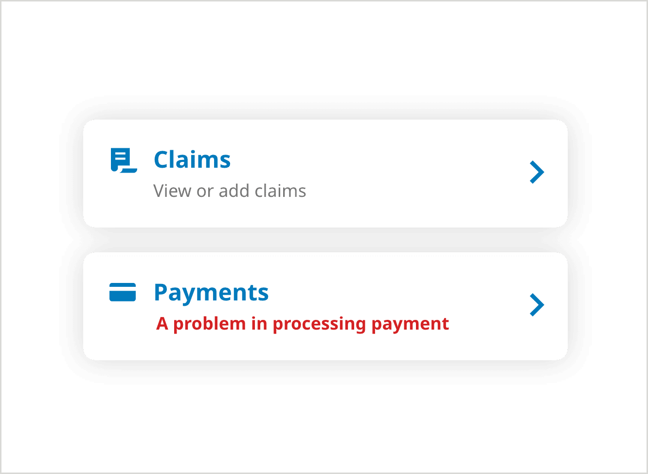
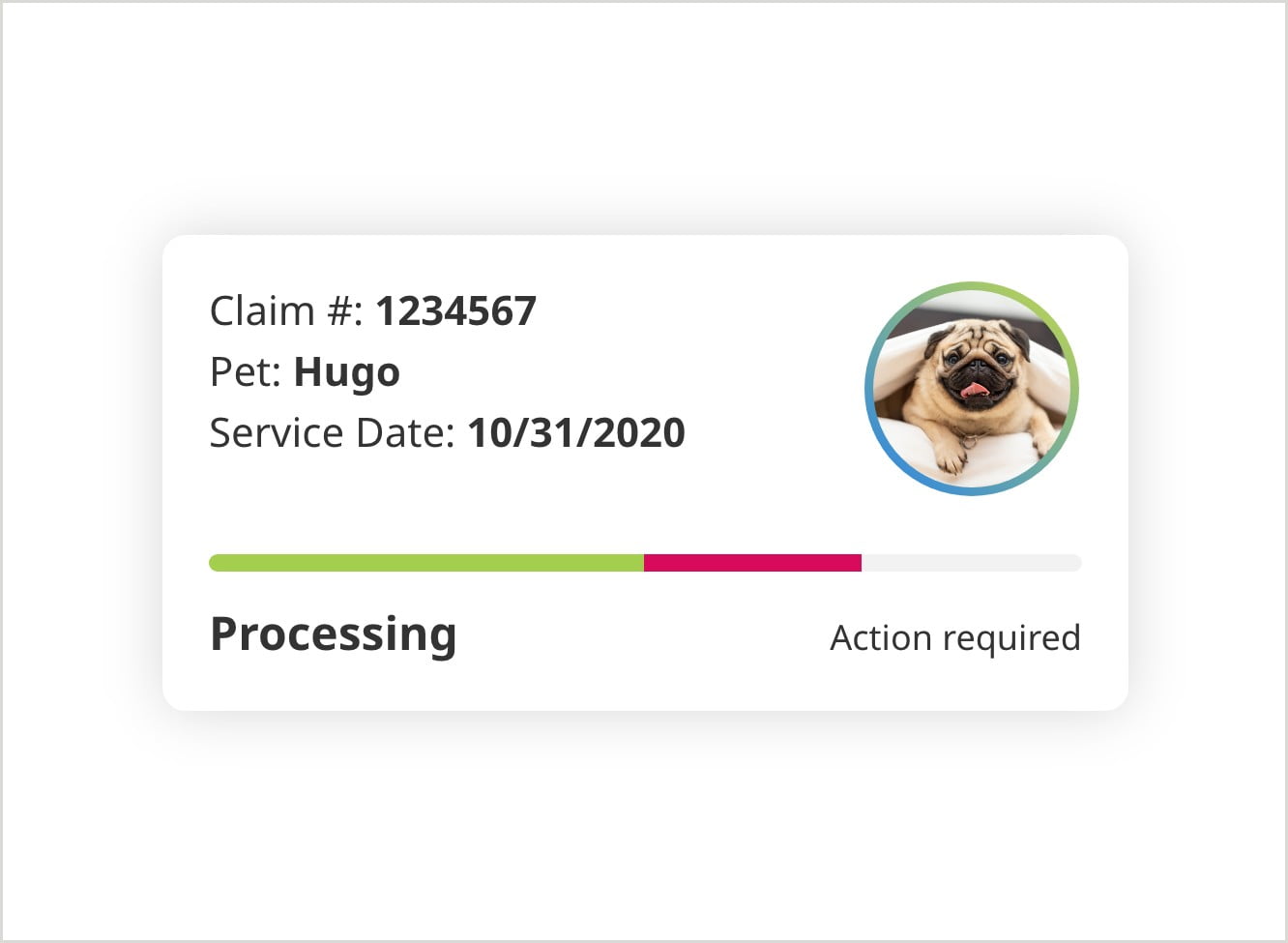
Active claims Cards
Selection Cards
Quizlet Cards with a picture
Usage
Policy card and Dashboard Notifications
Quizlet Card
Provider Result Cards