COMPONENTS
Grouped Content
Overview
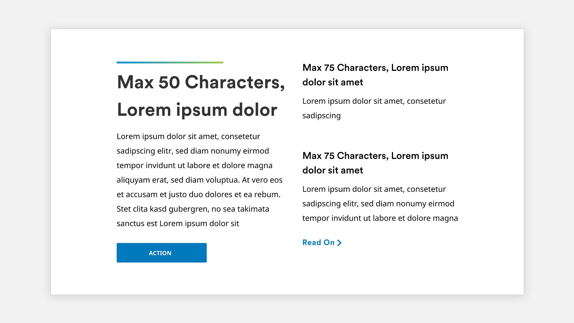
The Grouped Content component provides the option of displaying the main content block and the option to add two or more secondary content cards (up to 6) that may or may not have CTA.
Features
Component comprised of:
- Main Heading
- Body
- CTA Button
- Icon
- Layouts Types
- Icon
- Card Heading
- Card body
- Card CTA
Variations
- The component uses 2 column layout where there are up to 3 content cards, and it changes to 3 column layout when it has more than three cards.
- CTA button is optional for both main content and card content
- The icon for the Cards is optional as well.
Documentation
- How To Author Documentation (PDF)
- Content Specification Sheet (XLSX)