COMPONENTS
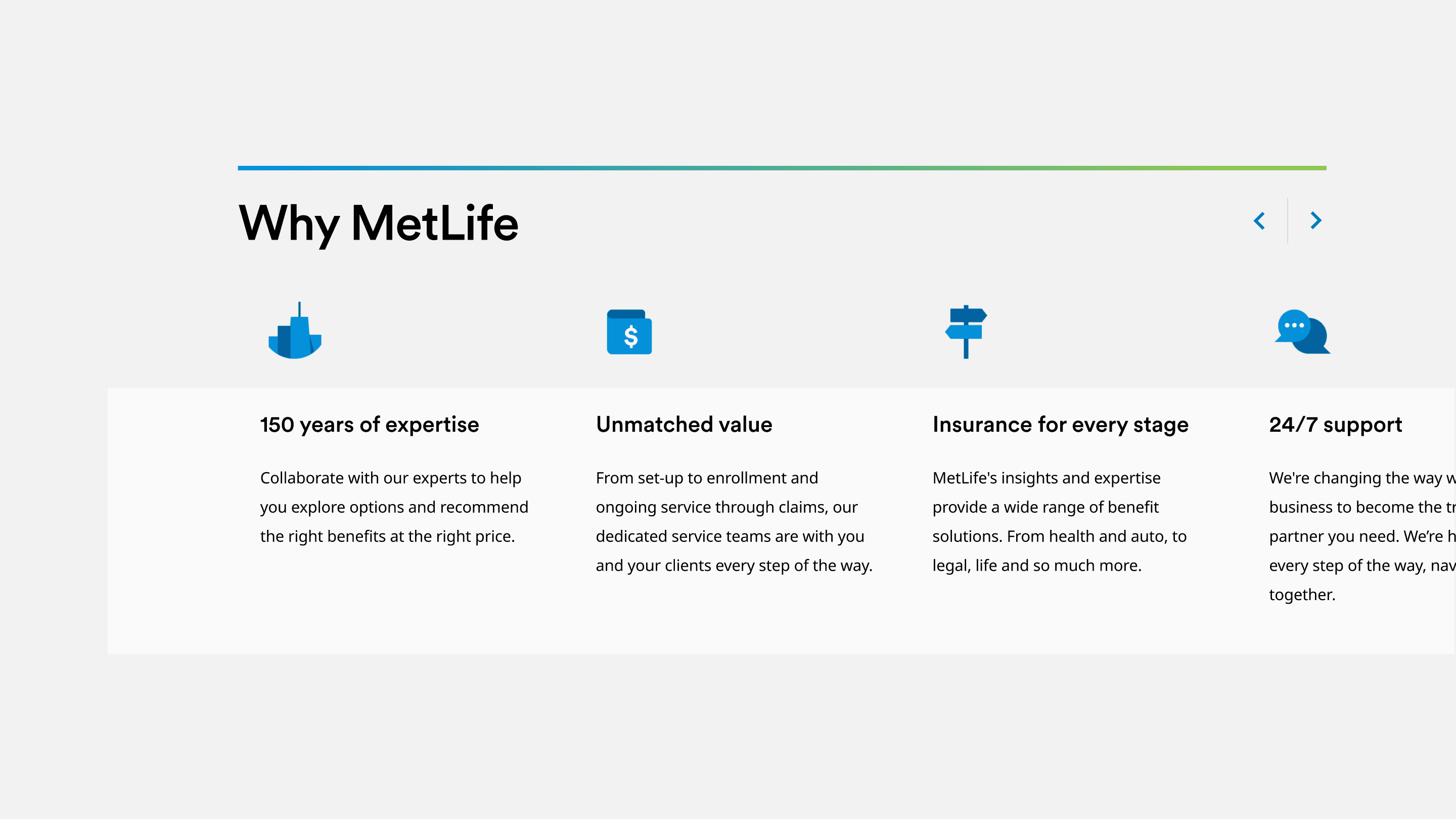
Value Prop
Overview
Features
- It has some graphical elements, and copy.
- With more than three items, carousel functionality is present.
- Carousel arrows follow infinite loop behavior.
- For screen readers: determine a first and last so tabbing through can reach the next module.
- Minimum items to display in this value prop: 3.
- Maximum recommended items: 6.
- The value prop has an optional CTA, and optional icons.
- On mobile, all elements will swipe. Markets that require the elements stacked can use that variation.
Variations
This component has 2 variations.
Documentation
- How To Author Documentation (PDF)
- Content Specification Sheet (XLSX)