Alerts & Notifications

Alerts & Notifications

Variations

Alerts deliver urgent information to a user. Notifications can also consist of updates, recent account activity, and upcoming events.

1. System alert

Alerts and notifications variations system alert
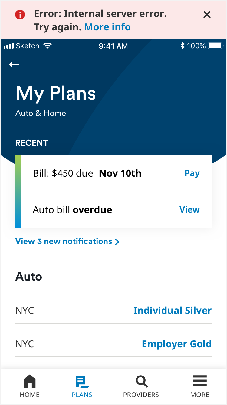
System alerts appear at the top of the page or card, to communicate a timely alert such as internet connectivity or MetLife system issues. One line contains a maximum of 30 characters including spaces. Fill is light red (#FCE8E8), text is black (#000000), link is MetLife Blue 3 (#0061A0). Red alert icon is dark red (#BB1818). The text link is tappable, as well as the ‘x’ button to close the alert.

2. Notification card

Alerts and notifications variations notification card
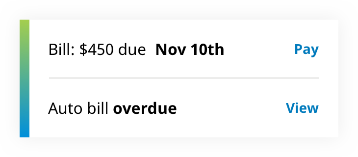
Notification cards show a user their recent account activity or upcoming events. Text is black (#000000) and links are MetLife Blue 2 (#007ABC). Important information is called out by setting in Noto Sans Bold. There should not be more than two notifications on a card. One line of text contains a maximum of 26 characters including spaces, and each notification should not exceed one line. A vertical gradient along the left side of the card signifies unread status. Each row and text link are tappable to the same destination, separate from other rows.

3. Status alert

Alerts and notifications variations status alert
A status alert displays urgent (briefly worded) information in relation to the component it is placed on. It appears in conjunction with a corresponding notification card. Status background is red (#DB1818). Text is MetLife Darkest Gray (#333333) and text link is MetLife Blue 2 (#007ABC). The status alert is not tappable.

States

Unread alert card

Alerts and notifications state unread alert card
On notification cards, unread messaging should appear in MetLife Circular Bold in black (#000000). Text link is MetLife Blue 2 (#007ABC). Vertical gradient is made up of three colors: MetLife Green (#A4CE4E), MetLife Teal (#00ACA0), and MetLife Blue 1 (#0090DA).

Unread expanded alert

Alerts and notifications state unread expanded card
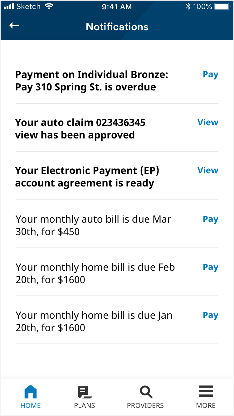
When viewing all alerts and notifications, unread messaging should appear in MetLife Circular Bold in black (#000000). Text link and circle is MetLife Blue 2 (#007ABC).

Read expanded alert

Alerts and notifications state read expanded alert
When viewing all alerts and notifications, read messaging should appear in MetLife Circualr Normal. Text is black (#000000) and text link is MetLife Blue 2 (#007ABC).

Focused

Alerts and notifications state focus first example
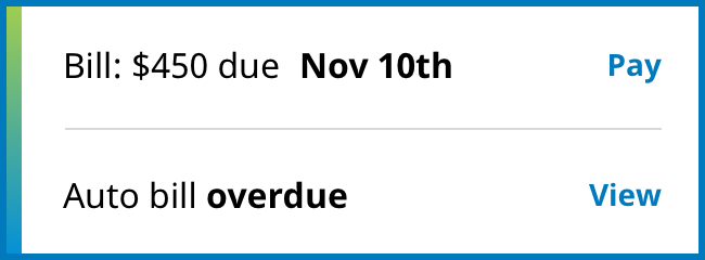
Focused state border is 3px in MetLife Blue 2 (#007ABC).

Focused

Alerts and notifications state focus second example

Focused

Alerts and notifications state focus third example

Usage

Alerts are used to deliver urgent information to a user, in a top bar or on a notification card. Errors or alerts in a table can be identified with a status alert that corresponds to information in the top bar or notification card.

Notification card

Alerts and notifications usage notification card
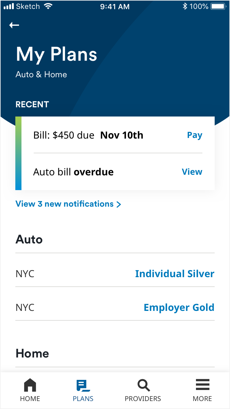
Cards should not exceed two notifications. Each notification may not exceed 1 line of text. Below the card is a link leading to all notifications.

System alert

Alerts and notifications usage system alert
The system alert notifies of something wrong on the page. The status alert points out an item in a table that corresponds to a notification in the notification card.

Notification center

Alerts and notifications usage notification center
In the notification center, a user can view all their notifications in brief, along with a link to view specific notification details on the right. The notification center screen always displays the header in its scrolled state. Notification text should not exceed 3 lines, and each line should not exceed 26 characters. Link text should not exceed 7 characters.

Animation

The alert slides in from the top of the screen pushing all of the screen content down (except the bottom nav). Upon close this animation reverses.