Dividers
Variations
There are 2 variations of dividers.
1. Primary divider

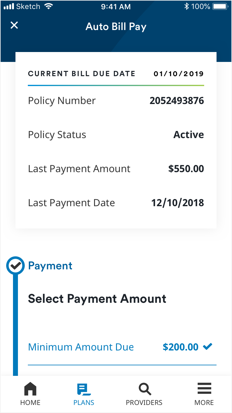
The primary divider is used to separate rows of text. Primary dividers are 1px thick and are MetLife Gray (#D9D9D6).
2. Gradient divider
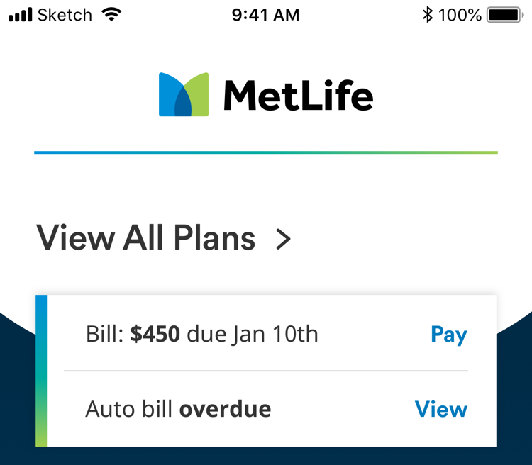
The gradient divider (horizontal) is used sparingly, to separate larger sections of content.
Usage
Dividers are used for visual clarity, when using rows of text. They can be used between header and data rows, or between multiple rows of data. Dividers are the width of the content they are relating to. Primary dividers appear as part of a larger component, like a card or data row, and do not appear individually or between blocks of content. Gradient dividers should be used sparingly to separate larger sections of content. They should not be used within header and data rows in a table, unless the table is within a card. In a card, the gradient divider should not be used more than once.

The primary divider separating rows on and off of a card.
Gradient divider used within a card.

Gradient divider separating larger sections of content.