Spacing

Spacing

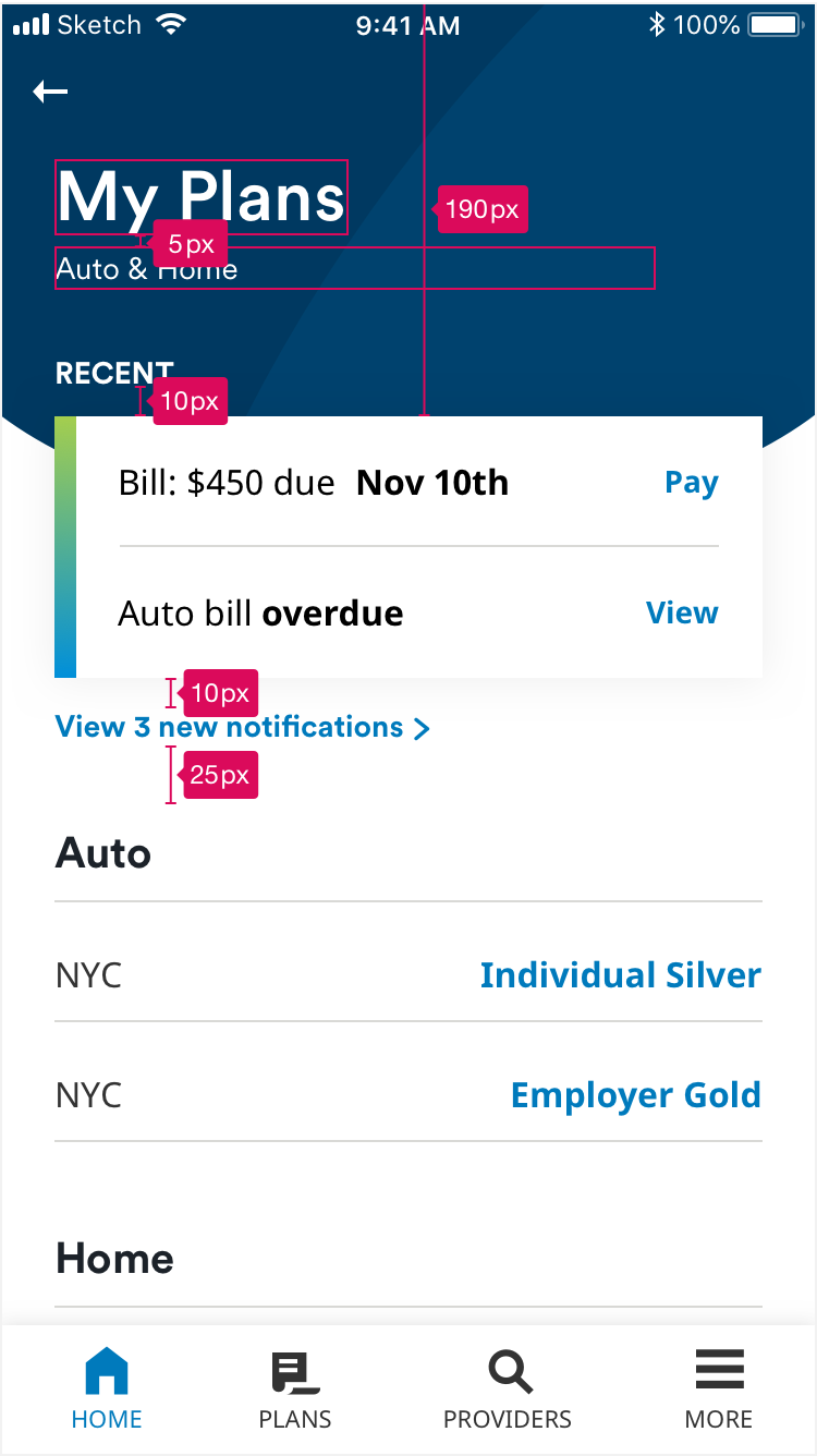
MetLife apps should be designed and built using spacing in multiples of 5px. Common spacing measurements have been defined as: 10px, 15px, 20px, 25px, 30px, 40px, and 60px.

Contextual Navigation

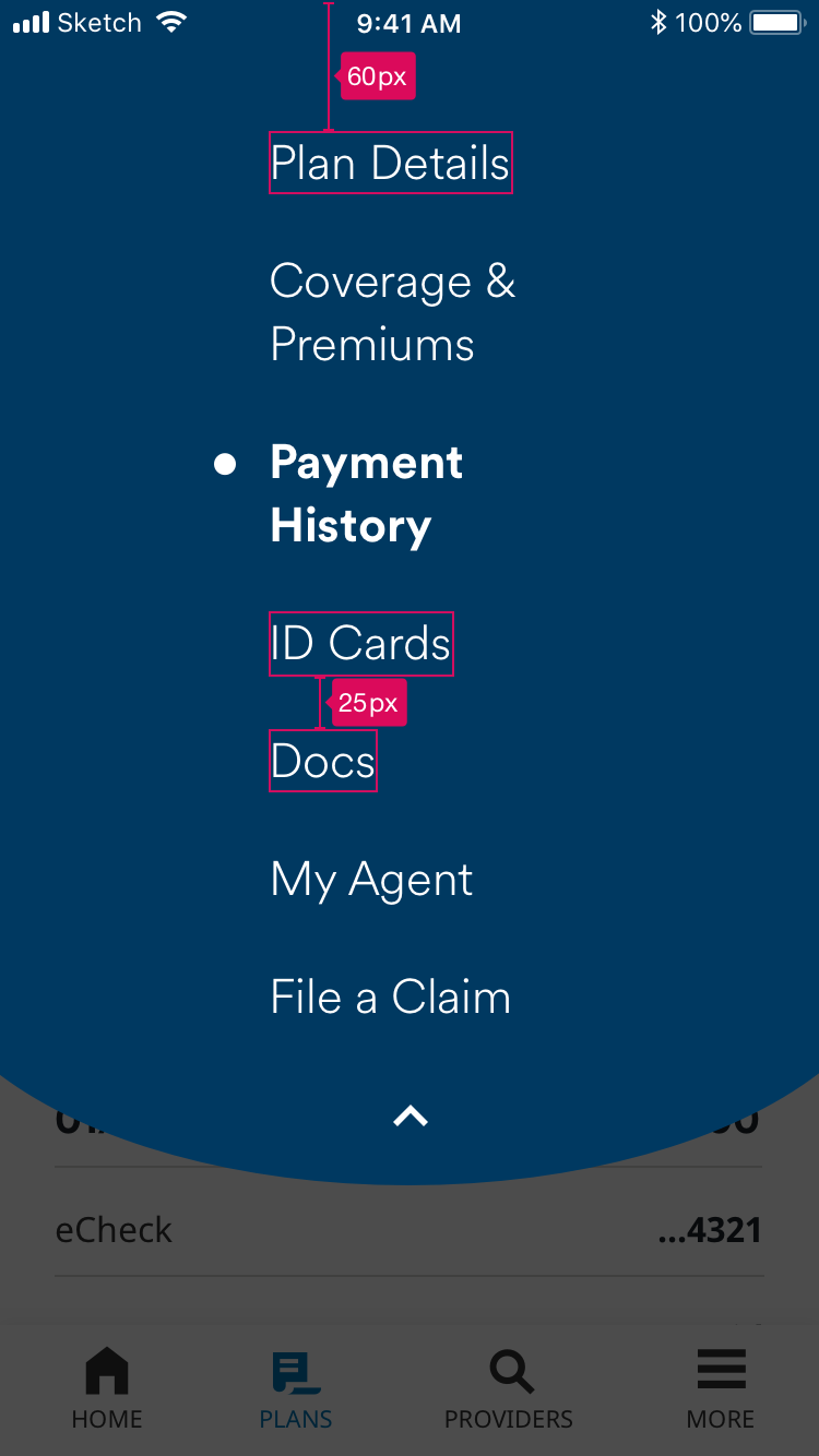
Spacing contextual navigation
Contextual nav menu items begin 60px from the top. Each menu item is 25px apart.

Tables

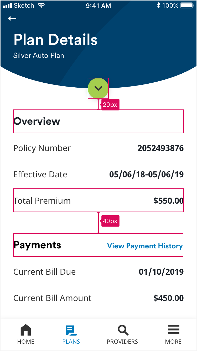
Spacing tables first example
Spacing between the contextual navigation button and table header is 20px. Spacing between tables are 40px.

Tables

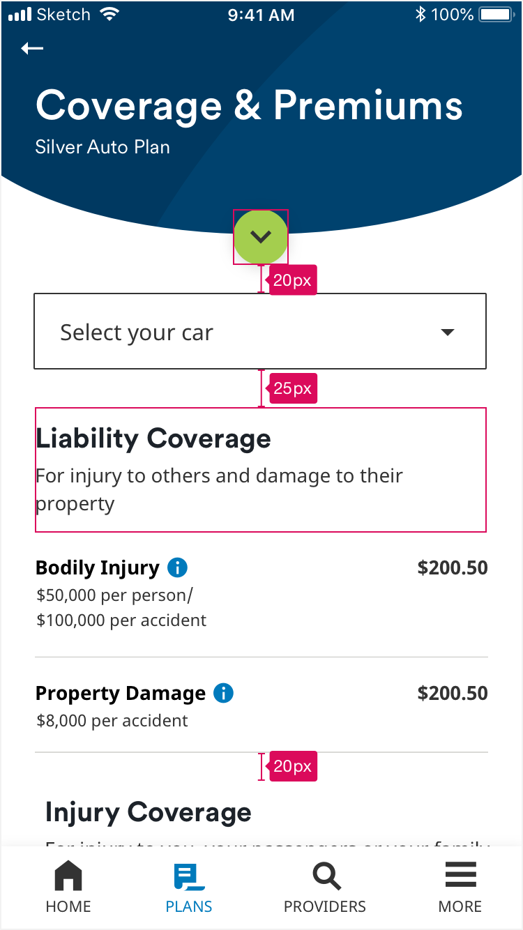
Spacing tables second example
Spacing between the contextual navigation button and the dropdown is 20px. Spacing between the dropdown and header row is 25px. Spacing between tables (data row and header row) is 20px.

Tables

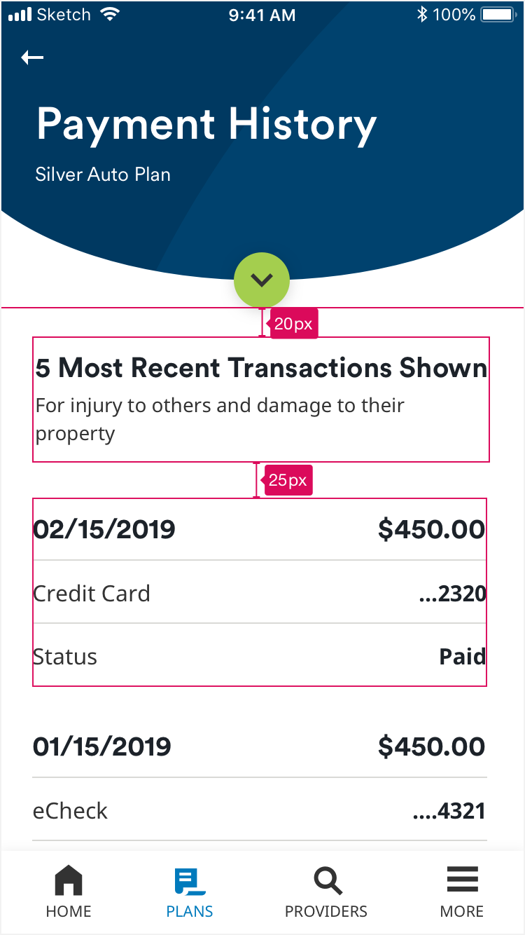
Spacing tables third example
Spacing between the contextual navigation button and a header row is 20px. Spacing between consecutive header rows is 25px.

Filters

Spacing filters
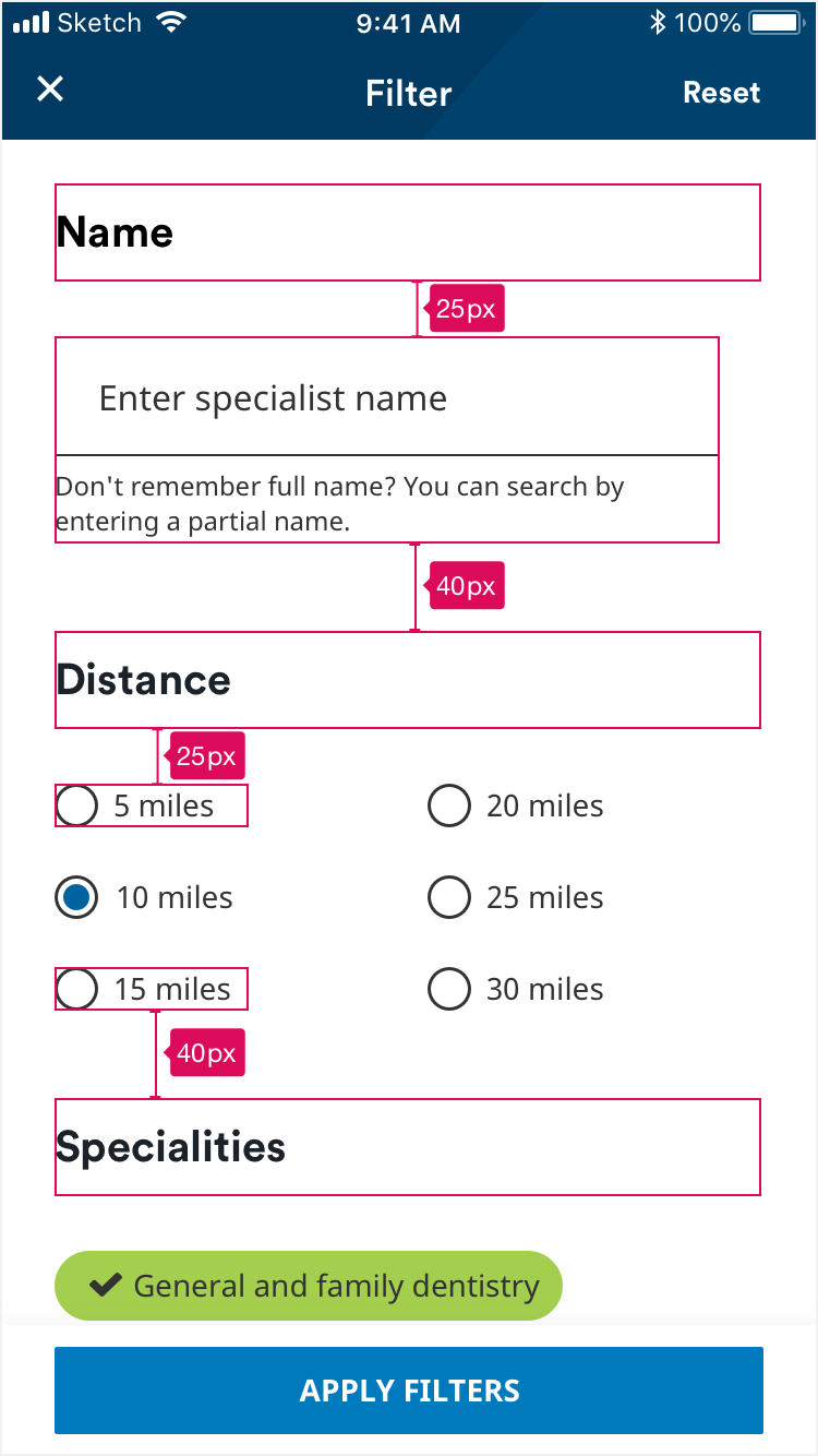
Headers are 25px above filter content. Spacing between blocks of filter content is 40px.

Buttons

Spacing buttons
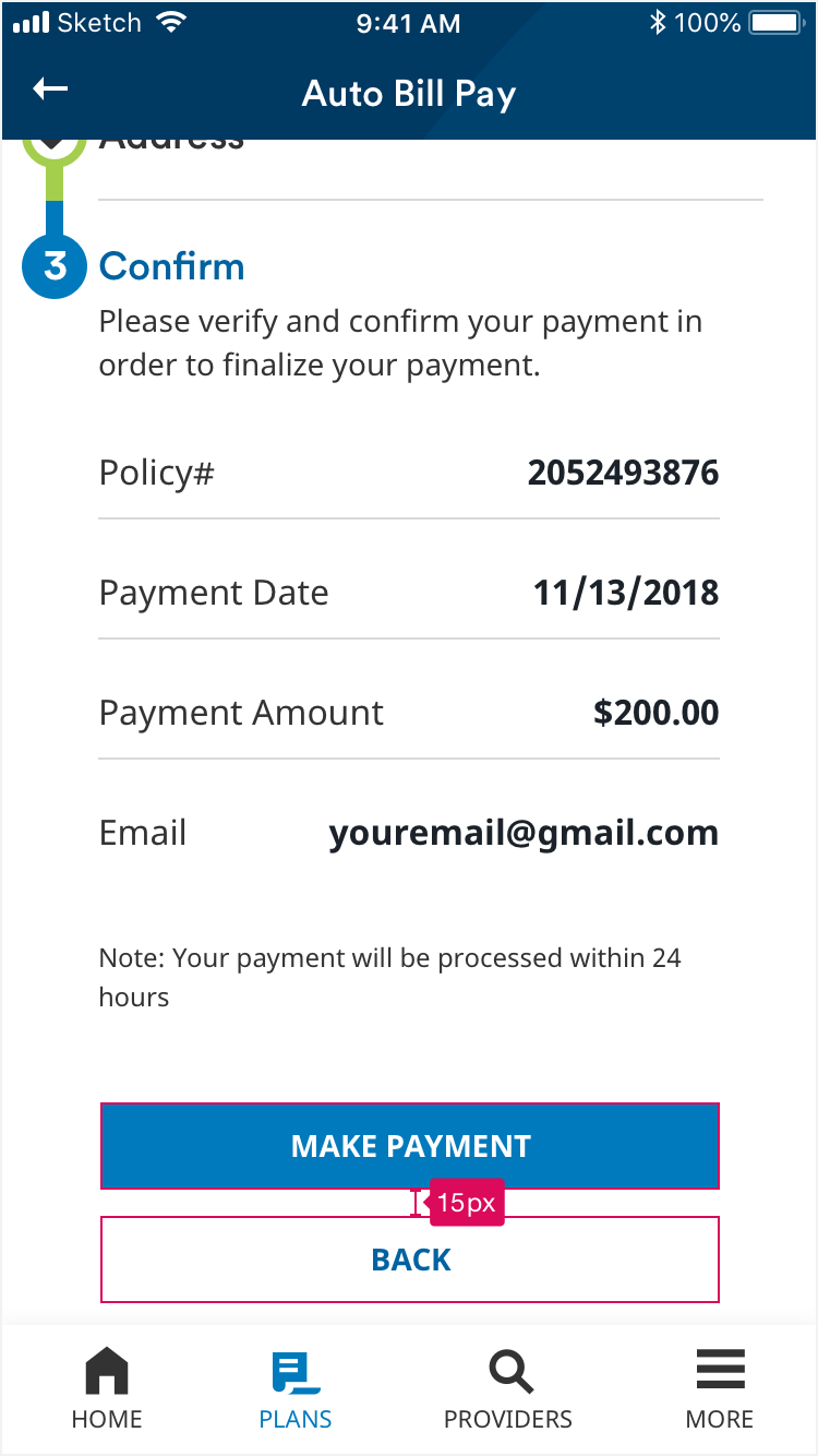
Spacing between buttons is 15px.

Cards on map

Spacing cards on map
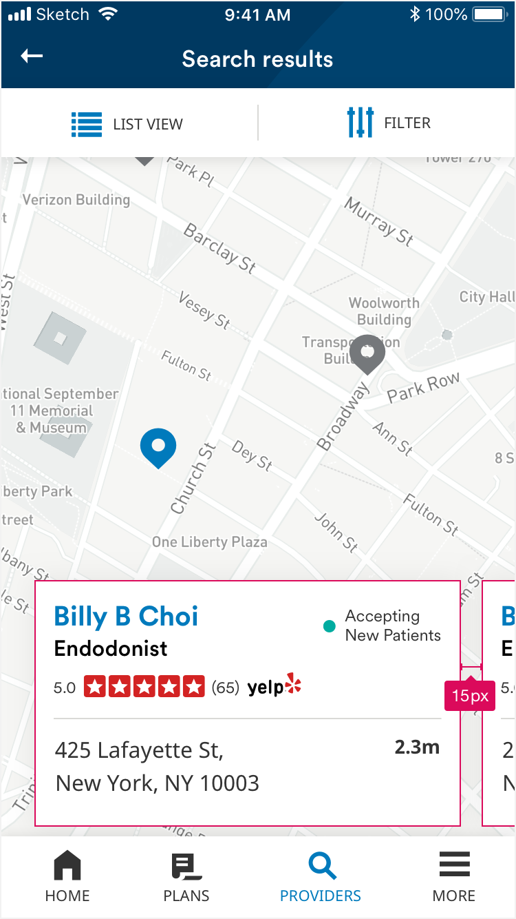
Cards on map are 15px apart, horizontally.

Cards in list

Spacing cards on list
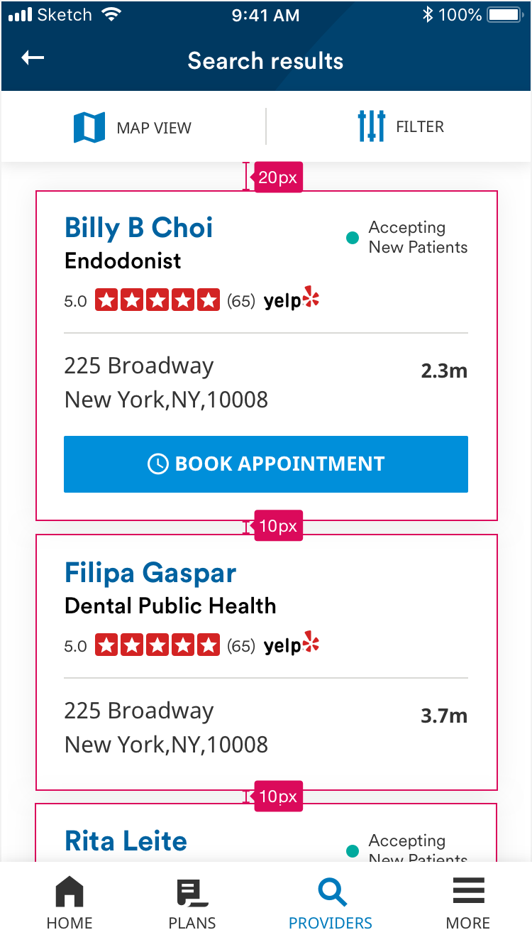
Spacing between cards in a list is 10px. The first card is 20px below the top button bar.

Notification Card

Spacing notification card
The notification card is 190px from the top. The card title is 10px above the card. Spacing between the card and the text link below is 10px. Spacing below the text link is 25px. Space between header and subhead in extended header is 5px.