Text Fields

Text Fields

Variations

There are 2 variations of text fields. Outline text fields are for simple interactions, like search. Underline text fields are for forms, such as payments and claims.

1. Outline text field

Form fields variation outline input field
Text fields allow people to enter information. Text and border are MetLife Darkest Gray (#333333). Field border is 1px. A user must tap a text field to begin typing.

2. Underline text field

Form fields variation underline input field

States

Outline text field

Default

Form field state outline default
On default state, text field has placeholder label.

Selected

Form field state outline selected
On tap, placeholder text floats to top of field and field border becomes MetLife Blue 2 (#007ABC).

Filled

Form field state outline filled
Once filled, field border becomes MetLife Darkest Gray (#333333).

Error

Form field state outline error
Error state is used when the system cannot accept the data the user has entered (e.g. information is missing, the information does not meet the data required).

Focused

Form field state outline focused
On Focus, placeholder text floats to top of field and field border becomes 3px. Border is MetLife Blue 2 (#007ABC).

Inactive

Form field state outline inactive
Inactive state appears grayed out. Text is MetLife Darkest Gray (#333333), background is MetLife Gray (#D9D9D6), and outline is MetLife Medium Gray (#A7A8AA).

Underline text field

Default

Form field state underline default
On default state, text field has placeholder label. The text field can have icons on the left or right.

Selected

Form field state underline selected
On tap, placeholder text floats to top of field and underline becomes MetLife Blue 2 (#007ABC).

Filled

Form field state underline filled
Filled state text is MetLife Circular Bold in MetLife Darkest Gray (#333333).

Error

Form field state underline error

Focused

Form field state underline focused

Inactive

Form field state underline inactive

Default with 2 icons

Form field state underline default 2 icons
Magnifying glass indicates a search field. Location icon indicates that the field requires a location input.

Selected with 2 icons

Form field state underline selected 2 icons
‘X’ icon, when tapped, clears any entered text.

Usage

Form fields facilitate information collection.

Form field usage notification card
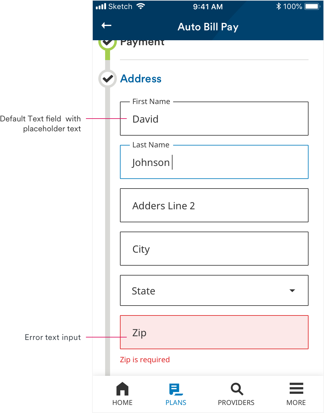
Example of different states of text fields on address input page.
Form field usage bill card
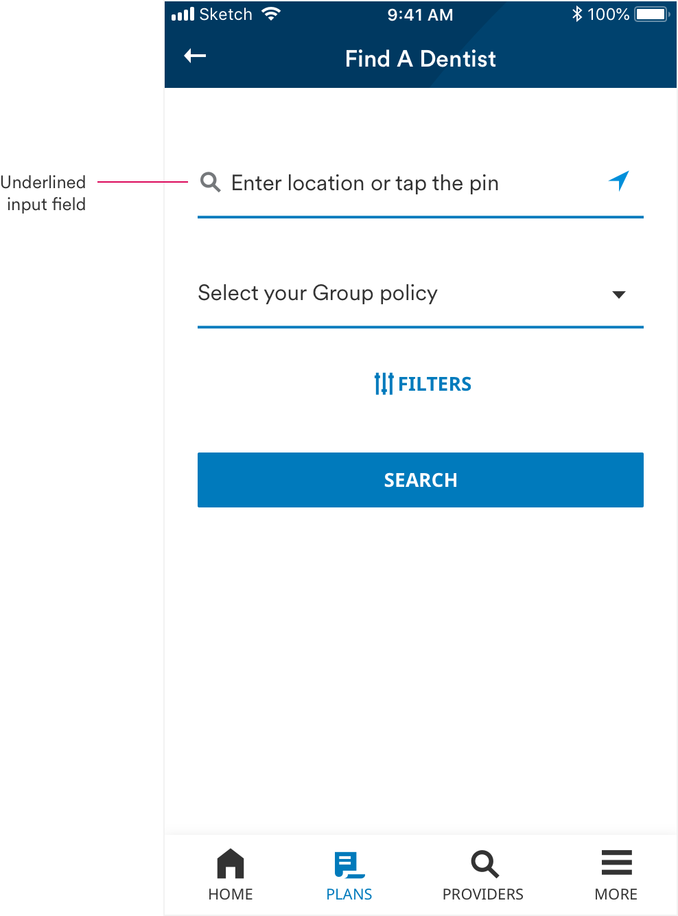
Underlined text field and dropdown in the Find A Provider flow.
Form field usage provide card in list
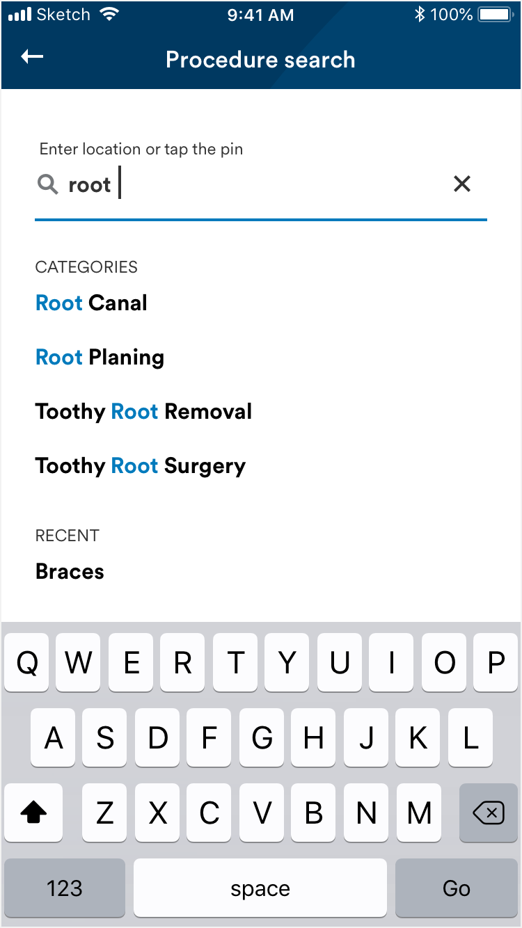
Suggested search results appear in a full screen view. Results are organized by category.
Form field usage provide card in list
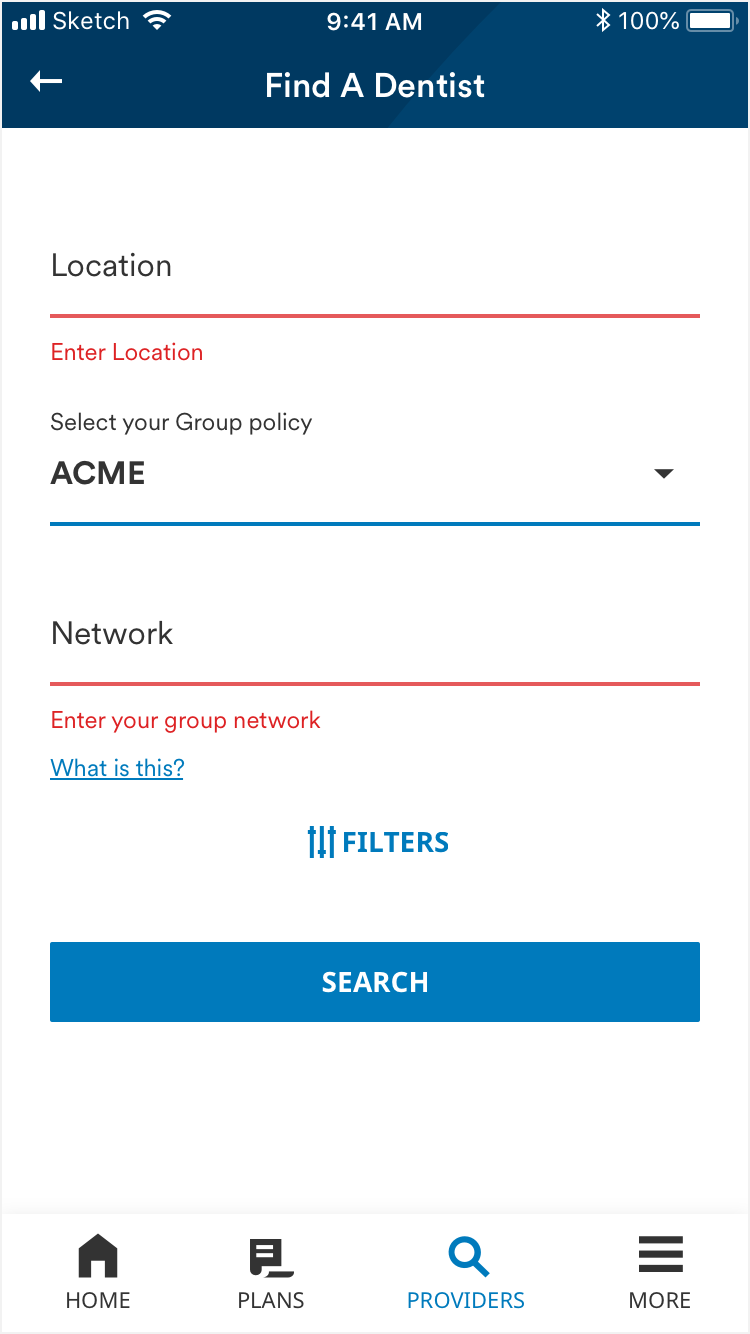
When an error occurs, text fields shift down to maintain spacing of 20px between each field.

Animation

1. Outline text field

The outline of the outline text field animates through different color states.

2. Underline text field

The underline text field offer a menu of text suggestions based on what a user is typing. This opens from the bottom of the text field.

Text style and color also animate throughout the selection process.