Selection Controls

Selection Controls

Variations

There are 6 types of selection controls.

1. Checkmark

Selection controls variation checkmark
When selected, a checkmark appears next to the option to signify that it is selected, and all elements become MetLife Blue 2 (#007ABC).

2. Checkmark with text field

Selection controls variation checkmark with input
This selection control can be tapped to select, and allows a user to input a value. Before being filled, text in the second column should be MetLife Dark Gray (#75787B).

3. Radio Button

Selection controls variation radio button
Radio buttons are used to select one option in a list, while all available options are exposed.

4. Pill

Selection controls variation pill
Pills are used to select one or multiple options in a list, while all available options are exposed.

5. Checkbox

Selection controls variation checkbox
Checkboxes are used to select one or more options.

6. Toggle

Selection controls variation toggle
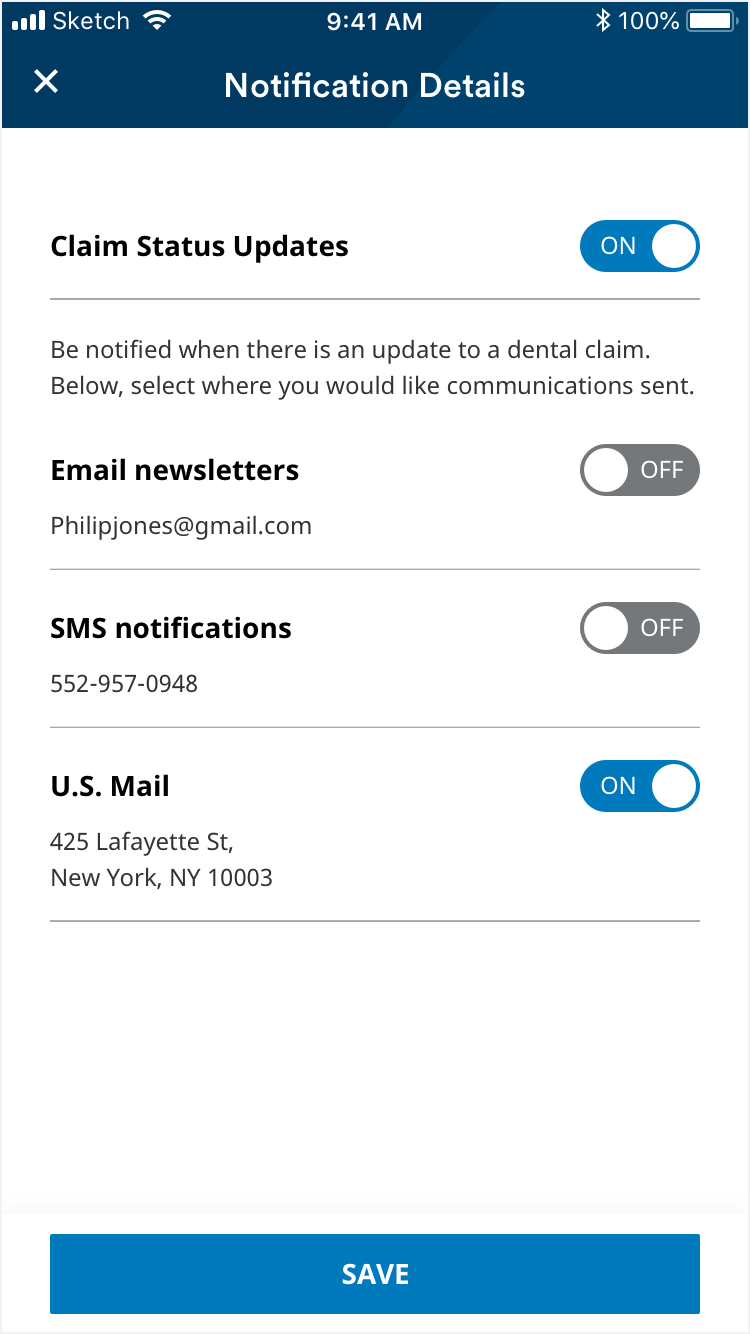
Toggles are used to turn an option on or off.

States

Checkmark

Default

Selection controls state checkmark default
Column one text is MetLife Darkest Gray (#333333), column two text is black (#000000) and underline is MetLife Gray (#D9D9D6).

Filled

Selection controls state checkmark filled
Text, checkmark and underline are MetLife Blue 2 (#007ABC).

Focused

Selection controls state checkmark focused
Text, checkmark and underline are MetLife Blue 2 (#007ABC).

Checkmark with text field

Default

Selection controls state checkmark with input default
Before a user inputs their own value, text in the second column should be MetLife Dark Gray (#75787B).

Selected

Selection controls state checkmark with input selected
When a user is inputting their own value, text is MetLife Darkest Gray (#333333) and the underline is MetLife Blue 2 (#007ABC).

Filled

Selection controls state checkmark with input filled
When a user exits the field, the text, checkmark and underline are MetLife Blue 2 (#007ABC) to signal the control is selected.

Focused

Selection controls state checkmark with input focused

Radio Button

Default

Selection controls state radio button default
Unselected radio button outline and text are MetLife Darkest Gray (#333333).

Filled

Selection controls state radio button filled
Radio button text and circle outline are MetLife Darkest Gray (#333333) and the circle fill is MetLife Green (#A4CE4E).

Focused

Selection controls state radio button focused

Pill

Default

Selection controls state pill default
Unselected pill outline and text are MetLife Darkest Gray (#333333).

Filled

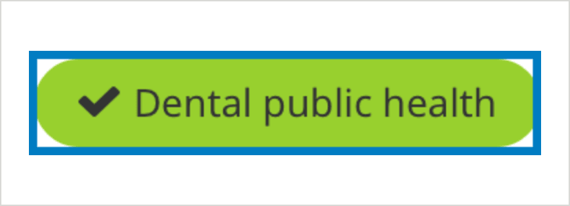
Selection controls state pill filled
Filled pill text is MetLife Darkest Gray (#333333) and pill background is MetLife Green (#A4CE4E).

Focused

Selection controls state pill focused

Checkbox

Default

Selection controls state checkbox default
Unselected checkbox outline is black (#000000) and text is MetLife Darkest Gray (#333333).

Filled

Selection controls state checkbox filled
Checkbox fill is MetLife Blue 2 (#007ABC) and checkmark is white (#FFFFFF).

Focused

Selection controls state checkbox focused

Toggle

Default

Selection controls state toggle default
Unselected toggle is is MetLife Dark Gray (#75787B) and text is White (#FFFFFF).

Filled

Selection controls state toggle filled
Toggle fill is MetLife Blue 2 (#007ABC) and text is white (#FFFFFF).

Focused

Selection controls state toggle focused

Usage

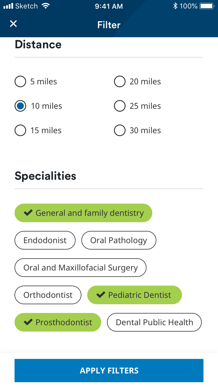
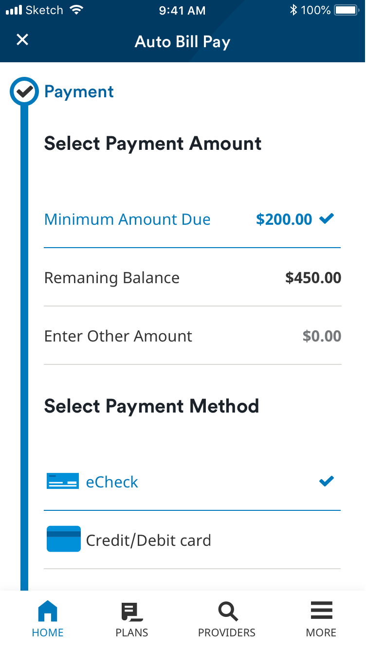
Selection controls allow a user to make a selection. Checkmarks and radio buttons are used to select one item among multiple choices, whereas pills can be used to select one or more options.

Selection controls usage first example
Radio buttons and pills in the Find A Provider flow.
Selection controls usage second example
Checkmark in a payment flow. The first option in a list should start selected to indicate that a user can select from the options.
Selection controls usage second example
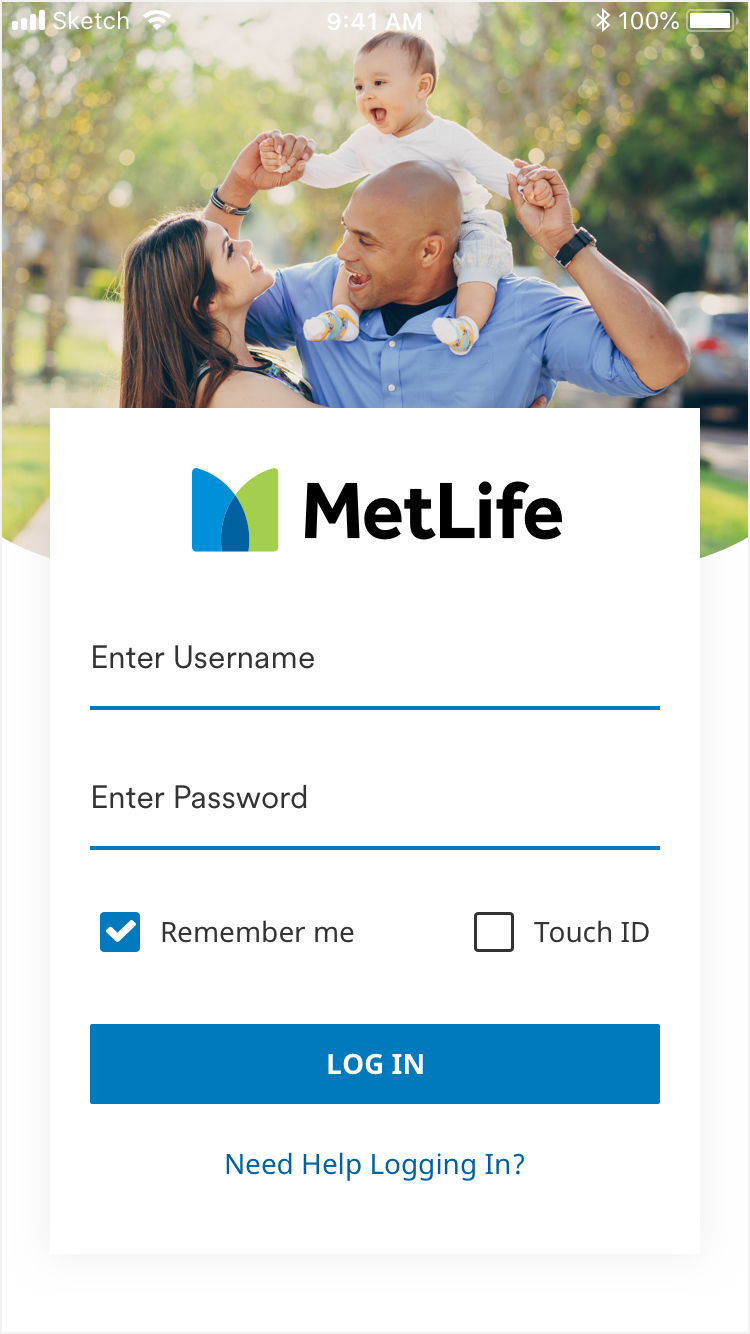
Checkboxes in the login widget.
Selection controls usage second example
Notification settings with toggles.

Animation

1. Checkmark & Checkmark with text field

When a user selects a payment amount option in a payment flow, the underline’s color change animates from left to right.