Shadows
Variations
There are 2 types of shadows.
1. Primary Shadow
Primary shadow is black (#000000) at 15% opacity, x=0, y=2, blur=15. This is the primary shadow to be used for all elements requiring a shadow that are not the bottom navigation bar.
2. Navigation shadow

Shadow is black (#000000) at 10% opacity, x=0, y=2, blur=10. This is used for the bottom navigation bar of the screen, but is more subtle than the primary shadow.
Usage
Shadows are used to emphasize or differentiate content from the rest of the page. For cards, they contain important information. Buttons use shadows to draw a user’s attention and suggest that they are actionable. The bottom navigation bar uses a shadow to differentiate navigation from the main page content.
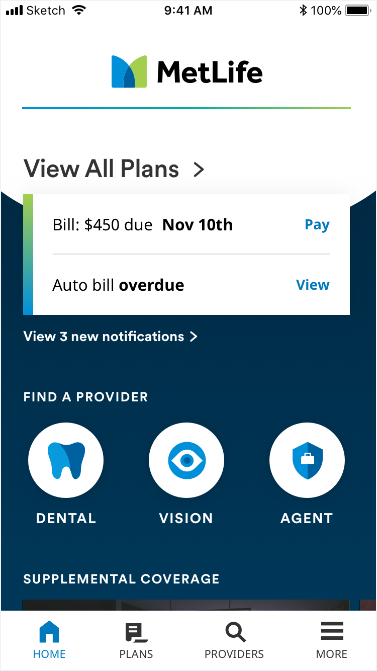
The notification card and circular menu buttons on the home screen use the primary shadow.

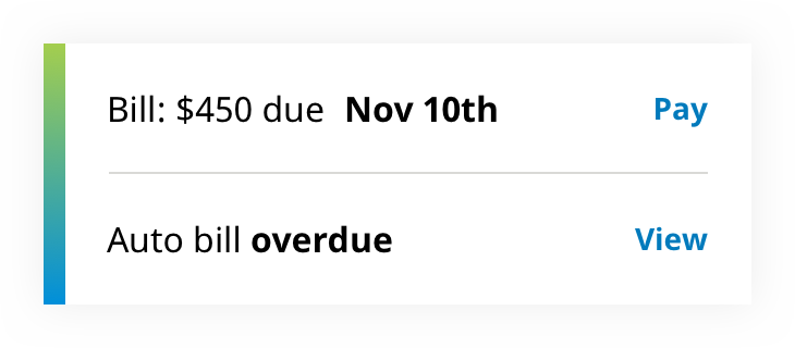
The bill card uses the primary shadow, while the footer navigation bar uses the navigation shadow.
The contextual navigation button (green) uses the primary shadow.
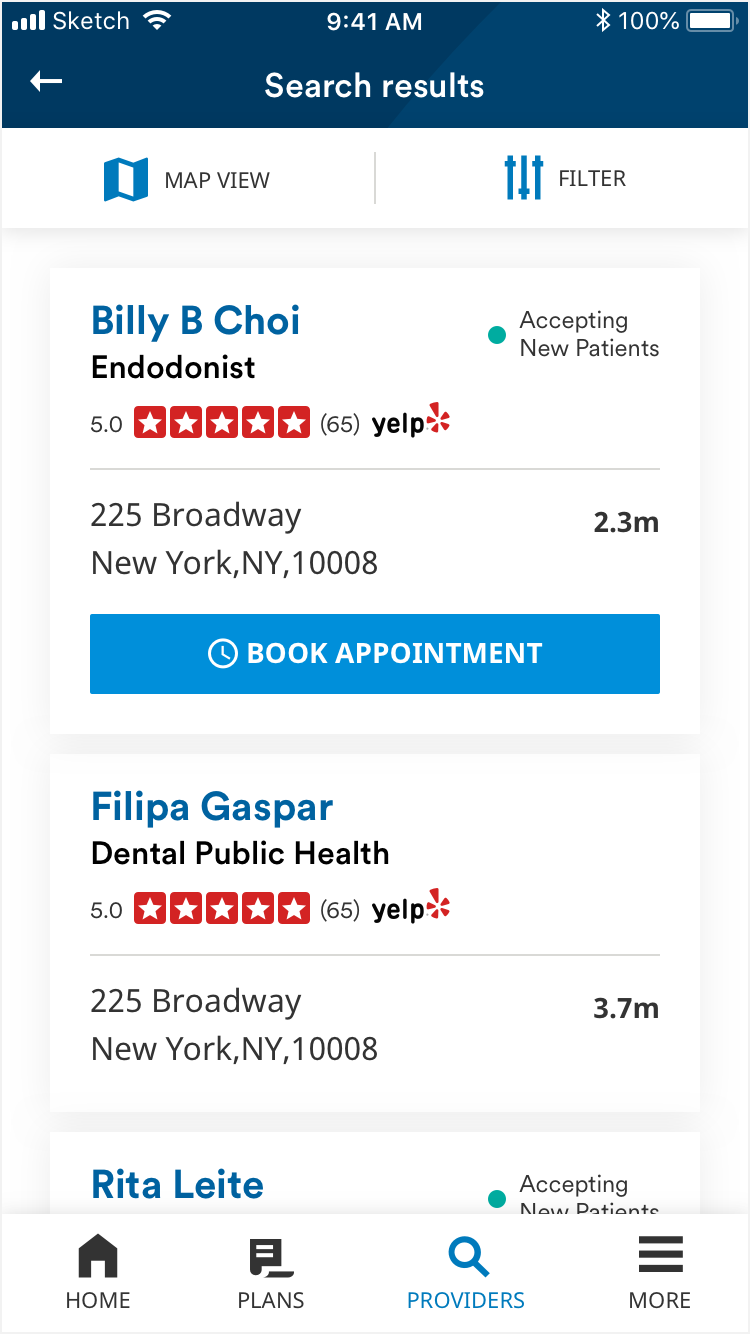
Provider info cards in list view use primary shadow, while the top button bar uses the navigation shadow.
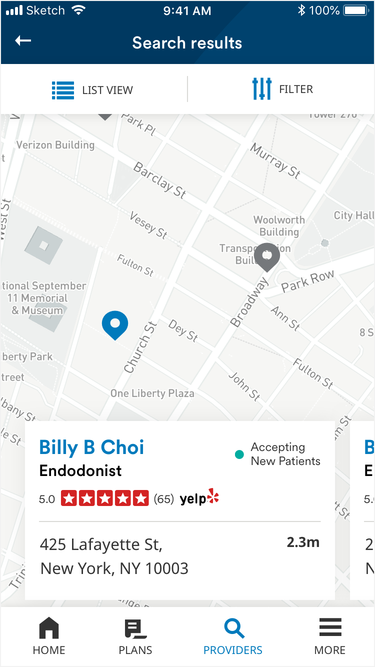
Provider info cards in map view use primary shadow.