NATIVE APP USER INTERFACE ELEMENTS
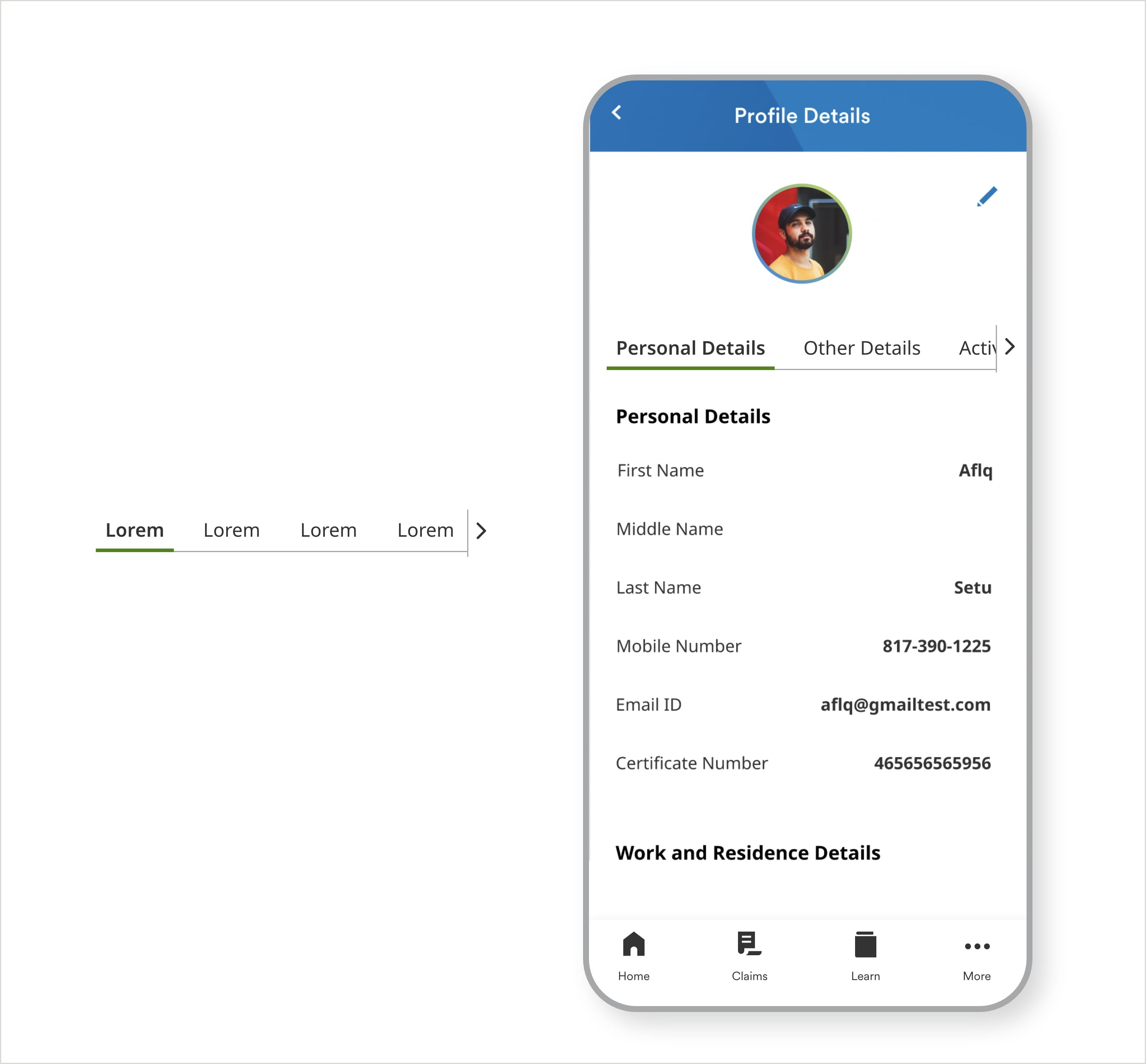
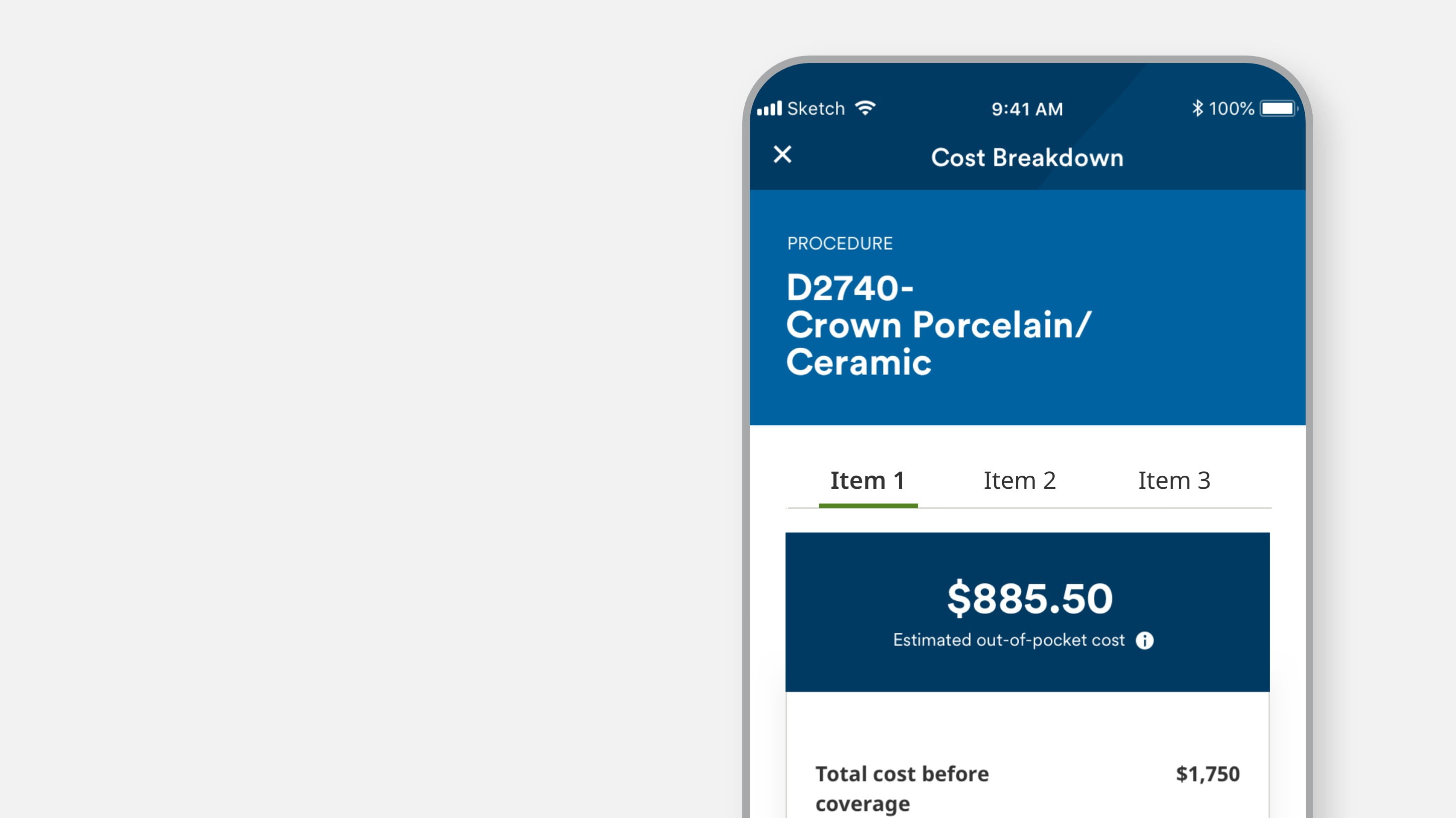
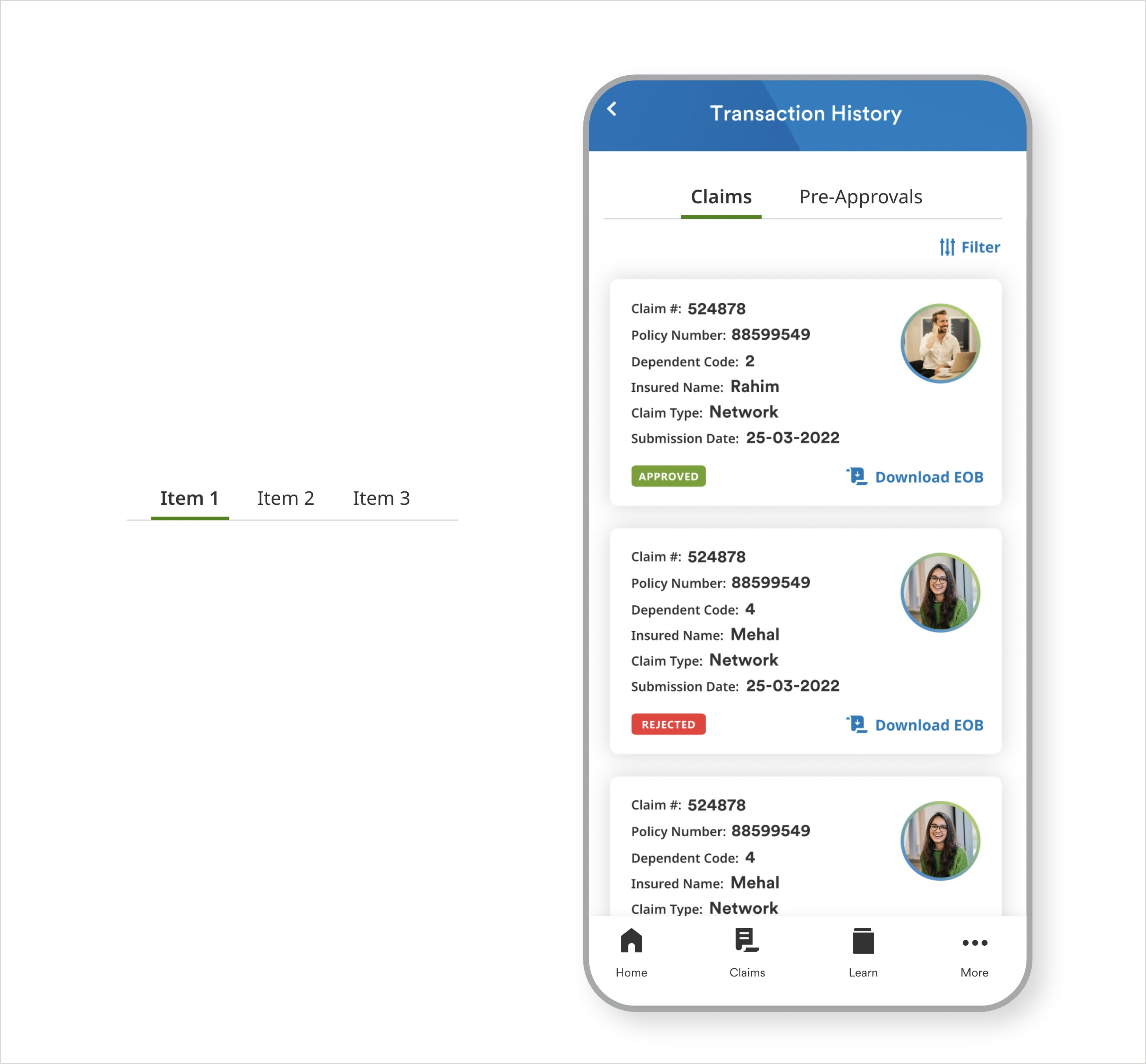
Tabs
Overview
Tabs are used to switch between alternative views within the same context. Tabs serve as secondary navigation where users have to navigate within the same main section they are in.
Variations
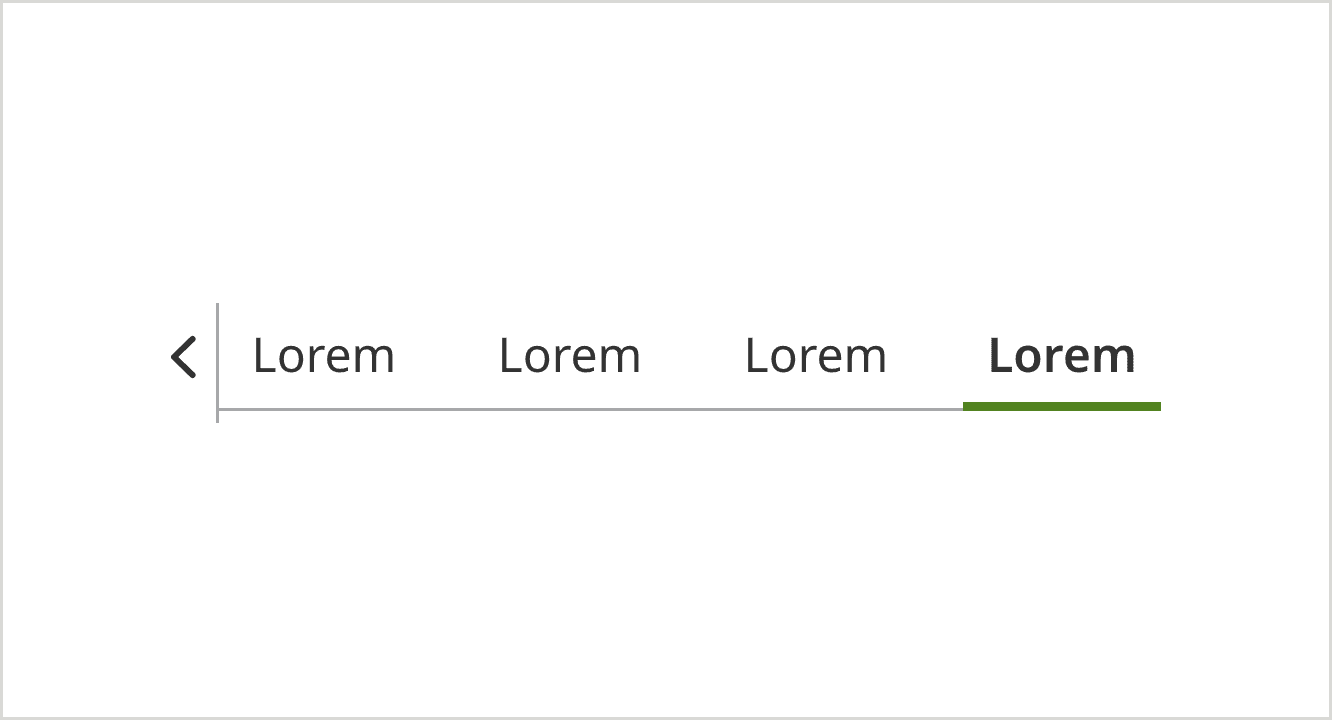
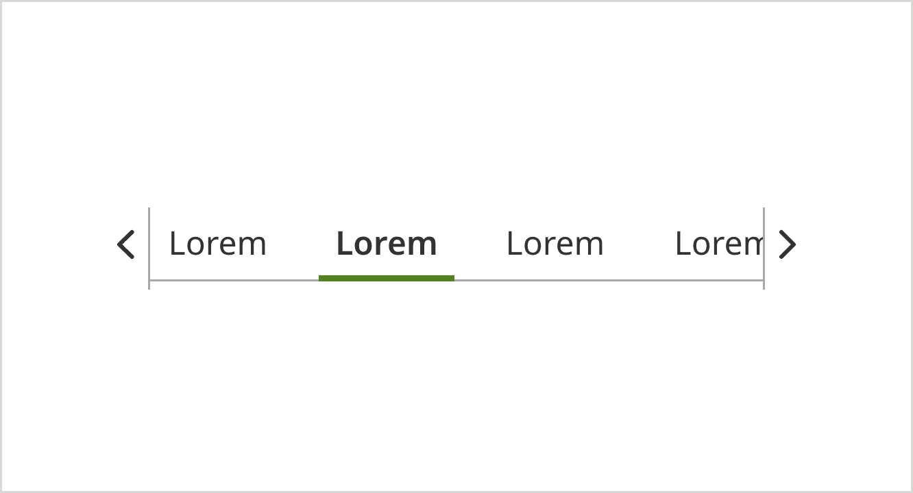
Try to minimize the number of tabs within the page to keep it clear and concise with short labels. You have the option to scroll horizontally when tabs are running out of the viewport. Provide a clear selected state to indicate which tab user is in. Avoid nested tabs because they complicate navigation, making it hard for user to track where they are within the flow.
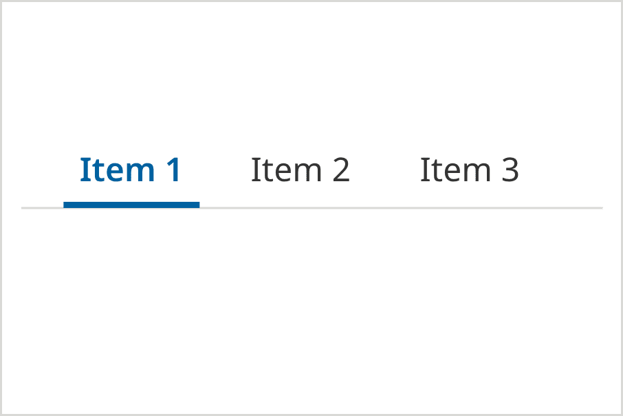
Selected
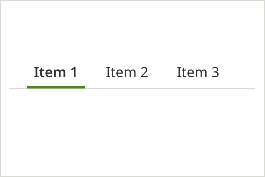
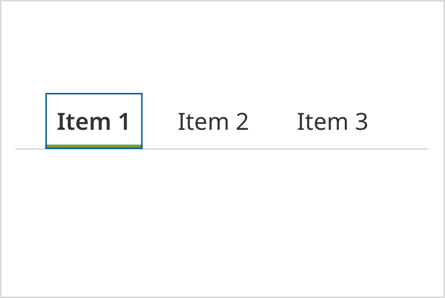
ADA Default
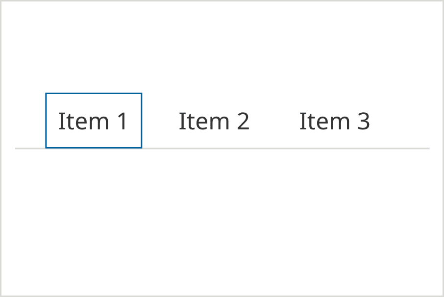
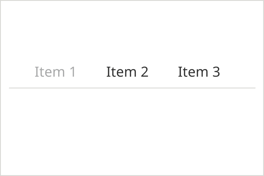
Hover
ADA Selected
Inactive
First tab selected
(more than the viewport width)
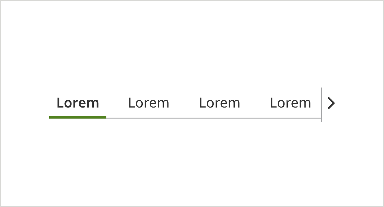
Last tab selected
(more than the viewport width)
Middle tab selected
(more than the viewport width)
Usage
Tabs Selected
Tabs Selected (more than the viewport width)