USER INTERFACE ELEMENTS
Buttons
Overview
Buttons allow users to perform actions such submitting a completed form. They have multiple styles for various contexts, and are typically used to indicate the primary call-to-action on a given card or page.
Specifications
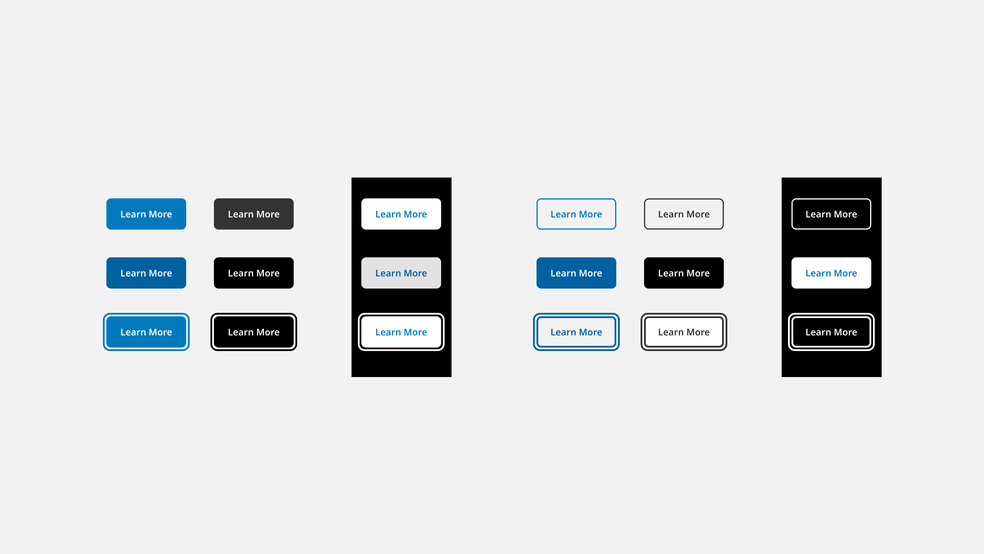
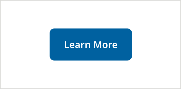
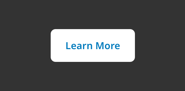
Primary
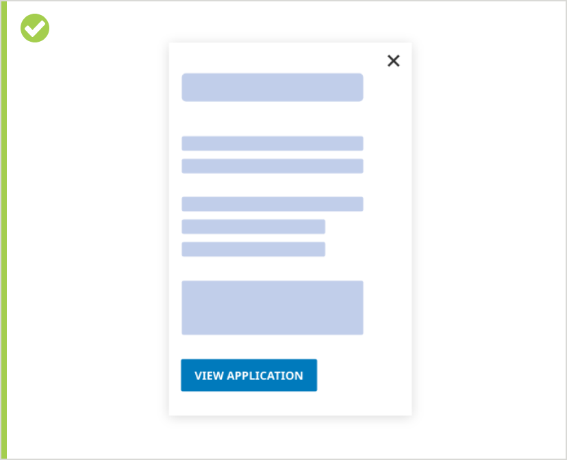
Primary buttons are used to initiate task completion for the primary purpose of the page or section, such as submitting a form. Buttons should use action-oriented text and be appropriately placed within the context of use.
Button Specifications
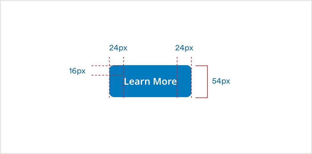
Default
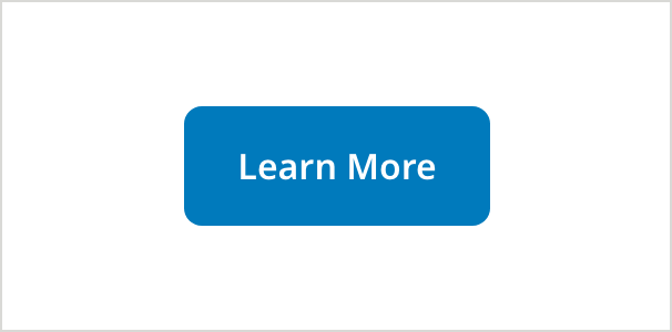
- Background: #007ABC
- Text Color: #FFFFFF
- Font: Noto Sans 16
- Text Style: SemiBold
- Letter Spacing: 0px
- Corner Radius: 8px
Hover/Pressed
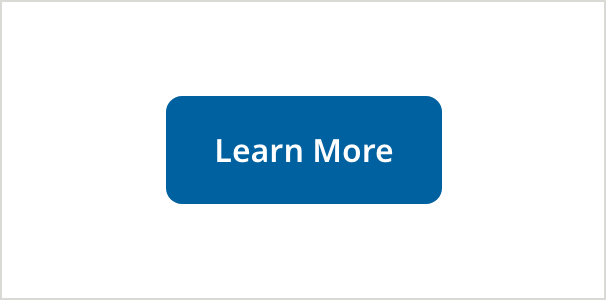
- Background: #0061A0
- Text Color: #FFFFFF
- Font: Noto Sans 16
- Text Style: SemiBold
- Letter Spacing: 0px
- Corner Radius: 8px
On Focus - (ADA compliant) - appears on keyboard navigation only
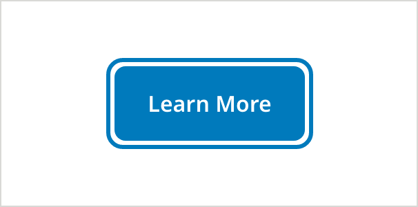
- Background: #007ABC
- Text Color: #FFFFFF
- Font: Noto Sans 16
- Text Style: SemiBold
- Letter Spacing: 0px
- Corner Radius: 8px
- Stroke: #007ABC | Corner Radius: 12px | Thickness: 3px | Padding: 4px
Primary (on dark)
Dark background use should be limited to informative page callout or promotionals.
Default

- Background: #FFFFFF
- Text Color: #007ABC
- Font: Noto Sans 16
- Text Style: SemiBold
- Letter Spacing: 0px
- Corner Radius: 8px
Hover/Pressed

- Background: #E2E2E2
- Text Color: #0061A0
- Font: Noto Sans 16
- Text Style: SemiBold
- Letter Spacing: 0px
- Corner Radius: 8px
On Focus - (ADA compliant) - appears on keyboard navigation only

- Background: #FFFFFF
- Text Color: #007ABC
- Font: Noto Sans 16
- Text Style: SemiBold
- Letter Spacing: 0px
- Corner Radius: 8px
- Stroke: #FFFFFF | Corner Radius: 12px | Thickness:3px | Padding: 4px
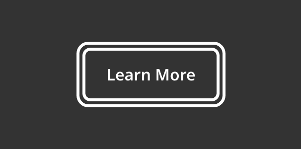
Secondary
Secondary buttons are used to provide an alternative action for the user in conjunction with a primary button. They can also be used in a section of a page to allow user to complete a sub-task. An example of this would be when performing file upload as one part of a larger form.
Default
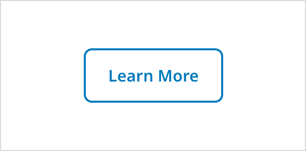
- Border Color: 2px, #007ABC
- Text Color:#007ABC
- Font: Noto Sans 16
- Text Style: SemiBold
- Letter Spacing: 0px
- Corner Radius: 8px
Hover/Pressed
- Border Color: 2px, #0061A0
- Background: #0061A0
- Text Color: #FFFFFF
- Font: Noto Sans 16
- Text Style: SemiBold
- Letter Spacing: 0px
- Corner Radius: 8x
On Focus - (ADA compliant) - appears on keyboard navigation only
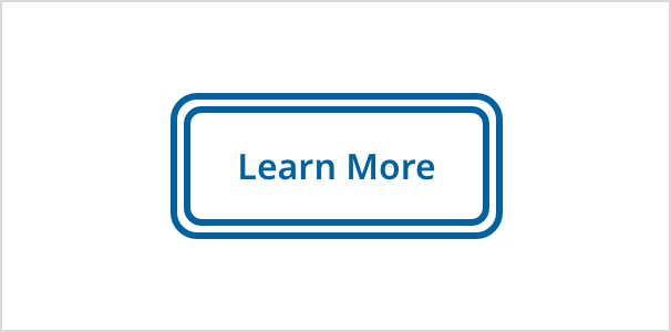
- Border Color: 3px, #0061A0
- Text Color: #0061a0
- Font: Noto Sans 16
- Text Style: SemiBold
- Letter Spacing: 0px
- Corner Radius: 8px
- Stroke: #0061A0 | Corner Radius: 12px | Thickness:3px | Padding: 4px
Secondary White (on dark)
Secondary buttons on dark are used to provide an alternative action for the user in conjunction with a primary button. They can also be used in a section of a page to allow user to complete a sub-task.
Default

- Border color: #FFFFFF, 2px
- Text Color: #FFFFFF
- Font: Noto Sans 16
- Text Style: SemiBold
- Letter Spacing: 0px
- Corner Radius: 8px
Hover/Pressed
- Border Color: #FFFFFF, 3px
- Background: #FFFFFF
- Text Color: #007ABC
- Font: Noto Sans 16
- Text Style: SemiBold
- Letter Spacing: 0px
- Corner Radius: 8px
On Focus - (ADA compliant) - appears on keyboard navigation only
- Border Color: #FFFFFF, 3px
- Text Color: #FFFFFF
- Font: Noto Sans 16
- Text Style: SemiBold
- Letter Spacing: 0px
- Corner Radius: 8px
- Stroke: #FFFFFF | Corner Radius: 12px | Thickness:3px | Padding: 4px
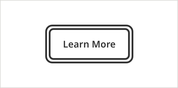
Secondary Black (on light)
Secondary buttons on light backgrounds are used to provide an alternative action for the user in conjunction with a primary button. They can also be used in a section of a page to allow user to complete a sub-task.
Default

- Border Color: #333333, 2px
- Text Color: #333333
- Font: Noto Sans 16
- Text Style: SemiBold
- Letter Spacing: 0px
- Corner Radius: 8px
Hover/Pressed

- Border Color: #000000, 2px
- Background: #000000
- Text Color: #FFFFFF
- Font: Noto Sans 16
- Text Style: SemiBold
- Letter Spacing: 0px
- Corner Radius: 8px
On Focus - (ADA compliant) - appears on keyboard navigation only
- Border Color: #333333, 3px
- Text Color: #333333
- Font: Noto Sans 16
- Text Style: SemiBold
- Letter Spacing: 0px
- Corner Radius: 8px
- Stroke: #333333 | Corner Radius: 12px | Thickness:3px | Padding: 4px
Disabled
Ideally, all buttons on a page should be enabled. When clicked, if all criteria for a button action have not been met, then error messaging should appear to communicate which requirements need attention.
When disabled buttons must be used (for example, for legal reasons within an underwriting process), additional copy should accompany them to inform the user of the action they need to perform in order to enable the button so they can proceed.
Primary Blue
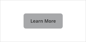
- Background: #A7A8AA
- Text Color: #333333
- Font: Noto Sans 16
- Text Style: SemiBold
- Letter Spacing: 0px
- Corner Radius: 8px
Secondary Blue

- Border Color: #A7A8AA, 2px
- Text Color: #333333
- Font: Noto Sans 16
- Text Style: SemiBold
- Letter Spacing: 0px
- Corner Radius: 8px
Primary Black
- Background: #A7A8AA
- Text Color: #333333
- Font: Noto Sans 16
- Text Style: SemiBold
- Letter Spacing: 0px
- Corner Radius: 8px
Secondary Black
- Border Color: #A7A8AA, 2px
- Text Color: #333333
- Font: Noto Sans 16
- Text Style: SemiBold
- Letter Spacing: 0px
- Corner Radius: 8px
Primary White on Dark
- Background: #A7A8AA
- Text Color: #333333
- Font: Noto Sans 16
- Text Style: SemiBold
- Letter Spacing: 0px
- Corner Radius: 8px
Secondary White on Dark

- Border Color: #A7A8AA, 2px
- Text Color: #A7A8AA
- Font: Noto Sans 16
- Text Style: SemiBold
- Letter Spacing: 0px
- Corner Radius: 8px
Usage Guidelines
Button group overflow
When horizontal space is limited, button groups stack vertically. They should appear in descending order based on importance, with the most critical action at the top.
Disabled button usage
Use of disabled buttons is discouraged. It is preferable to display only relevant, active buttons and to error-message a user when they attempt to use an active button, but have not completed all necessary steps.
Error messages should be explicit about the action a user needs to take for the button to work as expected.
Use disabled buttons only where required for legal reasons within a process.
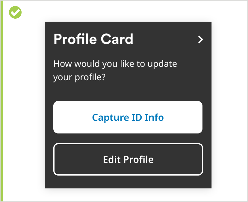
Use 2 button styles, maximum
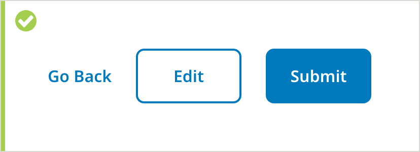
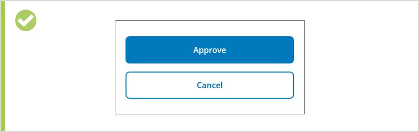
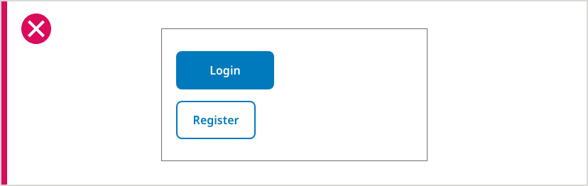
The top-level action within a button group should be a primary button. The subsequent buttons should always be secondary buttons of the same style.
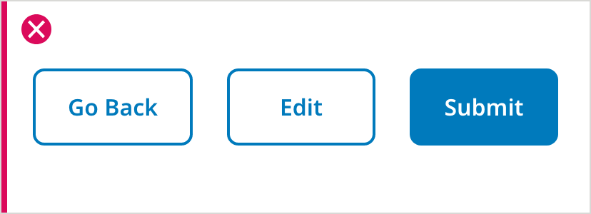
Never use rows or stacks that include more than 2 buttons adjacent to one another. In this scenario, the least important CTA should be styled as a link. (See above.)
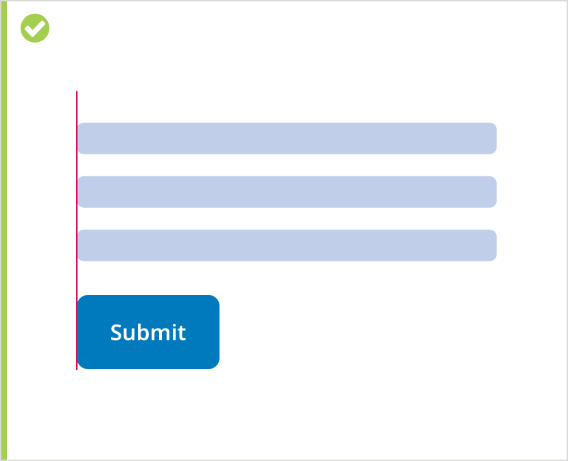
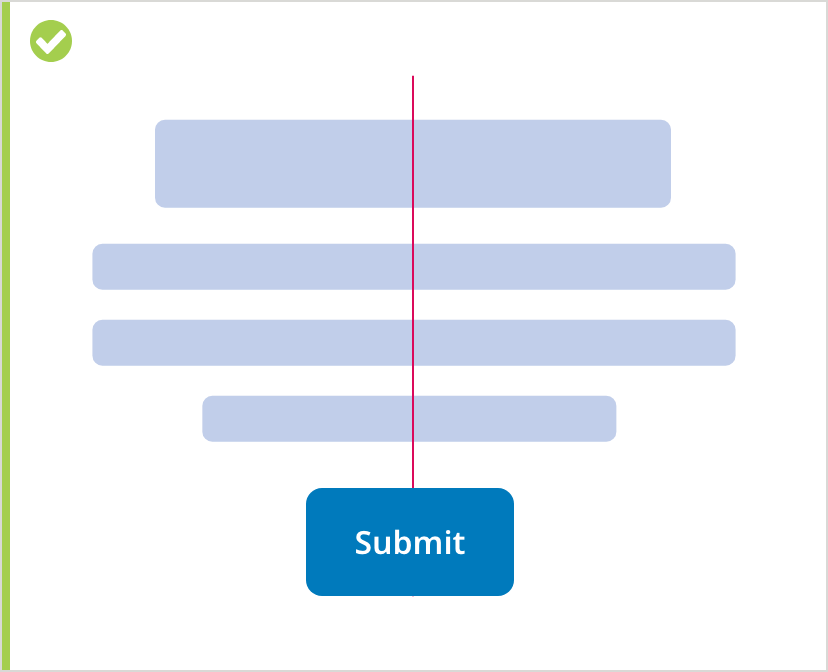
Align button groups based on content
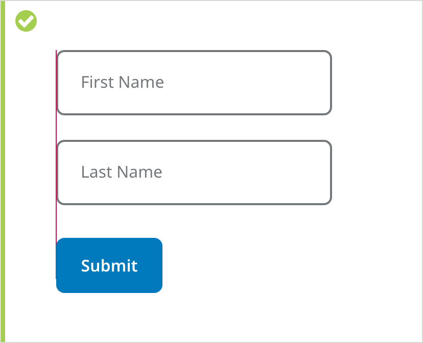
Button groups are aligned contextually. Generally, button groups should be left-aligned to follow page content.
They should be right-aligned inside container components, such as in dialogs, popovers, or cards.
They should generally be center-aligned in mobile viewports and conversational UI screens.
Be concise
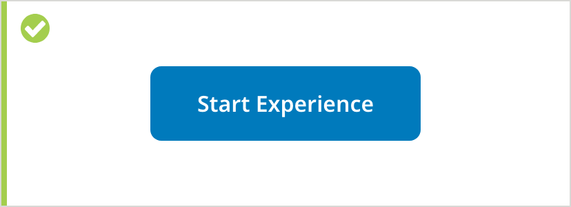
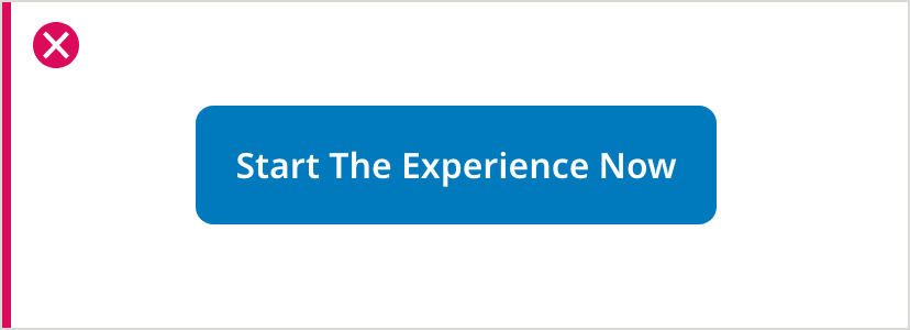
Button text should be concise: 1 or 2 words and no longer than 4, with fewer than 20 characters (including spaces). Don’t use punctuation marks such as periods or exclamation points.
No long phrases in buttons
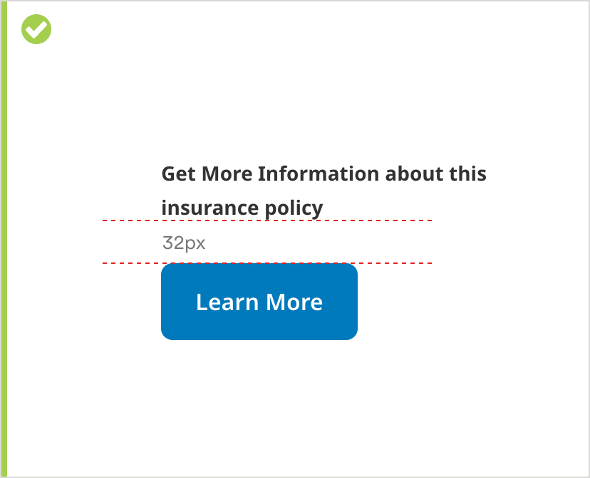
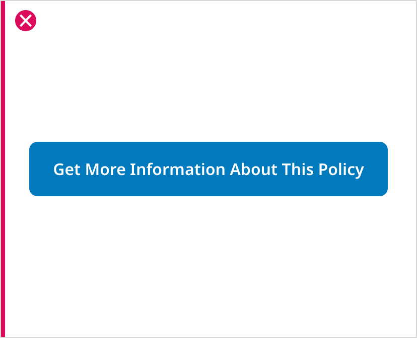
When necessary copy exceeds 20 characters, most of the copy should be pulled out of button, leaving only a short remaining CTA in the button itself.
Use clear text

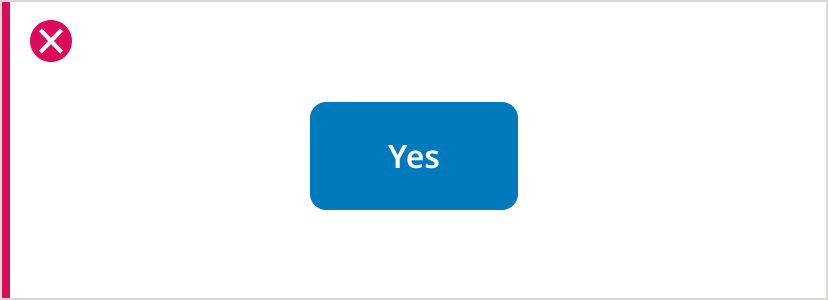
Button copy should clearly convey the outcome of the action. Most buttons should start with a verb. For example, use “Agree” instead of “Yes” in a dialog.
Don’t override color
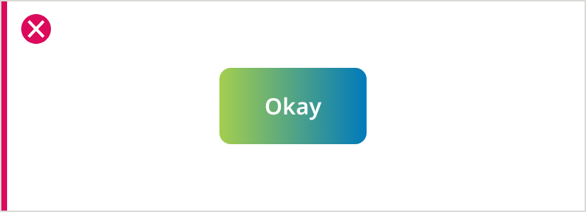
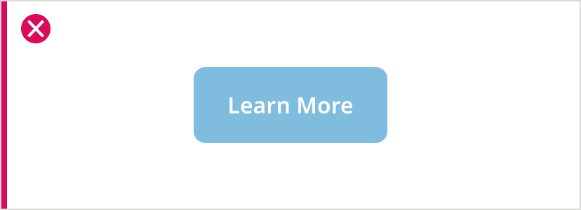
Do not use custom colors for buttons. The colors of different button variations have been designed to be consistent and accessible.
Buttons on mobile viewports
For mobile viewports, there are two variations of buttons you can use: half-width or full-width.
If only one button is used, we recommend using a full-width button. For multiple full-width buttons, we recommend having the buttons stack on top of each other.
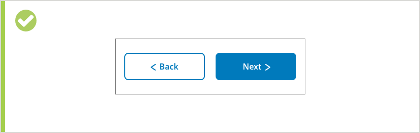
For smaller quick action labels (such as Back or Next), you can place the buttons side by side.
When stacked, buttons should not have different widths.