USER INTERFACE ELEMENTS
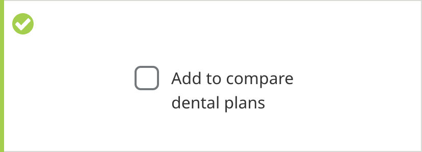
Checkboxes
Overview
Checkboxes are used to select one or more options from a set of choices.
Specifications

Checkbox Spacing

Checkboxes
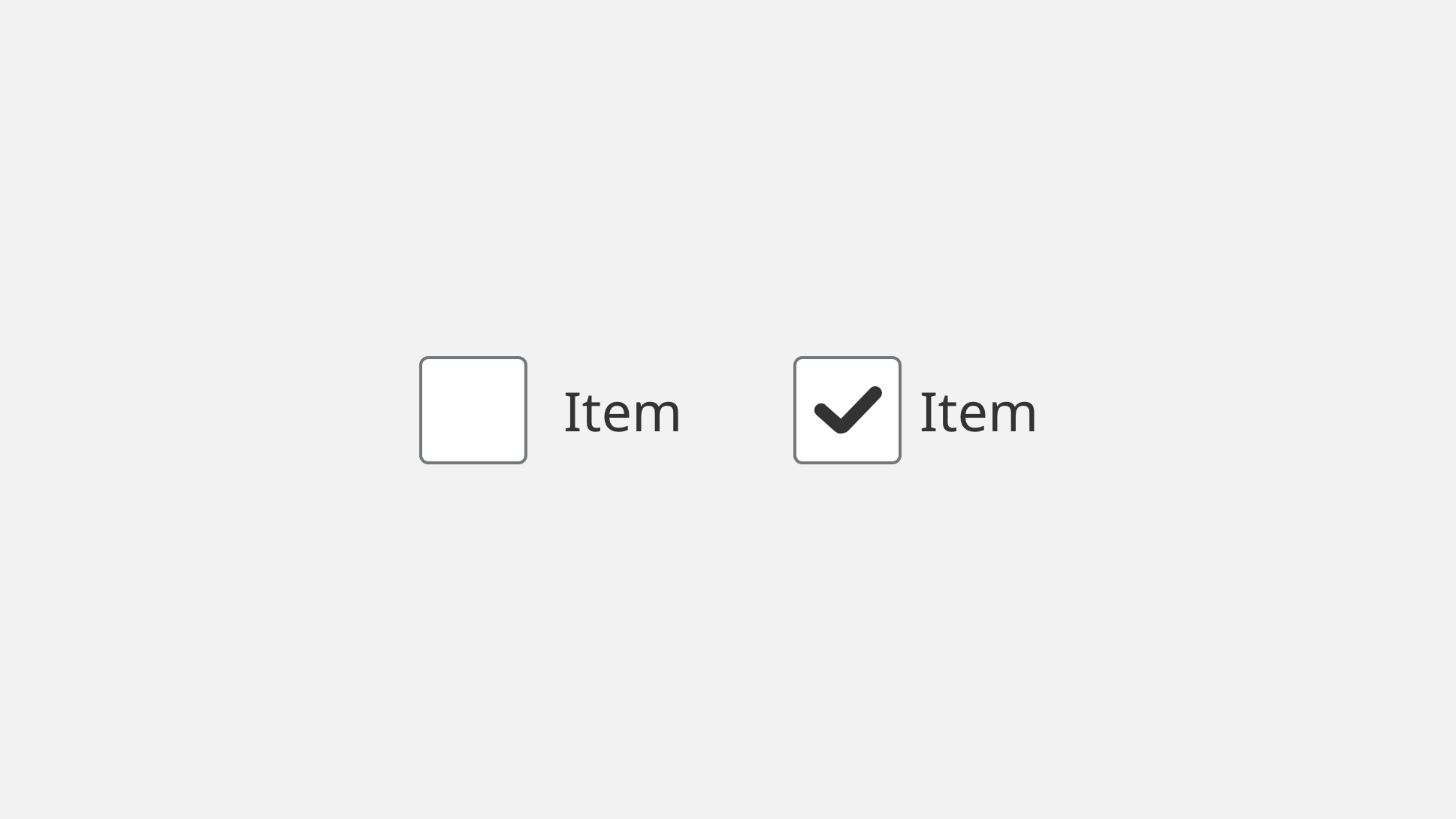
Default

- Checkbox Border Color: #6E6E6E
- Checkbox Border Size: 2px
- Checkbox Corner Radius: 6px
- Button Label Color: #333333
- Button Label Text: Noto Sans 16px Regular
Selected
- Checkbox Border Color: #6E6E6E
- Checkbox Border Size: 2px
- Checkbox Corner Radius: 6px
- Checkmark Icon Color: #333333
- Button Label Color: #333333
- Button Label Text: Noto Sans 16px Regular
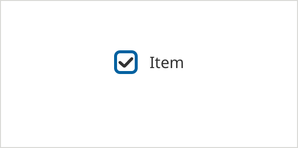
On Focus - (ADA compliant) - appears on keyboard navigation only
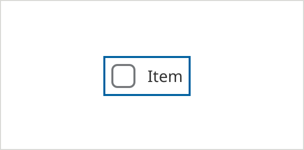
- Field Border Color: #0061A0
- Field Border Size: 2px
- Checkbox Border Color: #6E6E6E
- Checkbox Border Size: 2px
- Checkbox Corner Radius: 6px
- Checkmark Icon Color: #333333
- Button Label Color: #333333
- Button Label Text: Noto Sans 16px Regular
Error
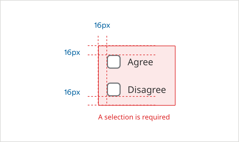
- Error Border Color: #D42123
- Error Border Size: 1px
- Error Background Color: #FCE8E8
- Caption Text Color: #D42123
- Caption Text: Noto Sans 12px Regular
Selected Hover
- Checkbox Border Color: #0061A0
- Checkbox Border Size: 3px
- Checkbox Corner Radius: 6px
- Checkmark Icon Color: #333333
- Button Label Color: #333333
- Button Label Text: Noto Sans 16px Regular
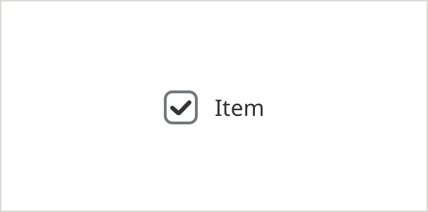
Selected Inactive
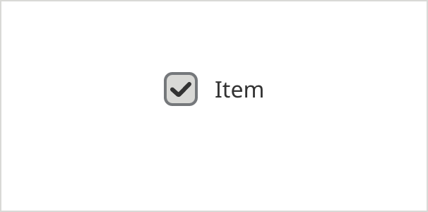
- Checkbox Border Color: #6E6E6E
- Checkbox Fill Color: #D9D9D6
- Checkbox Border Size: 2px
- Checkbox Corner Radius: 6px
- Checkmark Icon Color: #333333
- Button Label Color: #333333
- Button Label Text: Noto Sans 16px Regular
Individual Error
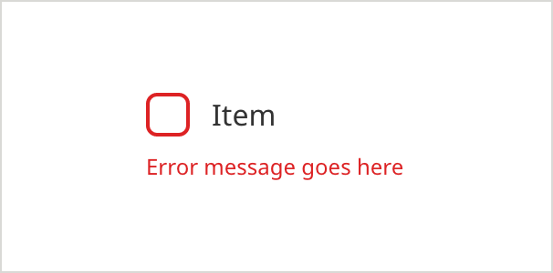
- Checkbox Border Color: #D42123
- Checkbox Border Size: 2px
- Checkbox Corner Radius: 6px
- Checkmark Icon Color: #333333
- Button Label Color: #333333
- Button Label Text: Noto Sans 16px Regular
- Caption Text Color: #D42123
- Caption Text: Noto Sans 12px Regular
Usage Guidelines
Text overflow
When the label is too long for the space available, it wraps to form another line.
Checkbox or toggle
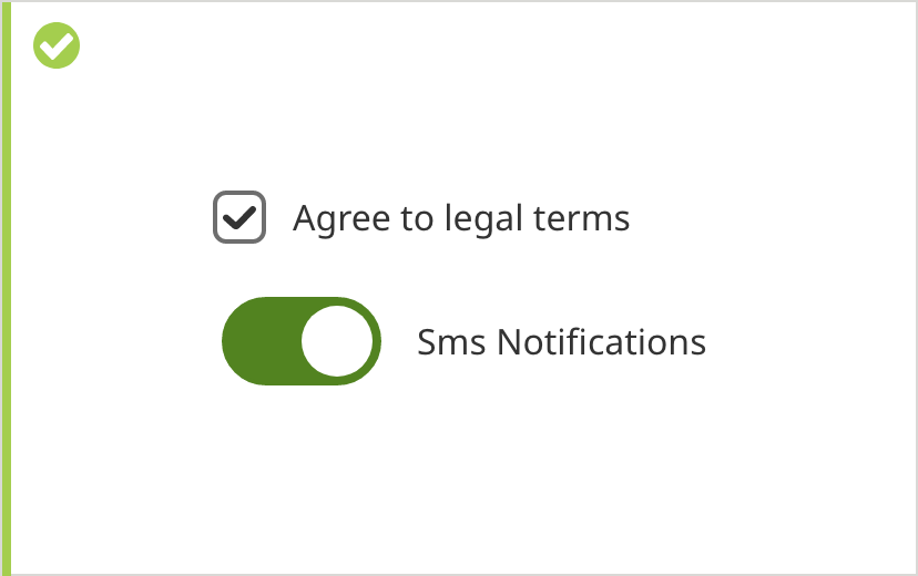
Checkboxes are best for indicating agreement (to legal terms, for example) or for allowing users to select several items from a set of choices. Checkboxes have an error state if leaving them empty indicates an incomplete action.
Toggles are implemented for turning on/off a series of preferences. Since toggles are set to either on or off by default, and have no incomplete state and can’t generate errors.
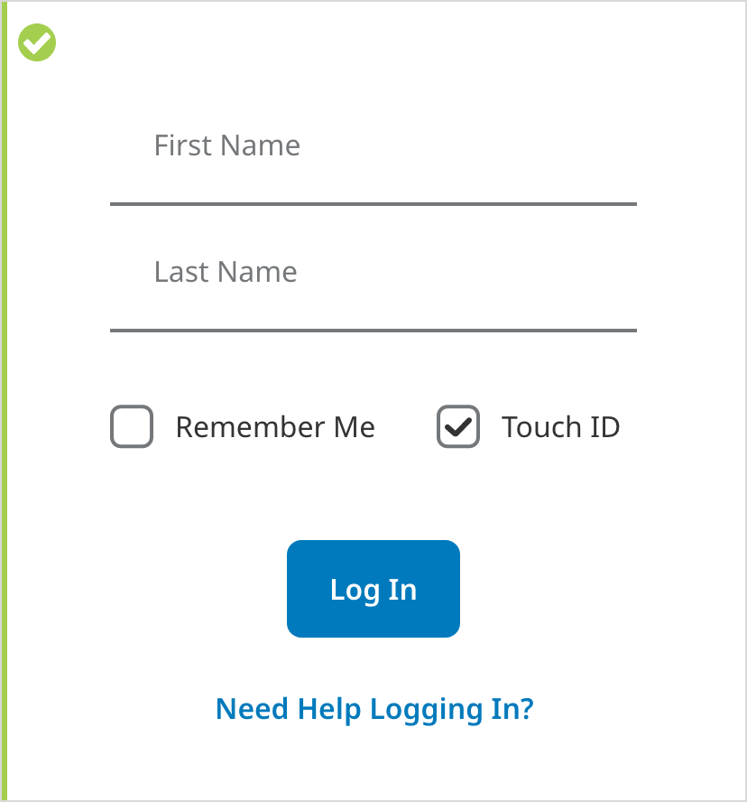
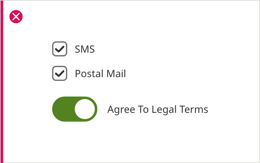
In page example