USER INTERFACE ELEMENTS
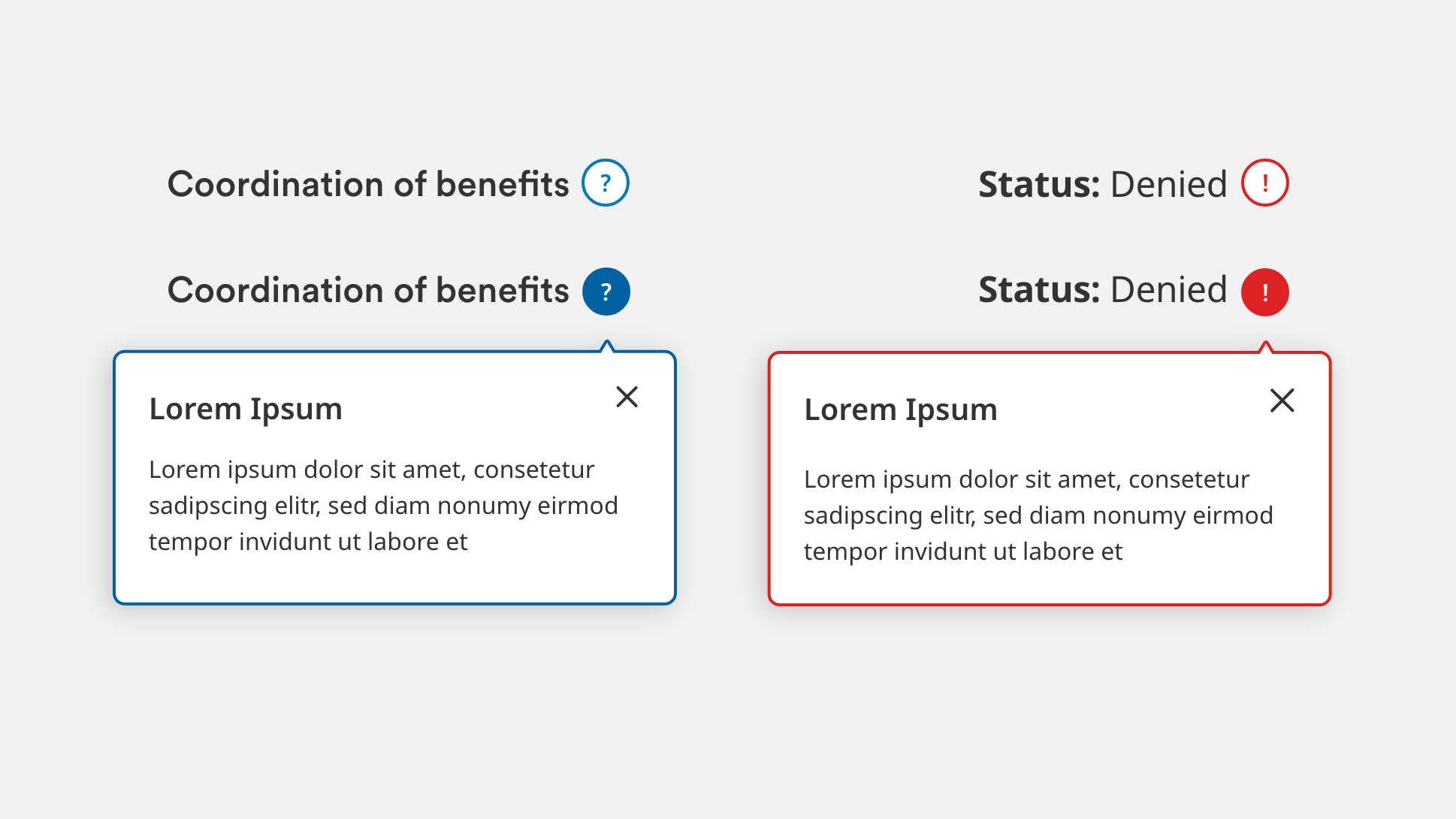
Tooltips
Overview
Tooltips are used to display supporting information about a question or block of content upon click/tap. They make supplemental information available to users without taking up extra screen space.
Specifications
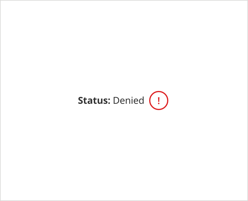
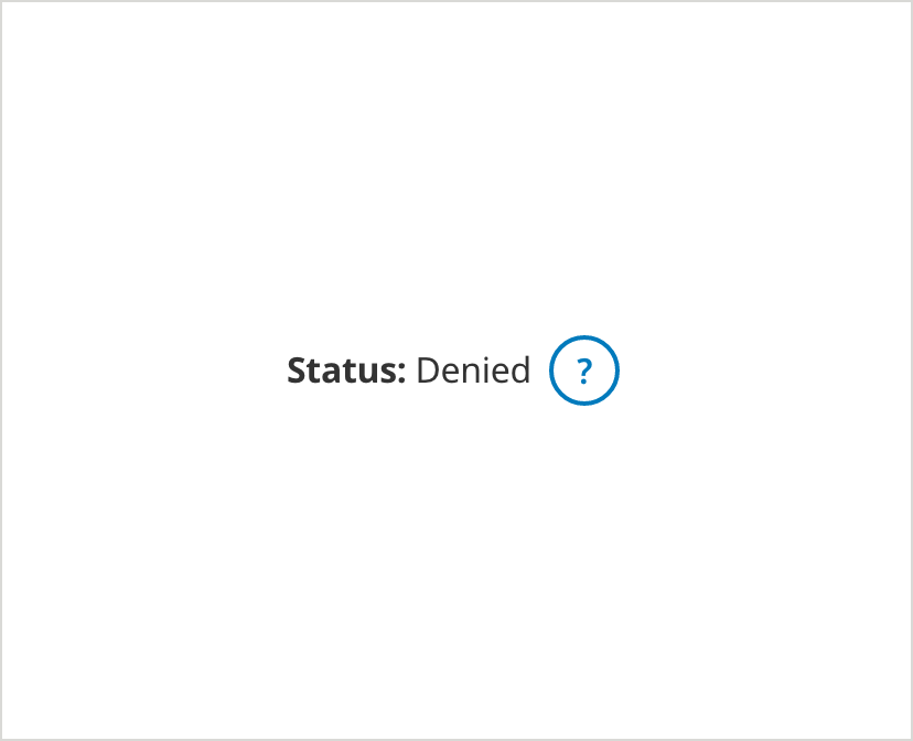
Error Status
• Use when there is an error associated with a a piece of data in a table.
• This tooltip must be used in conjunction with the Top Level Validation Message.
• Do not use with form fields – use form field error patterns instead.
On Load
Selected
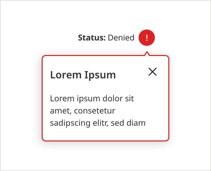
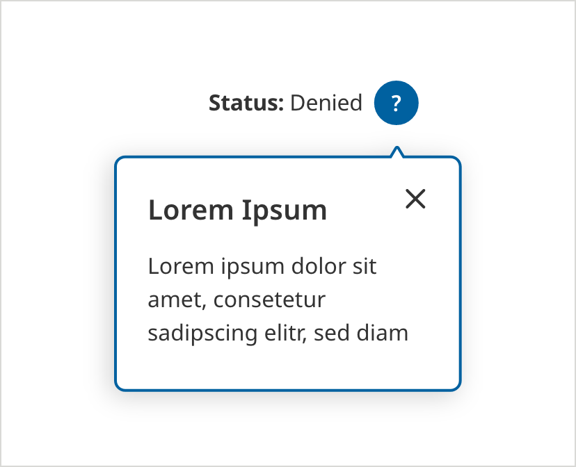
The tooltip alert should be used when there is an error associated with a piece of data/content (not with form fields.)
- Tooltip Border Color: #D42123
- Tooltip Border Size: 2px
- Text Color: #333333
- Text: Noto Sans 16px Regular, Bold
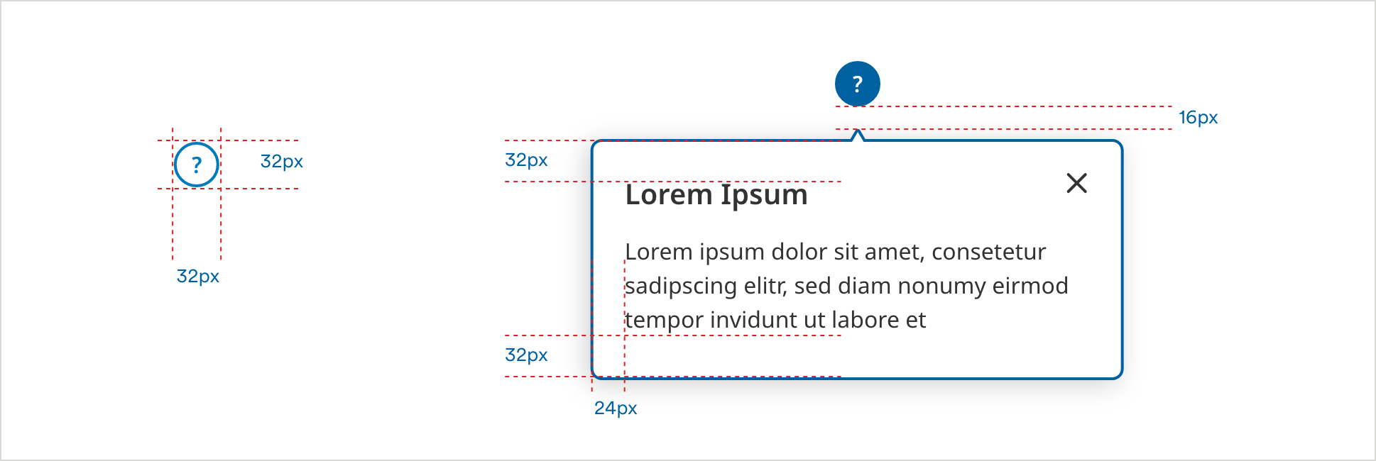
This tooltip toggles to show/hide the flyout message on hover or tap of the icon.
- Tooltip Border Color: #D42123
- Tooltip Fill Color: #FFFFFF
- Tooltip Border Size: 2px
- Text Color: #333333
- Text: Noto Sans 16px Regular, Bold
- Tooltip Card Border Color: #D42123
- Tooltip Card Border Size: 2px
- Tooltip Card Headline Text: Noto Sans 20px SemiBold
- Tooltip Card Text: Noto Sans 16px Regular
- Tooltip Card Shadow Color: #000000
- Tooltip Card Shadow Opacity: 18%
- Tooltip Card Shadow Blur: 18
- Tooltip Card Shadow Y-offset: 3
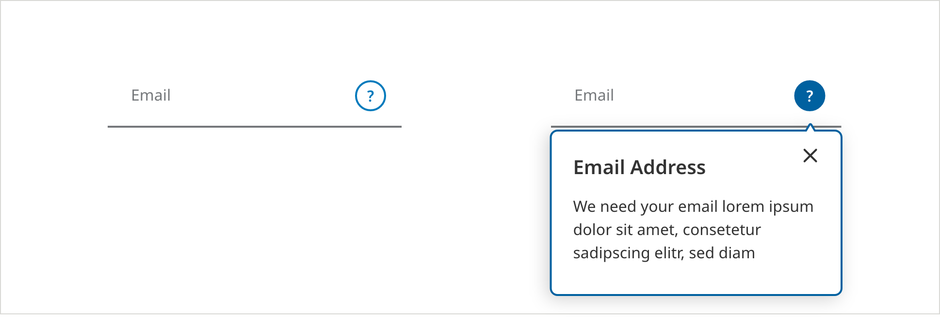
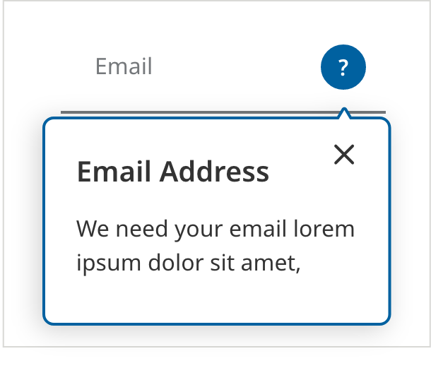
Information Icon
- Use the question mark icon with any piece of data or text where you want to provide additional information to the user.
- Use only with text that is helpful but not essential to the user – essential text should always be exposed on the page.
On Load
Selected
The tooltip alert should be used to offer helpful (but not essential) text. Essential text should be exposed at all times on the page.
- Tooltip Border Color: #007ABC
- Tooltip Border Size: 2px
- Text Color: #333333
- Text: Noto Sans 16px Regular, Bold
This tooltip toggles to show/hide the flyout message on hover or tap of the icon.
- Tooltip Border Color: #0061A0
- Tooltip Fill Color: #0061A0
- Tooltip Border Size: 2px
- Text Color: #333333
- Text: Noto Sans 16px Regular, Bold
- Tooltip Card Border Color: #0061A0
- Tooltip Card Border Size: 2px
- Tooltip Card Headline Text: Noto Sans 20px SemiBold
- Tooltip Card Text: Noto Sans 16px Regular
- Tooltip Card Text Color: #333333
- Tooltip Card Shadow Color: #000000
- Tooltip Card Shadow Opacity: 18%
- Tooltip Card Shadow Blur: 18
- Tooltip Card Shadow Y-offset: 3
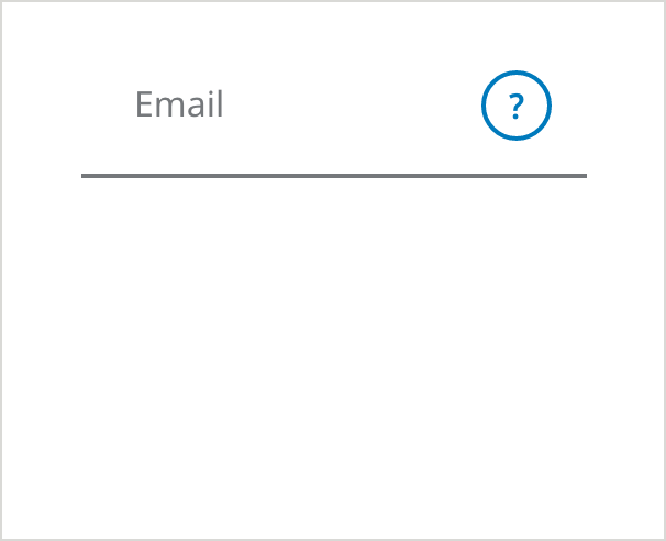
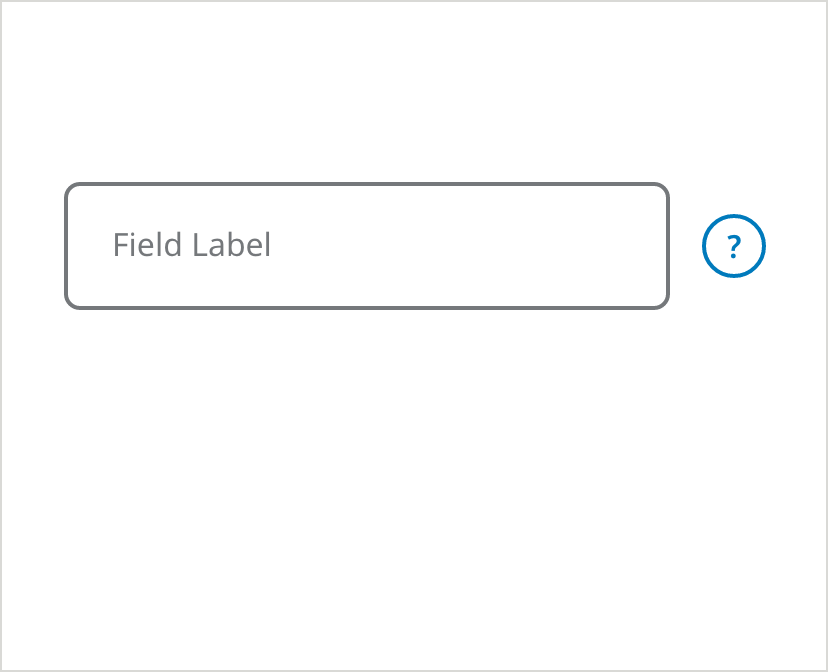
Information Icon Inside Form Fields
- Use this question mark icon within a form field in situations where there are only a few fields on the screen, and saving vertical space is critical.
- Use only with text that is helpful but not essential to the user – essential text should always be exposed on the page.
- Do not mix question mark icons with the “What’s this?” pattern on the same form.
Underlined - On Load
- Tooltip Border Color: #007ABC
- Tooltip Border Size: 2px
- Field Border Color: #75787B
- Field Border Size: 2px
- Text Color: #75787B
- Text: Noto Sans 16px Regular, Bold
Underlined - Selected
- Tooltip Border Color: #0061A0
- Tooltip Fill Color: #0061A0
- Tooltip Border Size: 2px
- Text Color: #75787B
- Text: Noto Sans 16px Regular, Bold
- Tooltip Card Border Color: #0061A0
- Tooltip Card Border Size: 2px
- Tooltip Card Headline Text: Noto Sans 20px SemiBold
- Tooltip Card Text: Noto Sans 16px Regular
- Tooltip Card Text Color: #333333
- Tooltip Card Shadow Color: #000000
- Tooltip Card Shadow Opacity: 18%
- Tooltip Card Shadow Blur: 18
- Tooltip Card Shadow Y-offset: 3
Outlined - On Load
- Tooltip Border Color: #007ABC
- Tooltip Border Size: 2px
- Field Border Color: #75787B
- Field Border Size: 2px
- Text Color: #75787B
- Text: Noto Sans 16px Regular, Bold
Outlined - Selected
- Tooltip Card Border Color: #0061A0
- Tooltip Card Border Size: 2px
- Tooltip Card Headline Text: Noto Sans 20px SemiBold
- Tooltip Card Text: Noto Sans 16px Regular
- Tooltip Card Text Color: #333333
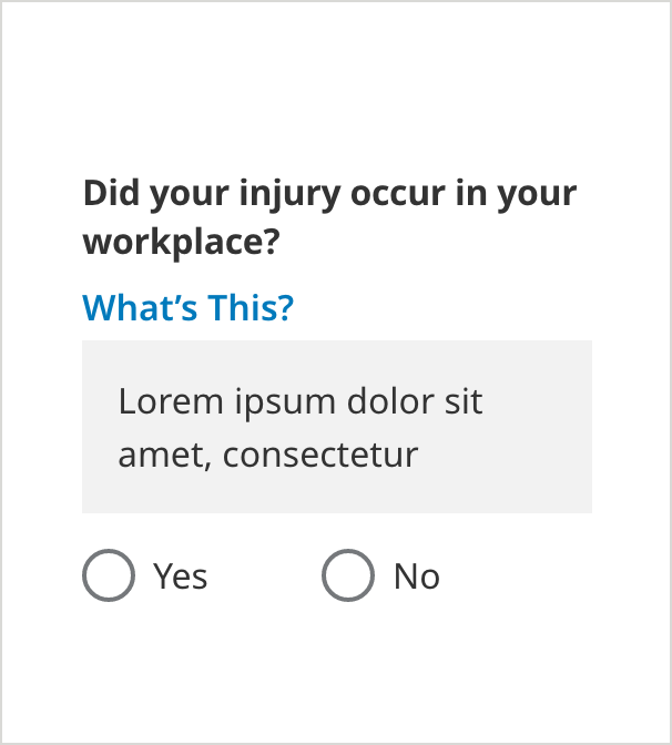
Information Icon with Radio Button
On Load
- Icon Color: #007ABC
Selected
- Messaging Border Color: #007ABC
- Border Size: 1px
- Messaging Border Size: 1px
- Messaging Text: Noto Sans 12px #333333
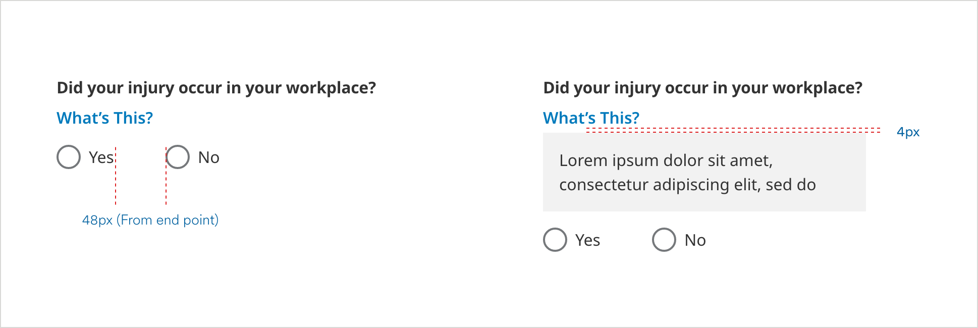
What’s This?
Tooltip (Text)
- Use the “What’s This” Link when displaying a text field or dropdown, where you want to provide additional helpful information to the user.
• Use only with text that is helpful but not essential to the user – essential text should always be exposed on the page. - Always use “What’s this?” instead of a tooltip icon within the field for all fields that already have an icon (such as a caret or show/hide icon) sitting in the far right real estate.
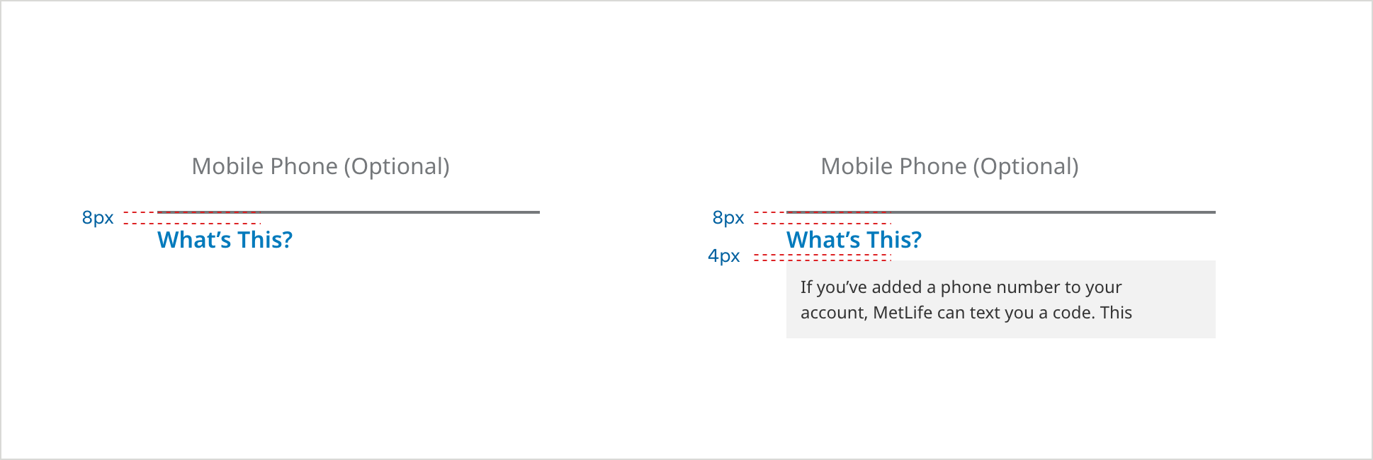
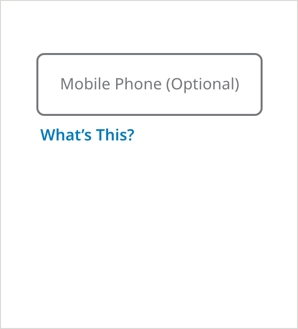
Underlined Field - On Load
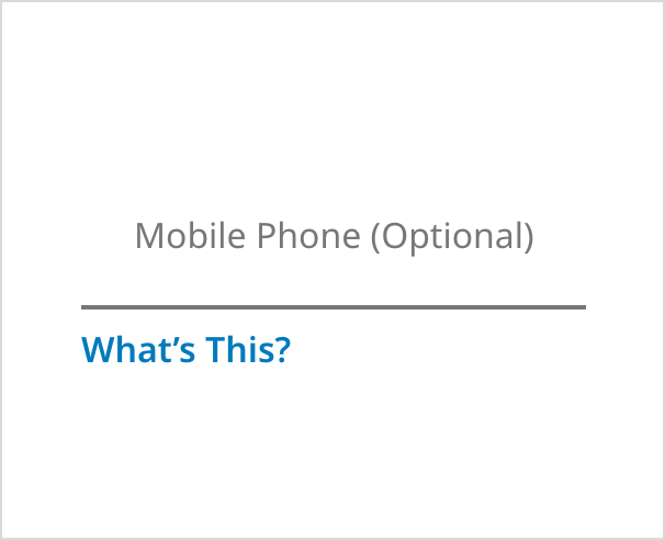
- Field Border Color: #75787B
- Field Border Size: 2px
- Text Color: #75787B
- Text: Noto Sans 16px Regular
- Field Specific Text Link Color: #007ABC
- Field Specific Text Link: Noto Sans 16px SemiBold
Underlined Field - Tooltip Selected
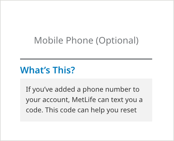
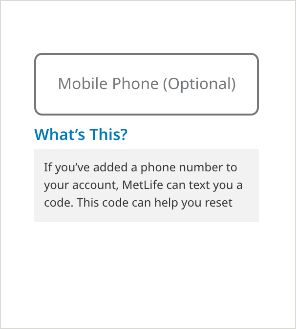
- Messaging Background Color: #F2F2F2
- Messaging Text Color: #333333
- Messaging Text: Noto Sans 16px Regular
Outlined Field - On Load
Outlined Field - Tooltip Selected
Underlined Dropdown - On Load
- Field Border Color: #75787B
- Field Border Size: 2px
- Text Color: #75787B
- Text: Noto Sans 16px Regular
- Field Specific Text Link Color: #007ABC
- Field Specific Text Link: Noto Sans 16px SemiBold
Underlined Dropdown - Tooltip Selected
- Messaging Background Color: #F2F2F2
- Messaging Text Color: #333333
- Messaging Text: Noto Sans 16px Regular
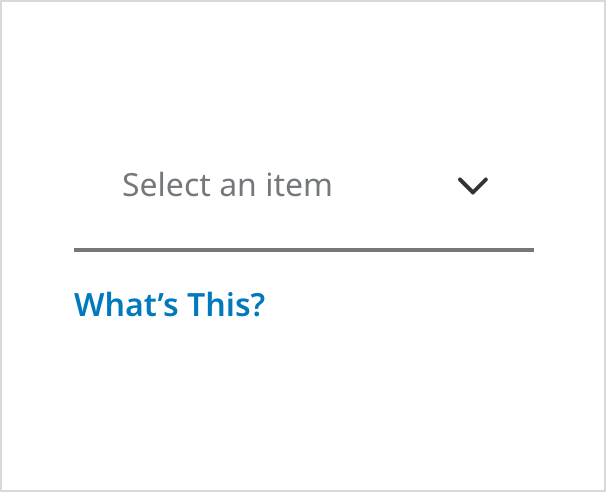
Outlined Dropdown - On Load
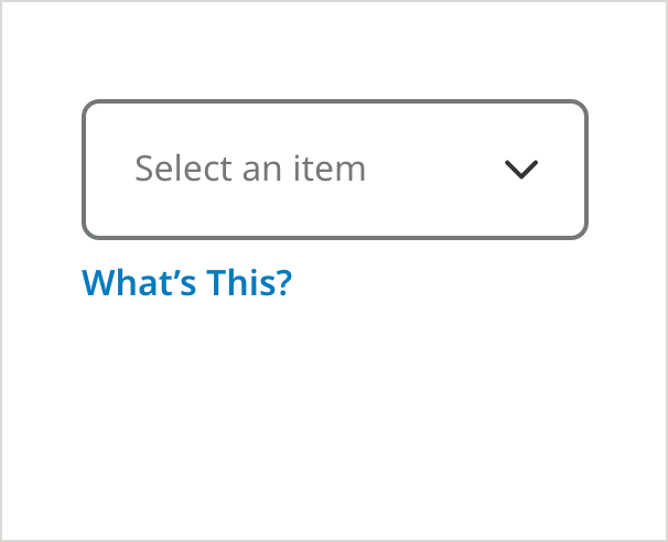
- Field Specific Text Link Color: #007ABC
- Field Specific Text Link: Noto Sans 16px SemiBold
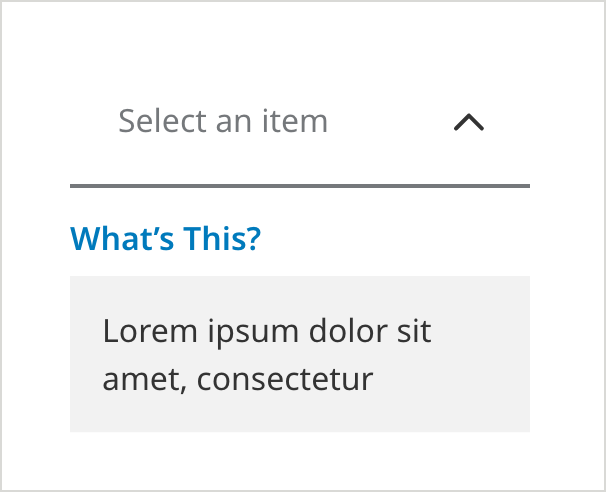
Outlined Dropdown - Tooltip Selected
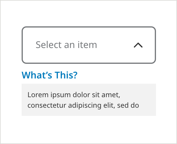
- Messaging Background Color: #F2F2F2
- Messaging Text Color: #333333
- Messaging Text: Noto Sans 16px Regular
Usage Guidelines
Don’t use tooltips without labels or context

A tooltip icon should always be placed next to the content it refers to and should never appear floating in white space with no clear reference point.
Use “What’s this?” tooltips in the right places
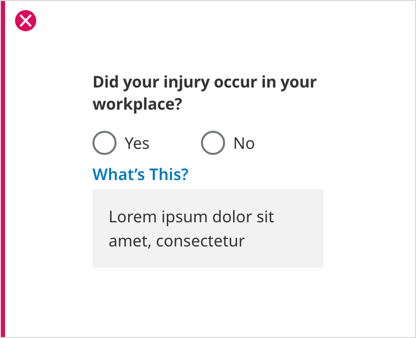
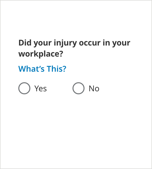
Don’t use a “What’s this?” tooltip with radio buttons or blocks of content. Use the Information Icon tooltip in those situations. Use “What’s this?” only with Text Fields or Dropdowns.