USER INTERFACE ELEMENTS
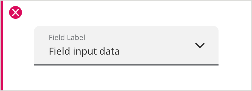
Dropdowns (Underlined)
Overview
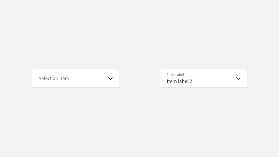
Underlined dropdowns function the same way as traditional outlined dropdowns, and are appropriate when implemented in a conversational UI sequence (where underlined text fields would also be used). Another use case is for filtering, at the top of a page or table. Do not mix outlined text fields or outlined dropdowns on the same screen.
Specifications
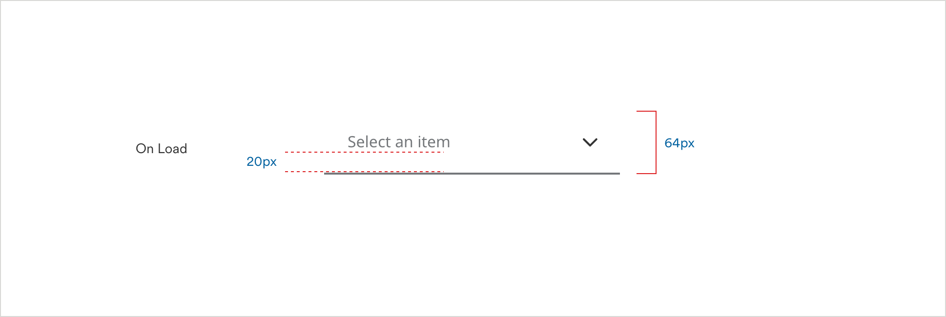
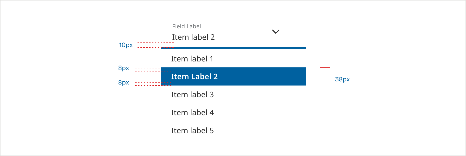
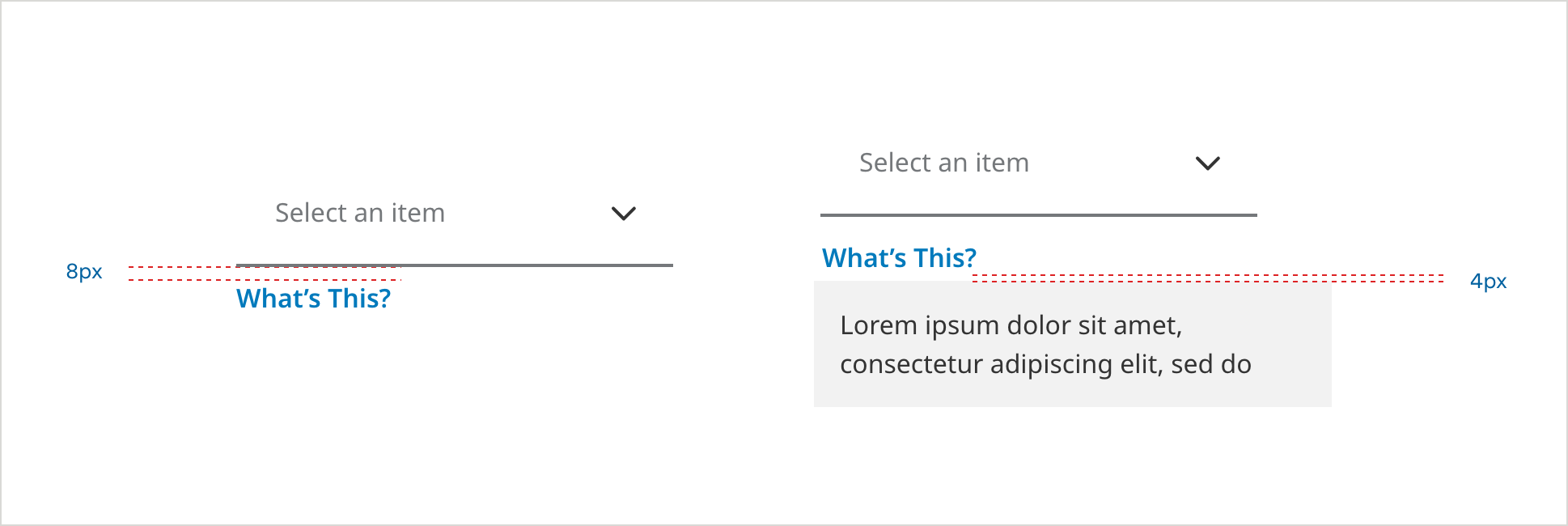
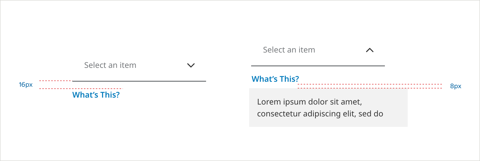
Dropdown Spacing

Dropdown Spacing
Responsive Dropdowns
On Load
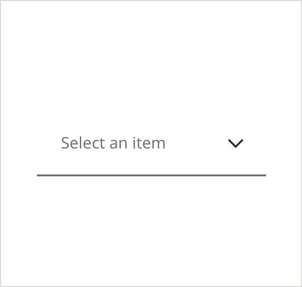
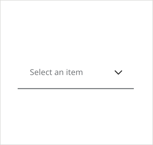
- Field Border Color: #6E6E6E
- Field Border Size: 2px
- Pre-Selection Text Color: #6E6E6E
- Pre-Selection Text: Noto Sans 16px Regular
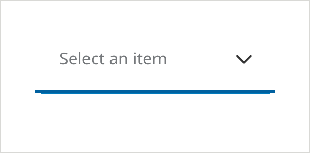
Selected
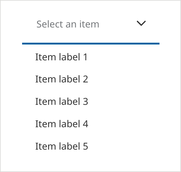
- Field Border Color: #0061A0
- Field Border Size: 3px
- Pre-Selection Text Color: #6E6E6E
- Pre-Selection Text: Noto Sans 16px Regular
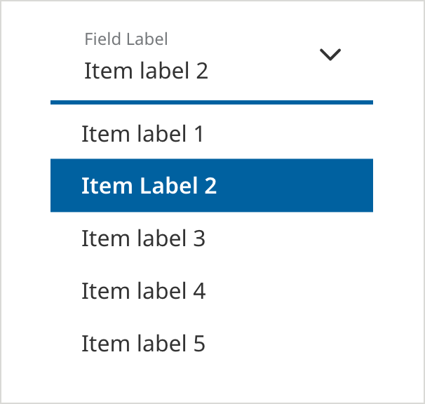
DROPDOWN:
- Text Color: #333333
- Text: Noto Sans 16px Regular
—
- Hover Text: MetLife Circular 16px Bold
- Hover Text Color: #000000
- Hover Fill Color: #BADDF5
—
- Dropdown Border Size: 2px
- Dropdown Border Color: #D9D9D6
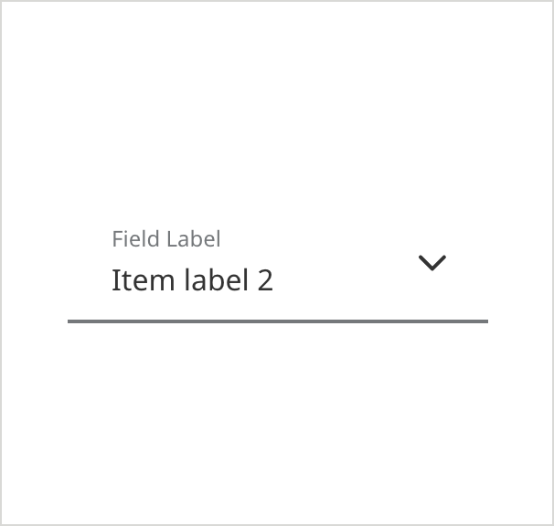
Filled
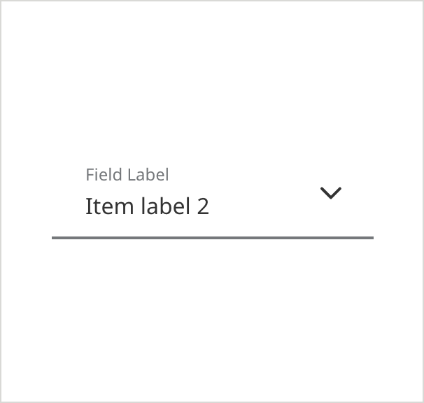
- Field Border Color: #6E6E6E
- Field Border Size: 2px
- Field Label Text Color: #6E6E6E
- Field Label Text: Noto Sans 12px Regular
- Text Color: #333333
- Text: Noto Sans 16px Regular
On Focus - (ADA compliant) - appears on keyboard navigation only
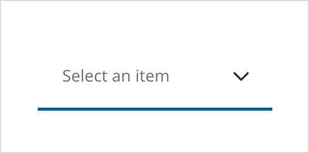
- Field Border Color: #0061A0
- Field Border Size: 3px
- Pre-Selection Text Color: #6E6E6E
- Pre-Selection Text: Noto Sans 16px Regular
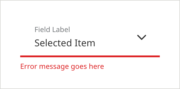
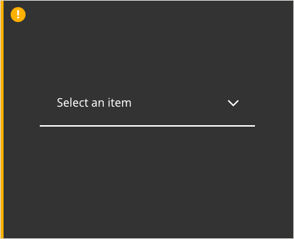
Error
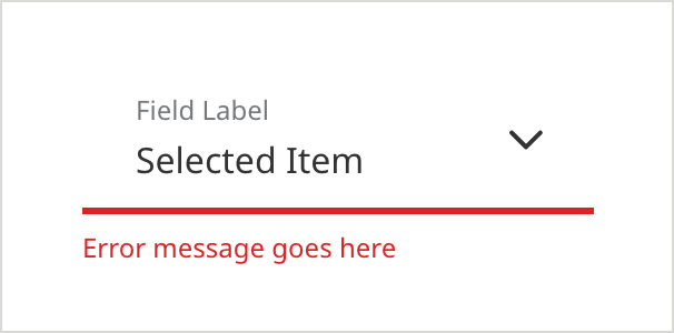
- Field Border Color: #D42123
- Field Border Size: 3px
- Field Label Text Color: #6E6E6E
- Field Label Text: Noto Sans 12px Regular
- Text Color: #333333
- Text: Noto Sans 16px Regular
- Caption Text Color: #D42123
- Caption Text: Noto Sans 12px Regular
Icon - Leading
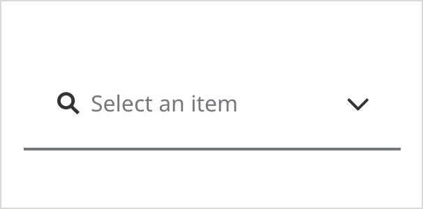
- Field Border Color:#6E6E6E
- Field Border Size: 2px
- Pre-Selection Text Color: #6E6E6E
- Pre-Selection Text: Noto Sans 16px Regular
- Icon Color Color: #333333
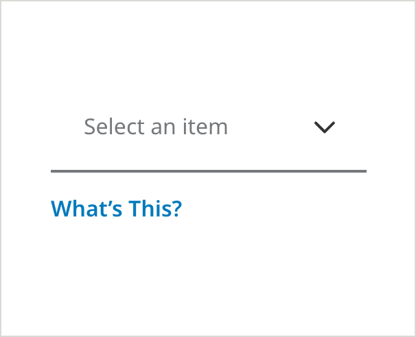
Responsive Dropdown With Tooltip
Use the “What’s This” Link when displaying a form element, such as a text field or dropdown, where you want to provide additional helpful information to the user.
On Load

- Field Specific Text Link Color: #007ABC
- Field Specific Text Link: Noto Sans 16px SemiBold
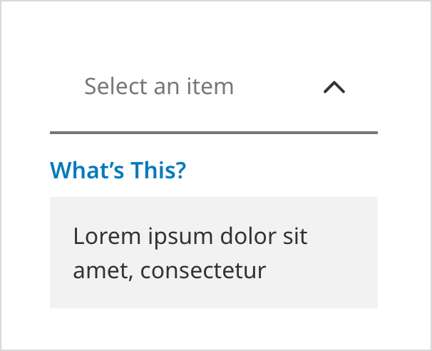
Tooltip Selected
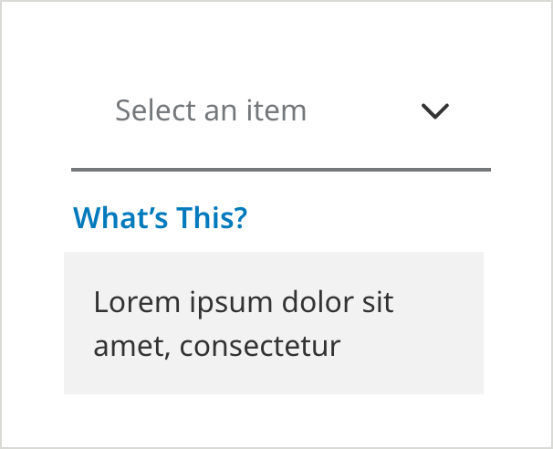
- Messaging Background Color: #F2F2F2
- Messaging Text Color: #333333
- Messaging Text: Noto Sans 16px Regular
Mobile Dropdowns
On Load
- Field Border Color:#6E6E6E
- Field Border Size: 2px
- Pre-Selection Text Color: #6E6E6E
- Pre-Selection Text: Noto Sans 16px Regular
Selected
- Field Border Color: #0061A0
- Pre-Selection Text Color: #6E6E6E
- Pre-Selection Text: Noto Sans 16px Regular
DROPDOWN:
- Text Color: #333333
- Text: Noto Sans 16px Regular
—
- Hover Text: MetLife Circular 16px Bold
- Hover Text Color: #000000
- Hover Fill Color: #BADDF5
—
- Dropdown Border Size: 2px
- Dropdown Border Color: #D9D9D6
Filled
- Field Border Color: #6E6E6E
- Field Border Size: 2px
- Field Label Text Color: #6E6E6E
- Field Label Text: Noto Sans 12px Regular
- Text Color: #333333
- Text: Noto Sans 16px Regular
On Focus - (ADA compliant) - appears on keyboard navigation only
- Field Border Color: #0061A0
- Field Border Size: 3px
- Pre-Selection Text Color: #6E6E6E
- Pre-Selection Text: Noto Sans 16px Regular
Error
- Field Border Color:#D42123
- Field Border Size: 3px
- Field Label Text Color: #6E6E6E
- Field Label Text: Noto Sans 12px Regular
- Text Color: #333333
- Text: Noto Sans 16px Regular
- Caption Text Color:#D42123
- Caption Text: Noto Sans 12px Regular
With Tooltip
Use the “What’s This” Link when displaying a form element, such as a text field or dropdown where you want to provide additional helpful information to the user.
On Load
- Field Specific Text Link Color: #007ABC
- Field Specific Text Link: Noto Sans 16px SemiBold
Clicking Link
- Messaging Background Color: #F2F2F2
- Messaging Text Color: #333333
- Messaging Text: Noto Sans 16px Regular
Usage Guidelines
Mobile App dropdowns on dark backgrounds
Caution in using this white variation of this dropdown. This should be used sparingly.
Disabled