USER INTERFACE ELEMENTS
Radio Buttons
Overview
Radio buttons allow users to select a single option from a set. Functionally, radio buttons allow for one selection only. Selecting a new choice automatically de-selects the first.
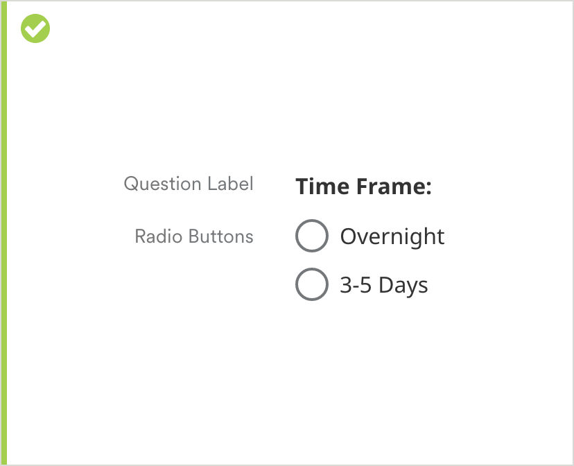
Radio buttons should be stacked in most cases. If the associated labels are short, button/label sets can be displayed side-by-side to reduce scroll.
Specifications

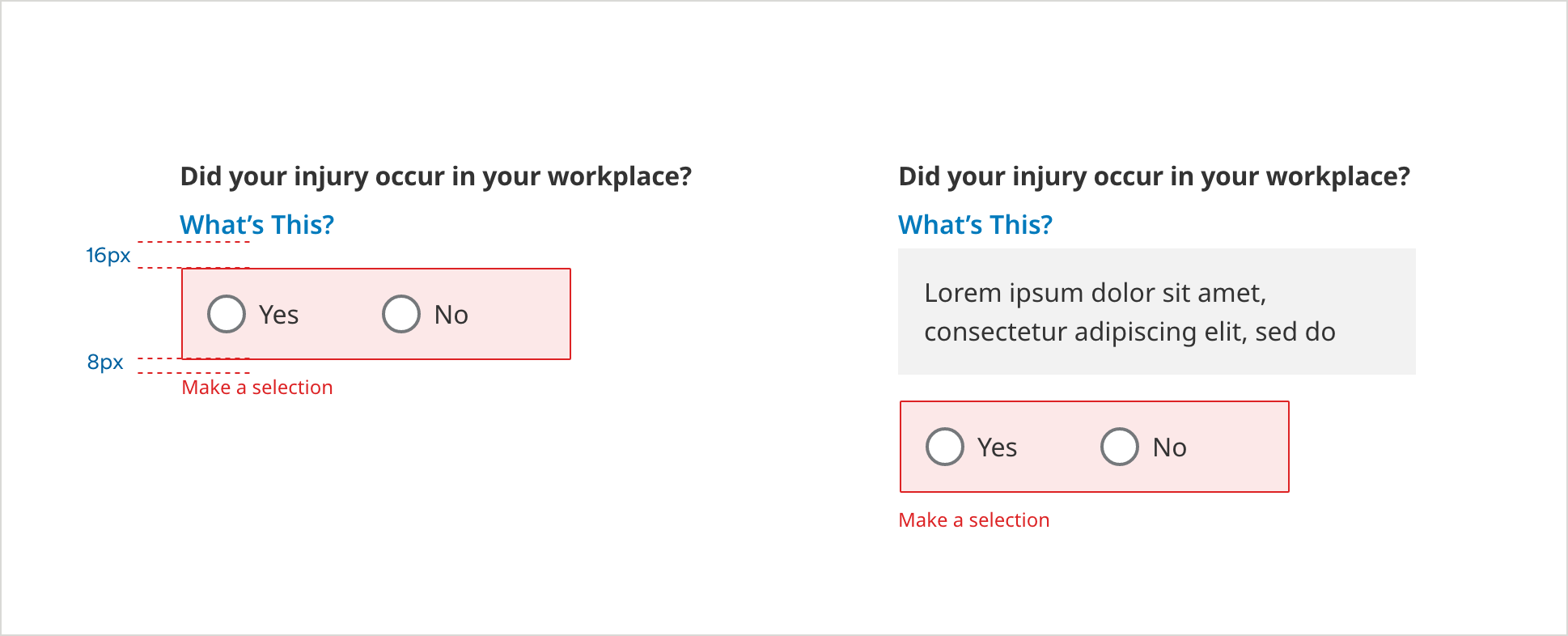
Radio Button Spacing

Radio Button Error Container

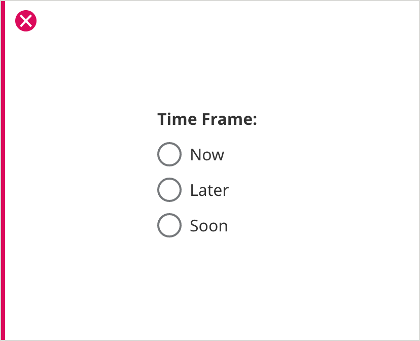
Radio Buttons with Label
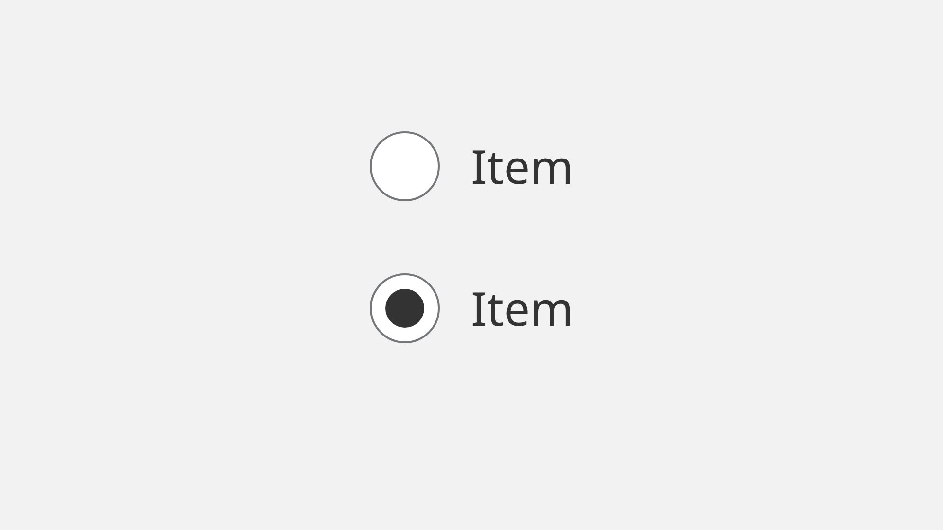
On Load
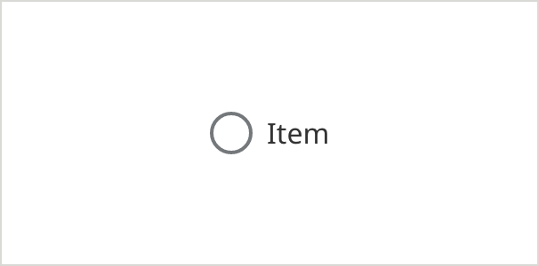
- Outer Circle Border Color: #6E6E6E
- Outer Circle Border Size: 2px
- Button Label Color: #333333
- Button Label Text: Noto Sans 16px Regular
Selected
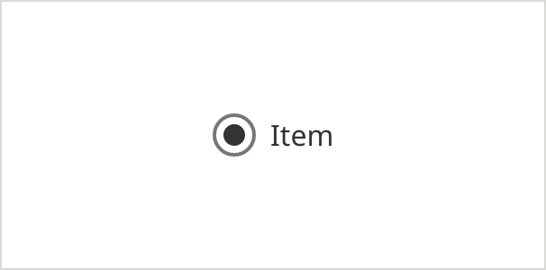
- Outer Circle Border Color: #6E6E6E
- Outer Circle Border Size: 2px
- Inner Circle Fill Color: #333333
- Button Label Color: #333333
- Button Label Text: Noto Sans 16px Regular
On Focus - (ADA compliant) - appears on keyboard navigation only
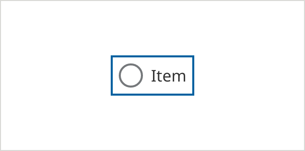
- Field Border Color: #0061A0
- Outer Circle Border Color: #6E6E6E
- Outer Circle Border Size: 2px
- Button Label Color: #333333
- Button Label Text: Noto Sans 16px Regular
Error
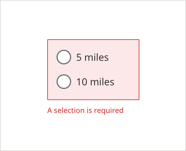
- Error Border Color: #D42123
- Error Border Size: 1px
- Error Background Color: #FCE8E8
- Caption Text Color: #D42123
- Caption Text: Noto Sans 12px Regular
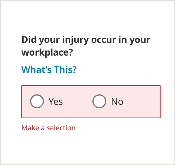
Radio Button Tooltip
On Load
- Field Specific Text Link Color: #007ABC
- Field Specific Text Link: Noto Sans 16px SemiBold
Selected
- Messaging Background Color: #F2F2F2
- Messaging Text Color: #333333
- Messaging Text: Noto Sans 16px Regular
Tooltip with Error
On Load
- Error Border Color: #D42123
- Error Border Size: 1px
- Error Background Color: #FCE8E8
- Caption Text Color: #D42123
- Caption Text: Noto Sans 12px Regular
Selected
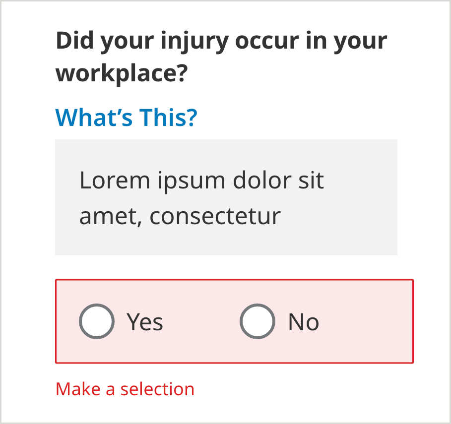
- Messaging Background Color: #F2F2F2
- Messaging Text Color: #333333
- Messaging Text: Noto Sans 16px Regular
- Caption Text Color: #D42123
- Caption Text: Noto Sans 12px Normal
- Error Background: #FCE8E8
- Error Border: 1px
Usage Guidelines
UX Best Practice
Typically radio buttons are used when there are two choices. Use a dropdown when there are more than two choices.
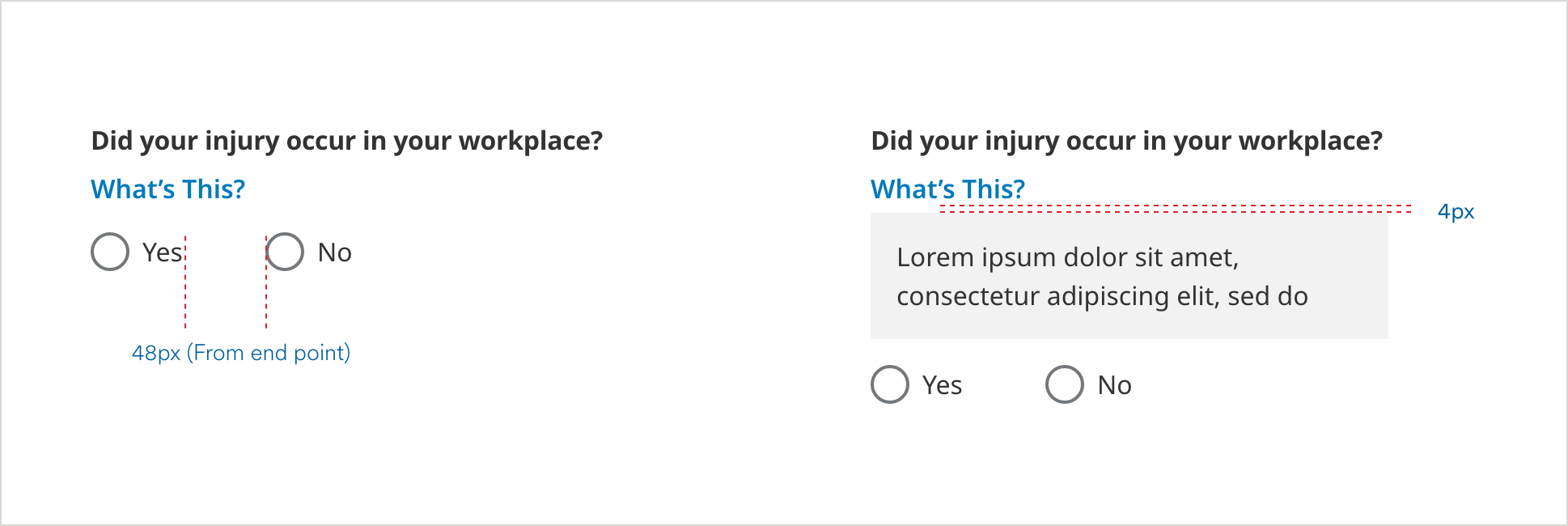
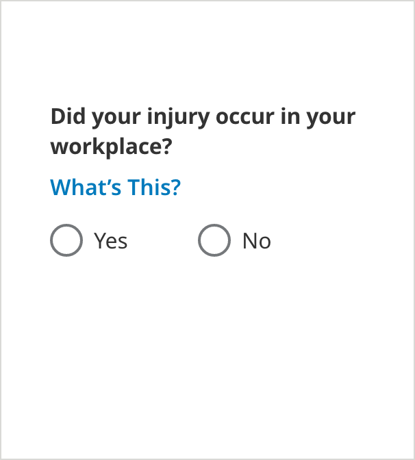
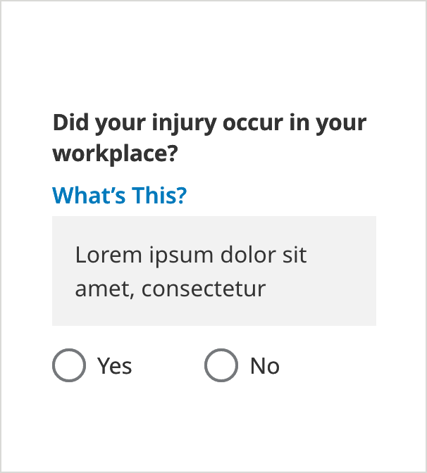
Don’t use the “What’s this?” Tooltip with Radio Buttons
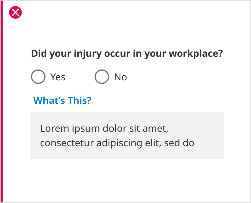
Don’t use a “What’s this?” tooltip with radio buttons. Use the Information Icon tooltip in these situations.