USER INTERFACE ELEMENTS
Overlay
Overview
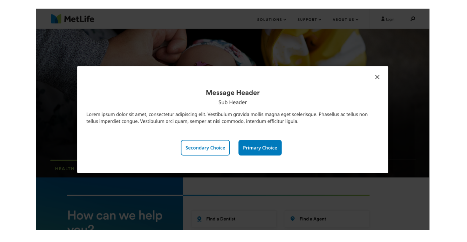
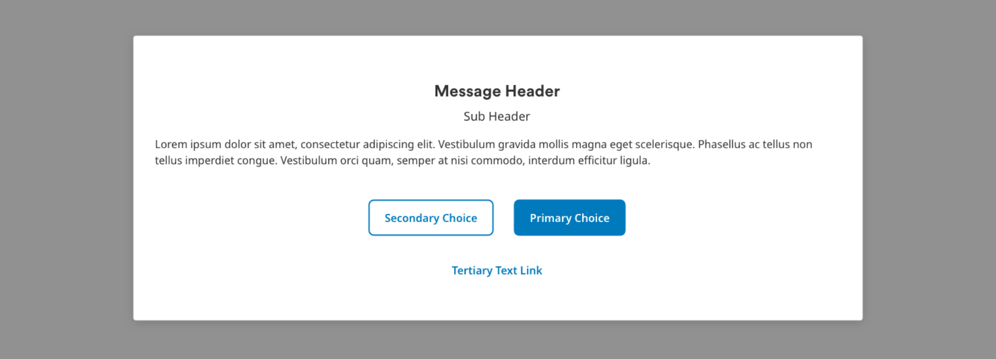
Overlays are modals that serve to overlay content on top of the existing interface. They sit on top of a main window, disabling the grayed-out main window content until the user closes the message. Overlays provide focused interactions without navigating away from the current experience.
Usage Guidelines
Do
Use overlays in the following scenarios:
- To interrupt the user with messages too important to miss.
- When immediate input is needed from the user in order to begin, continue or conclude a process.

Do
Keep the content simple and concise.
- Aim for a few sentences or key points of information within the overlay to convey your message effectively.
Do
Use proper hierarchy and readability.
- Use proper typography, hierarchy, and legible font sizes to ensure that the content is easily readable.
- Users should be able to quickly scan the content.
- Important information should be prominently displayed.
Do
Use proper trigger elements.
- The trigger element, which opens the Overlay component, should be a recognizable interactive element such as a button or text link.
- Ensure the trigger element has a clear label indicating it's purpose, such as "Open" or "View Details".
Don't
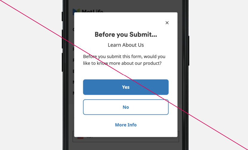
- Don’t use overlays that interrupt a users’ tasks or workflows, as it can be disruptive to the overall experience.

Resources
