USER INTERFACE ELEMENTS
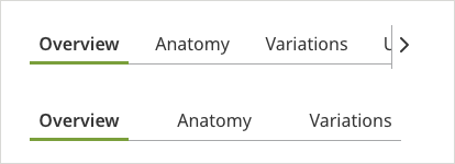
Tabs
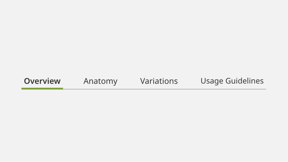
Overview
Tabs serve as a flexible secondary navigation, allowing a user to navigate between different groups of content within the same page.
Specifications
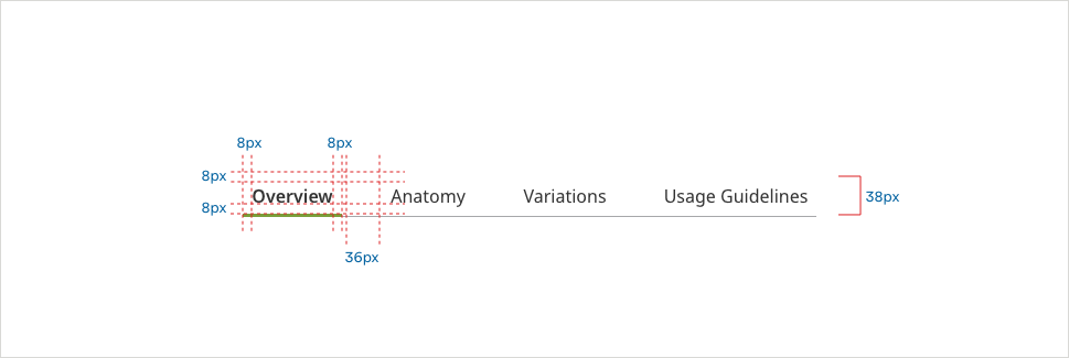
Tabs (Secondary Navigation)
Unselected

- Divider Color: #A7A8AA
- Divider Size: 1px
- Text Color: #333333
- Text: Noto Sans 16px Regular
Hover

- Divider Color: #A7A8AA
- Divider Size: 1px
- Tab Line Color: #0061A0
- Tab Line Size: 3px
- Text Color: #0061A0
- Text: Noto Sans 16px SemiBold
Selected

- Divider Color: #A7A8AA
- Divider Size: 1px
- Tab Line Color: #528320
- Tab Line Size: 3px
- Text Color: #333333
- Text: Noto Sans 16px SemiBold
On Focus - (ADA compliant) - appears on keyboard navigation only
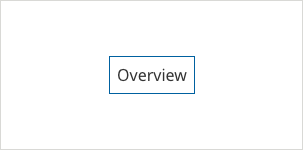
- Divider Color: #A7A8AA
- Divider Size: 1px
- Border Color: #0061A0
- Border Size: 1px
- Text Color: #333333
- Text: Noto Sans 16px Regular
On Focus Selected - (ADA compliant) - appears on keyboard navigation only

- Divider Color: #A7A8AA
- Divider Size: 1px
- Tab Line Color: #528320
- Tab Line Size: 3px
- Border Color: #0061A0
- Border Size: 1px
- Text Color: #333333
- Text: Noto Sans 16px SemiBold
Scrolled (Mobile)
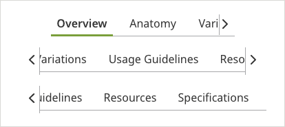
When there are more than two options on a small viewport such as the phone, tabs are scrollable. The tabs on the edge should always be partially onscreen, so that a user knows there are further options.
Usage Guidelines
Alignment
When there are more than two options, tabs are scrollable. The tabs on the edge should always be partially onscreen, so that a user knows there are further options.
Mobile Scenario (Secondary Navigation)
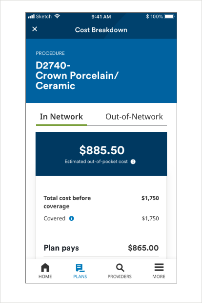
Tabs navigate between two groups of related content. In the cost estimator example, it allows a user to quickly and clearly compare projected pricing.