USER INTERFACE ELEMENTS
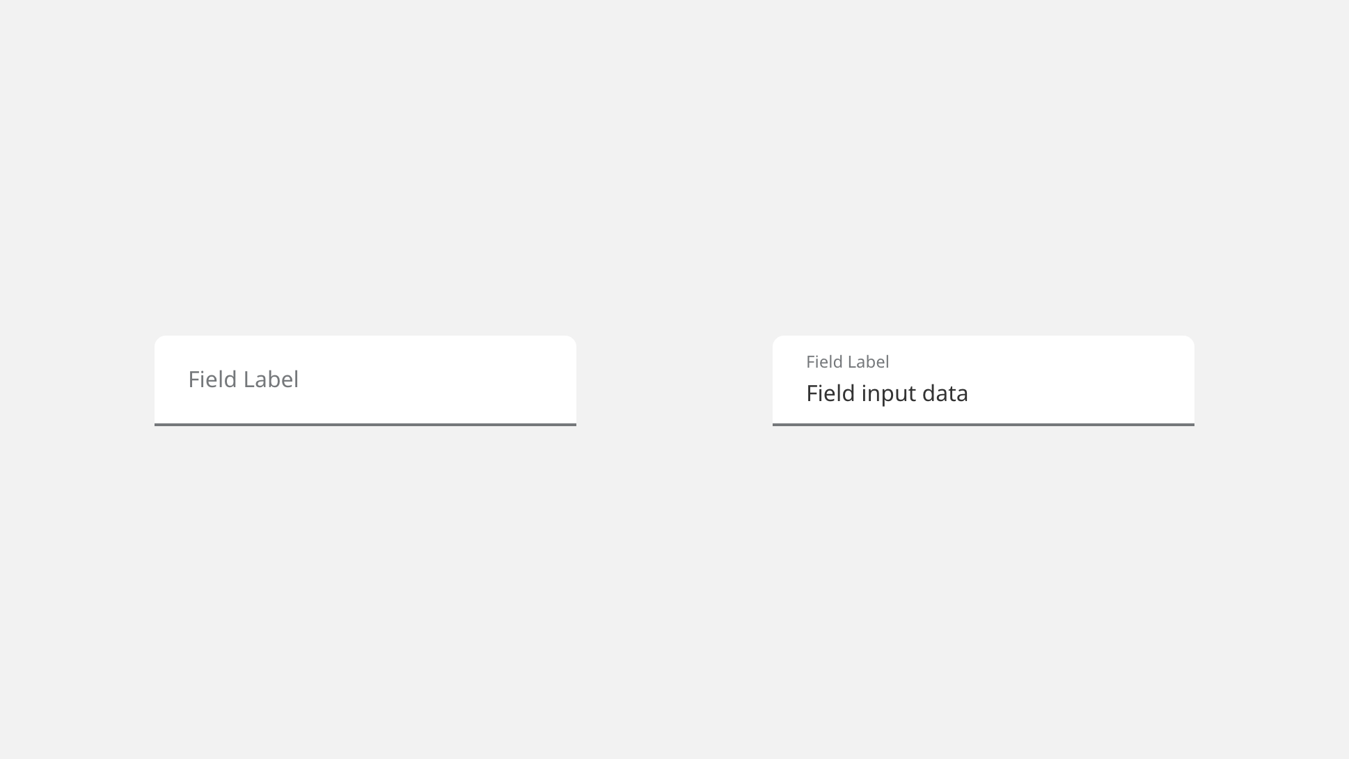
Text Fields (Underlined)
Overview
Underlined text fields are ideal for scenarios where small chunks of data are being collected, such as basic identity details within a conversational UI sequence. They should not be used where large amounts of sequential fields create a stack – as in traditional forms. Do not mix underlined text fields with outlined text fields on the same screen.
Specifications
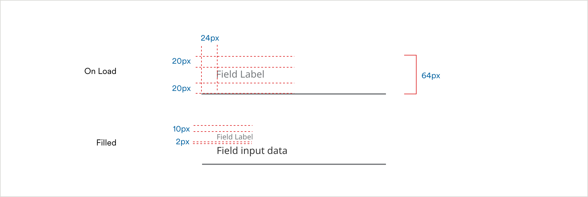
Form Field Spacing
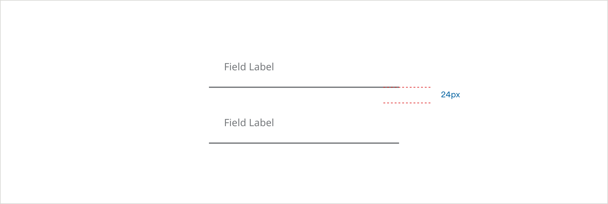
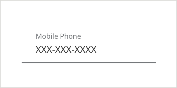
Simple Form Fields
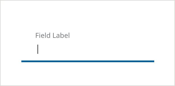
Default
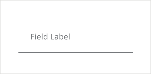
- Field Border Color: #6E6E6E
- Field Border Size: 2px
- Field Label Color: #6E6E6E
- Field Label Text: Noto Sans 16px Regular
Hover
- Field Border Color: #0061A0
- Field Border Size: 3px
- Field Label Color: #6E6E6E
- Field Label Text: Noto Sans 12px Regular
- Text Color: #333333
- Text: Noto Sans 16px Regular
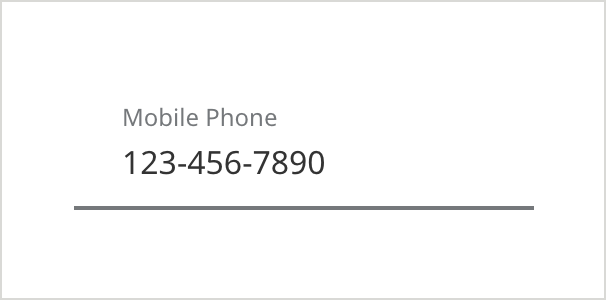
Filled/ Disabled
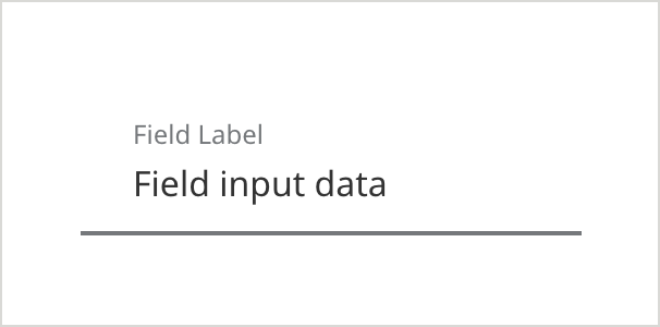
- Field Border Color: #6E6E6E
- Field Border Size: 2px
- Field Label Color: #6E6E6E
- Field Label Text: Noto Sans 12px Regular
- Text Color: #333333
- Text: Noto Sans 16px Regular
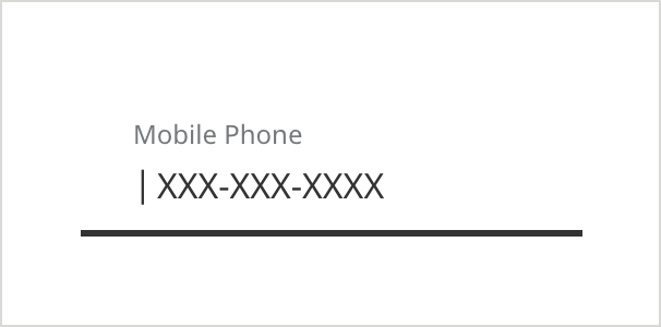
On Focus/Selected + Keyboard Focus (ADA)
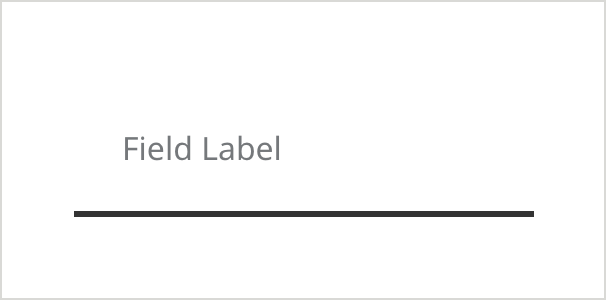
- Field Border Color: #333333
- Field Border Size: 3px
- Field Label Color: #6E6E6E
- Field Label Text: Noto Sans 16px Regular
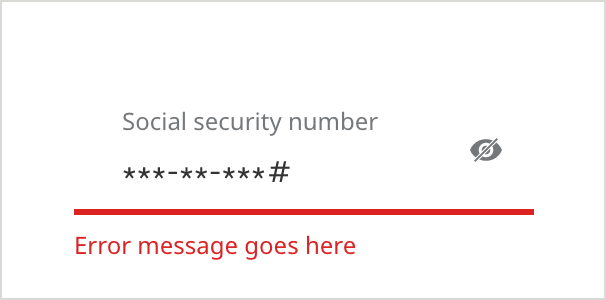
Error
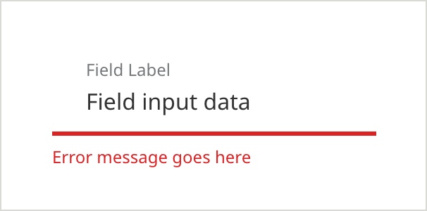
- Field Border Color:#D42123
- Field Border Size: 3px
- Field Label Color: #6E6E6E
- Field Label Text: Noto Sans 12px Regular
- Text Color: #333333
- Text: Noto Sans 16px Regular
- Caption Color: #D42123
- Caption Text: Noto Sans 12px Regular
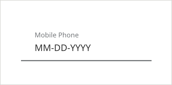
With Hint Text
Use hint text for fields that have specific formatting requirements, to help users understand how they need to enter the information.
On Load
- Field Border Color: #6E6E6E
- Field Border Size: 2px
- Field Label Color: #6E6E6E
- Field Label Text: Noto Sans 12px Regular
- Text Color: #333333
- Text: Noto Sans 16px Regular
With Hint Text (Alternate Variation)
Selected
- Field Border Color: #333333
- Field Border Size: 3px
- Field Label Color: #6E6E6E
- Field Label Text: Noto Sans 12px Regular
- Text Color: #333333
- Text: Noto Sans 16px Regular
Filled
- Field Border Color: #6E6E6E
- Field Border Size: 2px
- Field Label Color: #6E6E6E
- Field Label Text: Noto Sans 12px Regular
- Text Color: #333333
- Text: Noto Sans 16px Regular
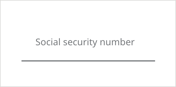
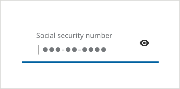
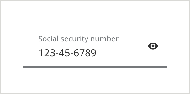
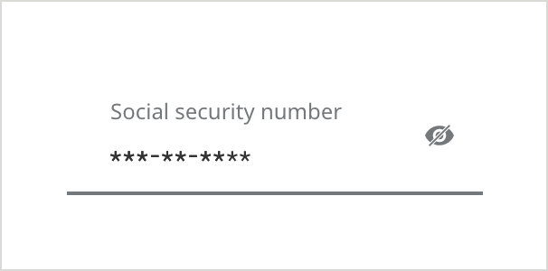
With Show/Hide Icon
The show/hide icon provides an extra layer of visual security when entering sensitive information, such as a social security number or password.
On Load
Selected
- Field Border Color: #0061A0
- Field Border Size: 3px
- Field Label Color: #6E6E6E
- Field Label Text: Noto Sans 12px Regular
- Text Color: #333333
- Text: Noto Sans 16px Regular
Filled
- Field Border Color: #6E6E6E
- Field Border Size: 2px
- Field Label Color: #6E6E6E
- Field Label Text: Noto Sans 12px Regular
- Text Color: #333333
- Text: Noto Sans 16px Regular
- Icon Color: #333333
Filled (Hide)
- Field Border Color: #6E6E6E
- Field Border Size: 2px
- Field Label Color: #6E6E6E
- Field Label Text: Noto Sans 12px Regular
- Text Color: #333333
- Text: Noto Sans 16px Regular
- Icon Color: #6E6E6E
Error
- Field Border Color: #D42123
- Field Border Size: 3px
- Field Label Color: #6E6E6E
- Field Label Text: Noto Sans 12px Regular
- Text Color: #333333
- Text: Noto Sans 16px Regular
- Caption Color: #D42123
- Caption Text: Noto Sans 12px Regular
Tooltip (Text)
- Use the “What’s This” Link when displaying a text field or dropdown, where you want to provide additional helpful information to the user.
- Use only with text that is helpful but not essential to the user – essential text should always be exposed on the page.
- Always use “What’s this?” (instead of a tooltip icon within the field) for all fields that already have an icon (such as a caret or show/hide icon) sitting in the far right real estate.
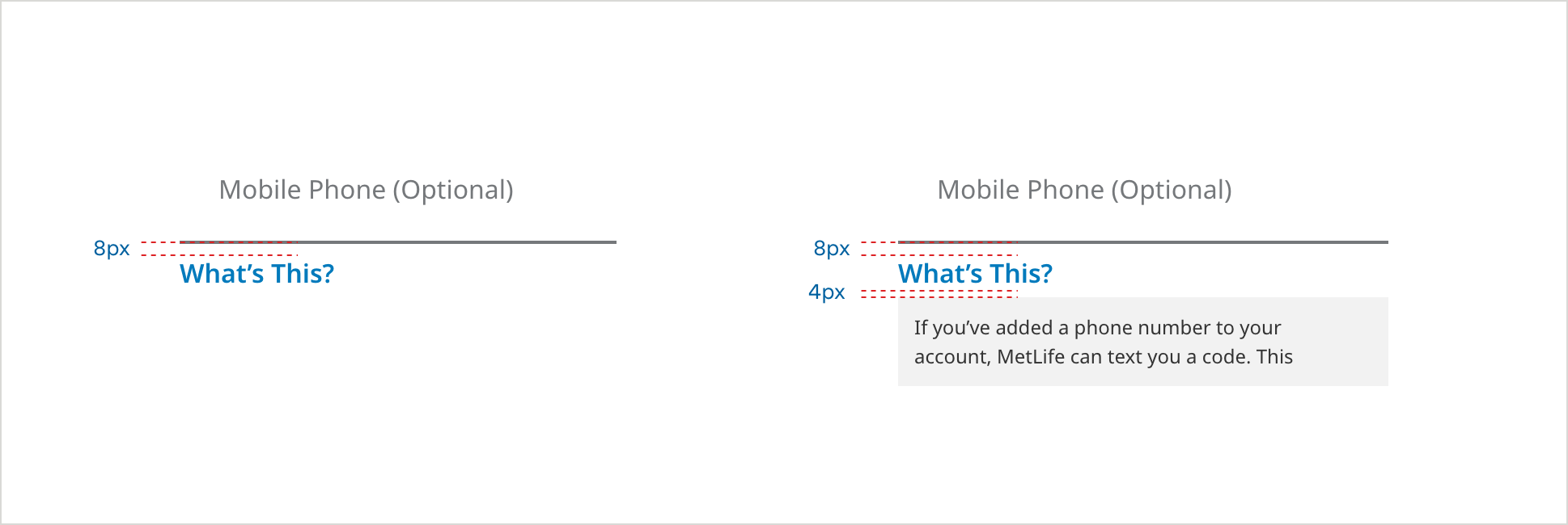
On Load
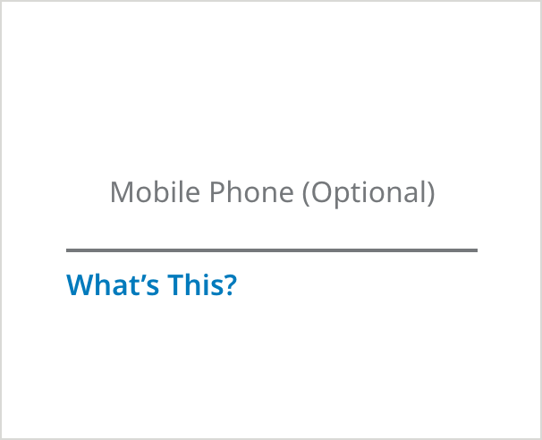
- Field Border Color: #6E6E6E
- Field Border Size: 2px
- Field Label Color: #6E6E6E
- Field Label Text: Noto Sans 16px Regular
- Field Specific Text Link Color: #007ABC
- Field Specific Text Link: Noto Sans 16px SemiBold
Tooltip Selected
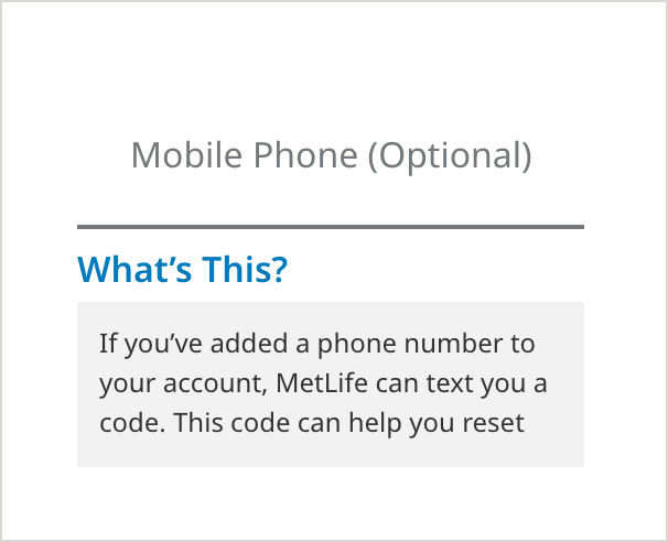
- Messaging Background Color: #F2F2F2
- Messaging Text Color: #333333
- Messaging Text: Noto Sans 12px Regular
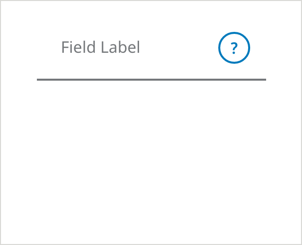
Tooltip (Information Icon)
- Use this question mark icon within a form field in situations where there are only a few fields on the screen, and saving vertical space is critical.
- Use only with text that is helpful but not essential to the user – essential text should always be exposed on the page.
- Do not mix question mark icons with the “What’s this?” pattern on the same form.
Underlined - On Load
- Field Border Color: #6E6E6E
- Field Border Size: 2px
- Field Label Color: #6E6E6E
- Field Label Text: Noto Sans 16px Regular
- Tooltip Icon Border color: #007ABC
Underlined - Selected
- Tooltip Icon Background Color: #007ABC
- Messaging Border Color: #007ABC
- Messaging Border Size: 2px
- Messaging Text Color: #333333
- Messaging Headline Text: Noto Sans 20px SemiBold
- Messaging Text: Noto Sans 16px Regular
- Messaging Icon Color: #333333
- Tooltip Card Shadow Color: #000000
- Tooltip Card Shadow Opacity: 18%
- Tooltip Card Shadow Blur: 18
- Tooltip Card Shadow Y-offset: 3
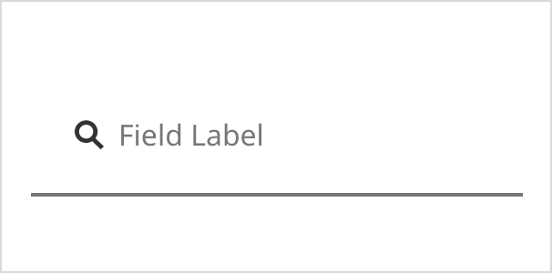
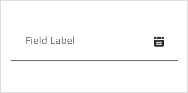
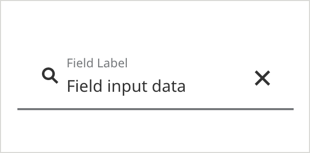
With Icons – Leading & Tailing
Icon - Leading
- Field Border Color: #6E6E6E
- Field Border Size: 2px
- Field Label Color: #6E6E6E
- Field Label Text: Noto Sans 16px Regular
- Icon Color Color: #007ABC
Icon - Tailing
Icon - Leading & Tailing
Icon - Leading & Tailing (Filled)
Usage Guidelines
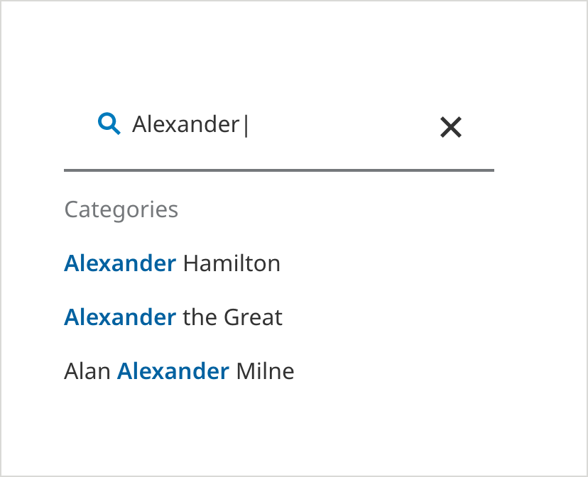
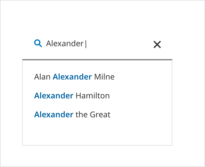
Type Ahead Styles
- There are 2 variations of type aheads outline fields:
- In Version 1, suggested search results appear below the field as the user types. Results are organized by category.
- Version 2 displays a panel below the field containing suggested search results, displaying alphabetically.
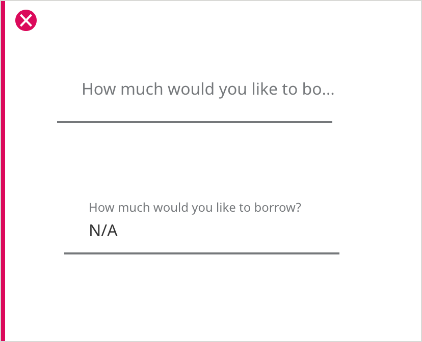
UX best practice (Error State)
Form validations pertaining to data entered in incorrect data format will appear immediately after user removes focus from the field. Other messages will display when the user submits the form.
Text Field Label
In cases where there are questions or text that is too long to be a text field label, display the question or field label above the text field. Then choose a specific noun as a floating label or add a static label to the text field.