USER INTERFACE ELEMENTS
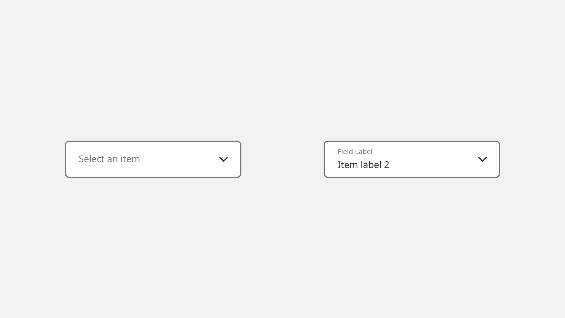
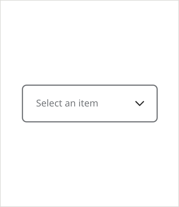
Dropdowns (Outlined)
Overview
Outlined text fields are a traditional space-saving format for presenting users a list of choices, and are easier to distinguish when stacked in large groups of form fields than underlined dropdowns. Outlined dropdowns have floating labels, like our outlined text fields, and should be used in conjunction with those text fields. Do not mix the outlined and underlined formats together on the same screen.
Specifications
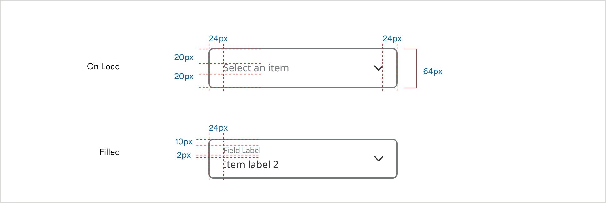
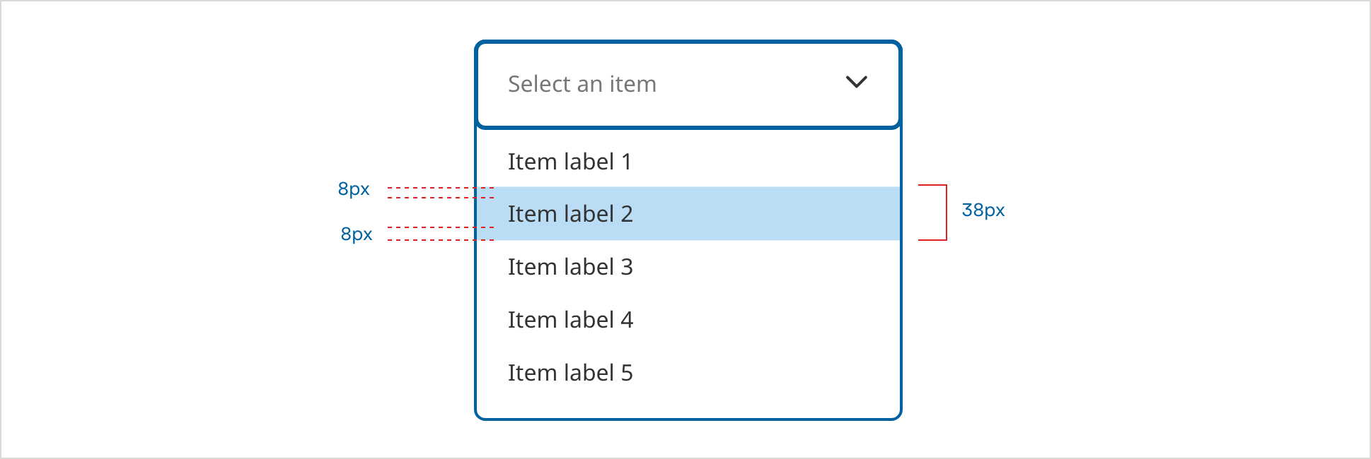
Dropdown Spacing
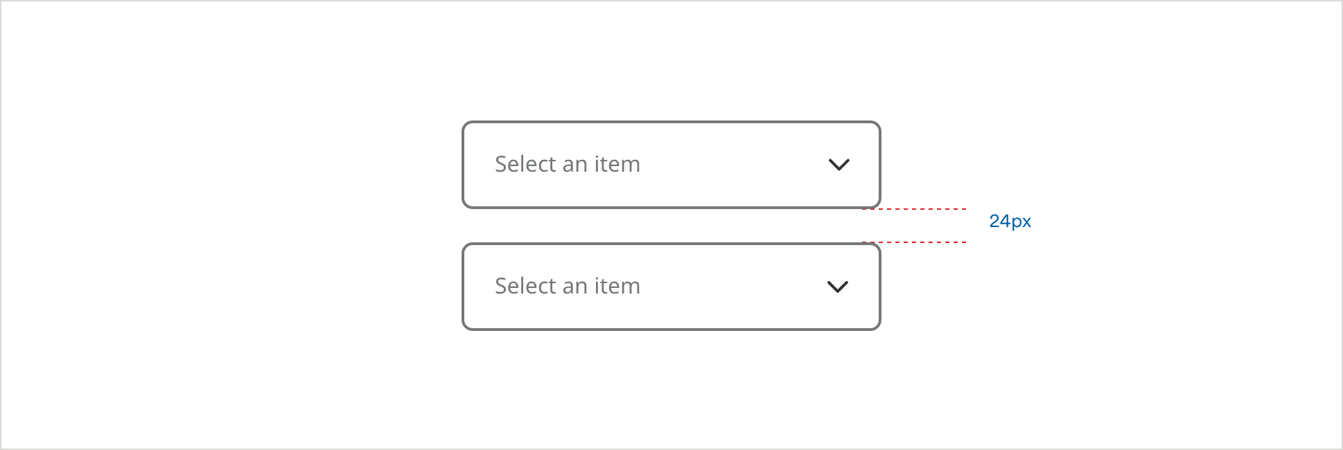
Dropdown Panel Spacing
Dropdowns on White
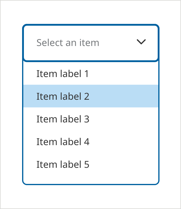
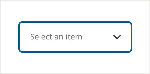
Default
- Field Border Color: #6E6E6E
- Field Border Size: 2px
- Text Color: #6E6E6E
- Text: Noto Sans 16px Regular
- Corner Radius: 8px
On Focus/Selected
- Field Border Color: #0061A0
- Border Size: 3px
- Dropdown Border Color: #0061A0
- Dropdown Border Size: 2px
- Text Color: #6E6E6E
- Text: Noto Sans 16px Regular
- Item Text Color: #333333
- Selected Hover State Color: #BADDF5
- Corner Radius: 8px
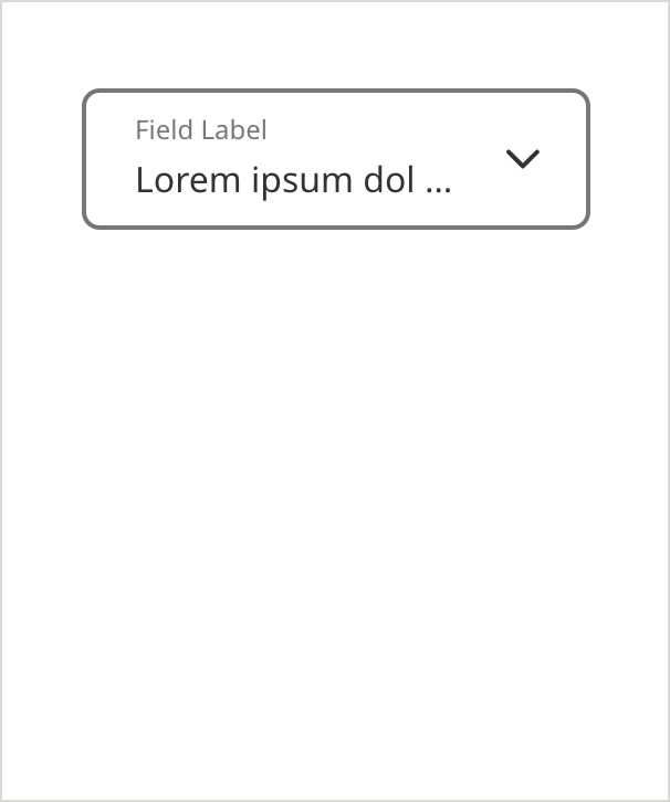
Filled
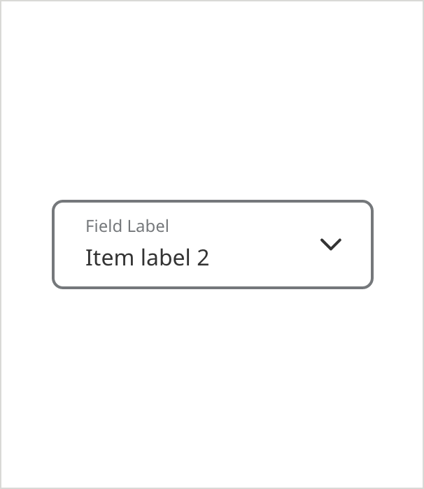
- Field Border Color: #6E6E6E
- Field Border Size: 2px
- Field Label Text Color: #6E6E6E
- Field Label Text: Noto Sans 12px Regular
- Text: Noto Sans 16px Regular
- Corner Radius: 8px
Keyboard Focus (ADA)
- Field Border Color: #0061A0
- Field Border Size: 3px
- Text Color: #6E6E6E
- Text: Noto Sans 16px Regular
- Corner Radius: 8px
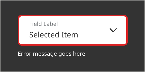
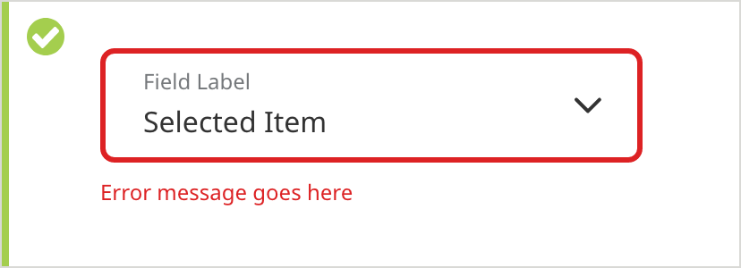
Error
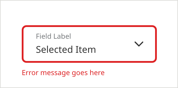
- Field Border Color: #D42123
- Field Border Size: 3px
- Field Label Text Color: #6E6E6E
- Field Label Text: Noto Sans 12px Regular
- Text Color: #333333
- Text: Noto Sans 16px Regular
- Caption Color: #D42123
- Caption Text: Noto Sans 12px Regular
- Corner Radius: 8px
Icon - Leading
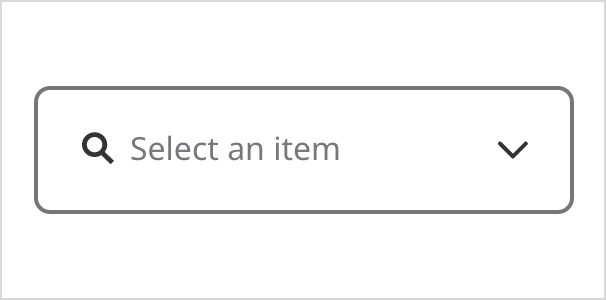
- Field Border Color: #6E6E6E
- Field Border Size: 2px
- Field Label Text Color: #6E6E6E
- Field Label Text: Noto Sans 12px Regular
- Text: Noto Sans 16px Regular
- Corner Radius: 8px
- Icon Color Color: #333333
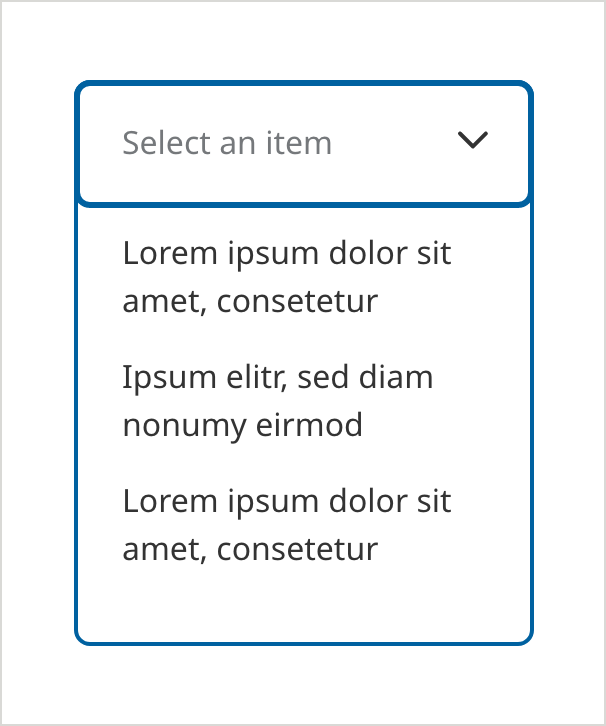
5+ Option Scroll
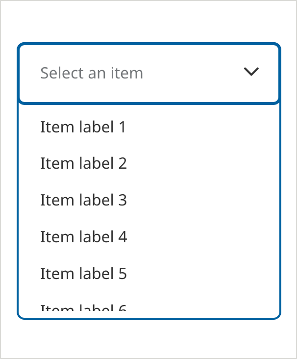
- Use a scroll bar for viewing the lists with more than 5 items
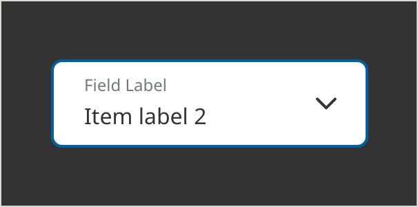
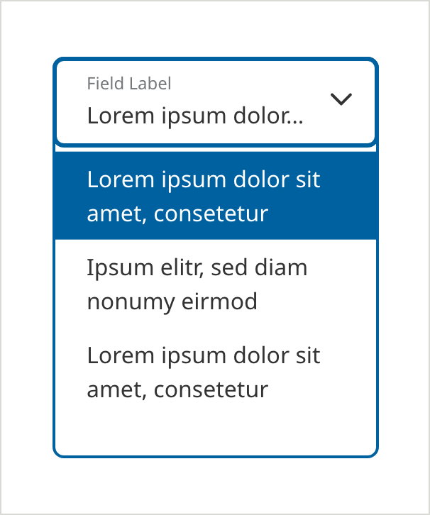
Selected Field
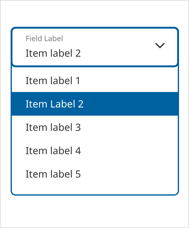
- Field Border Color: #0061A0
- Field Border Size: 3px
- Dropdown Border Color: #0061A0
- Dropdown Border Size: 2px
- Field Label Text Color: #6E6E6E
- Text: Noto Sans 16px Regular
- Item Text Color: #333333
- Selected State Background Color: #0061A0
- Selected State Text Color: #FFFFFF
- Corner Radius: 8px
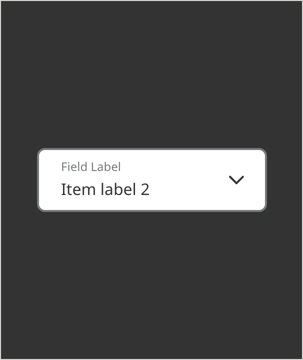
Dropdowns on Dark Background
When dropdowns appear on a dark background, the floating label is contained inside the dropdown field itself, as opposed to floating midway across the top dropdown border.
Default
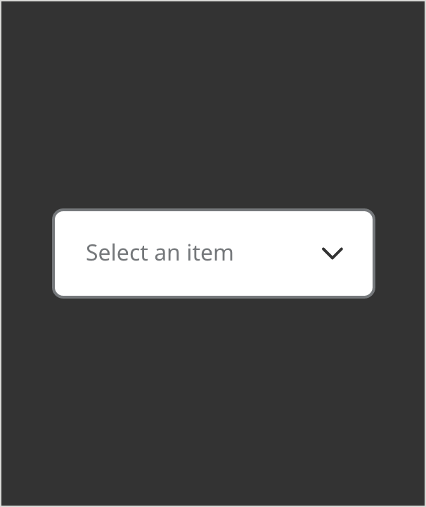
- Field Border Color: #6E6E6E
- Field Border Size: 2px
- Text Color: #6E6E6E
- Text: Noto Sans 16px Regular
- Corner Radius: 8px
Selected
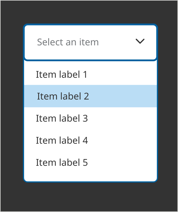
- Field Border Color: #0061A0
- Field Border Size: 3px
- Dropdown Border Color: #0061A0
- Dropdown Border Size: 2px
- Text Color: #6E6E6E
- Text: Noto Sans 16px Regular
- Item Text Color: #333333
- Selected Hover State Color: #BADDF5
- Corner Radius: 8px
Filled
- Field Border Color: #6E6E6E
- Field Border Size: 2px
- Field Label Text Color: #6E6E6E
- Field Label Text: Noto Sans 12px Regular
- Text Color: #333333
- Text: Noto Sans 16px Regular
- Corner Radius: 8px
On Focus - (ADA compliant) - appears on keyboard navigation only
- Field Border Color: #0061A0
- Field Border Size: 2px
- Field Label Text Color: #6E6E6E
- Field Label Text: Noto Sans 12px Regular
- Text Color: #333333
- Text: Noto Sans 16px Regular
- Corner Radius: 8px
Error
- Field Border Color: #D42123
- Field Border Size: 3px
- Field Label Text Color: #6E6E6E
- Field Label Text: Noto Sans 12px Regular
- Text Color: #333333
- Text: Noto Sans 16px Regular
- Caption Color: #FFFFFF
- Caption Text: Noto Sans 12px Regular
- Corner Radius: 8px
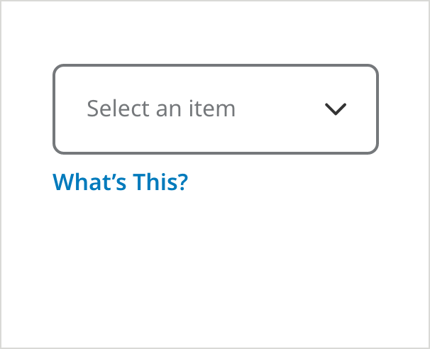
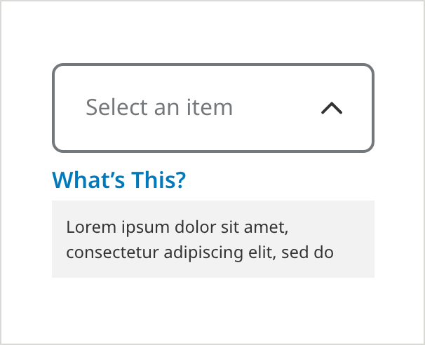
Tooltip (Text)
• Use the “What’s This” Link when displaying a text field or dropdown, where you want to provide additional helpful information to the user.
• Use only with text that is helpful but not essential to the user – essential text should always be exposed on the page.
• Always use “What’s this?” (instead of a tooltip icon within the field) for all fields that already have an icon (such as a caret or show/hide icon) sitting in the far right real estate.
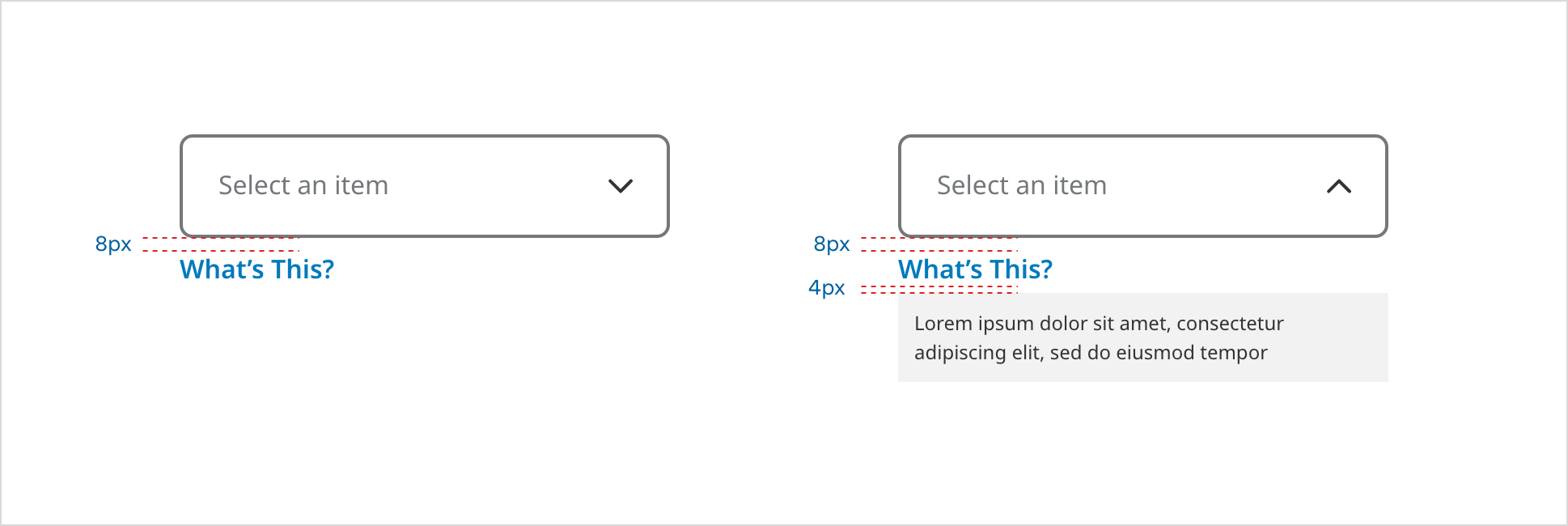
On Load
- Field Border Color: #6E6E6E
- Field Border Size: 2px
- Field Label Color: #6E6E6E
- Field Label Text: Noto Sans 16px Regular
- Field Specific Text Link Color: #007ABC
- Field Specific Text Link: Noto Sans 16px SemiBold
Tooltip Selected
- Messaging Background Color: #F2F2F2
- Messaging Text Color: #333333
- Messaging Text: Noto Sans 12px Regular
Usage Guidelines
Multiple Line Examples
Dropdown menu items can wrap to as many as three lines when necessary. Long answers in the filled dropdown truncate with an ellipsis.
Double Line Menu Items
Triple Line Menu Items - Selected
Triple Line Menu Items - Filled
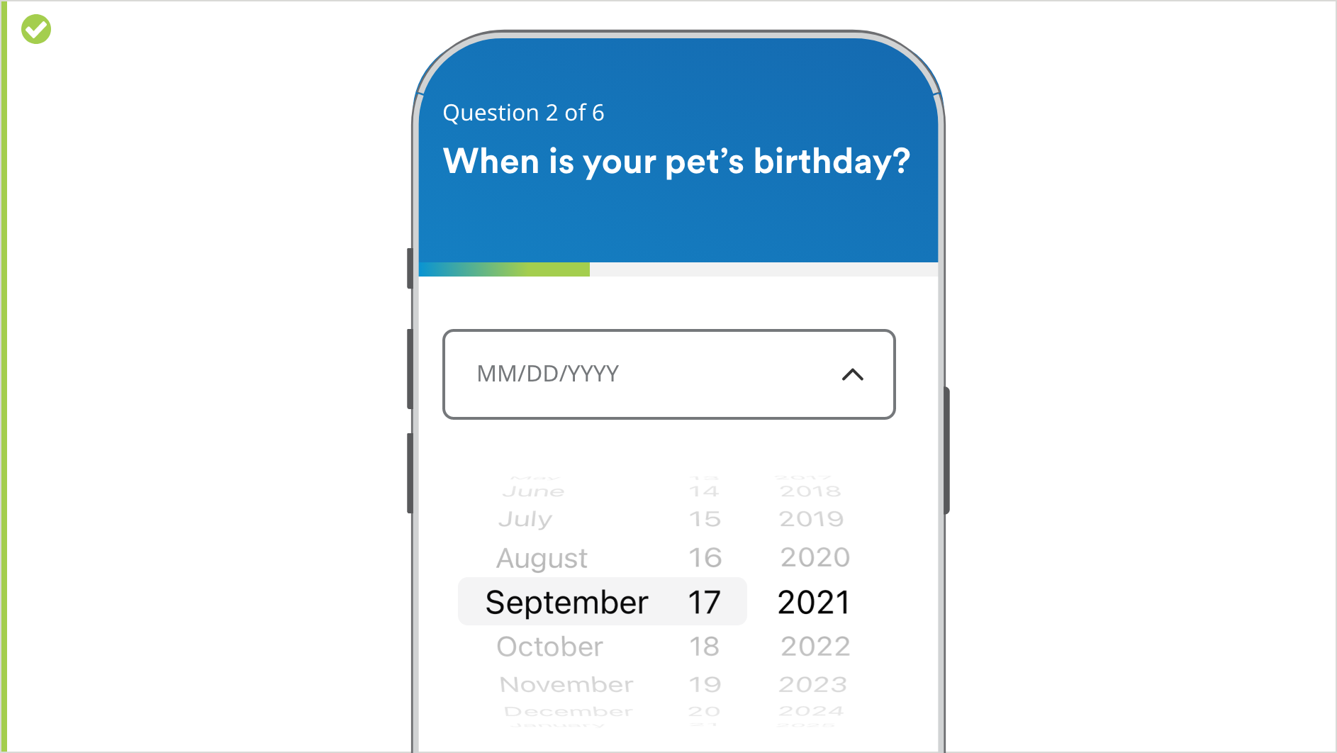
Mobile Phone - Selected State
For mobile/native app purposes, outline dropdowns in the selected state invoke native controls for the device being used.
UX best practice (Error State)
Form validations pertaining to data entered in incorrect data format will appear immediately after user removes focus from the field. Other messages will display when the user submits the form..
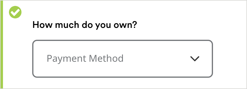
Dropdown Label
In cases where there are questions or text that is too long to be the drop down label, display the question or field label above the dropdown. Then choose a specific noun as a label for the dropdown.