USER INTERFACE ELEMENTS
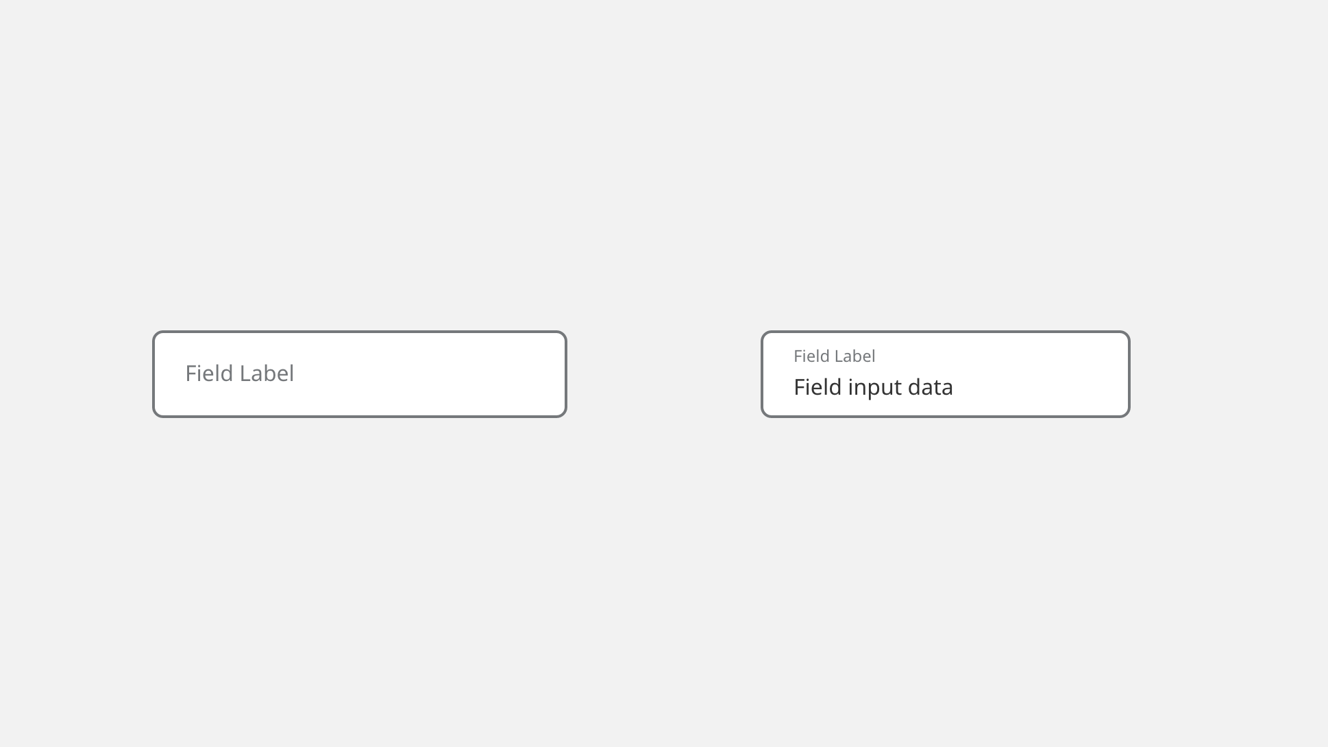
Text Fields (Outlined)
Overview
Outlined text fields are used where multiple items of data are being requested. They are the more traditional format for data input and are easier to distinguish when stacked in large groups. Our outlined text fields have floating labels which allow users to identify the original data requested at all times while filling out forms.
Specifications
Form Field Specifications
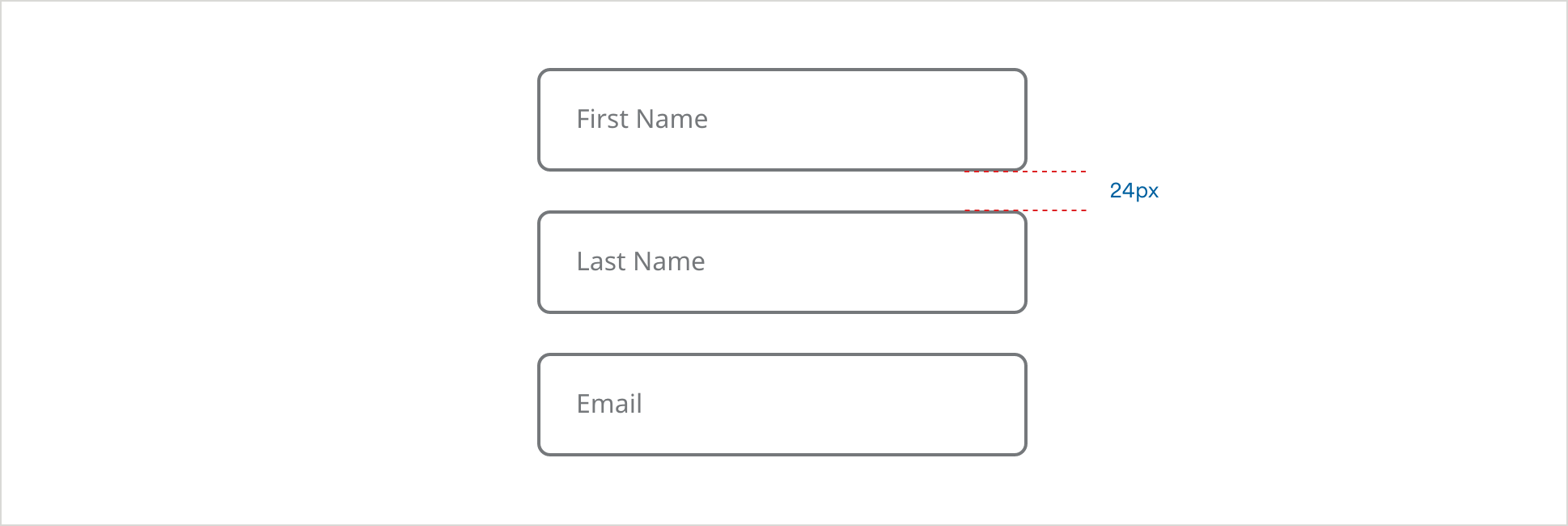
Form Field Spacing
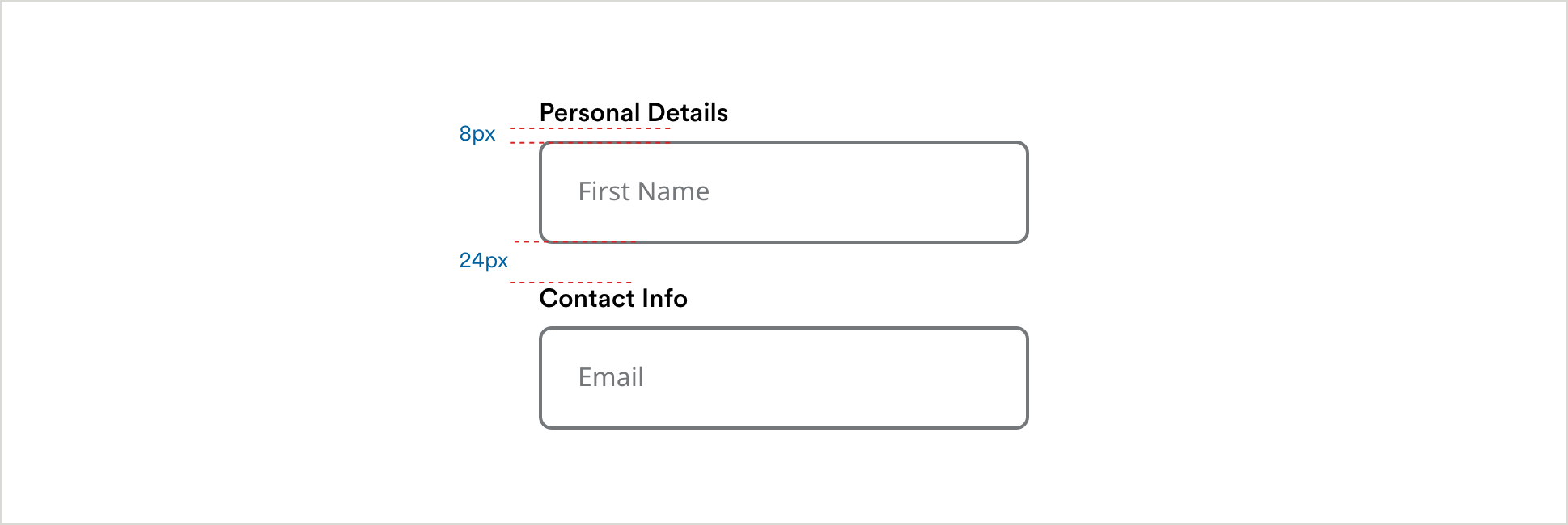
Question + Form Field Spacing
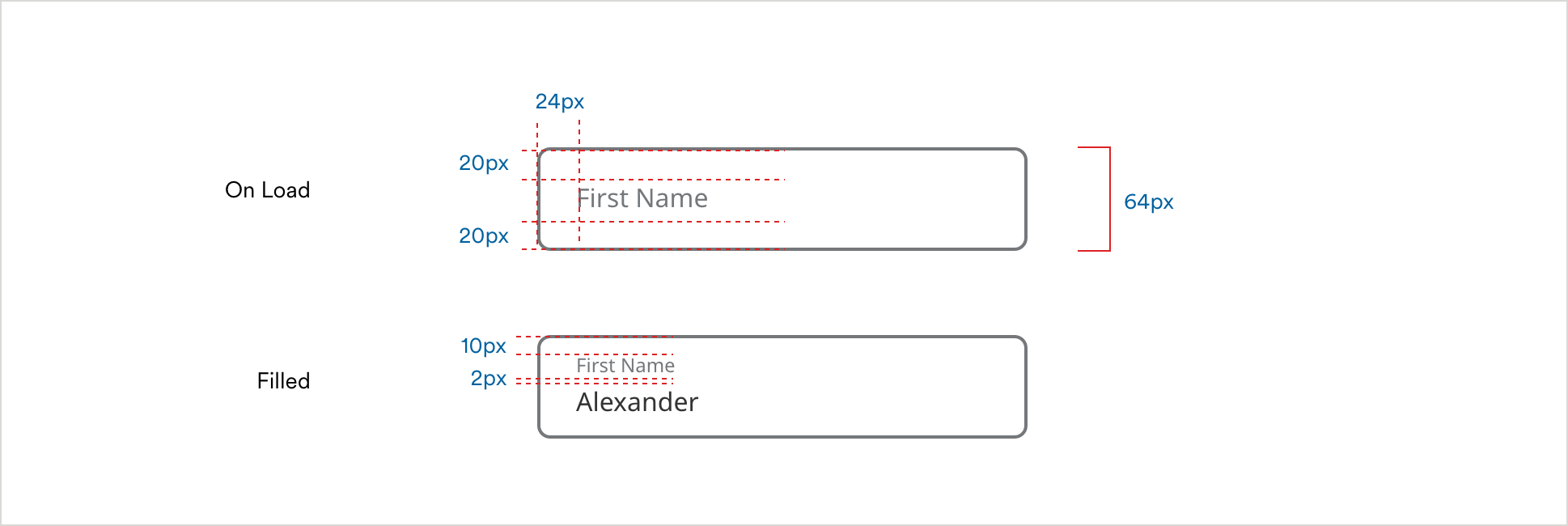
Simple Form Fields
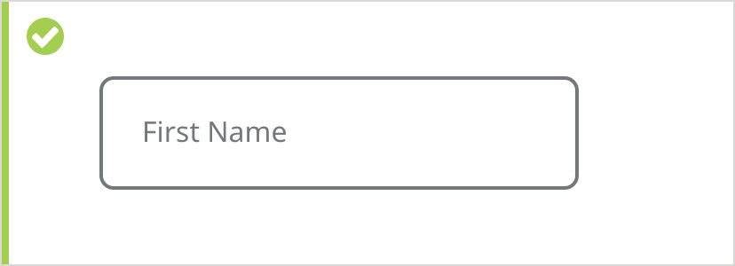
Default
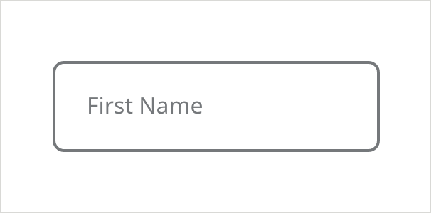
- Field Border Color: #6E6E6E
- Field Border Size: 2px
- Field Label Color: #6E6E6E
- Field Label Text: Noto Sans 16px Regular
- Corner Radius: 8px
On Focus/Selected + Keyboard Focus (ADA)
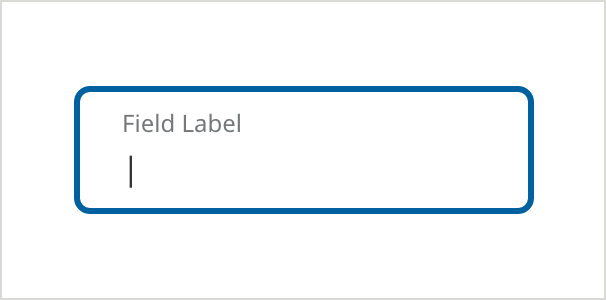
- Field Border Color: #0061A0
- Field Border Size: 3px
- Field Label Color: #6E6E6E
- Field Label Text: Noto Sans 12px Regular
- Corner Radius: 8px
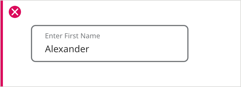
Filled
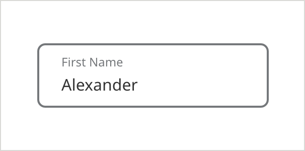
- Field Border Color: #6E6E6E
- Field Border Size: 2px
- Field Label Color: #6E6E6E
- Field Label Text: Noto Sans 12px Regular
- Text Color: #333333
- Text: Noto Sans 16px Regular
- Corner Radius: 8px
Hover/ Pressed
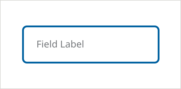
- Field Border Color: #0061A0
- Field Border Size: 3px
- Field Label Color: #6E6E6E
- Field Label Text: Noto Sans 16px Regular
- Corner Radius: 8px
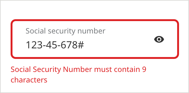
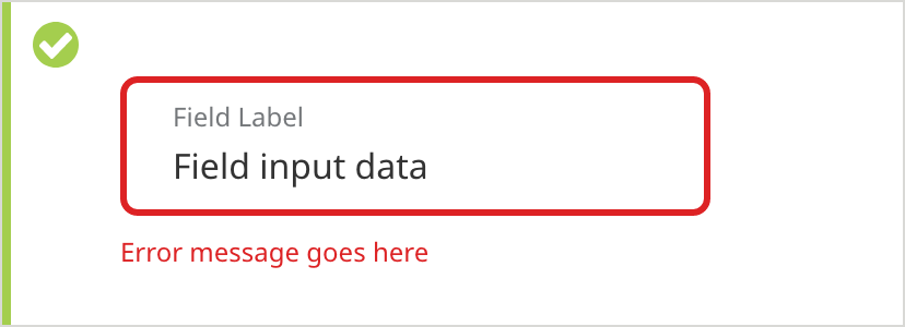
Error
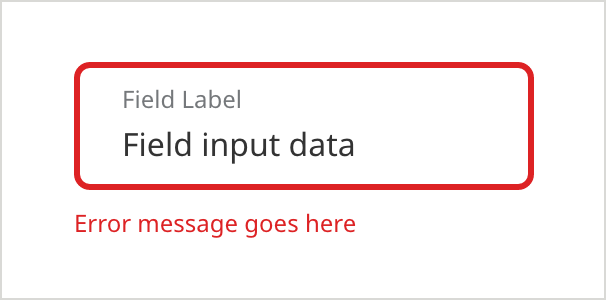
Errors appear when the system cannot accept the data the user has entered (e.g. information is missing, the information does not meet the data required)
- Field Border Color: #D42123
- Field Border Size: 3px
- Field Label Color: #6E6E6E
- Field Label Text: Noto Sans 12px Regular
- Caption Color: #D42123
- Caption Text: Noto Sans 12px Regular
- Text Color: #333333
- Text: Noto Sans 16px Regular
- Corner Radius: 8px
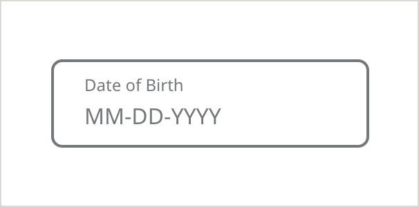
With Hint Text
Use hint text for fields that have specific formatting requirements, to help users understand how they need to enter the information.
On Load
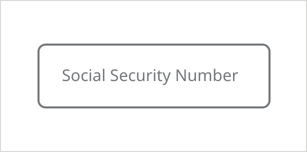
- Field Border Color:#6E6E6E
- Field Border Size: 2px
- Field Label Color: #6E6E6E
- Field Label Text: Noto Sans 16px Regular
- Corner Radius: 8px
Selected
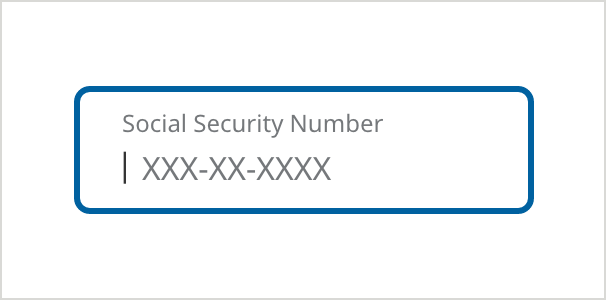
Placeholder label will float and hint text will appear in the field
- Field Border Color: #0061A0
- Field Border Size: 3px
- Field Label Color: #6E6E6E
- Field Label Text: Noto Sans 12px Regular
- Corner Radius: 8px
Filled
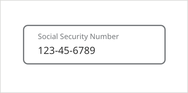
Once filled, hint text disappears and takes the appearance of filled text.
- Field Border Color: #6E6E6E
- Field Border Size: 2px
- Field Label Color: #6E6E6E
- Field Label Text: Noto Sans 12px Regular
- Text Color: #333333
- Text: Noto Sans 16px Regular
- Corner Radius: 8px
With Hint Text (Alternate Variation)
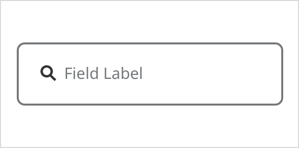
Icon - Leading
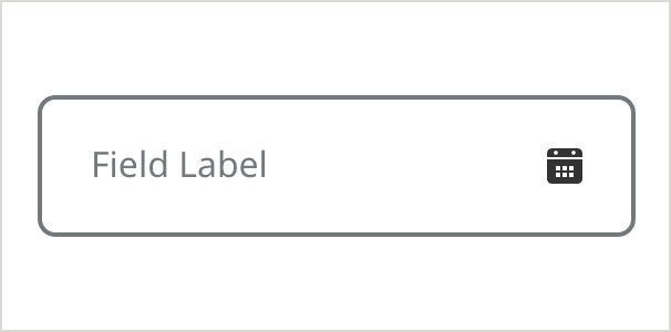
Icon - Tailing
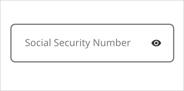
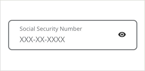
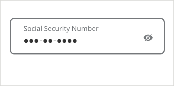
With Show/Hide Icon
The show/hide icon provides an extra layer of visual security when entering sensitive information, such as a social security number or password.
On Load
Selected
Selected - Filling
Filled
Filled (Hide)
Error
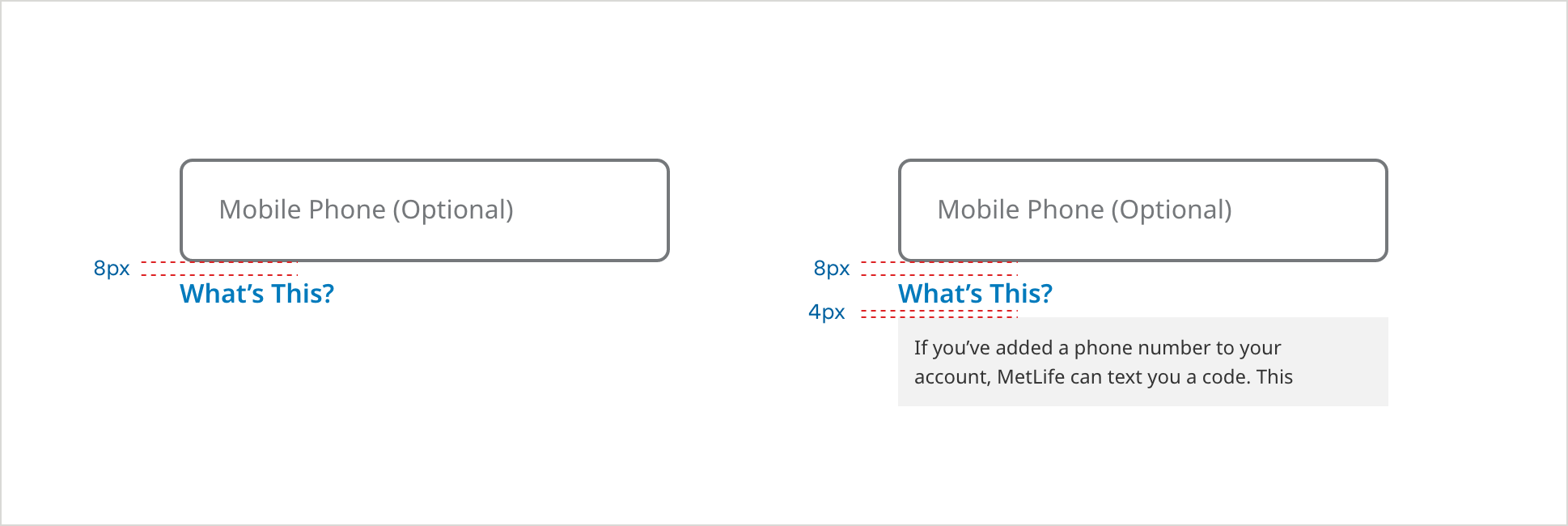
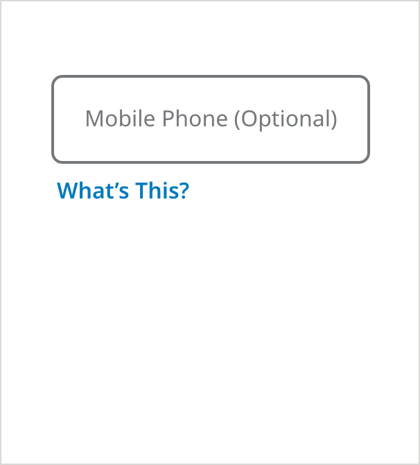
Tooltip (Text)
• Use the “What’s This” Link when displaying a text field or dropdown, where you want to provide additional helpful information to the user.
• Use only with text that is helpful but not essential to the user – essential text should always be exposed on the page.
• Always use “What’s this?” (instead of a tooltip icon within the field) for all fields that already have an icon (such as a caret or show/hide icon) sitting in the far right real estate.
Default
- Field Border Color: #6E6E6E
- Field Border Size: 2px
- Text Color: #6E6E6E
- Text: Noto Sans 16px Regular
- Field Specific Text Link Color: #007ABC
- Field Specific Text Link: Noto Sans 16px SemiBold
Tooltip Selected
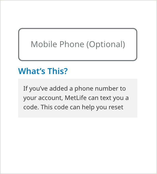
- Messaging Background Color: #F2F2F2
- Messaging Text Color: #333333
- Messaging Text: Noto Sans 12px Regular
Tooltip Selected - Active Field
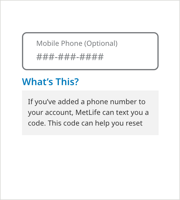
- Messaging Background Color: #F2F2F2
- Messaging Text Color: #333333
- Messaging Text: Noto Sans 12px Regular
- Field Label Text Color: #6E6E6E
- Field Label Text: Noto Sans 12px Regular
- Text Color: #6E6E6E
- Text: Noto Sans 16px Regular
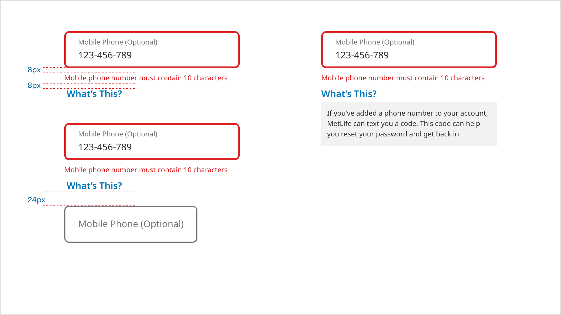
Error + “What’s this?” Tooltip
When an error state occurs where using a “What’s this?” tooltip, the error information appears above the tooltip and pushes the tooltip down.
Tooltip (Information Icon)
• Use this question mark icon within a form field in situations where there are only a few fields on the screen, and saving vertical space is critical.
• Use only with text that is helpful but not essential to the user – essential text should always be exposed on the page.
• Do not mix question mark icons with the “What’s this?” pattern on the same form.
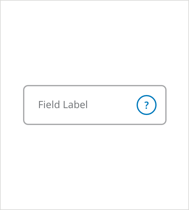
Outlined - On Load
- Field Border Color: #6E6E6E
- Field Border Size: 2px
- Field Label Color: #6E6E6E
- Field Label Text: Noto Sans 16px Regular
- Tooltip Icon Border color: #007ABC
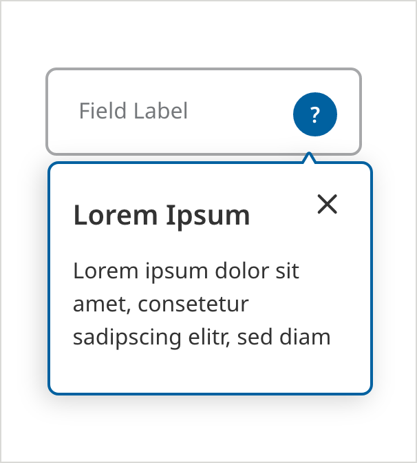
Outlined - Selected
- Tooltip Icon Background Color: #007ABC
- Messaging Border Color: #007ABC
- Messaging Border Size: 2px
- Messaging Text Color: #333333
- Messaging Headline Text: Noto Sans 20px SemiBold
- Messaging Text: Noto Sans 16px Regular
- Messaging Icon Color: #333333
Usage Guidelines
UX best practice (Error State)
Form validations pertaining to data entered in incorrect data format will appear immediately after user removes focus from the field. Other messages will display when the user submits the form.
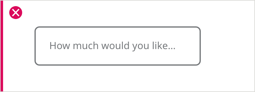
Text Field label length
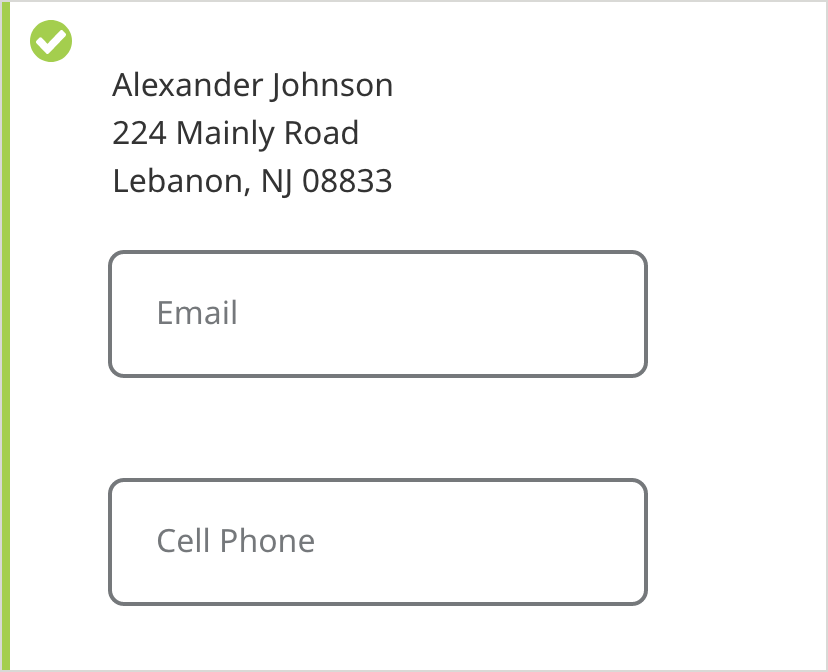
In cases where there are questions or text that is too long to be a text field label, display the question or field label above the text field. Then choose a specific noun as a label for the text field.
Labels should make sense
Never use field labels with verbs in them that don’t translate well to floating labels when the field is filled.
Disabled fields
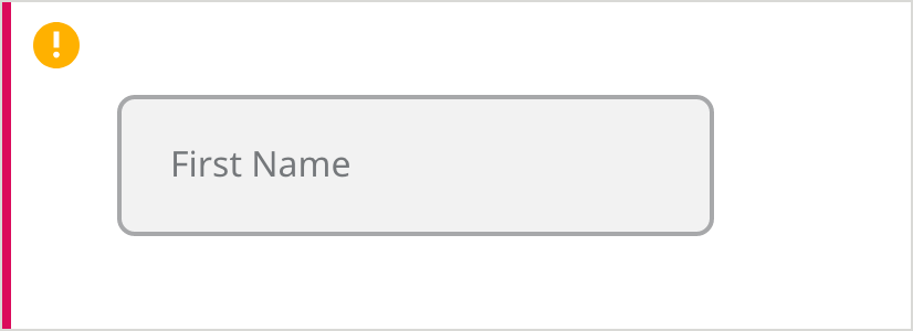
Use of disabled fields is discouraged. It is preferable to display only relevant, active fields and to reveal fields progressively as a user works through a form.
Data that the user can’t edit should be displayed as static text, not inside a text field.