USER INTERFACE ELEMENTS
Segmented Control
Overview
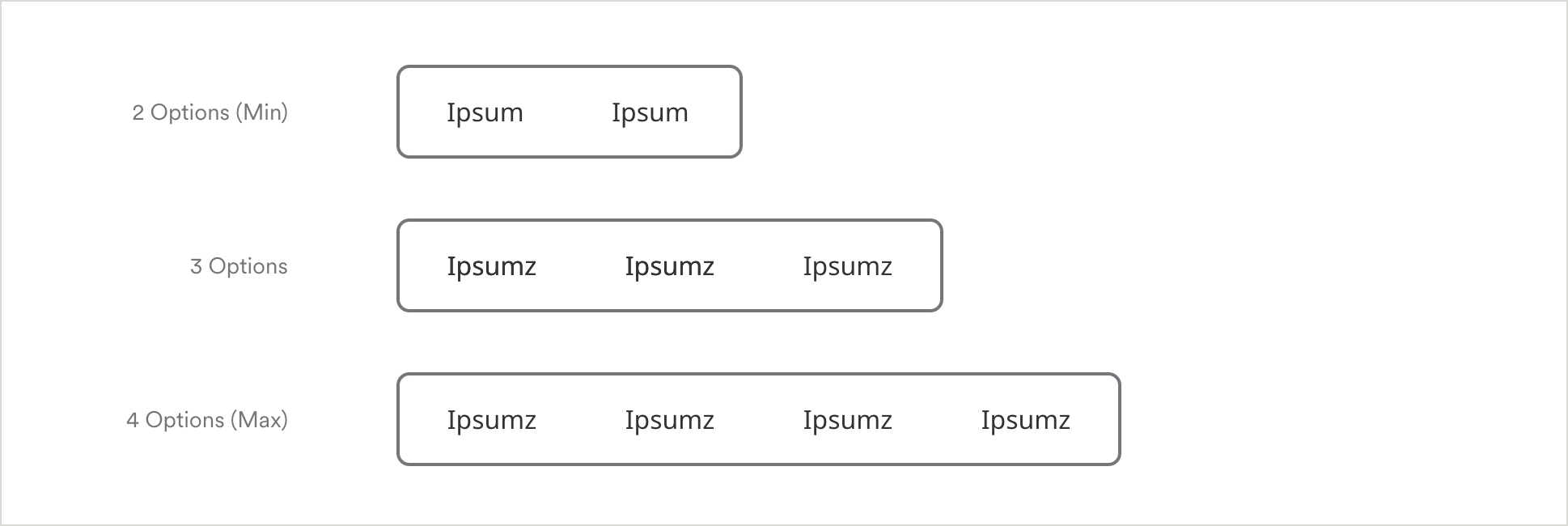
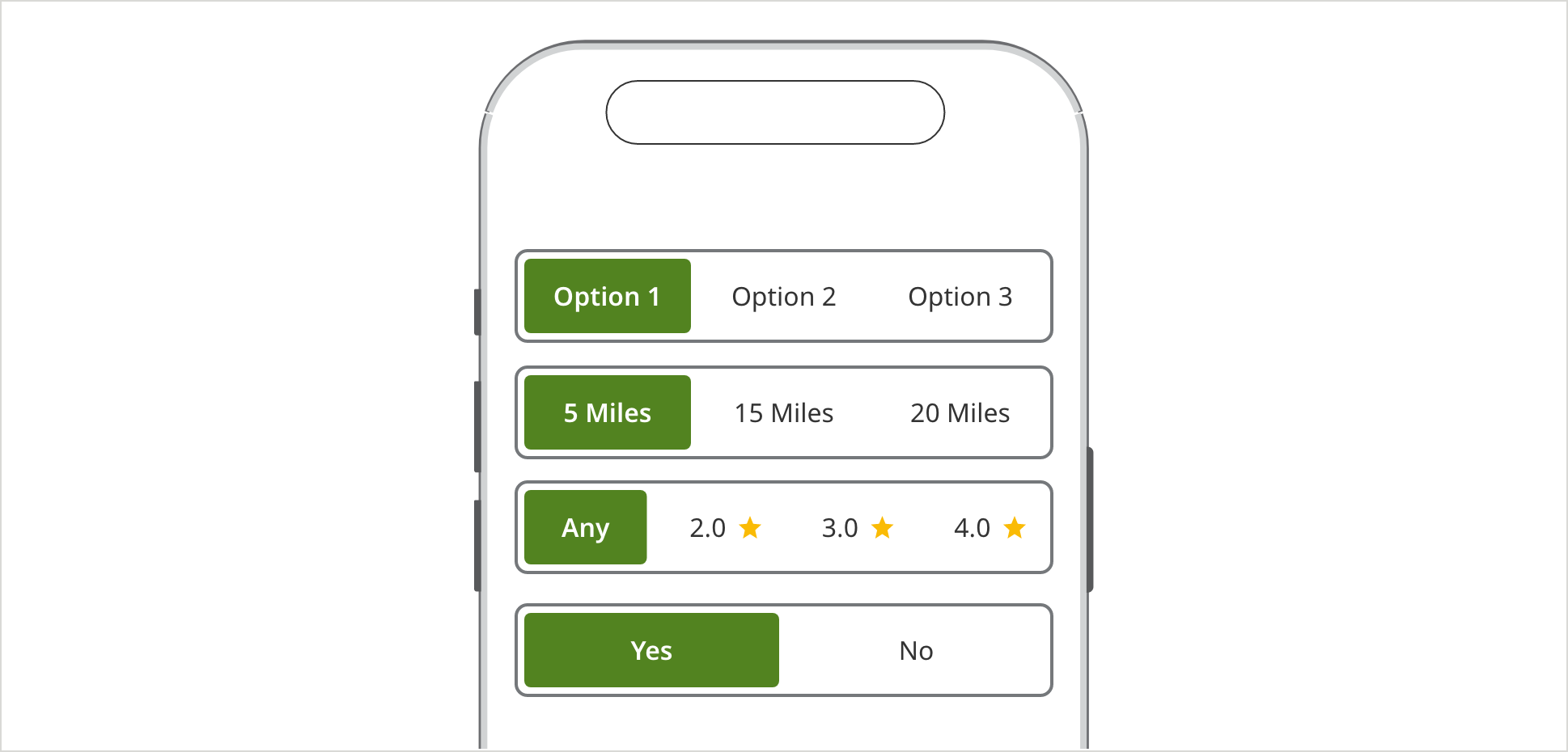
Segment selectors allow users to choose only one of a predefined set of mutually exclusive options, (similar to radio buttons). They can contain a maximum of 4 selections. Segment selectors offer an alternative to radio buttons with larger, more mobile-friendly touch targets.
Specifications
Responsive Web Segmented Control
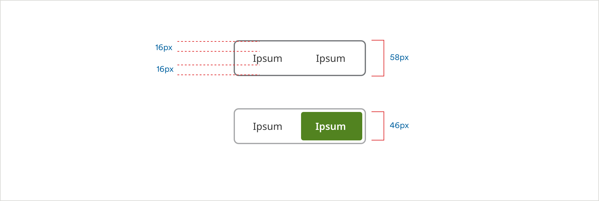
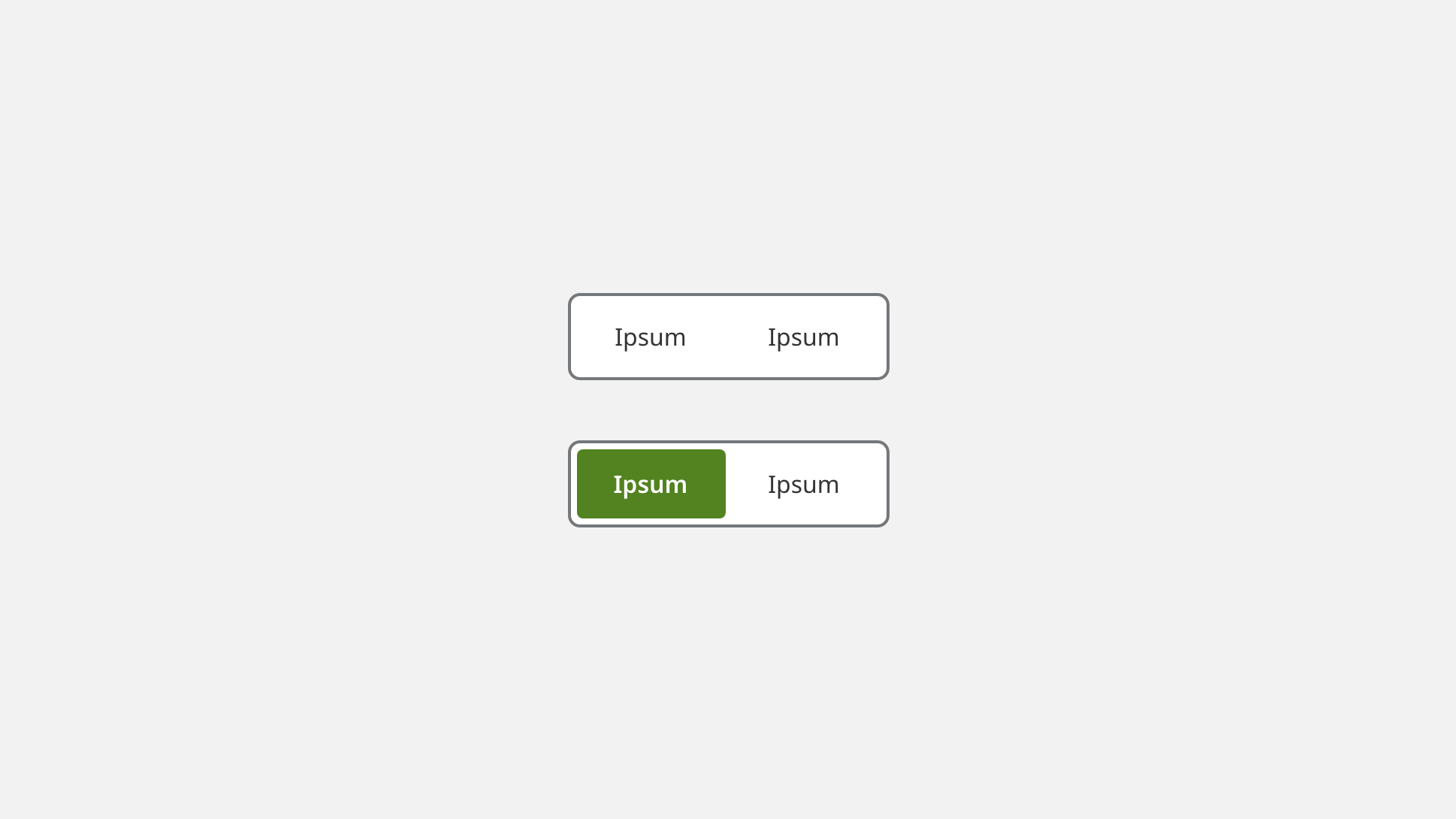
On Load
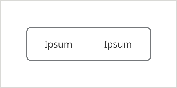
- Inactive Button Fill Color: #FFFFFF
- Field Border Color: #75787B
- Field Border Size: 2px
- Field Corner Radius: 6px
- Inactive Button Label Color: #333333
- Inactive Button Label Text: Noto Sans 16px Regular
Hover/Selected
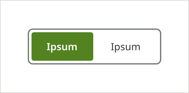
- Active Button Fill Color: #528320
- Inactive Button Fill Color: #FFFFFF
- Field Border Color: #75787B
- Field Border Size: 2px
- Field Corner Radius: 6px
- Active Button Label Color: #FFFFFF
- Active Button Label Text: Noto Sans 16px SemiBold
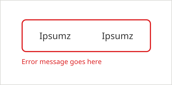
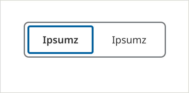
On Focus - (ADA compliant)
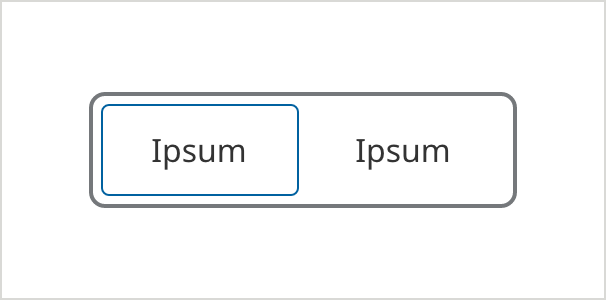
- Inactive Button Fill Color: #528320
- Focused Border Color: #0061A0
- Focused Border Size: 1px
- Field Border Color: #75787B
- Field Border Size: 2px
- Field Corner Radius: 6px
- Inactive Button Label Color: #FFFFFF
- Inactive Button Label Text: Noto Sans 16px Regular
Groupings
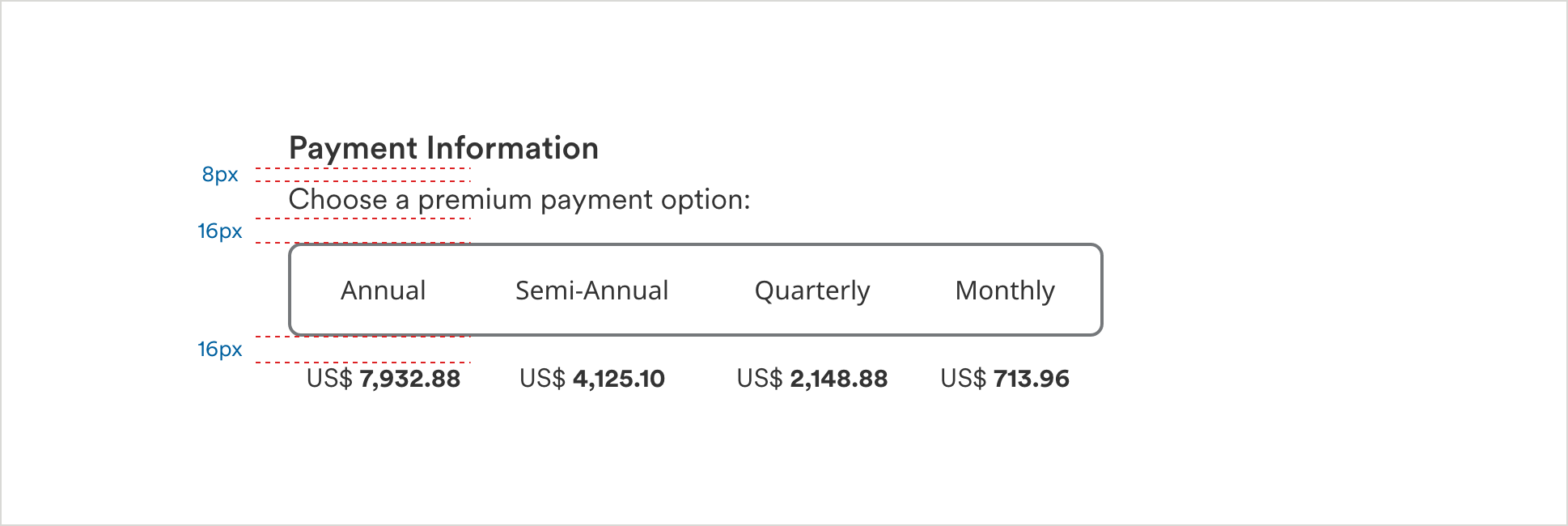
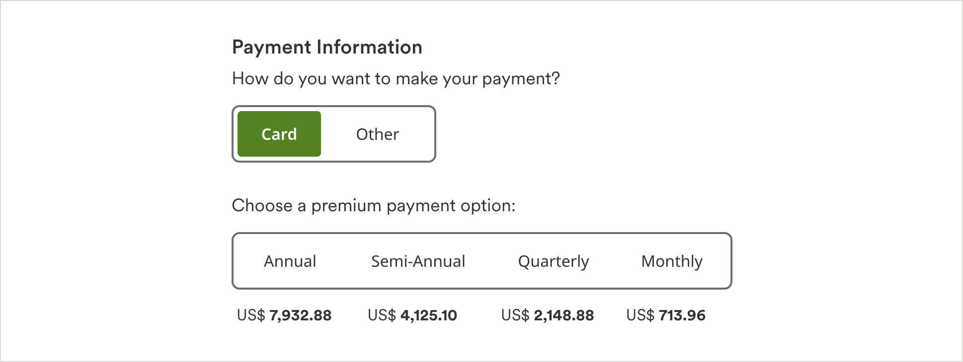
Segmented Control with Additional Question and Label Text
Mobile Segmented Control
Usage Guidelines
Maximum Option Count (Tablet or Larger)
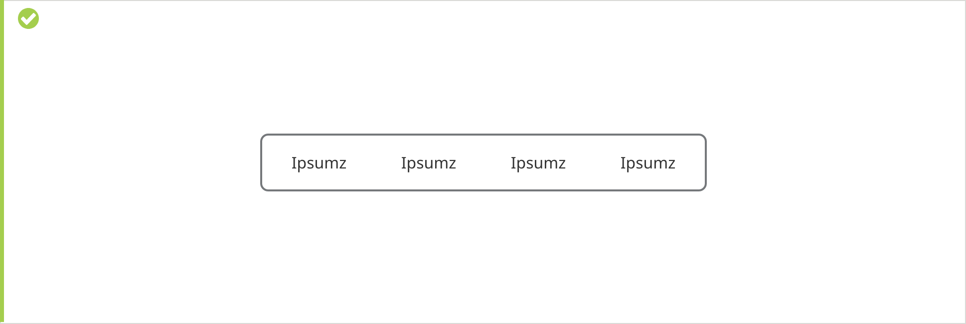
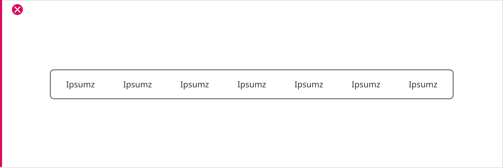
Up to 4 segments/options.
Scenario: Segment Selectors with additional question or label text.
Hover
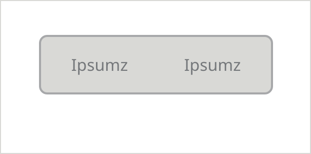
Inactive
Error